
Introduction to chart
A chart is a graphical representation of data points. It is the heart and soul of a technical analyst, who uses it to recognize various patterns with the objective of making trading and investment decisions from it. Technical analysts are frequently also called chartists given that they spend a major portion of their time looking at various charts. Besides providing historical information about price, a chart can also provide historical information about volume and open interest, both of which will be discussed in greater detail later. A chart can plot close only data or can even plot all four elements of a period’s range – open, high, low, and close. In this topic, we will talk about some of the most commonly used charts in technical parlance.
Types of Charts
The four most commonly used charts by technical analysts are line chart, bar chart, candlestick chart, and point & figure chart. We shall now discuss each of these types in more detail.
Line Chart
A line chart is the most basic type of chart available on any charting software. A line chart is formed by plotting a closing price for a particular time frame. So, in the case of daily data, a line chart is plotted by using the closing price of each day, in the case of weekly data, a line chart is plotted by using the closing price of each week, in the case of 5-minute data, a line chart is plotted by using the closing price of each 5-minute period, and so on. In the case of a line chart, price is plotted along the vertical Y-axis and time is plotted along the horizontal X-axis. Given that a line chart uses only closing price, it essentially removes noise from the chart by ignoring the period’s price range. This has both advantages and disadvantages. The key advantage is fewer whipsaws in case of breakouts from price patterns (which will be discussed in detail in a later topic), while the key disadvantage is the possibility that the trader could miss out on some vital piece of information by shrugging off the period’s trading range. A line chart comes into handy especially when spotting long-term trends.
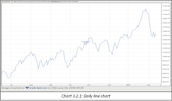
The above chart shows how a daily line chart looks like. The closing price for each session is connected to the closing price of the previous session using a line. Notice how smooth the line chart looks like by not considering the other elements of the trading range (open, high, and low).
Bar Chart
A bar chart provides more information than a line chart as it displays not only the closing price but also the opening price, the high price, and the low price. A bar chart consists of a vertical line and two small horizontal dashes, one on the left of the vertical line and one on the right of the vertical line. The top of the vertical line represents a period’s high, the bottom of the vertical line represents a period’s low, the small horizontal dash to the left of the vertical line represents the period’s open, and the small horizontal dash to the right of the vertical line represents the period’s close. While the length of the horizontal dashes remains the same, the length of the vertical line could vary depending on period’s trading range. The larger the period’s trading range, the larger will be the length of the vertical line, and the smaller the period’s trading range, the smaller will be the length of the vertical line. If the period’s close is above the open, the right horizontal dash will be above the left horizontal dash, and if the period’s close is below the open, the right horizontal dash will be below the left horizontal dash. Just like in case of line chart, in case of a bar chart also, price is plotted along the vertical Y-axis and time is plotted along the horizontal X-axis.
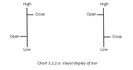
The above chart represents visual display of each candle. Note that the vertical line represents the range (with the top of the line representing the high and the bottom of the line representing the low), the left horizontal dash represents the open, and the right horizontal dash represents the close. Also notice in chart 3.2.2.1 that the bar on the left is a bullish bar as the close is above the open, while the chart on the right is a bearish bar as the close is below the open.
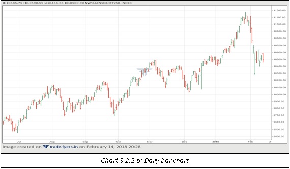
The above chart represents the daily bar chart. Observe that the size of the vertical line keeps changing depending on the size of each day’s trading range. Some bars appear small while some appear large. This helps in determining volatility of each trading session. Also observe that some bars are green while the others are red. A bar is green when the current bar close is above the previous bar close. A bar is red when the current bar close is below the previous bar close.
Candle Chart
Candle charts are believed to have originated in Japan, but their popularity has soared around the world over the past 2-3 decades. This is because candle charts not only provide the same information as bar charts do, but candle charts provide information in a more visual manner which enables a chart reader to glean more patterns (more on this in a later topic) than he could ever think of with a bar chart. Just like in case of a line and bar chart, in case of a candle chart also, price is plotted along the vertical Y-axis and time is plotted along the horizontal X-axis. In a candle chart, the real body represents the opening and closing range, while the shadows represent the high and low range. Real body and shadows when combined represent one candle. If the close is above the open, the candle is usually represented by green colour, while if the close is below the open, the candle is usually represented by red colour. A green candle represents a bullish candle, while a red candle represents a bearish candle. Just like a bar, the longer the candle, the larger the period’s trading range, and vice versa.
Because of the visual nature of a candlestick, a lot of candle patterns can be plotted on the chart depending on various parameters such as the size of the candle, the colour of the real body, the location of the real body in the candle, the size of the real body in the candle, the size of the real body compared to the previous candle, and much more. In fact, a whole topic is dedicated to various candle patterns, ranging from simple patterns to complex patterns. It is this feature of candle charting that makes it so unique compared to bar charting. When used in conjunction with other technical parameters, Japanese candlesticks add a strong arsenal to a trader’s trading box.
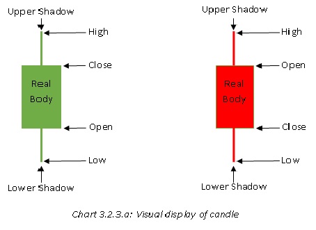
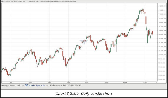
The chart below represents the daily candle chart. Notice that the size of the candle keeps changing depending on the size of each day’s trading range. Some candles appear small while some appear large, which tells a lot about the volatility of the trading session. An interesting feature of candle is that the colour of the real body is determined by the current closing to the current opening, while in case of bar chart, the colour is determined by current bar closing to the previous bar closing.
Point & Figure Chart
Compared to the line chart, bar chart, and candle chart, Point & Figure (P&F) chart is quite different, both in terms of look and construction. P&F charts have been used for decades, but they are not nearly as widely used as are the three types of charts mentioned earlier in this chapter. People often get intimidated by P&F charts. However, these charts are not as intimidating as they look like. In fact, once an individual understands the basics of these charts, he or she will be very keen to learn more and more about them, given the different insights these charts bring into the charting domain, and how valuable they can be in addition to the traditional charts. So, let’s get started.
Unlike the traditional charts wherein the X-axis represents time and Y-axis represents price, P&F charts only account for a change in price along the vertical Y-axis. Although, it is possible to incorporate time into the chart, time doesn’t play any role and can be completely ignored. In fact, P&F charts move only when price changes. If price does not change by the pre-defined amount, P&F charts do not move. P&F charts are constructed with Xs and Os, with Xs representing price gains and Os representing price declines. Each X or O is called a box. Each column contains either a sequence of Xs or a sequence of Os. There are two things that are unique to P&F charts: the box size and the reversal size. In fact, P&F charts are defined by their box size and reversal size.
Box Size
The box size is the minimum amount by which the price must change for incorporating a new X or O. So, for example, assume that we are in a column of Xs, the box size is 10 points, the most recent X is at 100, and the current price of the security is 102. A new X will be added to the chart only when the security rises to at least 110 (the box size of 10 points added to the most recent box of 100 equals 110). Until then, a new X will not be printed. The box size can be adjusted by the user, depending on the time frame of analysis.
Reversal Size
The reversal size is the minimum amount by which the price must move in the opposite direction for changing from a column of X to a column of O, or vice versa. The reversal size is expressed in terms of boxes. So, for example, assume that we are in a column of Xs, the box size is 10 points, the reversal size is 3 boxes, the most recent X is at 100, and the current price of the security is 102. Now, for the trend to continue higher, price must rise to at least 110 (the box size of 10 points added to the most recent box of 100 equals 110). On the other hand, for the trend to reverse from a column of X to a column of O, price must fall to 70 or below (the box size of 10 points times the reversal size of 3 boxes subtracted from the most recent box of 100). Just like the box size, the reversal size can also be adjusted by the user, depending on the time frame of analysis.
It may be noted that P&F charts give more importance to the prevailing trend. In the case above, the most recent box was an X at 100 and the current price of the security was 102. For the uptrend to continue i.e. for a new X to emerge, price must rise just 10 points from the most recent box of 100. However, for a trend to change i.e. for a shift from a column of X to a column of O, price must drop by 30 points or more from the most recent box of 100.
As stated above, P&F charts are named by their box size and reversal size. A P&F chart with a box size of 50 and a reversal size of 3 will be named as a 50x3 (read as 50 by 3) chart, wherein 50 represents the box size and 3 represents the reversal size. So, reiterating, if we are in a rising column of X, price must rise by at least 50 points from the most recent X for a new X to emerge or fall by at least 150 points (50 times 3) from the most recent X for the column to change and three Os to emerge.
The chart on the right shows a sample 50x3 P&F chart. Let us now talk about this chart in detail starting from column 1.

Column 1
From 500 to 900, the chart has been in a column of Xs. At the box of 900, one of two things can happen. For the uptrend to continue (i.e. for a new X to print), price must rise by at least 50 points to 950, while for a column change, price must drop by at least 150 points to 750.
Column 2
In fact, the latter scenario unfolds as price drops by 150 points from the last box of 900. As such, we shift to column 2. Because we have shifted to column 2, we add three Os. We are now at box 750. Price continues its downward journey and two new Os are added. We are now at box 650. From here, for a new O to emerge, price must drop to at least 600 while for new Xs to emerge, price must rise to at least 800.
Column 3
As we can see, price first rose by 150 points from the last box of 650 and as such, we now shift to column 3 and add three Xs. We are now at box 800. Price continues to rise from here on and new Xs are added until we reach 1050. From here, for a new X to emerge, price must rise to at least 1100 while for new Os to emerge, price must drop to at least 900.
Column 4
Price ends up declining by 150 points from the last box size of 1050, leading to a change in column from column 3 to column 4. Because of a column change, three new Os are added and we are now at box 900. The downtrend continues until two new Os are added. We are now at box 800. From here, for a new O to emerge, price must drop to at least 750 while for new Xs to emerge, price must rise to at least 950.
Column 5
As price does not drop to 750 and instead rises to 950, we now shift from column 4 to column 5 and add three new Xs. We currently are at box 950. As price does not reverse by at least 3 boxes and keeps rising by 1 box from the last box of 950, the up trend continues till the most recent box of 1200 is reached. From here on, a new X will emerge only on a print of 1250, while a reversal will occur only if price falls to 1050 first before reaching 1250.
So, this is how a P&F chart is constructed. Simple and interesting, isn’t it? With practice, P&F charts are as easy to use as are the traditional charts. Just keep in mind that P&F charts are defined by their box size and reversal size. For the current trend to prevail, price must change by the value of one box but for the current trend to change, price must change by the value of one box times the reversal size.
There are a few things important things to note about P&F charts:
-
P&F charts are always trending. What this means is we are either in an uptrend (when the current column is a column of X) or in a downtrend (when the current column is a column of O).
-
When the reversal size is more than one box, a column will contain at least as many boxes as the reversal size. What this means is, if the reversal size is 3 boxes, a column will contain at least 3 Xs or 3 Os. And this makes sense because a column is changed only if price changes by the value of the reversal size. Notice in example 1 that each column contained at least 3 Xs or 3 Os.
-
Also, when the reversal size is more than one box, a column will contain either Xs or Os but not both. Notice in example 1 that as the reversal size was more than one box, none of the columns contained both Xs and Os.
-
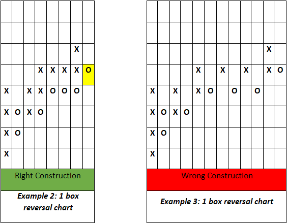
The only exception to the above point is when the reversal size is one box. Then and only then can one column contain both Xs and Os. Example 2 below illustrates this. Notice how a few columns contain both X and O. This is because once a reversal takes place from, say, a column of X to a column of O, given that the reversal size is just one box, the next box could either be an O in the same column or an X in the same column (there is space for adding either of them in the same column, something which is not the case when the reversal size is more than one box). As a small practice, notice the most recent box (the box that is highlighted yellow) in example 2. Given that there is room for adding an X above it or adding an O below it, the next box could either be an O immediately below it or an X immediately above it. Also notice example 3, which is incorrectly constructed.
-
Always think from the most recent box point of view. What matters most is not the current price of the security, but the value of the most recent box. For example, in example 1, the most recent box is 1200. Assume that the current market price of the security is 1210. For a new X to emerge, the price will have to rise by at least 50 points from the most recent box of 1200 and not 50 points from the current price of 1210. The understanding of this concept is important for proper analysis of P&F chart.
-
The larger the box size and reversal size, the less sensitive will the chart be to price changes. The smaller the box size and reversal size, the more sensitive will the chart be to price changes. This is similar to using shorter-time frame and longer-time frame charts, with smaller box size and reversal size corresponding to shorter-time frame, and larger box size and reversal size corresponding to longer-time frame.
-
The box size could be either in absolute terms or in percentage terms. Example 1 is presented in absolute terms wherein the box size is fixed at 50 points. In percentage terms, each new box is expressed as a percent of the most recent box. So, in case of a 1%x3 chart, if we are in a column of Xs and the most recent box is 1000, a new X will come if price rises by at least 10 points to 1010 (1% of 1000 added to the most recent box). Once 1010 has been printed on the chart (which now becomes the most recent box), a new X will emerge if price rises by at least 10.1 points to 1020.1 (1% of 1010 added to the most recent box). Notice the subtle difference?
-
Just like a traditional chart, P&F chart can be plotted either on an arithmetic scale or on a logarithmic scale
There are two methods of constructing a P&F chart. The first method is called the close only method, while the second method is called the high/low method. Each of these methods is discussed below:
Close Only Method
The close only method is a method of plotting P&F chart using the daily closing price. When using this method, the chart reader will take into consideration only one price in plotting the chart: the closing price at the end of the day. All other prices namely, the open, the high, and the low will be ignored. The construction of a close only P&F chart is the same as the example presented earlier (example 1), with just one exception: instead of using all the available prices during the day, only the closing price for that day is used. When plotting, the current day close is compared to the previous day close. So, if we are in a column of X, today’s close will be compared to yesterday’s close to check whether a new X can be plotted in case of a price advance or the column can be shifted to a column of Os in case there is a sufficient price decline. Close only method is beneficial to medium-term and long-term traders who are not much concerned about intraday movements in price.
High/Low Method
The high/low method is similar to close only method in that it also plots end of day data. However, there is one difference. Instead of plotting the closing price, the day’s high/low price is plotted. The closing price is totally ignored. The construction of high/low P&F chart is slightly different than that of a close only chart. And this is how. First scenario: Let’s assume that we are in a column of Xs. Because we are in a column of Xs, the first thing we would do is check the high of the day to see whether the high is large enough to plot a new X. If it is, plot the new X and ignore the low of the day. However, if the high is not large enough the plot a new X, then look at the low of the day. If the low is large enough to warrant a reversal, shift from the current column of X to a new column of O and plot as many Os as necessary. However, if the low is not large enough to warrant a reversal, ignore both the high and the low of the day. Second scenario: Let’s assume that we are in a column of Os. Because we are in a column of Os, the first thing we would do is check the low of the day to see whether the low is large enough to plot a new O. If it is, plot the new O and ignore the high of the day. However, if the low is not large enough the plot a new O, then look at the high of the day. If the high is large enough to warrant a reversal, shift from the current column of O to a new column of X and plot as many Xs as necessary. However, if the high is not large enough to warrant a reversal, ignore both the low and the high of the day. Now let’s look at how P&F charts look like in the real world.
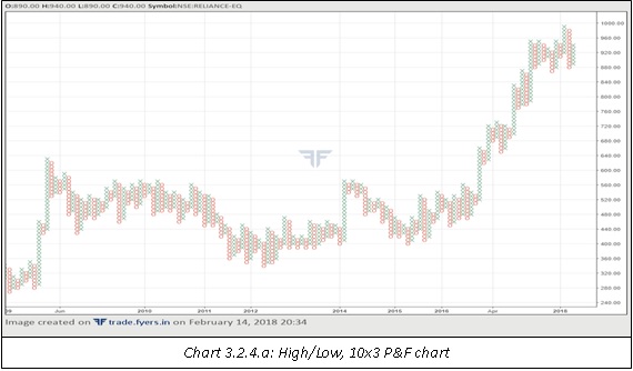
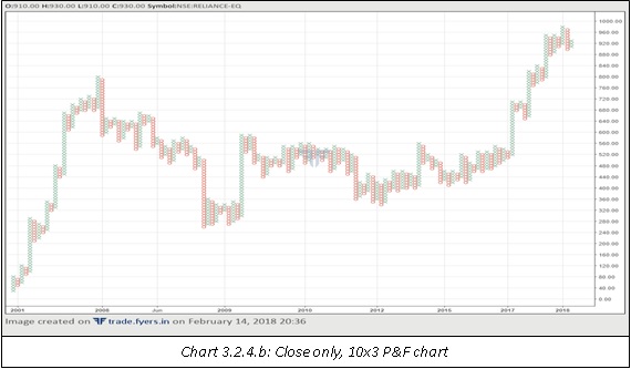
Compare charts 3.2.4.1 and 3.2.4.2. Both the charts are of Reliance Industries and are for the same period. Notice that the first chart has more data points than the second chart. This is because of their different construction style. While the first chart is a high/low chart, the second is a close only chart.
Summary
-
A chart is a graphical representation of data points.
-
A line chart is formed by plotting a closing price for a particular time frame. Given that a line chart uses only closing price, it essentially removes noise from the chart by ignoring the period’s price range.
-
A bar chart consists of a vertical line and two small horizontal dashes, one on the left of the vertical line and one on the right of the vertical line. The top of the vertical line represents a period’s high, the bottom of the vertical line represents a period’s low, the small horizontal dash to the left of the vertical line represents the period’s open, and the small horizontal dash to the right of the vertical line represents the period’s close.
-
In a candle chart, the real body represents the opening and closing range, while the shadows on either side of the body represent the high and low range. Real body and shadows when combined represent one candle.
-
P&F charts are constructed with Xs and Os, with Xs representing price gains and Os representing price declines. Each X or O is called a box. Each column contains either a sequence of Xs or a sequence of Os.
-
P&F charts are defined by their box size and reversal size. The box size is the minimum amount by which the price must change for incorporating a new X or O. The reversal size is the minimum amount by which the price must move in the opposite direction for changing from a column of X to a column of O, and vice versa.
-
There are two methods of constructing a P&F chart: the close only method and the high/low method. The close only method takes into consideration the day’s closing price only. The high/low method takes into consideration the day’s high/low price only.
Next Chapter
Comments & Discussions in
FYERS Community
Vijay commented on April 24th, 2019 at 11:12 PM
Please explain about renko chats as well
tejas commented on May 29th, 2019 at 4:42 PM
Will do this in the future.
Rakesh Hansalia commented on May 23rd, 2019 at 6:40 AM
How easily you explained the P&F chart, I always have had skipped it to understand but you explain it very nicely especially the example of switching between 'Columns'.
Your content team is rock, my dear Mr. Tejas
tejas commented on May 29th, 2019 at 4:44 PM
Hi Rakesh, Thanks! It's something that traders ought to know. Yeah, we do tend to focus on content quite a bit. :)
Rakesh Hansalia commented on May 23rd, 2019 at 7:19 AM
Tejas, please note - I hope you're aware of it, SchoolOfStocks does NOT allow right-click. (I generally see such in banking application where right-click(or copy-paste) are not allowed)
Why it is required
1. some time user require to copy some content/word and want to paste it in google or at some other source
2. some time user would want to copy full line or paragraph and want to ask you in comment
tejas commented on May 29th, 2019 at 4:46 PM
Yeah, we have disabled it at the moment due to plagiarism. You can, however, share the links of the subheadings. If you click on the sub-heading/lesson, it will create a URL which will help re-direct users to the exact section within each chapter.
Ajay commented on August 30th, 2019 at 3:39 PM
Hello Tejas,
Are there RANGE BAR charts on Fyers platform ?
If yes, then can one modify the box size/range ?
Thanks.
aYlNlfdX commented on October 24th, 2024 at 9:04 PM
555
aYlNlfdX commented on October 24th, 2024 at 9:47 PM
555
aYlNlfdX commented on October 24th, 2024 at 9:48 PM
555
aYlNlfdX commented on October 24th, 2024 at 9:50 PM
555
aYlNlfdX commented on October 24th, 2024 at 9:51 PM
555
aYlNlfdX commented on October 24th, 2024 at 9:52 PM
555
aYlNlfdX commented on October 24th, 2024 at 9:56 PM
555
aYlNlfdX'" commented on October 24th, 2024 at 9:56 PM
555
@@bmT40 commented on October 24th, 2024 at 9:56 PM
555
aYlNlfdX commented on October 24th, 2024 at 9:56 PM
555
aYlNlfdX commented on October 24th, 2024 at 9:57 PM
555
aYlNlfdX commented on October 24th, 2024 at 10:01 PM
555
aYlNlfdX commented on October 24th, 2024 at 10:02 PM
555
aYlNlfdX commented on October 24th, 2024 at 10:02 PM
555'"
aYlNlfdX commented on October 24th, 2024 at 10:02 PM
@@6Sszq
aYlNlfdX commented on October 24th, 2024 at 10:03 PM
555
aYlNlfdX commented on October 24th, 2024 at 10:04 PM
555
aYlNlfdX commented on October 24th, 2024 at 10:07 PM
555
aYlNlfdX commented on October 24th, 2024 at 10:07 PM
555
aYlNlfdX commented on October 24th, 2024 at 10:07 PM
555
aYlNlfdX commented on October 24th, 2024 at 10:08 PM
555
aYlNlfdX commented on October 24th, 2024 at 10:08 PM
555
aYlNlfdX commented on October 24th, 2024 at 10:08 PM
555
aYlNlfdX commented on October 24th, 2024 at 10:09 PM
555
aYlNlfdX commented on October 24th, 2024 at 10:10 PM
555
aYlNlfdX commented on October 24th, 2024 at 10:12 PM
555
aYlNlfdX commented on October 24th, 2024 at 10:13 PM
555
aYlNlfdX commented on October 24th, 2024 at 10:13 PM
555
aYlNlfdX commented on October 24th, 2024 at 10:13 PM
555
aYlNlfdX commented on October 24th, 2024 at 10:13 PM
555
aYlNlfdX commented on October 24th, 2024 at 10:14 PM
555
aYlNlfdX commented on October 25th, 2024 at 12:44 AM
555
aYlNlfdX commented on October 25th, 2024 at 12:44 AM
555
aYlNlfdX commented on October 25th, 2024 at 12:45 AM
555
aYlNlfdX commented on October 25th, 2024 at 12:47 AM
555
aYlNlfdX commented on October 25th, 2024 at 12:47 AM
555
aYlNlfdX commented on October 25th, 2024 at 12:52 AM
555
aYlNlfdX commented on October 25th, 2024 at 12:53 AM
555
aYlNlfdX commented on October 25th, 2024 at 12:53 AM
555
aYlNlfdX commented on November 9th, 2024 at 5:21 AM
555
aYlNlfdX commented on November 9th, 2024 at 5:52 AM
555
aYlNlfdX commented on November 9th, 2024 at 5:53 AM
555
aYlNlfdX commented on November 9th, 2024 at 5:54 AM
555
aYlNlfdX commented on November 9th, 2024 at 5:55 AM
555
aYlNlfdX commented on November 9th, 2024 at 5:55 AM
555
aYlNlfdX commented on November 9th, 2024 at 5:58 AM
555
aYlNlfdX'" commented on November 9th, 2024 at 5:58 AM
555
@@t3NP2 commented on November 9th, 2024 at 5:59 AM
555
aYlNlfdX commented on November 9th, 2024 at 5:59 AM
555
aYlNlfdX commented on November 9th, 2024 at 5:59 AM
555
aYlNlfdX commented on November 9th, 2024 at 6:02 AM
555
aYlNlfdX commented on November 9th, 2024 at 6:03 AM
555'"
aYlNlfdX commented on November 9th, 2024 at 6:03 AM
@@NiZri
aYlNlfdX commented on November 9th, 2024 at 6:04 AM
@@NiZri
aYlNlfdX commented on November 9th, 2024 at 6:05 AM
555
aYlNlfdX commented on November 9th, 2024 at 6:06 AM
555
aYlNlfdX commented on November 9th, 2024 at 6:08 AM
555
aYlNlfdX commented on November 9th, 2024 at 6:08 AM
555
aYlNlfdX commented on November 9th, 2024 at 6:08 AM
555
aYlNlfdX commented on November 9th, 2024 at 6:09 AM
555
aYlNlfdX commented on November 9th, 2024 at 6:09 AM
555
aYlNlfdX commented on November 9th, 2024 at 6:09 AM
555
aYlNlfdX commented on November 9th, 2024 at 6:12 AM
555
aYlNlfdX commented on November 9th, 2024 at 6:13 AM
555
aYlNlfdX commented on November 9th, 2024 at 6:13 AM
555
aYlNlfdX commented on November 9th, 2024 at 6:13 AM
555
aYlNlfdX commented on November 9th, 2024 at 6:13 AM
555
aYlNlfdX commented on November 9th, 2024 at 6:13 AM
555
aYlNlfdX commented on November 9th, 2024 at 6:15 AM
555
aYlNlfdX commented on November 9th, 2024 at 6:16 AM
555
aYlNlfdX commented on November 9th, 2024 at 6:17 AM
555
aYlNlfdX commented on November 9th, 2024 at 6:19 AM
555
aYlNlfdX commented on November 9th, 2024 at 6:20 AM
555
aYlNlfdX commented on November 9th, 2024 at 6:52 AM
555
GRLpGpAG commented on November 13th, 2024 at 2:21 AM
555
GRLpGpAG commented on November 13th, 2024 at 2:22 AM
555
GRLpGpAG commented on November 13th, 2024 at 2:23 AM
555
GRLpGpAG commented on November 13th, 2024 at 2:26 AM
555
GRLpGpAG commented on November 13th, 2024 at 2:26 AM
555