
Why is analyzing the trend crucial
In the first chapter, we introduced a concept called trend. We defined a trend as the direction in which the price of an asset is heading. We also discussed about the three types of trend: uptrend, downtrend, and sideways trend. In the second chapter, we spoke the three categories of trend: primary trend, secondary trend, and minor trend. In this chapter, we will speak about the importance of identifying a trend and the various tools that can be used to identify a trend. We conclude this chapter by discussing in detail about moving averages and how to use them.
The primary objective of technical analysis is to identify the trend. Technical analysts use a variety of tools, ranging from simple price tools to some sophisticated statistical tools, all with the objective of identifying what the trend is,so as to trade or invest in the direction of that trend. The direction of the trend tells an analyst whether to buy a security, sell a security, or do neither. At any point in time,an analyst must be aware about the three categories of trend as this enables him to understand what to do and what not to do. As an example, knowing that the primary trend is up informs the analyst to buy a security during secondary corrections rather than using the decline to sell the security. Once an analyst knows the direction of the primary trend, he can then use minor trends within the secondaries to time his entry better. Furthermore, once an analyst identifies what the trend is, he must then identify where in that trend is the price at present. Is the price at the start of a trend, or is it at the midway point of a trend, or is it near the end of a trend? The earlier the trend is detected, the better would be the trading results.
Price Tools
In this section, we will speak in detail about the various price tools that a chartist can use in order to identify the trend and trade in the direction of that trend. These include trendlines, channels, fibonacci retracements, fibonacci extensions, and Andrew’s Pitchfork.
Trendlines
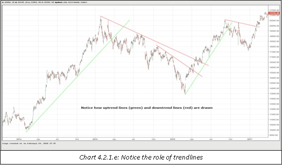
Trendline is the most basic of all price tools. It is very commonly used by chartists to identify the trend. Just as there are three trends (up, down and sideways), there are three trendlines too. These are: uptrend line, downtrend line, and sideways trendline. An uptrend line is drawn by connecting two or more reactionary lows, with each low being above its preceding low. Similarly, a downtrend line is drawn by connecting two or more reactionary highs, with each high being below its preceding high. If the lows are at an identical level, a horizontal trendline connecting the supports is drawn, and if the highs are at an identical level, a horizontal trendline connecting the resistances is drawn.
As is already evident by now, at least two points are needed to draw a trendline. So, the first job is to identify what the trend is, and once the trend is identified, it then becomes pivotal to identify the extreme points. Also note that the trendline can be drawn only after the second reactionary point is confirmed by way of a reversal from that point. For example, once it is evident that the price of a security is in an uptrend, a chartist must then find out at least two reactionary lows. Before proceeding to draw an up trendline, the chartist must ensure that there is a decent reversal from the second reactionary low to confirm that this low is in place. Then and only then can be proceed further to draw a trendline.
A trendline can be drawn on any chart, be it line chart, bar chart, candle chart, or point and figure chart. If drawn on line charts, the trendline will connect the closing prices. If drawn on bar or candle charts, the trendline will usually connect the highs or the lows. Again, drawing trendline is extremely subjective and varies between two or more people.
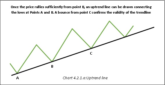
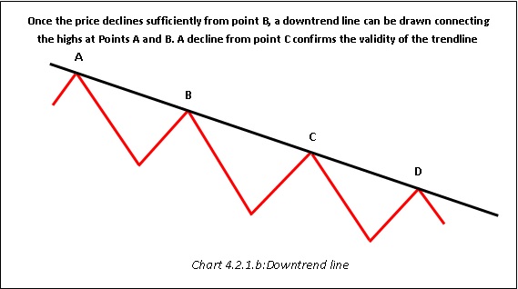
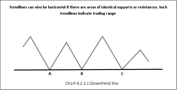
Once a trendline has been drawn and confirmed, the chartist can use buy and sell signals indicated by the trendline. For example, once an uptrend line is drawn and confirmed, the chartist can use declines towards the trendline to generate buy signals and keep on riding the uptrend until the trendline is convincingly broken. Notice in chart 4.2.1.a that the area near points C and D can be used to buy the security.
Break of a trendline indicates a change in trend and not necessarily a reversal in trend. An uptrend line when broken does not necessarily mean a reversal from an uptrend to a downtrend. It just means the uptrend has possibly ended, and we could now be set for a period of consolidation or a reversal from an uptrend to a downtrend. Having said that, once a trendline is decisively broken, existing positions in the direction of the trend must be closed out.

Notice in the chart above how an uptrend ended and a downtrend started. The break of the uptrend line warranted closing all long positions. Also notice in the chart above how the rally at point E halted near the uptrend line. This is similar to the concept we learnt in chapter 2 (a support once broken becomes a resistance on the way up, and vice versa). Once an uptrend line is broken and price has moved below the trendline, expect any rallies towards the uptrend line to meet with resistance. Simply put, an uptrend line once broken frequently switches its role from support to resistance. As such, always get into the habit of extending trendlines infinitely to the right. In future, these areas could act as areas of potential support or resistance. Once the price reverses lower from point F, the chartist can use rallies towards the trendline to generate sell signals and keep on riding the downtrend until the trendline is decisively broken on the upside.
Below mentioned are some general guidelines relating to trendlines:
-
To draw a trendline, at least two reactionary points are needed
-
A trendline once broken usually switches its role of support or resistance
-
A trendline can be considered to be decisively broken if price closes beyond it along with an uptick in volume
-
A trendline can be used on line chart, bar chart, candle chart, or P&F chart
-
A trendline can be used on arithmetic scale as well as on logarithmic scale
-
The greater the number of times a trendline has been tested, the greater is its significance
-
The longer the trendline, the greater is its significance
-
The gentler the angle of ascent or descent of a trendline, the greater its significance
-
Drawing a trendline is subjective. Two chartists can draw trendlines connecting the same points, but in a different manner
Channels
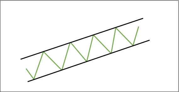
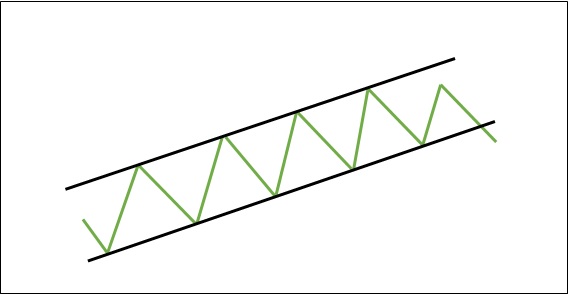
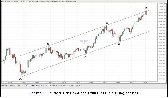
Channels are an extension to the concept of trendline. We saw earlier than an uptrend line connects higher lows, while a downtrend line connects lower highs. Sometimes, it is also possible to draw a parallel trendline to the main trendline. So, in an uptrend, once a main trendline is drawn connecting the supports, a parallel trendline can be drawn connecting the first peak. If during the subsequent rally price reverses lower after touching the parallel trendline, the existence of a channel is confirmed. The is called a rising channel. Similarly, in a downtrend, once a main trendline is drawn connecting the resistances, a parallel trendline can be drawn connecting the first trough. If during the subsequent decline, price reverses higher after touching the parallel trendline, the existence of a channel is confirmed. The is called a falling channel.
Channels are a valuable tool in that they not only help in knowing where to enter, but they also help in knowing where to exit and take profits. So, in a rising channel, a chartist can use declines toward the main trendline to buy and rallies toward the parallel trendline to exit longs, while in a falling channel, a chartist can use rallies toward the main trendline to sell and declines toward the parallel trendline to exit shorts. Furthermore, channels also help in understanding the strength of the trend. For example, in a rising channel, if the price fails to touch the parallel line and starts heading lower, it is sign that the uptrend could be running out of steam. If during the subsequent decline, price breaks below the main trendline, it signals that the channel has broken and the uptrend has ended. Similarly, in a falling channel, if the price fails to touch the parallel line and starts heading higher, it is sign that the downtrend could be losing traction. If during the subsequent rally, price breaks above the main trendline, it signals that the channel has broken and the downtrend has ended.
Fibonacci retracement
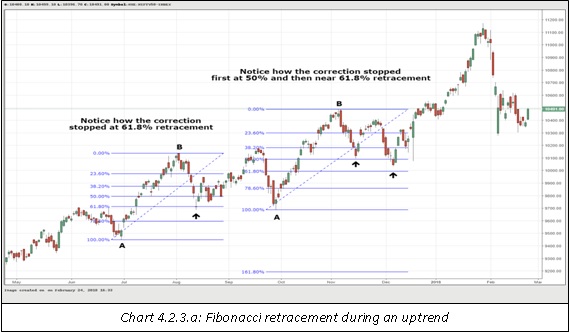
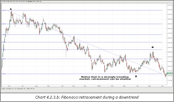
Fibonacci retracement is one of the most commonly used price tool by chartists. It is used to find areas of support after a rally in price, or to find areas of resistance after a decline in price. In order to drawn fibonacci retracement, a chartist needs two points. To find areas of potential support after a rally, the chartist first needs to identify a swing low (A) and then a swing high (B) that follows the low. Once the lows and highs are identified, the chartist can plot fibonacci retracement by clicking on the fibonacci retracement icon on his charting platform, and then clicking on point A followed by point B. The system will automatically plot the fibonacci ratios on the chart. Similarly, to find areas of potential resistance after a decline, the chartist first needs to identify a swing high (A) and then a swing low (B) that follows the high. Once the highs and lows are identified, the chartist can plot fibonacci retracement by clicking on the fibonacci retracement icon, and then clicking on point A followed by point B.
The most commonly used fibonacci retracement ratios are 23.6%, 38.2%, 50%, 61.8%, and 76.4%. During an uptrend, after the swing high has been made and price starts to fall, expect the security to find support at any of these levels. If the security finds support at any of these levels and shows indications of a resumption of uptrend, long positions can be initiated. Similarly, during a downtrend, after the swing low has been made and price starts to rally, expect the security to find resistance at any of these levels. If the security finds resistance at any of these levels and shows indications of a resumption of downtrend, short positions can be initiated. Also, it is beneficial to combine fibonacci with other parameters such as volume, technical indicators, price patterns, Japanese candlestick patterns etc. if price reverses off the retracement levels, as these increase the validity of the signal.
At what fibonacci retracement levels will the price take support (or resistance) is difficult to tell at hindsight. As a general statement though, if the prevailing trend is very strong, expect 23.6% and 38.2% to act as areas of strong support (or resistance). Else, expect a correction towards 50% or 61.8%. 61.8% is also called the ‘golden ratio’. Quite often, correction ends around the vicinity of this level. As such, keep a close eye on this ratio whenever price approaches near it. Failure to hold 61.8% is a signal that the prevailing trend is weakening and increases the odds of a full retracement.
Fibonacci Extension
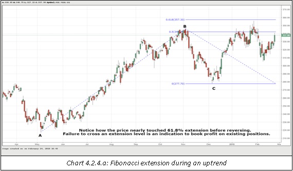
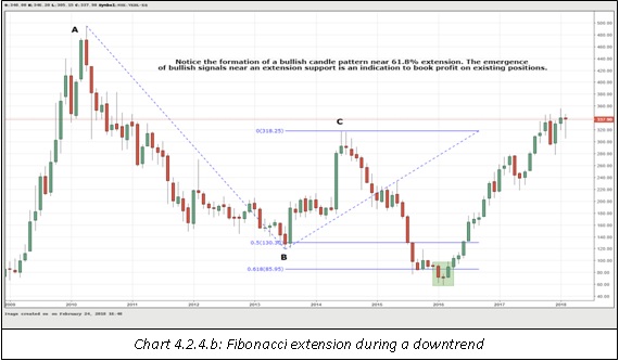
While Fibonacci retracement is used to calculate areas of potential support and resistance, Fibonacci extension is used to calculate potential price targets once the security reverses off these support and resistance levels. In order to drawn fibonacci extension, a chartist needs three points. During an uptrend, to project potential targets after a bounce from a fibonacci support, the chartist needs a swing low (A), a swing high (B) that follows the low, and the retracement low (C). Once these points are identified, the chartist can plot fibonacci extension by clicking on the fibonacci extension icon on his charting platform, and then clicking on point A,then point B, and finally point C. The system will automatically plot the fibonacci extension levels on the chart. Similarly, during a downtrend, to project potential targets after a decline from a fibonacci resistance, the chartist needs a swing high (A), a swing low (B) that follows the high, and the retracement high (C). Once these points are identified, the chartist can plot fibonacci extension clicking on point A, then point B, and finally point C.
The most commonly used Fibonacci extension ratios are 50%, 61.8%, 100%, and 161.8%. While Fibonacci retracement levels are used to enter a new position, Fibonacci extension levels are used to exit those positions and book profits. The question that now arises is at what extension level should one exit? Well, there is no definitive answer to this. A chartist needs to observe the price movement around each of these extension levels. If the price move halts around these levels and shows signs of exhaustion, it is advisable to cover existing positions, either partially or completely. However, if the price breaks past these extension levels without much hurdle, then the existing positions can be held on by trailing the stop losses.
Again, combine Fibonacci extension with other tools such as volume, technical indicators, price patterns, Japanese candlestick patterns etc. rather than using it in isolation. Fibonacci extension just gives us potential price targets. Whether or not price reaches those targets can only be decided after using other tools, especially trend following tools. For example, let us assume a scenario wherein we are projecting upside targets using Fibonacci extension. If the rally from a Fibonacci retracement level is accompanied by a bullish candle pattern, sharp uptick in volume, and bullish divergence between price and the RSI, the odds of price rallying towards those extension levels are significantly increased than if the rally from a Fibonacci retracement level were not accompanied by such bullish signals.
Andrew’s Pitchfork
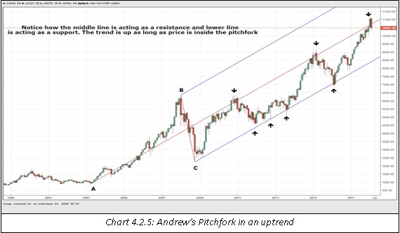
Andrew’s Pitchfork is not as widely used as are trendlines, channels, Fibonacci retracements, and Fibonacci extensions. Nonetheless, it is a useful tool worth keeping an eye on. It is a tool that was developed by Alan Andrews. Andrew’s pitchfork can be plotted during an uptrend as well as during a downtrend. It is used to find areas of potential support and resistance. During an uptrend, to plot the pitchfork, a chartist requires three points. The first is the swing low (A), the second is the swing high (B), and the third is the reactionary low (C) between points A and B. Similarly, during a downtrend, to plot the pitchfork, a chartist requires three points. The first is the swing high (A), the second is the swing low (B), and the third is the reactionary high (C) between points A and B. Once the three points and identified, a pitchfork can be drawn by clicking on the Andrew’s Pitchfork icon on the charting platform, and then clicking Point A followed by Point B and then Point C on the chart.
The middle line starts from point A and passes through the midpoint of Points B and C, while the upper and lower lines run parallel to the middle line. In case of an upward sloping pitchfork, the upper line starts from point B while the lower line starts from point C. In case of a downward sloping pitchfork, the lower line starts from point B while the upper line starts from point C. The slope of the three lines is determined by point A. Generally speaking, the gentler the slope of the pitchfork, the more significant the pitchfork is, and vice versa. A pitchfork with a steeper slope is likely to be broken sooner than a pitchfork that has a gentler slope.
In case of an upward sloping pitchfork, the lower line acts as a support while the upper line acts as a resistance. Failure to touch the upper line signals that the price is failing to maintain the angle of the ascent. Meanwhile, a break below the lower line accompanied by a break below a prior support level signals at a change in trend (to either sideways or down). Similarly, in case of a downward sloping pitchfork, the upper line acts as a resistance while the lower line acts as a support. Failure to touch the lower line signals that the price is failing to maintain the angle of descent. Meanwhile, a break above the upper line accompanied by a break above a prior resistance level signals at a change in trend (to either sideways or up).
Moving Average
A moving average is one of the oldest and most frequently used tools by chartists. The primary objective of using a moving average is to smooth out the data by filtering out the noise element of the market, thereby enabling a chartist to focus on the trend. A moving average can be used across all the time frames, ranging from minute charts to yearly charts.
But what exactly is a moving average? In charting context, a moving average is the average price of a security over the past ‘n’ periods. The average price could be the average of closing price, opening price, high price, low price, or a combination thereof. However, the most frequently used average price is the average closing price, and this is what we will be focusing on in this chapter. Meanwhile, ‘n’ could stand for minutes, hours, days, weeks, months, quarters, years etc. For example, a 20-day moving average means the average closing price over the past 20 days, while a 20-hour moving average means the average closing price over the past 20 hours. Because the average keeps moving with time by eliminating the oldest element from the data set and adding the latest element, the average is called a moving average.
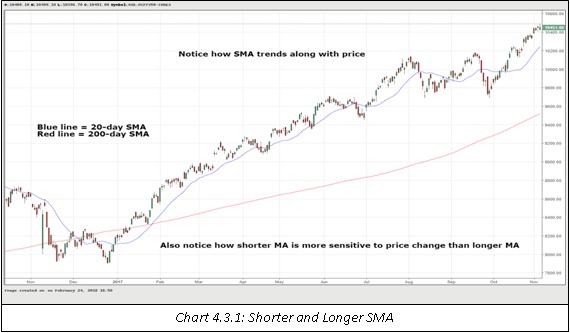
One thing to keep in mind is that because a moving average is the average price of past data, it is a lagging indicator. As such, the signals generated by a moving average come with a slight bit of lag. A shorter moving average is more sensitive to price changes and as such will result in a shorter lag, while a longer moving average is less sensitive to price changes and as such will result in a longer lag. The lag factor has both advantage as well as disadvantage. The advantage is that the lag factor enables to eliminate early whipsaws whenever the trend is about to change orhas changed. The disadvantage is that by the time a signal is generated, the chartist would already have missed some part of the move. Another thing to keep in mind is that a moving average is a trending indicator. It works best when used in trending markets, but it gives a lot of whipsaws and false signals when used in ranging markets.
There are many types of moving averages, but the most commonly used types are simple moving average, weighed moving average, and exponential moving average. In this chapter, we will discuss these three moving averages in detail.
Simple Moving Average
A simple moving average (SMA) is the most commonly used moving average. Its calculation is really simple. First the closing price for the past ‘n’ periods is summed and then this sum is divided by ‘n’. For example, to calculate the 50-day SMA, the closing prices of the past 50 days are summed, and then this sum is divided by 50. As can be seen, the SMA gives equal weight to each and every observation. So, in case of the 50-day SMA, the most recent observation will have as much weight as the oldest observation.
Weighed Moving Average
As already discussed, an SMA gives equal weight to each observation in the data set. For example, in the case of a 20-day SMA, the data yesterday has the same impact as the data 20 days ago. One of the drawback of this approach is that as the data gets older, it has less impact on the current price of a security. This issue is addressed by the Weighed Moving Average (WMA). A WMA gives more weight to recent data and less to older data. Calculation of a WMA is slightly more complex than that of an SMA. As an example, to calculate the 20-day WMA, the price of the 20th day would be multiplied by 20, the price of the 19th day would be multiplied by 19, the price of the 18th day would be multiplied by 18, and so forth until the price of the 1st day which would be multiplied by 1. All these values are then summed, and this sum is divided by 210, which is the sum of the weights (1+2+3+….+20). As we can see, greater weights are given to recent data.The 20th or the most recent day has twice the weight as compared to the 10th day and 20 times the weight as compared to the first day.
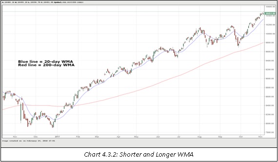
Exponential Moving Average
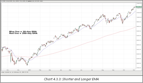
Just like a WMA, an Exponential Moving Average (EMA) also assigns greater weight to more recent data and lesser weight to older data. However, the calculation of an EMA is quite different as compared to that of a WMA. A WMA applies linear weights to observations i.e. the weights decrease by a constant multiplier as the data gets older. Meanwhile, an EMA applies exponential weights to observations i.e. the weights decrease by an exponential multiplier as the data gets older. The formula that is used to calculate the multiplier in case of an EMA is: {[2 / (Period + 1 )] * 100 }. So, in case of a 10-day EMA, the multiplier is 18.18% (2/11*100); in case of a 50-day EMA, the multiplier is 3.92% (2/51*100); in case of 200-day EMA, the multiplier is 0.99% (2/201*100); and so on. Notice that as the period gets larger, the multiplier gets smaller.
There are two steps that are involved in the calculation of an EMA. These steps are as mentioned below (let us assume we are calculating a 20-day EMA):
Step 1 - Calculate the SMA for the past 20 days. This value becomes the EMA for the 20th day (Note: this step is done only once, at the start of the calculation)
Step 2 - From the 21st day onwards, calculate the EMA using the formula below:
{(Close of current period - EMA of previous period)* multiplier}+ EMA of previous period
This calculation looks quite tedious. As a matter of fact, it is. However, the good thing is that we need not worry about the calculation part. Thanks to the advancement in technology, all the calculations will be taken care of by the charting platform. We just need to select the time period for the EMA, and the system will do the rest of the work for us.
Which type of moving average to use?
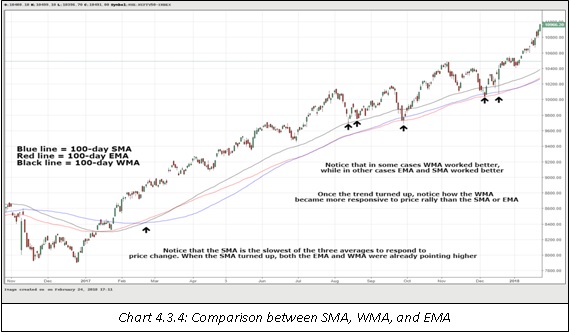
The big question that now arises is which type of moving average to use: non-weighted or weighted? Generally speaking, each moving average has its own benefits and drawbacks. The benefit of using a weighted average is that it reduces the lag effect and as such, is more responsive to price change. This generates buy/sell signals early. The drawback, however, is that there is a risk of whipsaw in case these early buy/sell signals turn out to be false signals. Similarly, the benefit of using a non-weighed average is that it helps to limit whipsaws by generating buy/sell signals with a slight lag. The drawback, however, is that if these buy/sell signals turn out to be true, the chartist will have missed a part of the move. So, as we can see, both the types of moving averages have advantages and disadvantages. As such, it is always advisable to keep a track of both types of moving averages: non-weighted (SMA) and weighed (WMA and EMA).
How to use moving averages for generating signals
Now that we have a good understanding of moving averages, it is time to focus on how the use them to generate buy/sell signals. A chartist can plot either a single moving average on the chart or he can plot multiple moving averages on the chart. We will discuss each of these in more detail.
Using single moving average
This is the most basic form of using a moving average. In this case, the chartist plots just one moving average on the chart. Using the average and price, the chartist can generate buy/sell signals, find out what the prevailing trend is, or identify supports and resistances.
Generating buy/sell signals
A buy signal is generated when the price crosses the moving average from below. A sell signal is generated when the price crosses the moving average from above. For generating buy/sell signals, the chartist can use either a shorter moving average, which is more sensitive to price change, or a longer moving average, which is less sensitive to price change. The advantage of using a shorter moving average is that signals will be generated early, but the disadvantage is that, there will be a greater number of false signals. Similarly, the advantage of using a longer moving average is that there will be relatively fewer false signals, but the disadvantage is that, signals will be quite delayed. As such, there will always be a trade-off between using shorter moving averages and longer moving averages. In order to overcome this difficulty, the chartist, through experimentation, must find an average that neither generates signals too late nor too early. Meanwhile, one way to deal with the problem of false signals is to buy when price crosses above the moving average and the moving average starts to point higher, or to sell when price crosses below the moving average and the moving average starts to point lower .
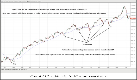
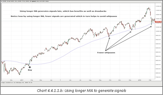
Compare the above chart to that on the next page. Notice how using a longer moving average gives fewer false signals than using the shorter moving average. However, also keep in mind that when the signals are right, a shorter moving average will help to time the trade better. Also notice in the chart above that most of the sell signals could have been avoided because the shorter moving average never started to point lower.
Finding out the prevailing trend
A moving average can also be used to find out what the prevailing trend is. When price is trading above the moving average and the moving average is pointing higher, the trend is up. When price is trading below the moving average and the moving average is pointing lower, the trend is down. Notice in the previous two charts that the prevailing trend is up in both cases given that the price was above the averages for most of the time and that the averages were pointing higher.While using a shorter moving average tells the direction of the shorter trend, using a longer moving average tells the direction of the larger trend. In the above charts, both shorter and longer trends are up.As stated earlier, knowing the direction of the trend tells a chartist what to do and what not to do. As such, it is of paramount importance to know the direction of the trend and moving averages can help in doing this.
Identifying areas of support and resistance
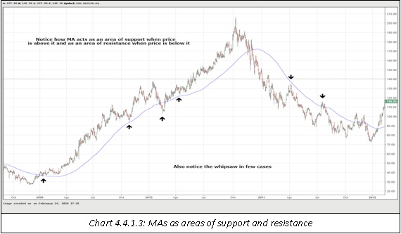
A moving average also helps in identifying areas of support and resistance. When price is trading above the moving average, the moving average line acts as an area of support. Declines towards the moving average and a bounce back off it can be used as a signal to add new long positions. Notice in chart 4.4.1.1.b that once price rose above the moving average, subsequent retests of the average were a good zone to enter new long positions, as the price bounced exactly off it.Meanwhile, if price decisively breaks below the moving average, the moving average could subsequently actas a resistance going forward (remember: change of polarity principle). Similarly, when price is trading below the moving average, the moving average line acts as an area of resistance. Rallies towards the moving average and then a decline off it can be used as a signal to add new short positions.Meanwhile, if price decisively crosses above the moving average, the moving average could subsequently act as a support going forward.
Using multiple moving average
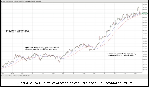
Chartists can use more than one moving average to generate signals. When multiple moving averages are used, moving average crossovers can also be used as signals. For example, let us assume that a chartist uses one shorter moving average, say 50-day SMA, and one longer moving average, say 100-day SMA. When 50-day SMA crosses above 100-day SMA, we have a bullish crossover and the short-term trend has turned higher. Similarly, when 50-day SMA crosses below 100-day SMA, we have a bearish crossover and the short-term trend has turned lower.
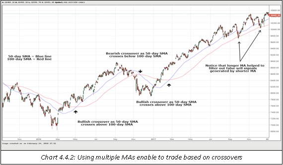
Notice in the chart above that moving average crossovers have both advantages and disadvantages. The advantage is that trading based on crossovers could be very profitable in case of a strongly trending market. The disadvantage is that trading based on crossovers could lead to whipsaws in case the trend fails to pick momentum in the direction of the crossover. Note in the chart that if a chartist had initiated a long position when the first and the second bullish crossovers occurred, and had he held on to this long position until a bearish crossover was signalled, he would have made a very successful trade. This is because the price was in a sustained uptrend during this period. Also notice that had the chartist initiated a short position when the first bearish crossover occurred and held on to that position until a bullish crossover was signalled, he would have suffered a loss. This is because the price failed to proceed lower after the bearish crossover was signalled.Also notice in the chart above that using multiple moving averages can also help to filter out false signals.
Summing up moving averages
A moving average is the average price of a security over the past ‘n’ periods. The most commonly used average price is the average closing price. The three most commonly used moving averages are simple moving average, weighed moving average, and exponential moving average. SMA is unweighted while WMA and EMA are weighed. SMAs are slow to turn as compare to WMAs and EMAs. Both weighted and unweighted moving averages have benefits and drawbacks. Shorter period moving averages are more sensitive to price change than longer period moving averages. A chartist can use either a single moving average to generate signals, or he can use multiple moving averages to generate signals. A chartist can use moving averages to generate buy/sell signals, identify the prevailing trend, and find out areas of support and resistance.
Remember that moving average is a trending indicator. It works best when used in a trending market. When traded in a non-trending market, a moving average will generate whipsaws. Once a trend catches motion, a chartist can make profitable trades by riding in the direction of the trend. Also remember that a moving average is a lagging indicator. That is, it will generate signals after a move has already occurred. As such, be prepared to miss some part of the move. Finally, like other tools discussed earlier, get into the habit of combining moving averages with other indicators rather than using them in isolation.
Summary
-
The primary objective of the technical analysis is to identify the trend. Technical analysts use a variety of tools with the objective of identifying what the trend is, so as to trade or invest in the direction of that trend.
-
Trendline is the most basic of all price tools that is used to identify a trend. There are three types of trendlines. These are uptrend line, downtrend line, and sideways trendline.
-
Channels are an extension to the concept of trendline. Channels are a valuable tool in that they not only help in knowing where to enter, but they also help in knowing where to exit and take profits.
-
Fibonacci retracement is one of the most commonly used price tool by chartists. It is used to find areas of support after a rally in price, or to find areas of resistance after a decline in price.
-
Fibonacci extension is used to calculate potential price targets once the security reverses off the Fibonacci support and resistance levels.
-
Andrew’s Pitchfork is used to find areas of potential support and resistance as well as trend reversals.
-
A moving average is the average price of a security over the past ‘n’ periods. The three commonly used types of moving averages are simple, weighed, and exponential.
-
Moving averages can be used to generate buy/sell signals, find out what the prevailing trend is, or identify supports and resistances.
-
A chartist can either plot single moving average on the chart or he can plot multiple moving averages.
-
Moving averages work best when used in trending markets. When used in non-trending markets, moving averages will frequently generate false signals.
Next Chapter
Comments & Discussions in
FYERS Community
Rakesh Hansalia commented on April 8th, 2019 at 6:46 PM
It is a fantastic one, superb article - please also provide PDF format as well.
Nice initiative to educate the people.
Thanks,
Rakesh Hansalia
tejas commented on April 8th, 2019 at 7:31 PM
HI Rakesh, Thanks! We don't intend to provide PDF of this content as it can undergo changes from time to time.
Aly Chiman commented on April 19th, 2019 at 5:45 AM
Hello there,
My name is Aly. Would you have any interest to have your website here at fyers.in promoted as a resource on our blog alychidesign.com ?
We are in the currently updating our do-follow broken link resources to include current and up to date resources for our readers.
If you may be interested please in being included as a resource on our blog, please let me know.
Thanks,
Aly
Avinash K R commented on April 20th, 2019 at 9:36 PM
Hi Tejas,
It was a wonderful read! Keep writing!
tejas commented on April 22nd, 2019 at 5:55 PM
Hey Avinash! Thanks. Glad you like it. :). After the incessant questions on Quora, I thought we'd write about it on our own portal in a systematic manner.
Matilda Farrelly commented on May 8th, 2019 at 9:33 PM
Any brand or business who Posts to Facebook knows how important it is to maximize every single facebook post.
This tool helps you do exactly that with ease. Your facebook post will be much more engaging and you will see more results
and interaction from each and every post.
http://bit.ly/308FZvF
This tool is a must in the arsenal of any brand or business. This FB tool will help bring attention to your posts. Start getting more engagement from every post on
Facebook and see the results for yourself
http://bit.ly/308FZvF
Aniket M K commented on July 15th, 2019 at 11:04 PM
Which is the best one to identify the levels, between Fibonacci and Pivot Points?
tejas commented on October 24th, 2019 at 5:48 PM
I can't say which one is better. It depends on what you're looking for in the charts. Fibonacci levels work best on the daily or weekly timeframes IMHO. Pivots are used by short-term traders.
Adarshdeep Jha commented on July 15th, 2019 at 11:20 PM
Fibonacci levels are calculated by the Golden ratio, How this golden ratio is connected to the trading or price action. Actually, these Fibonacci levels works or not?
tejas commented on October 24th, 2019 at 5:49 PM
I have used Fibonacci levels and they do work especially on the daily or weekly timeframes. I don't think it makes much sense to use them in 1 minute or 5-minute timeframe charts :-)
Anup Rawath commented on July 15th, 2019 at 11:27 PM
The EMV, SMV, and MACD give a lot of false signals. How to avoid these false signals.
Any specific steps we need to follow to avoid these false signals.
tejas commented on October 24th, 2019 at 5:50 PM
Divergences can be used to avoid false signals.
Janyanth Karanth commented on July 15th, 2019 at 11:33 PM
Which one is better for day traders 20days MA or 50days MA
tejas commented on October 24th, 2019 at 5:51 PM
Obviously 20 DMA. If you are a short-term trader, then short-term crossovers make more sense.
tejas commented on October 24th, 2019 at 5:51 PM
Although, for day traders, MA time periods need to be lower. Maybe crossovers which can occur frequently in the intraday timeframe.
Subhash Chandra Ghosh. commented on October 19th, 2019 at 11:07 AM
Hi Tejas,
Awesome, Beautiful elaboration. Grabbed and will keep in mind always.
Searching for more from your end. Thanks a lot.
tejas commented on October 24th, 2019 at 5:52 PM
Thanks, Subhash!
Subhash Chandra Ghosh. commented on November 5th, 2019 at 9:32 PM
Hi Tejas,
Solicit an article dedicated to "Spreads" on Spot and Futures, and Calendar spreads. Because I want to understand its pros and cons. Hope, will help for the sake of curious students of your school.
tejas commented on November 6th, 2019 at 11:37 PM
Hi Subhash, Have taken note of it. Let's see where we can fit this in.
Subhash Chandra Ghosh. commented on November 7th, 2019 at 9:29 PM
Thanks, and looking ahead.
Sameer commented on December 16th, 2019 at 12:54 PM
Sir, How to plot Moving Average on RSI In Fyers Platform
tejas commented on December 30th, 2019 at 9:03 PM
An indicator on Indicators is not available on the platform. Also, it is not particularly useful to trade as it kinda distorts the original indicator's signals. At least that's my opinion. Anyways, we may introduce it in the future.
Tejas commented on July 1st, 2020 at 8:04 PM
I'd get how to place a pitchfork ..and also how to avoid false signal in MACD and combination of Simple Moving Average and Exponential Moving Average of 7 and 21 days respectively....Hope You would answer my doubts ..And also I just love the way you simplify every topic hats off man
Tejas commented on July 1st, 2020 at 8:05 PM
Correction in upper comment :- actually it's was like .... ''I did not got "
Abhishek Chinchalkar commented on July 3rd, 2020 at 8:02 AM
Hi Tejas, to draw a Pitchfork, you need to identify three important points on the chart. Let me explain this. If the price is in an uptrend, the three points needed to draw a pitchfork are an important low (Pt.1), a reactionary high (Pt.2), and a reactionary low (Pt.3). Once the three points are plotted, draw a line from pt.2 to pt.3 and then mark the midpoint of the line drawn. Once the midpoint is marked, draw a line from pt.1 passing and extending through that midpoint. This line is nothing but the median line. Once the median line is drawn, you need to draw two parallel lines, one from pt.2 and the other from pt.3, and extend it forward. This completes the pitchfork. While this might sound complicated and time consuming, the good news is you don't need to do this manually. It is constructed by the charting software itself. All you need to do is select the pitchfork from your charting toolbox and identify the three points.
To learn about MACD, I would suggest you to read the chapter on Technical Indicators. False signals cannot be completely avoided, you have to live with them . What you must instead do is rigorously work on reducing the false signals that are generated by an indicator, be it MACD or anything else. For this, you need to understand the indicator very well, in terms of things such as how it is constructed, under which conditions does it tend to work the best, what are the ideal parameters for the indicator etc...
Moving average is an indicator that works best in a trending market. Hence, when trading based on indicators, you need to see what the prevailing trend of the instrument is. Trading MA crossovers in, say, a sideways trend, will give a lot of false signals. Also, MA must be used in conjunction with other tools, rather than using it in isolation.
Tejas commented on July 3rd, 2020 at 7:05 PM
Thank you very much sir .
I am a beginner and I offeten get some doubts
...where should I clear ..would be great if you help me out at times ..thank you for that brief explanation..
Abhishek Chinchalkar commented on July 4th, 2020 at 8:15 AM
Hi Tejas, you could ask any questions that you have in the respective chapters. As you are a beginner, I would suggest you to go through each chapter in our Technical Analysis module.
Tejas commented on July 4th, 2020 at 7:00 PM
Definitely..I am going through all the chapters one by one ..and I love the way every term is explained simply ..great work ..
Abhishek Chinchalkar commented on July 7th, 2020 at 11:57 AM
Hi Tejas, thank you for your valuable feedback!