In an earlier chapter, we talked about various types of charts. These included four of the most popular chart types used by technicians around the world – line chart, bar chart, candlestick chart, and point & figure chart. However, there are a few other charts that havebeen gaining popularity among traders in recent times. The idea of the next four chapters is to discuss about the charts that are not as widely used as the traditional ones, but nonetheless do provide some valuable and unique information. The charts that we would be discussing over the next four chapters are:
-
Renko charts
-
Line break chart
-
Kagi chart
-
Heikin-Ashi chart
Introduction to Renko Charts
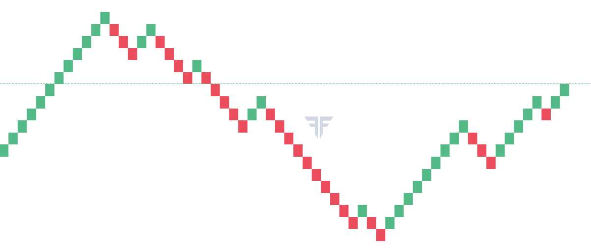
Renko charts were developed by the Japanese, but they are today gaining popularity around the world. They loosely resemble point & figure charts in terms of their rules. While point & figure charts are classified as having either an X-column (bullish) or an O-column (bearish), Renko charts are classified by the appearance of bricks (Renko is derived from the Japanese word “Renga”, which means “bricks”). Unlike point and figure chart which can have multiple boxes in one column, Renko chart has only one brick per column. Each column in a Renko chart is either a bullish column (usually represented by a green brick) or a bearish column (usually represented by a red brick).
Characteristics of Renko charts
For using a Renko chart, the user must first define the size of each brick. For instance, if the user wants to look at the Renko chart of Nifty, he can select any brick size that he wants to, such as 1, 5, 10, 100 etc. Keep in mind that the shorter the size of each brick, the shorter is the time frame of the chart, and vice versa. Unlike point & figure charts which are defined by the box size and the reversal size, Renko charts are defined by the brick size only.
For a new brick to emerge, the market must move by at least the size of one brick.In other words, for a new green brick to emerge, the market must rise by the size of at least one brick from the current brick high, and for a new red brick to emerge, the market must fall by the size of at least one brick from the current brick low. Any move that is less than the size of one brick is ignored and the Renko chart remains unchanged.
Construction of Renko charts
Let us try to simplify this further by explainingRenko charts using a simple, theoretical example. Let us assume a few things as follows: the current day closing price of the security is 102, the brick size is 5, time frame is “daily closing price”, the current brick is green (bullish brick) that has a high of 100 and a low of 95 (keep in mind that if the brick size is 5, the width of each brick will be a fixed 5 point, i.e. the difference between the high and the low of each brick will be 5). As the high and the low of the current brick are 100 and 95, respectively, for the trend to continue, i.e. for a new green brick to emerge, price must rise to at least 105 (current brick high of 100 + brick size of 5). Similarly, for the trend to reverse, i.e. for a new red brick to emerge, price must fall to at least 90 (current brick low of 95 - brick size of 5). As long as the price will not rise to at least 105 or fall to at least 90, the Renko chart will not move. In other words, just like point & figure charts, Renko charts only take into consideration the movements in price and ignore the changes in time. An advantage of this is that Renko charts filter out the noise element of the market and only consider moves that are at least as large as the brick size.
A thing to always remember is that each column in a Renko chart will contain only one brick and no more. Also, consecutive bricks will never appear next to each other. In other words, two bricks will never appear next to each other between consecutive columns.
With that in mind, let us continue with the example mentioned above to gain a better understanding of how Renko charts move. Kindly note that we have taken daily closing price as our time frame. Usually, Renko charts are constructed on a closing price basis on various time frames such as intraday, daily, weekly, and monthly. For our purpose, we will take ‘daily’ time frame into consideration.
| Day # | Closing Price | Will New Brick Print? | Colour of Brick | Current Brick | # of Bricks Printed | |
| High | Low | |||||
| 1 | 102 | 100 | 95 | |||
| 2 | 104 | No | 100 | 95 | ||
| 3 | 98 | No | 100 | 95 | ||
| 4 | 103 | No | 100 | 95 | ||
| 5 | 106 | Yes | Green | 105 | 100 | 1 |
| 6 | 109 | No | 105 | 100 | ||
| 7 | 111 | Yes | Green | 110 | 105 | 1 |
| 8 | 114 | No | 110 | 105 | ||
| 9 | 119 | Yes | Green | 115 | 110 | 1 |
| 10 | 116 | No | 115 | 110 | ||
| 11 | 115 | No | 115 | 110 | ||
| 12 | 109 | No | 115 | 110 | ||
| 13 | 104 | Yes | Red | 110 | 105 | 1 |
| 14 | 106 | No | 110 | 105 | ||
| 15 | 111 | No | 110 | 105 | ||
| 16 | 118 | Yes | Green | 115 | 110 | 1 |
| 17 | 116 | No | 115 | 110 | ||
| 18 | 114 | No | 115 | 110 | ||
| 19 | 127 | Yes | Green | 125 | 120 | 2 |
| 20 | 126 | No | 125 | 120 | ||
| 21 | 122 | No | 125 | 120 | ||
| 22 | 123 | No | 125 | 120 | ||
| 23 | 120 | No | 125 | 120 | ||
| 24 | 123 | No | 125 | 120 | ||
| 25 | 137 | Yes | Green | 135 | 130 | 2 |
| 26 | 114 | Yes | Red | 120 | 115 | 3 |
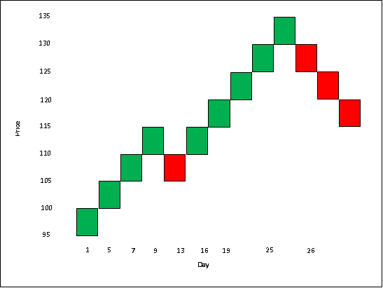
As stated earlier, the base value i.e. the value of the closing price on day 1 is 102 and the current brick is a green brick that has a high of 100 and a low of 95. For a new brick to print, the price must rise to at least 105 (i.e. rise by at least 5 points from the current brick high) or fall to at least 90 (i.e. fall by at least 5 points from the current brick low). This doesn’t happen from day 2 to 4, hence price action during these days are ignored. However, on day 5, the price crosses above 105, hence a new green brick in printed in a new column. Now for a new brick to emerge, the price must rise to at least 110 or fall to at least 95, which happens not on day 6 but on day 7. Hence, a new brick is added on day 7. Similarly, one more new brick is added on day 9. For a new brick to now emerge, the price must rise to at least 120 or fall to at least 105. Nothing happens between days 10 to 12, but on day 13, the price drops below 105. Hence, a new red brick is now printed on day 13. As of day 13, the current brick high and low are 110 and 105, respectively. For a new brick to emerge, the price must rise to at least 115 or drop to at least 100. This happens on day 16 when the price rises above 115, causing a new green brick to emerge. As of day 16, the current brick high and low are 115 and 110, respectively. Now observe what happens on day 19. On this day, as compared to the current brick high (115), the price has risen by 12 points. Hence, not 1 but 2 new green bricks would be added to account for this change. Now, the current brick high and low are 125 and 120, respectively. Nothing happens between days 20 and 24, hence the chart remains as is. On day 25, the price rises by another 12 points from the current brick high (125). Hence, two more bricks are added on day 25. Now, the current brick high and low are 135 and 130, respectively. For new brick to emerge, the price must rise to at least 140 or fall to at least 125. Notice that on day 26, the price drops by 16 points from the current brick low (130). Hence, 3 new red bricks are added on day 26 to account for this drop in price. The current brick high and low are now 120 and 115, respectively. For a new brick to emerge in the days ahead, the price must rise to at least 125 or fall to at least 110.
Let us now see how the Renko chart for the above price action would appear graphically.
Compare the table with the above chart. Observe that there were a total of 26 closes. However, only 8 closes were taken into consideration. The rest of the closes were ignored as they did not meet the brick size criteria. This is the advantage of using Renko charts as they tend to filter out the noise element and instead focus more on the trend.
Let us now summarize some of the rules of Renko charts that we have so far discussed:
-
Renko charts are defined by their brick size, the width of which remains fixed throughout.
-
Changing the brick size will affect the sensitivity of the chart. Larger the brick size, lower is the sensitivity to price, and vice versa.
-
Each column contains only one brick, which is either bullish or bearish.
-
Usually, Renko charts are based on closing prices.
-
Any time frame can be selected, such as intraday, daily, weekly, monthly etc.
-
For a new brick to emerge, price must change by the value of at least one brick from the current brick high or low.
-
Only the current brick high or low must be taken into consideration when comparing it with the current price.
-
From the current brick high or low, any price movement that is less than the size of one brick is ignored.
-
Renko charts filter out the noise element of the market and only consider moves that are at least as large as the brick size.
-
Two bricks will never appear next to each other between consecutive columns.
-
Renko charts that are based on daily closing price will take into consideration only the day’s close, and so forth. The high or the low of the day would be ignored. What matters is the close.
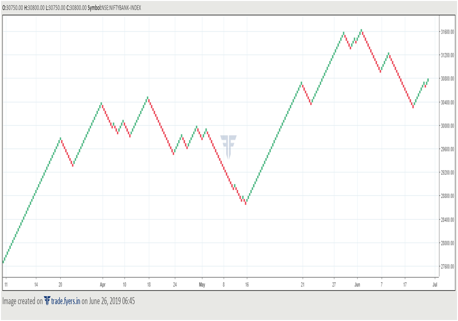
Let us now see how Renko charts would look like in the real world. Below is the Renko chart of Bank Nifty index, wherein the brick size is 50, and the chart is based on daily closing price.
Notice above how smooth the chart can get, when the underlying instrument is trending. By ignoring the day-to-day unwanted volatility and price fluctuation, the trader can instead focus on the trend of the underlying security.
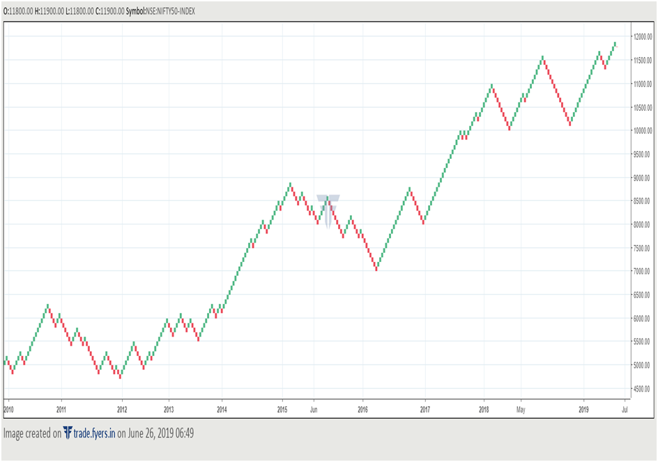
The chart below is the Renko chart of Nifty 50 index, wherein the brick size is 100, and the chart is based on weekly closing price.
As this is the weekly chart, we are dealing with a larger time frame than the one observed in case of Bank Nifty chart earlier, which was based on daily closing. Observe the trend of the index in this chart. Notice how smooth the overall uptrend is, especially from 2012 to early 2015 and then again from 2016 till date. The advantage of using Renko charts is that it filters out the unnecessary noise and instead allows one to focus on the broader trends.
How to analyse and interpret Renko charts
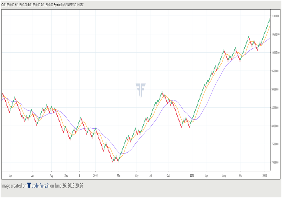
One of the simplest way of using Renko charts is to trade in the direction of the prevailing trend. Let us explain this using the chart of Nifty for the time period between 2015 and 2018. Let us assume a brick size of 50 and a time frame based on daily closing price. We have also plotted two moving averages (10-day SMA and 30-day SMA). One thing worth keeping in mind is that indicators on Renko charts differ slightly from those on other charts. In bar charts or in candle charts, as the time scale is fixed, indicators are based on each period’s price action. For instance, a 10-period SMA in a bar chart would be based on the price action of the past 10 periods or bars. However, in Renko charts, as the time scale is not fixed, indicators are based on the number of bricks rather than on the number of periods. For instance, a 10-day SMA on Renko chart is not based on the price action of the last ten periods, but rather on the price action of the past 10 bricks.
It can be observed in the chart that Nifty was in a downtrend for most of 2015. Also, during this period, both the moving averages were pointing lower, indicating that the inherent trend is bearish. This suggests that one should trade on the short side, utilizing recoveries to go short until evidence emerges that the downtrend could be ending or has ended. Midway through 2015, a bullish signal was hinted after price broke above the late-May high. However, there was no follow-through strength.The recovery soon ran out of steam and the downtrend resumed. One can utilize rallies during a bear market or break below previous lows to go short, as long as the overall sequence of lower highs and lower lows are intact.
During early 2016 however, early signs of market bottom emerged after the index formed a double bottom kind of pattern in February. Break above the high of this pattern suggested that the downtrend might have entered its last stages. The continued rally in the index coupled with the change in the direction of the moving averages from down to up and short-term MA crossing above long-term MA signalled that the downtrend has probably ended. This would suggest one to close out all the short positions, and start building long positions, by keeping a stop loss below the recent lowest low. Notice how the Nifty continued heading higher in the coming months. The correction in late-2016 ended at 50% fibonacci retracement (not shown in the chart) of the previous up move, along with the emergence and the breakout of a double bottom pattern towards the end of 2016. This signalled an end of the correction and the resumption of the uptrend. Notice how steadily Nifty rose in 2017.
During a bear market, one can utilize recoveries to build short positions and downside breakouts to add further short positions. Similarly, during a bull market, one can utilize declines to build long positions and upside breakouts to add more long positions. The principles of Dow theory can be applied effectively to Renko charts as well. Moreover, this can also be complemented with various technical indicators. The only drawback is that if the market enters a prolonged sideways or a non-trending phase, a lot of false signals could be generated. As such, it becomes pivotal to utilize Renko charts not in isolation but complement it with other charts and filters.
The above chart is the daily Renko chart of Reliance Industries based on closing price. The brick size is 10. Notice how Renko charts can also be used to identify resistance and support. Observe how the break of a former resistance zone led to a strong price rally. Also observe that during this upside price breakout, a bullish moving average crossover signal was generated, and both the averages were pointing higher at the time of the price breakout, indicating the odds of a successful breakout rather than a false one. Post the upside breakout, observe that there was one steep correction. However, notice that the moving averages did not give a bearish signal. Instead, the shorter-term MA took support exactly at the longer-term MA and started to head higher again. This signalled the continuation of the up move in price.
The uptrend, however, eventually ended when price broke below a support zone. Again, observe that during this downside price breakout, a bearish moving average crossover signal was being generated, and both the averages were pointing lower at the time of the break, indicating the odds of a successful downside breakout rather than a false one.
As can be seen in the above chart, Renko charts can be utilized with various traditional price tools and technical indicators too. Doing so increases the validity of Renko charts.
Next Chapter
Comments & Discussions in
FYERS Community

surya commented on July 4th, 2019 at 11:25 AM
Please check Renko charts explanation ( In the Table give, many times close price is above the High of Day. How is that possible.)
Shriram commented on January 26th, 2020 at 5:52 PM
Hi Surya, whenever the high or low exceeds the range of the prevailing bar, a new Renko bar appears following it in the next column. Keep in mind that the width of the Renko bar is fixed.
Siddhu Gaddi commented on July 5th, 2019 at 6:44 PM
Renko Chart, work beautifully for Positional trade.
If you marry with EW then it works more beautiful.
Shriram commented on January 26th, 2020 at 5:53 PM
Hi Siddhu, i agree with you. Renko charts are excellent for longer-term trades as they eliminate the noise element of the market, just like Point and figure chart does.