Introduction
The next chart that we would be talking about is the line break chart. This chart shares a few similarity with Renko chart that we discussed earlier in the previous chapter. For instance, line break charts only move when the price moves i.e., they ignore the changes in time. Also, line break charts have only one line per column and there are no line overlaps between consecutive columns. However, there are noteworthy differences between a Renko and a line break chart. For instance, while Renko charts are defined by their brick size, line break charts are defined by the number of consecutive lines. For instance, a two-line break chart is defined by the high-low range of two consecutive lines, while a three-line break chart is defined by the high-low range of three consecutive lines. Also, while the size of each brick is fixed in case of a Renko chart, the size of each line is not fixed in case of a line break chart. Instead, a line break chart allows the market to decide the size of each line. Let us now discuss about the characteristics of line break chart.
Characteristics of line break charts
In order to use line break chart, the first step is to select the number of lines. The user can select any number of lines that he wants to, such as 2, 3, 4 etc. However, the default and the most widely used number of lines is 3. Keeping this in mind, for the rest of our discussion, we will be talking about three-line break charts only. As the name implies, a three-line break chart is defined by the high-low range of three consecutive lines. Also, keep in mind that line break charts are based on closing prices. The time frame could vary between intraday, daily, weekly, monthly etc. So, for instance, if one is looking at 4-hourly time frame, a line break chart would be based on the 4-hourly closing price, if one is looking at daily time frame, a line break chart would be based on the daily closing price, and so on.
While a Renko chart comprises of bricks, a line break chart comprises of lines. A line could be either a rising line (bullish), usually represented by a green line, or a falling line (bearish), usually represented by a red line. A line break chart gives importance to the prevailing trend. For instance, if we are looking at the daily time frame of a three-line break chart and if currently there are three rising lines, all that needs to happen for the trend to continue (i.e. for a fourth rising line to print) is get a daily close above the high of the third line. However, for a reversal to happen, there should be a daily close below the low of the three rising lines. This may look a little difficult to understand at first without any visuals. However, in the next section when we discuss about the construction of a line break chart, this would become very clear and easy to understand.
Another thing to note is the size of each line. As stated earlier, this is not fixed but is rather variable. A unique feature of a line break chart is that it allows the market to decide the size of each line, rather than the size of each line being decided by a pre-determined amount. We also said that a line break chart gives importance to the prevailing trend. At the start of the trend, usually the lines are large, but as the trend matures, there is a tendency for the lines to get smaller and smaller. This unique feature of a line break chart has its own advantage, in that the size of the lines can help one in understanding the health of the prevailing trend. This is a feature which is not available in case of a Renko or a point & figure chart.
Let us now try to understand line break charts with an example.
Construction of line break charts
Let us now assume a few things. The base price i.e. the price of the security on day 1 is 100, the number of lines is 3 (i.e. we are referring to a three-line break chart), the time frame is the “daily closing price”, rising lines are represented by green lines, and falling lines are represented by red line. The table below shows the daily closing price for each session.
| Day # | Closing price |
| 1 | 100 |
| 2 | 104 |
| 3 | 98 |
| 4 | 103 |
| 5 | 106 |
| 6 | 109 |
| 7 | 111 |
| 8 | 114 |
| 9 | 119 |
| 10 | 116 |
| 11 | 115 |
| 12 | 119 |
| 13 | 117 |
| 14 | 120 |
| 15 | 121 |
| 16 | 118 |
| 17 | 116 |
| 18 | 113 |
| 19 | 111 |
| 20 | 114 |
| 21 | 112 |
| 22 | 115 |
| 23 | 118 |
| 24 | 120 |
| 25 | 119 |
| 26 | 121 |
| 27 | 124 |
| 28 | 127 |
| 29 | 132 |
| 30 | 135 |
Days 1 to 2
The base price for day 1 is 100. What line emerges will depend upon the closing of day 2. If day 2 closes above 100, we will have a green line; while if day 2 closes below 100, we will have a red line. As can be seen in the table, the day 2 closing is 104. Hence, we will have a green line that will stretch from a low of 100 to a high of 104. Observe in the graphical representation that lines loosely resemble bricks that we saw in Renko charts. The difference is that while bricks have a fixed width, lines do not have a fixed width.
Day 3
At the end of day 2, we just have 1 line and not 3 lines. Hence, the reference point for now is the high-low range of the 1 line that we have. In other words, for a new green line to emerge, we need a daily close above 104; while for a new red line to emerge, we need a daily close below 100. So, our reference range now becomes 100 to 104. A new line would emerge only if we get a closing outside of this range. Until then, the line break chart will not move. Let us now see what happened on day 3. As we have a closing below the lower end of the reference range, a new red line will now emerge in the next column. The red line will stretch from the low of the previous line (100) to the new low (98).
Days 4 to 5
At the end of day 3, we still have 2 lines and not 3 lines. Hence, the reference point for now is the high-low range of the two lines. For the downtrend to continue and a red line to emerge, price must close below the low of this range (98), while for the downtrend to reverse and a green line to emerge, price must rise above the high of this range (104). On day 4, price closed at 103. As this falls within the high-low range of the two lines, this day’s price action is ignored. On day 5 however, price closed at 106, which is above the high-low range of the two lines. Hence, a new green line is printed in the next column from the high of the previous line (100) to the new high (106).
Days 6 to 9
At the end of day 5, we now have three lines. Hence, our new reference point becomes the high-low range of the three latest lines, i.e. 98 to 106. For a new line to emerge, price must move beyond this range. This happens on day 6, when the market closed at 109. Hence, a new green line is printed in the next column from the high of the previous line (106) to the new high (109). Now the reference range is the high-low of the three latest lines, i.e. 98 to 109. As a new high is made on day 7, we shift one column to the right and draw a new column that stretches from 109 to 111 (new reference range is now 100 to 111). Similarly, on day 8, a new green column is printed from 111 to 114 (new reference range is now 106 to 114); and then on day 9, a new green column is again printed from 114 to 119 (new reference range is now 109 to 119).
Observe above that as new highs are printed, the three latest lines are taken into consideration and their range is kept in mind when determining whether a green line will appear next or whether a red line will appear. One thing to add here is that the emergence of three consecutive lines indicates that a trend is now in place. For instance, the emergence of three consecutive green lines indicates that a bullish trend is in place, while the emergence of three consecutive red lines indicates that a bearish trend is in place. Line break charts, just like point & figure charts, give a lot of importance to the prevailing trend. This is because once the trend is established, by way of the emergence of three consecutive lines (green or red), it takes just a small move to proceed in the direction of the prevailing trend, but it takes a noticeable move to go against the direction of the prevailing trend.
Days 10 to 13
At the end of day 9, the high-low range of the three latest lines is 109 to 119. For a new green line to emerge, price must close above 119 in the subsequent days, but for a new red line to emerge, price must close below 109 in the subsequent days. Until either of these happen, line break charts won’t move. From days 10 to 13, price does not go beyond the 109 to 119 range, hence price action for these days are ignored. Notice that on day 12, price closed at 119, which is equal to the high of the three latest line. However, for a new line to print in the next column, just merely equalling the high or the low of the range won’t suffice. Price must either close above the high of the range or below the low of the range for a new column to emerge. This is an important thing to always keep in mind when constructing line break charts.
Days 14 to 17
At the end of day 13, the high-low range of the three latest lines is still 109 to 119. On day 14, price closed above the high of this range. Hence, we shift one column to the right and print a new green line, which stretches from 119 to 120 (new reference range is now 111 to 120). As a new high is printed on day 15, we draw a new green line that stretches from 120 to 121. The new reference range is now 114 to 121. As price does not move beyond this range on days 16 and 17, the price action on these days are ignored.
Days 18 to 26
At the end of day 17, the reference range is 114 to 121. For a new green line to emerge, price must close above 121, while for a new red line to emerge, price must close below 114. On day 18, the price closed at 113. As this close is below the low of the latest three-line range, we move one column to the right and draw a red line that stretches from 120 to 113. The new reference range is now the high-low range of the latest three lines, which is 113 to 121. On day 19, as the price closes below this range, a new red line is drawn that stretches from 113 to 111. The new reference range is now 111 to 121. Observe that between days 20 and 26, price does not close beyond the 111-121 range. Hence, the line break chart remains unmoved during this period. Observe how line break charts filter out moves (and thereby the noise element of the market) that do not meet the line construction criterion.
Days 27 to 30
At the end of day 26, the reference range is 111 to 121. For a new red line to emerge, price must close below 111, while for a new green line to emerge, price must close above 121. This happens on day 27, when price closes at 124. Hence, we shift one column to the right and draw a new green line from 113 to 124. As a new closing high is posted on day 28, we draw a new green line from 124 to 127. As new high closes are posted again on days 29 and 30, we draw a new green line first from 127 to 132, and then again from 132 to 135. So, at the end of day 30, the reference range of the latest three lines is 124 to 135. In the subsequent days, for a new green line to emerge, price must close above 135, while for a new red line to emerge, price must head south and close below 124.
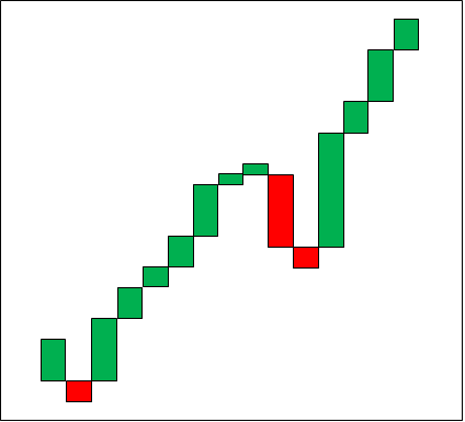
Let us now see how the three-line chart for the above price action would appear graphically.
Compare the above chart with the Renko chart that was constructed in the previous chapter. Notice that lines in line break charts resemble bricks in Renko charts. However, there is a big difference between the two. The bricks in Renko charts have a fixed width, while the lines in line break charts do not have a fixed width. Instead, the width of each line is determined by the market.
Let us now summarize some of the rules of line break charts that we have so far discussed:
-
Line break charts are determined by the number of lines. The most commonly used line break chart is the three-line break chart.
-
The width of each line in a line break chart is not fixed. Instead, the width of each line is determined by the market.
-
Usually, line break charts are based on closing prices.
-
Any time frame can be selected by the user, such as intraday, daily, weekly monthly etc.
-
Each column in a line break chart contains only one line, which is either bullish or bearish.
-
Two lines will never appear next to each other between consecutive columns. In other words, lines between two columns will never overlap.
-
For a new line to emerge, price must close beyond the high-low reference range of the three latest lines (in case of a three-line break chart). Until price does not close beyond the reference range, line break charts do not move.
-
When looking at, say, a three-line break chart, the emergence of three consecutive green lines indicates that a bull trend is in place, while the emergence of three consecutive red lines indicates that a bear trend is in place
-
Because of the way line break charts are constructed, they filter out noise by removing moves that do not meet the line construction criterion.
As stated, the most commonly used line break chart is the three-line break chart. That said, the user can select any number of lines as per his/her preference and objectives. For instance, the user can select two-line break chart, four-line break chart etc. A thing to keep in mind is that the larger the number of lines, the larger will be the high-low reference range, and vice versa.
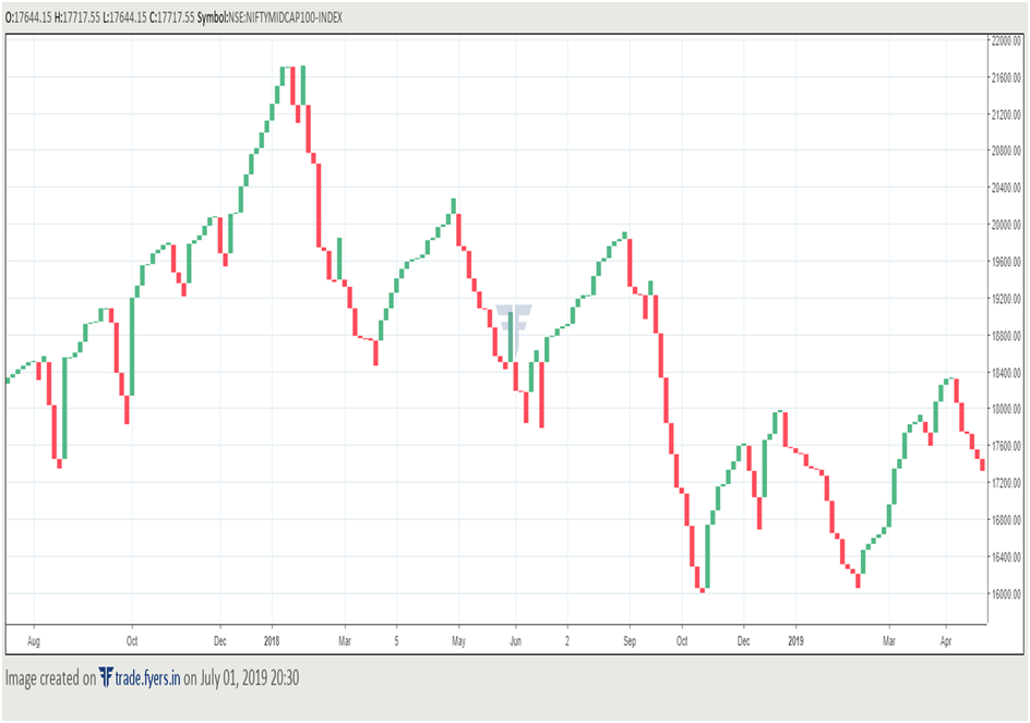
Let us now see how line break charts would look like in the real world. Below is the three-line break chart of NSE Nifty Midcap 100 index based on daily closing price.
Notice in the above chart the smoothness of a line break chart. As stated earlier, one of the advantage of using a line break chart is that it filters out the noise element by ignoring the price action that do not meet the reference range criterion.
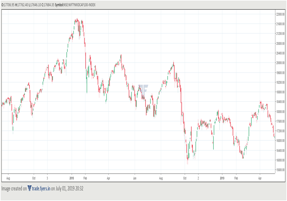
Now compare the above line break chart to the candlestick chart below. Keep in mind that for ease of comparison, the time period is the same for both the charts (2017 to 2019) and so is the time frame (daily). However, notice the amount of data in the candlestick chart. This is because the candlestick chart will include every price information for each day, irrespective of whether there has been movement in price or not. On the other hand, line break chart will only include price action that fits the criteria of the reference range for a certain number of lines. Hence, line break charts can be very useful for traders who want to ignore the noise element and rather focus on the larger term price action.
How to analyse and interpret line break charts
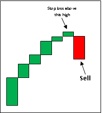
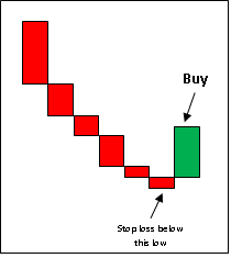
One of the simplest ways of trading a line break chart is to buy when the market switches from a series of red lines to a green line, and to sell when the market switches from a series of green lines to a red line. An aggressive trader can go long on the emergence of the first green line following a series of red lines by placing a stop loss below the low of the red line that immediately precedes the first green line. Similarly, an aggressive trader can go short on the emergence of the first red line following a series of green lines by placing a stop loss above the high of the green line that immediately precedes the first red line. The below chart will make this earlier to visualize.
An aggressive trader who creates a buy position on the emergence of the first green line following a series of red lines can hold on to the buy position as long as a red line does not emerge. Once a red line emerges, the trader should exit the buy position, and depending on his/her style can create a new sell position. Similarly, a trader who creates a sell position on the emergence of the first red line following a series of green lines can hold on to the sell position as long as a green line does not emerge. He/she should exit the sell position on the emergence of the first green line. Having said that, this method of buying on the emergence of the first green candle and selling on the emergence of the first red candle is risky, and hence must be traded with strict stop losses.
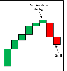
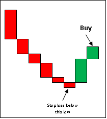
Conservative traders, on the other hand, can establish a buy position following the emergence of the second green line following a series of red lines, and a sell position following the emergence of the second red line following a series of green lines. The advantage of waiting for the second line to print before buying or selling is that there will be more evidence of a change in trend. However, the disadvantage is that the trader could miss a large part of the move, especially if the second line turns out to be a long green or red line. One possible solution to this problem is to enter a position early, i.e. after the print of the first line but before the print of the second line, once the trader becomes sufficiently confident that the price has sustained above the high or below the low of the first line. Yet another possible solution is to wait for a pullback in price once the second line is printed, before entering a position. Either ways, the rules for stop loss will remain the same. For a buy position, the stop loss would be below the low of the red line that immediately precedes the first green line; while for a sell position, the stop loss would be above the high of the green line that immediately precedes the first red line.
The traditional technical analysis tools such as trendlines, moving averages, indicators etc. can also be applied to a line break chart. Let us now look at some real-time charts to get a better understanding of how line break charts work.
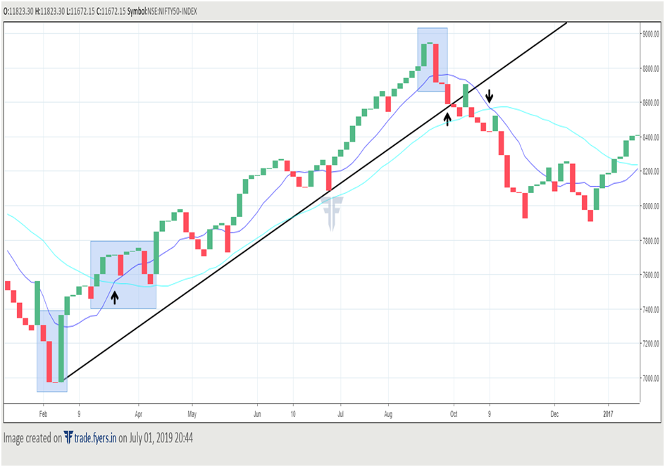
The chart below is the daily, three-line break chart of Nifty. Observe here how the three-line break chart has been used along with the application of traditional technical tools such as moving averages and trend lines.
Just like in case of any other chart, line break charts are not fool proof. There will be occasions when false signals would be generated, such as the appearance of a red line following a series of green lines, but without a continuation of the move in the direction of the red line. For instance, look at the chart above. During March and early April, green and red lines alternated, indicating market had entered a consolidation phase during this period. Then in May, a red line printed after a series of three green lines, but there was no follow through selling pressure after the appearance of the red line. Similar thing happened in June and early August, when the appearance of a red line following a series of green lines wasn’t met with further selling pressure. Then in November, when the price was declining, a green line emerged after a series of red lines, but again there was no follow through buying following the appearance of the green line. As such, it becomes prudent that not all buy and sell signals are acted up.
One way of dealing with this problem is to use line break chart in combination with other technical tools rather than using it in isolation. This can help one in filtering out false signals. Notice in the chart that we have used line break chart in conjunction with moving average and trend line signals. In March, a moving average bullish crossover occurred when the shorter period MA moved above the longer period MA and started heading higher. This was a signal of price in an uptrend. Also notice that the price was trading in a defined trend, forming a series of higher lows and highs. When the price is in an uptrend, a trader can use the appearance of a green line to buy, but the appearance of a red line to cut some of the existing buy positions rather than creating a sell position. Notice that the uptrend was in place until the time price broke below the rising trend line and there was a bearish moving average crossover signal that occurred in November. By this time, it is clear that the uptrend has ended, and we are now in a downtrend. When the price is in a downtrend, a trader can use the appearance of a red line to sell, but the appearance of a green line to cut some of the existing sell positions rather than creating a buy position. This way, a trader will ensure that he or she is trading in the direction of the trend rather than against it, while also avoiding the emergence of a false green or red line.
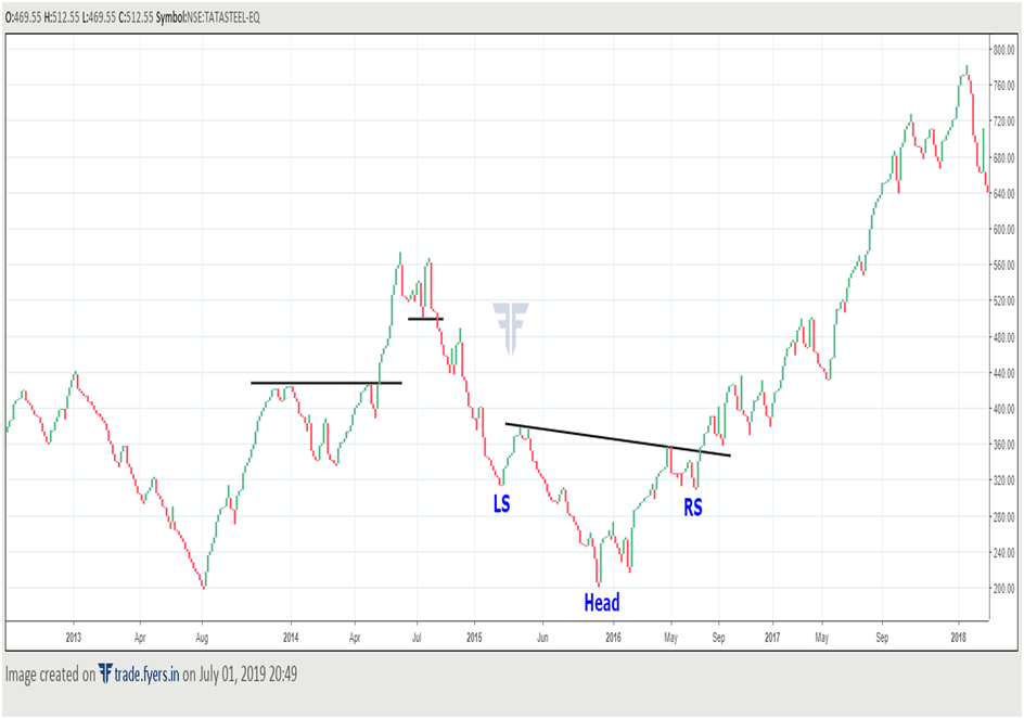
Notice from the above chart that patterns which apply to traditional charts can be applied to a line break chart as well. Observe that in the first half of 2014, Tata Steelmet with a minor hurdle near the previous top, from where it attracted a brief correction. However, once this correction ended and price broke above the trendline connecting the two highs, prices once again resumed their uptrend. This uptrend, later that year, ended when price broke below a trendline connecting two intervening bottoms. Later, in 2015 and 2016, notice that the stock was trying to carve in a bottom. In doing so, it formed an inverse Head and Shoulder (H&S) pattern. Notice that once price broke above the neckline of this pattern, it started into a major uptrend in the coming months. This chart very well sums up how the concepts which we studied earlier can be applied to non-traditional charts as well.
Next Chapter
Comments & Discussions in
FYERS Community
Agrawal S commented on October 20th, 2019 at 7:40 PM
Hello Friend
I am looking for 3 Line Break Chart for tracking Indian stocks.
Pls suggest me some good App or Software.
Rgds.
+918076491855
Shriram commented on January 26th, 2020 at 5:55 PM
Hi Agrawal, line break charts are available on our charting platform. You can use them for tracking Indian markets.
Vaishnav Dange commented on July 4th, 2020 at 12:18 AM
Platform name plz..?
Abhishek Chinchalkar commented on July 4th, 2020 at 8:11 AM
Hi Vaishnav, line break chart is available on our charting platform