Introduction
The final chart of the four-chart series that we will be taking about is the Heikin Ashi chart. This chart, along with the traditional candlestick chart, is quite popular among Japanese traders, and is now gaining popularity among the western traders as well. Heikin Ashi is a Japanese term that stands for “average bar”. These charts closely resemble candlestick charts in terms of their visual appearance. That said, there are few noteworthy differences between the two. The objective of this chapter is to talk about Heikin Ashi charts in detail and describe how these charts can be used to understand price movements of various financial securities.
Characteristics of Heikin Ashi charts
As stated, Heikin Ashi charts closely resemble candlestick charts in terms of how they look. However, there are noteworthy differences between the two. The biggest difference is that Heikin Ashi charts use the concept of average price for all the four price elements of a specific bar – open, high, low, and close. Now contrast this to candlestick charts,which use the current candle’s actual open, high, low, and close, to form the candle for that particular period. So, in crude terms, Heikin Ashi charts can be construed as a modified version of candlestick charts with one big difference – the open, high, low, and close that appear in each bar of a Heikin Ashi chart is an average price rather than the actual price.
Let us now look at how each candle’s data is calculated in case of a candlestick chart
-
Current candle open = the actual open for the period in question
-
Current candle high = the actual high that was registered for the period in question
-
Current candle low = the actual low that was registered for the period in question
-
Current candle close = the actual close for the period in question
Now, let us look at how each bar’s data is calculated in case of a Heikin Ashi chart:
-
Current HA bar open = (previous HA bar open + previous HA bar close) / 2
-
Current HA bar high = the highest of (current period high, current HA bar open, and current Ha bar close)
-
Current HA bar low = the lowest of (current period low, current HA bar open, and current HA bar close)
-
Current HA bar close = (current period open + current period high + current period low + current period close) / 4
As can be seen above, the formula looks a little intimidating. However, the good news is that there is no need to memorize these formulas as the chart would be constructed by the system. What is important to remember is that Heikin Ashi uses an average to calculate the data for the current Heikin Ashi bar open and close, the highest value from among a range of values to calculate the current Heikin Ashi bar high, and the lowest value from among a range of values to calculate the current Heikin Ashi bar low.
A thing to note from the above formulas is thatunlike a candlestick chart, a Heikin Ashi chart will never show gaps (or windows) between two consecutive bars. This is because of the way the current Heikin Ashi bar open is calculated - it is the average of the open and the close of the previous Heikin Ashi bar. As such, the current Heikin Ashi bar open will also be within the range of the previous Heikin Ashi baropen and close.Another thing to note is that as Heikin Ashi bars are averages, it is not possible to know the exact open and close for the current period (such as the current day open and close). To know what the exact open and close for the current period are, one must refer to bar or candlestick charts.Lastly, just like a candlestick chart, a Heikin chart is either green coloured (in some cases an unfilled bar) or red coloured (in some cases a filled bar). A Heikin Ashi bar is green coloured when open is above close and red coloured when open is below close.
Heikin Ashi charts vs. Candlestick chart
In this section, we will visually see the difference between a Heikin Ashi chart and a candlestick chart. We have already spoken about the way each of these two charts are constructed. Hence, we will no longer focus on the construction part, but will rather move straight to the charts.
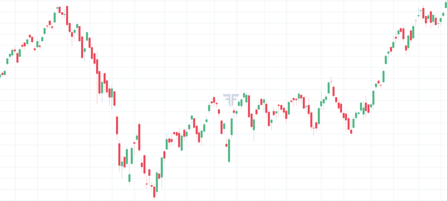
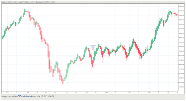
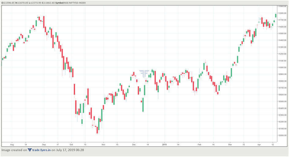
The chart on the top is the Heikin Ashi chart while that below it is the candlestick chart. Both the charts refer to the daily timeframeand for the same time period. Notice the difference between the two. Observe that the gaps that are visible on a candlestick chart are not visible on a Heikin Ashi chart. Again, this has got to do with the way a Heikin Ashi bar open is calculated. Also observe that a Heikin Ashi chart looks more smoother than a candlestick chart. There is a tendency for Heikin Ashi chart to have a sequence of consecutive green or red bars. Contrast this to a candlestick chart, in which it is relatively rare to find a long sequence of same-coloured candles. Because of this feature of a Heikin Ashi chart, thesecharts appear much smoother than a candlestick chart.
Another thing to note is that when in a downtrend, especially during the early stages of a downtrend, a Heikin Ashi bar will have very small upper shadows. Similarly, in an uptrend, especially during the early stages of an uptrend, a Heikin Ashi bar will have very small lower shadows. Contrast this to a candlestick chart, in which the occurrence of small upper shadows during a downtrend and small lower shadows during an uptrend is relatively less common.
Also, because of the way in which each data point in a Heikin Ashi chart is calculated, the various candle patterns that are visible on a candlestick chartget filtered out and are usually not visible on a Heikin Ashi chart. This has both advantages and disadvantages. The advantage is that in case the candle pattern turns out to be false, it is sometimes filtered out by a Heikin Ashi chart. The disadvantage is that in case the candle patter turns out to be true, the signals can be delayed slightly when using a Heikin Ashi chart. As such, there would be a trade off when using a Heikin Ashi chart.
As such, the best way of using a Heikin Ashi chart is to complement it with a candlestick chart, rather than using it in isolation. Using a candlestick chart would enable a trader to time the markets better than by using a Heikin Ashi chart, while using a Heikin Ashi chart would enable a trader to smoothly ride the trade for a longer period than by using a candlestick chart.
How to analyse and interpret Heikin Ashi charts
As we have seen thus far, a Heikin Ashi chart tends to smooth out the price data by averaging out the prices of each of the four elements of a bar (open, high, low, and close). As such, a Heikin Ashi chart becomes quite valuable when filtering out the noise element.
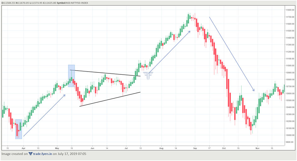
There are various ways in which one can analyse each bar of a Heikin Ashi chart. The structure of Heikin Ashi bars can tell a lot about the strength of the prevailing trend. For instance, look at the chart below. Towards the start of the chart, i.e. during March, we can see that prices were in a downtrend. The long size of the body (red in colour) coupled with no upper shadow suggested that sellers were in control of the market. However, after a few days of decline, the appearance of a spinning top-type pattern – small body coupled with tall shadows on either side of the body – suggested balance of power between sellers and buyers. During the next day, a green bar appeared that had a long body and no lower shadow. Also, the close of this bar was above the open of the long red bar that was printed two days ago. This was the first sign that the balance of power is shifting from sellers to buyers. Notice that from hereon, price entered a nice uptrend for the next month and a half. During this uptrend, notice that were very few red bars in between. As already stated earlier, in a Heikin Ashi chart, when the trend gets underway, opposite coloured bars (in this case red bars) appear relatively infrequently as compared to those that appear in candlestick charts. Also, notice that during the uptrend, the bars had little to no lower shadow and long green bodies. This indicates strength of the prevailing trend (in this case up) and suggests one to trade on the long side until signs that the uptrend is maturing start to appear.
This happened in May, with the appearance of a shooting star type pattern. Although the colour of the body is still green, the appearance of a tall upper shadow suggests that the bulls may be running out of steam. That said, until there are further signs of reversal, the prevailing trend (up) remains intact. On the next couple of days, two red bars appeared that had no upper shadows, suggesting that the uptrend might have run out of steam. For those who had built long positions, this warranted booking profits and (depending upon one’s risk appetite) building short positions. The selling continued for the next four sessions, but the appearance of a small bar that failed to create a new low and had a long lower shadow indicated pause to the downtrend. However, the appearance of a green bar on the following session with a closing above the high of the previous bar signalled that the balance of power is shifting back from sellers to buyers. For those who had built short positions, this warranted booking profits.
For the next few weeks, price consolidated in a range that was defined by lower peaks and higher troughs – in other words, a contracting triangle. Notice that classical patterns that are applicable in case of traditional charts are applicable in case of Heikin Ashi charts too. Also observe during this consolidation that the Heikin Ashi bars alternated in colours and that the bars had shadows on a lot of occasions – a classic sign of consolidation and a lack of clear trend. That said, notice that the breakout of this triangle in July was accompanied by a strong Heikin Ashi bar – one which had a long body and no lower shadow. This signalled the resumption of the uptrend and warranted one to build long position in the underlying. While there were a few opposite coloured Heikin Ashi bars during the price advance post the triangle breakout, notice that these bars were merely a brief pause to the uptrend, as none of them signalled that the uptrend was weakening.
The first signs that the uptrend was in trouble appeared in August, when three opposite coloured bars with long shadows on either side emerged and price failed to break above the highest high during this uptrend for four consecutive sessions. This sign of trouble was further compounded on the following session by the appearance of a Heikin Ashi bar that had a long red body and no upper shadow. The confluence of these signs suggested that it is time to exit bullish positions that had been established following the breakout of the triangle pattern.
Notice that the underlying entered a severe downtrend in the coming sessions. During this downtrend, observe that there were just three opposite coloured Heikin Ashi bars, while the rest were all red bars that had long bodies and little to no upper shadow. Until these characteristics prevail, the downtrend remained intact. Signs that these characteristics are weakening appeared in October though, when bullish Heikin Ashi bars started appearing. The appearance of these bars warranted booking profits for those who had built short positions.
Now let us summarise some of the key understandings from the above chart:
-
During an uptrend, there is a tendency for Heikin Ashi bars to have no lower shadows and long green bodies. This is a sign that the uptrend is healthy and dominant. As long as these signs prevail, it suggests one to trade from the long side.
-
Also, during an uptrend, bearish (red) bars appear relatively infrequently as compared to those that appear in candlestick charts.
-
Signs that the uptrend is maturing is usually signalled by Heikin Ashi charts beforehand by way of the appearance of indecisive bars – ones that have long shadows and small bodies that are usually red in colour. This is a caution for those who are long, signalling them to stay alert and look to exit the long-side trade in case a reversal is signalled by one or more Heikin Ashi bars in future.
-
During a downtrend, there is a tendency for Heikin Ashi bars to have no upper shadows and long red bodies. This is a sign that the downtrend is healthy and dominant. As long as these signs prevail, it suggests one to trade from the short side.
-
Also, during a downtrend, green bars appear relatively infrequently as compared to those that appear in candlestick charts.
-
Signs that the downtrend is maturing is usually signalled by Heikin Ashi charts beforehand by way of the appearance of indecisive bars – ones that have long shadows and small bodies that are usually green in colour. This is a caution for those who are short, signalling them to stay alert and look to exit the short-side trade in case a reversal is signalled by one or more Heikin Ashi bars in future.
-
Price tools and patterns that are applicable to traditional charts are applicable to Heikin Ashi charts as well. So, one must get into the habit of using trendlines, channels, Fibonacci retracements and extensions, Pitchfork, price patterns, etc. on Heikin Ashi charts to identify trends.
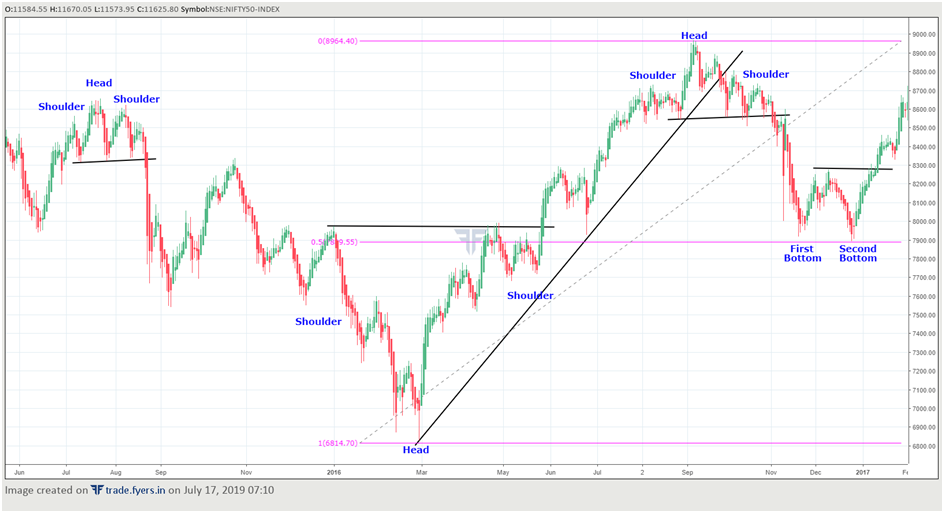
Now let us look at another chart. The chart below shows the daily Heikin Ashi chart of Nifty index. Notice that in this chart, there were three Head and Shoulder (H&S) patterns – two bearish and one bullish – and one double bottom pattern. Observe that both the bottoms of the double bottom pattern were formed near the 50% fibonacci retracement of the rally from 6825 to 8970. Also observe the rising trendline, which was broken in September 2016. Notice that when the price was trading above this rising trendline, the number of bullish bars far than outnumbered the number of bearish bars.The intent of this chart is to show that traditional patterns that are applicable on candlestick charts can as effectively be applied on Heikin Ashi charts as well.
Next Chapter
Comments & Discussions in
FYERS Community
Janardhanan K M commented on July 29th, 2019 at 12:14 PM
The chapter regarding Heikin Ashi candle is very useful.
recently opened account with Fyers so want to know where there previous chapters are available. also required user manual or operations manual for Fyers one set up, esp chart and also regarding various scanners. Thank You
tejas commented on August 14th, 2019 at 3:02 PM
Hi Janadhanan, Thanks! All the chapters and modules are available here itself. There is no user manual for FYERS One as such. However, we can give you a demo. For that, you'll have to contact our support team.
Devang Shah commented on July 29th, 2019 at 12:22 PM
Very informative Tx sir
tejas commented on August 14th, 2019 at 3:02 PM
Thanks, Devang.
BRAJ KISHORE BARIK commented on July 29th, 2019 at 12:53 PM
Can u add nifty / Bank nifty PCR live and EOD value
tejas commented on August 14th, 2019 at 3:03 PM
We'll look into this. Thanks for your feedback! Where do you currently get this information from?
Dhrubajit Narzary commented on July 30th, 2019 at 12:03 PM
Very good and informative explanation. Thank you for your kind insight.
tejas commented on August 14th, 2019 at 3:03 PM
:-)
SATISH ANANT KANETKAR commented on November 2nd, 2019 at 7:54 PM
Beautiful explanation , created new vision for taking decision.
tejas commented on November 6th, 2019 at 11:34 PM
These charts are useful. Especially if candlesticks seem very noisy or distorted to you. I have come across several traders in the last few years who prefer this chart type.
sukanth commented on February 12th, 2020 at 12:51 PM
Hello,
Why the next lesson button is not working for me?.. I cant navigate to the next lesson..
Gopal Kavalireddi commented on February 12th, 2020 at 1:27 PM
This is the last chart in this series. There are no more chapters in this series.