Introduction
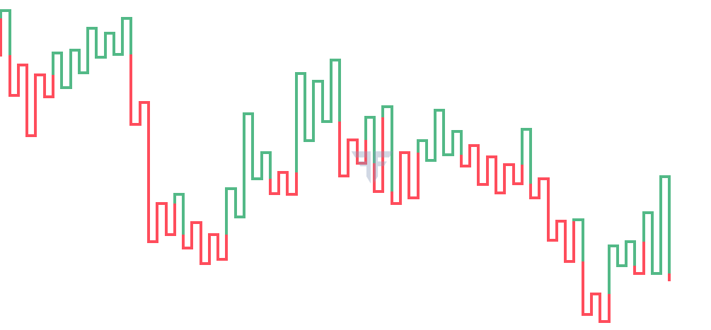
The next chart that we would be talking about is the Kagi chart. In terms of appearance, this chart looks a little different than the Renko and the line break chart that we discussed in the earlier chapters. This is because unlike a Renko or a line break chart, a Kagi chart is represented by lines (and not by bricks or rectangles). Having said that, there are quite a few similarities that Kagi charts share with Renko and line break charts. For one, Kagi charts give more importance to the prevailing trend - opposite directional moves that are smaller than the reversal size are ignored. A Kagi chart is defined by its reversal size. The reversal size is the minimum amount by which the price must move in the opposite direction to switch from one column to the next. At any point in time, a Kagi chart is represented by either a “yang” line or a “yin” line. A “yang” line is usually denoted by a thick line or a green line, while a “yin” line is usually denoted by a thin line or a red line. For our purpose, we will use green and red lines to represent the yang and the yin lines, respectively.
Characteristics of Kagi charts
As already stated, a Kagi chart is represented by the reversal size. The higher the reversal size, the less sensitive the chart would be to price changes in the opposite direction, and vice versa. Kagi charts give more importance to the prevailing trend than to the opposite trend. For instance, if the prevailing line is trending higher, all that is needed for the prevailing line to extend further is a close that is greater than the high of the prevailing line. Similarly, if the prevailing line is trending lower, all that is needed for the prevailing line to extend further is a close that is below the low of the prevailing line. On the other hand, for a reversal to materialize (i.e. to move from one column to the next), price must move in the opposite direction of the prevailing line by at least the reversal size. As long as this condition is not met, Kagi charts won’t switch direction and the prevailing line will continue. Also, if the price closes in the opposite direction of the prevailing line but fails to move by at least the reversal size, the price action for that period is ignored. Hence, at any point in time, one of three things could occur as follows:
Extension of the prevailing line
If the prevailing line is trending higher and price closes above the high of the prevailing line, the current trend continues, and the prevailing line extends higher by the amount of the close. Similarly, if the prevailing line is trending lower and price closes below the low of the prevailing line, the current trend continues, and the prevailing line extends lower by the amount of the close.
Reversal from the prevailing line
If the prevailing line is trending higher and price closes lower by at least the size of the reversal, the current trend reverses. To reflect this change, we shift one column to the right and draw a line in the opposite direction by the amount of the close. Similarly, if the prevailing line is trending lower and price closes higher by at least the size of the reversal, the current trend reverses. To reflect this change, we shift one column to the right and draw a line in the opposite direction by the amount of the close.
No change
If the prevailing line is trending higher and if price closes below the high of the prevailing line but fails to move by at least the reversal size, the price action for that period is ignored. Similarly, if the prevailing line is trending lower and if price closes above the low of the prevailing line but fails to move by at least the reversal size, the price action for that period is ignored.
One thing to note during a reversal from the prevailing line is the appearance of a small horizontal line that connects one vertical line with the next. The width of this horizontal line is fixed throughout. These horizontal lines are quite important because when they are surpassed, they can change the colour of the line from green to red, or from red to green. For instance, if the current line is green and if price closes under the immediately preceding horizontal line, the colour of the line changes from green to red. Similarly, if the current line is red and if price closes above the immediately preceding horizontal line, the colour of the line changes from red to green. The colour of the line changes at the point where the horizontal line is surpassed. It is not necessary that columns change for colour of the line to change.
This brings us to an important point. It is not necessary that the colour of a line changes when there is a reversal. For the colour of a line to change, price must close beyond the immediately preceding horizontal line. Hence, it is important to keep in mind that sometimes the colour of the line could be red even if it is rising or could be green even if it is falling.
At first, all this may be a little intimidating to understand. However, we will talk about each of these aspects using a sample chart, which will make the concepts of a Kagi chart much simpler to understand and interpret.
Construction of Kagi charts
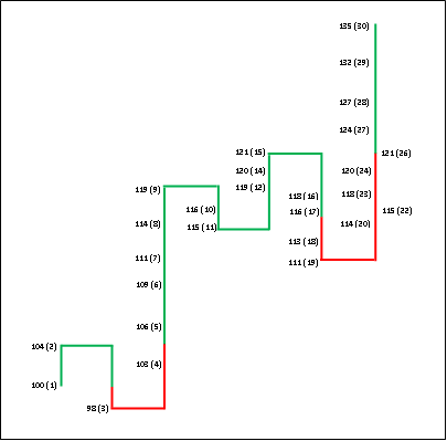
Let us now assume a few things. The base price i.e. the price of the security on day 1 is 100, the reversal size is 3, the time frame is the “daily closing price”, yang lines are represented by green lines, and yin lines are represented by red lines. The table below shows the daily closing price for each session.
| Day # | Closing price |
| 1 | 100 |
| 2 | 104 |
| 3 | 98 |
| 4 | 103 |
| 5 | 106 |
| 6 | 109 |
| 7 | 111 |
| 8 | 114 |
| 9 | 119 |
| 10 | 116 |
| 11 | 115 |
| 12 | 119 |
| 13 | 117 |
| 14 | 120 |
| 15 | 121 |
| 16 | 118 |
| 17 | 116 |
| 18 | 113 |
| 19 | 111 |
| 20 | 114 |
| 21 | 112 |
| 22 | 115 |
| 23 | 118 |
| 24 | 120 |
| 25 | 119 |
| 26 | 121 |
| 27 | 124 |
| 28 | 127 |
| 29 | 132 |
| 30 | 135 |
Days 1 to 2
The base price for day 1 is 100. What line emerges next will depend upon the closing of day 2. If day 2 closes above 100, we will have a green line; while if day 2 closes below 100, we will have a red line. As can be seen in the table, the day 2 closing is 104. Hence, we will have a green line that will stretch from 100 to 104.
Days 3
Now that we have a rising line, for the prevailing line to extend, price needs to close above the high of this line, which is 104. On the other hand, for the prevailing line to reverse, price needs to close at least 3 points below the high of this line, i.e. a close at or below 101. On day 3, as price closed at 98, we switch columns and draw a falling line that stretches from 104 to 98. Also, as we have broken below the immediately preceding low of 100, the colour of the line switches to red from 100 to 98. From 104 to 100 however, the colour of the line remains green. So, at the end of day 3, we have a falling, red line.
Days 4
Price on day 4 closed at 103, meaning an advance of 5 points from the previous low point. As this is at least as large as the reversal size, we switch columns and now draw a rising line that stretches from 98 to 103. The colour of the line remains unchanged i.e. red. So, at the end of day 4, we have a rising, red line.
Days 5
As price has risen and the prevailing line is a rising line, we extend the line further till 106. An important thing to note here is that as the price has broken above the immediately preceding horizontal line high (104), the colour of the line remains unchanged (red) from 103 to 104 but then changes to green from 104 to 106. So, at the end of day 5, we now have a rising, green line.
Days 6 to 9
From days 6 to 9, price keeps rising. As such, we extend our rising, green line from 106 to 109 (day 6), then from 109 to 111 (day 7), then from 111 to 114 (day 8), and finally from 114 to 119 (day 9). So, at the end of day 9, we continue to have a rising, green line.
Days 10
As price has fallen and closed 3 points below the high of the prevailing line (119), we switch columns and now draw a falling line that stretches from 119 to 116. The colour of the line remains unchanged i.e. green. So, at the end of day 10, we have a falling, green line.
Days 11
As price closes lower at 115 and the prevailing line is a falling line, we extend this line further from 116 to 115. The colour of the line remains unchanged i.e. green. Observe in the graphical representation that for the colour of the line to switch from green to red, price must close below the immediately preceding horizontal line, which happens to be 98. So, at the end of day 11, we continue to have a falling, green line.
Days 12
As price has risen and closed 4 points above the low of the prevailing line (115), we switch columns and now draw a rising line that stretches from 115 to 119. The colour of the line remains unchanged i.e. green. So, at the end of day 12, we now have a rising, green line.
Days 13
While price closed lower on day 13, it failed to register a close that is at least 3 points below the high of prevailing line (119). Hence, price action for day 13 is ignored and Kagi chart remains unmoved. So, at the end of day 13, we continue to have a rising, green line.
Days 14 to 15
As price has risen and the prevailing line is a rising line, we extend the line further from 119 to 120 (day 14) and then from 120 to 121 (day 15). So, at the end of day 15, we continue to have a rising, green line.
Days 16
As price has fallen and closed 3 points below the high of the prevailing line (121), we switch columns and now draw a falling line that stretches from 121 to 118. The colour of the line remains unchanged i.e. green. So, at the end of day 16, we have a falling, green line.
Days 17 to 19
From days 17 to 19, price keeps falling. As such, we extend our falling, green line from 118 to 116 (day 17), then from 116 to 113 (day 18), and finally from 113 to 111 (day 19). There is an important thing to note here. As price has closed below the immediately preceding horizontal line (115), the colour of the line remains green from 118 to 115 but then changes to red from 115 to 111. So, at the end of day 19, we now have a falling, red line.
Days 20
As price has risen and closed 3 points above the low of the prevailing line (111), we switch columns and now draw a rising line that stretches from 111 to 114. The colour of the line remains unchanged i.e. red. So, at the end of day 20, we have a rising, red line.
Days 21
While price closed lower on day 21, it failed to register a close that is at least 3 points below the high of prevailing line (114). Hence, price action for day 21 is ignored and Kagi chart remains unmoved on this day. So, at the end of day 21, we continue to have a rising, red line.
Days 22 to 24
From days 22 to 24, price keeps rising. As such, we extend our rising line from 114 to 115 (day 22), then from 115 to 118 (day 23), and finally from 118 to 120 (day 24). So, at the end of day 24, we continue to have a rising, red line.
Days 25
While price closed lower on day 25, it failed to register a close that is at least 3 points below the high of prevailing line (120). Hence, price action for day 25 is ignored and Kagi chart remains unmoved on this day. So, at the end of day 25, we continue to have a rising, red line.
Days 26
As price has risen and the prevailing line is a rising line, we extend the line further from 120 to 121. So, at the end of day 26, we continue to have a rising, red line. However, notice that price has now reached the immediately preceding horizontal line (121). If in the coming days, price closes above 121, the colour of the line will change from red to green.
Days 27
As price has risen and the prevailing line is a rising line, we extend the line further from 121 to 124. However, as price has surpassed the immediately preceding horizontal line (121), the colour of the line changes to green from 121 to 124. So, at the end of day 27, we now have a rising, green line.
Days 28 to 30
From days 28 to 30, price keeps rising. As such, we extend our rising line from 124 to 127 (day 28), then from 127 to 132 (day 29), and finally from 132 to 135 (day 30). So, at the end of day 30, we continue to have a rising, green line. In the subsequent days, for price to continue in the direction of the prevailing line, it must close beyond 135. However, for the prevailing line to reverse, price must close at least 3 points below the high of the prevailing line (i.e. close at 132 or below). Also, the colour of the line will remain green as long as price does not close below the low of the immediately preceding horizontal line, which is at 111.
Let us now see how the Kagi chart for the above price action would appear graphically.
Let us now summarize some of the rules of Kagi charts that we have so far discussed:
-
Kagi charts are defined by the reversal size. The higher the reversal size, the less sensitive the chart would be to price changes in the opposite direction, and vice versa.
-
Kagi charts give more importance to the prevailing trend - opposite directional moves that are smaller than the reversal size are ignored.
-
At any point in time, a Kagi chart is represented by either a “yang” line or a “yin” line. A “yang” line is usually denoted by a thick line or a green line, while a “yin” line is usually denoted by a thin line or a red line.
-
If the prevailing line is trending higher (lower), all that is needed for the prevailing line to extend further is a close that is above (below) the high (low) of the prevailing line.
-
If the prevailing line is trending higher (lower) and price closes lower (higher) by at least the size of the reversal, the current trend reverses. To reflect this change, we shift one column to the right and draw a line in the opposite direction by the amount of the close.
-
If the prevailing line is trending higher (lower) and if price closes below (above) the high (low) of the prevailing line but fails to move by at least the reversal size, the price action for that period is ignored.
-
One thing to note during a reversal from the prevailing line is the appearance of a small horizontal line that connects one vertical line with the next. The width of this horizontal line is fixed throughout.
-
Horizontal lines are quite important because when they are surpassed, they can change the colour of the line from green to red, or from red to green.
-
It is important to keep in mind that sometimes the colour of the line could be red even if it is rising or could be green even if it is falling. For a green line to turn into a red line, price must close under the immediately preceding horizontal line. Similarly, for a red line to turn into a green line, price must close above the immediately preceding horizontal line.
-
Reversal size is usually selected depending on the price of security. For instance, for a security whose current price is 10, the reversal size could be something like 0.1; while for a security whose current price is 1000, the reversal size could be something like 10. Again, this is subjective and completely depends on the user of the chart and his/her objective.
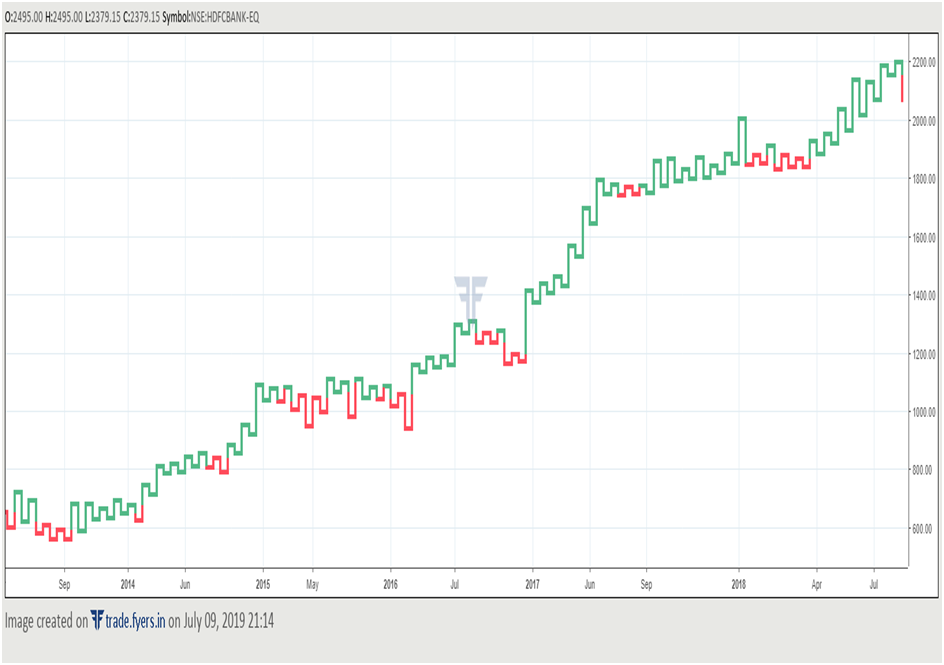
Let us now see how Kagi charts would look like in the real world. Below is the Kagi chart of HDFC Bank based on daily closing price.
Just like the Renko and line break charts discussed in earlier chapters, observe how smooth a Kagi chart is. By ignoring countertrend moves that are smaller than the reversal size, Kagi charts disregard the noise element, thereby enabling a trader to focus on the bigger picture. Notice in the chart that when price is moving in an uptrend, it is common for the number of green lines to outnumber the number of red lines. Similarly, when price is moving in a downtrend, it is common for the number of red lines to outnumber the number of green lines. When these dynamics start to change, it can give early hints that a trend could be nearing a change. We will study more about this in the next section, wherein we will discuss about ways to trade Kagi charts.
How to analyse and interpret Kagi charts
The simplest way of trading a Kagi chart is to buy on the emergence of a green (yang) line and liquidate that position on the emergence of a red (yin) line, and vice versa. However, trading on every such signal would generate a lot of whipsaws. This is because Kagi charts do not work so well when prices enter a consolidation range. As a matter of fact, none of the charts that we have discussed over the last three chapters – Renko, line break, and Kagi – work well in a sideways market. During such markets, they tend to produce a lot of false signals.
As such, the best way of trading a Kagi chart is to combine it with other indicators that would aid one in identifying what the broader trend is. Once the trend has been identified, a trader can take signals generated by Kagi charts in the direction of the trend and use countertrend signals to liquidate some or allofthe existing positions. For instance, one can combine Kagi charts with traditional tools such as moving averages, trendlines, fibonacci retracements, channels, price indicators and patterns etc. to identify what the trend is, and once the trend has been identified, take signals generated by Kagi charts in the direction of that trend. Let us now look at some real-world examples.
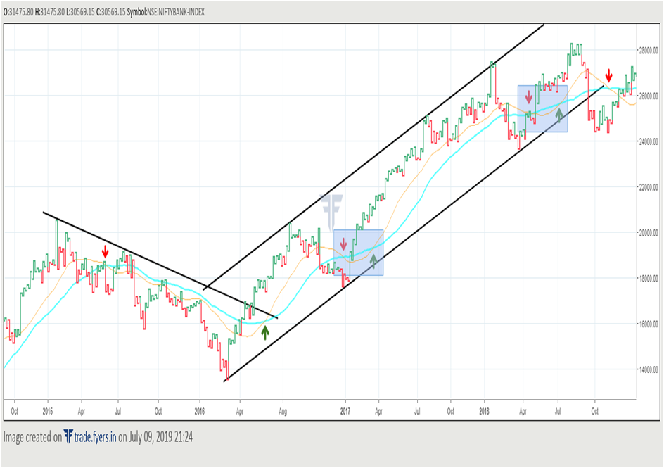
The above chart is the daily chart of Bank Nifty with the reversal size being 50 points. There are two moving averages used here, the 30-SMA and the 50-SMA. Bullish MA crossovers have been signalled with a green upward pointing arrow, while bearish MA crossovers have been signalled with a red downward pointing arrow. Observe here that from January 2015 to April 2016, Bank Nifty was trading underneath a falling resistance line, indicating a downtrend in place. A bearish MAcrossover was signalled in June 2015, suggesting the start of a downtrend. This bearish MA crossover was in place until June 2016, when a bullish MA crossover coupled with a break above the falling resistance line that occurred a few days ago signalled change of trend from down to up.
Notice that from hereon till September 2018, Bank Nifty was trading inside a rising channel. Observe that there were a few false MA crossovers that occurred when Bank Nifty was inside this channel (rectangular regions shaded in grey). As price was trading right near a rising trendline support when the bearish MA crossover occurred in December 2016, it would suggest one to wait and see whether price sustains below the trendline to indicate a possible change in trend. However, this did not happen. The decline halted right at the trendline and Bank Niftystarted moving higher, indicating that the broader uptrend remains intact. A few weeks later, in March 2017, a bullish MA crossover was again signalled, indicating resumption of the uptrend. Note the next false bearish MA crossover signal that occurred during April 2018 when Bank Nifty was still trading inside the rising channel pattern. This further highlights the importance of using multiple signals in order to reduce the likelihood of false moves.
Now that we understand the importance of using various traditional tools to identify the trend, let us see how to use Kagi charts to create and to exit positions.
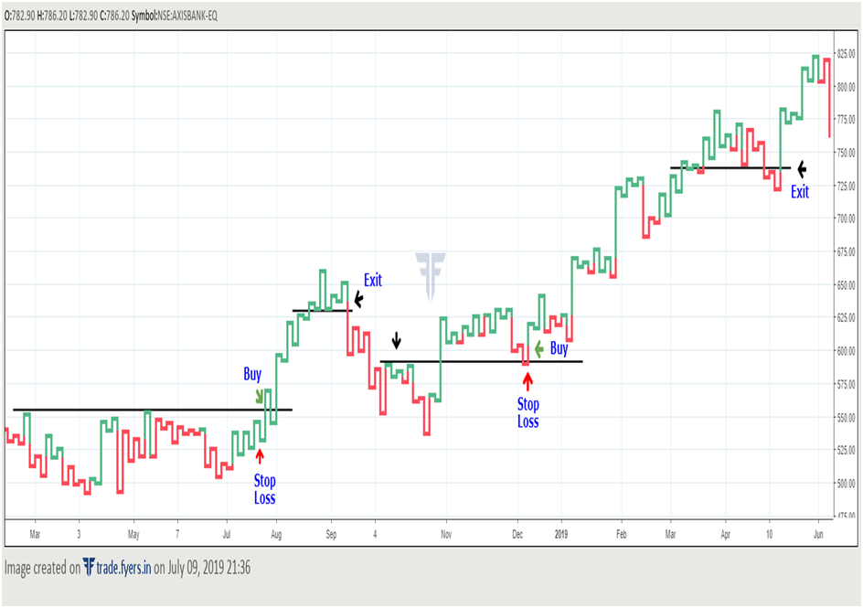
In the above chart, notice that between March and July, price entered a consolidation range. In early August however, price broke above this consolidation range, potentially signalling an up move in the coming days. To trade this breakout, one can enter a long position at the time of the breakout (marked with green arrow), keeping a stop loss below the low of the breakout Kagi line (marked with a red arrow). Rather than having a predetermined target, one can let the market decide what the target should be. In this case, notice that post the breakout, price started to go steadily higher and there were no red (Yin) lines, indicating strength of the up move. In early September though, there was first sign of caution, as price made a lower high and then the colour of the line turned to red (Yin). Break below the immediately preceding support levels (marked with a black trend line) indicated that this up move has possibly ended, suggesting one to book profits and exit this long trade at the level where price broke below the trend line.
Moving ahead, note that the high of October became the low of December, indicating that a prior support has now turned into a resistance. Such an occurrence can be construed as a sign that there is strong underlying support in the said region, signalling one to be on the lookout for a buy trade. A way of trading such a pattern is to buy on a break above the immediately preceding Kagi line high (marked with a green arrow) and place stop loss a few ticks below the low of the former resistance-turned-support level (marked with a red arrow). Again, observe that price entered a nice uptrend following the bounce off the support line. Between March to May however, price started showing signs of weakness as it made 3 consecutive lower tops, before breaking below a prior support. This warranted taking profits on the existing long trade.
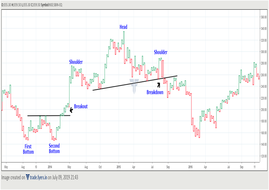
Observe in the above chart that classical price patterns that are applicable to bar charts and candlestick charts can be applied to Kagi charts as well. Notice above that price formed a double bottom pattern between September and March. Break above the neckline of this pattern triggered a strong rally in price in the coming weeks. Later, notice that price formed a bearish Head and Shoulder pattern. Break below the neckline of this pattern triggered a sharp fall in the days ahead. Once such patterns are detected, a trader can then use buy/sell signals from Kagi lines to enter/exit trades. For instance, if a trader entered a buy position following the double bottom breakout, he/she could have held on to that position until price made a lower top before breaking below the low of the immediately preceding line in June. Similarly, if a trader entered a sell position following the H&S breakdown, he/she could have held on to that position until price formed a long green (Yang) line in February. The emergence of such a long bullish line, which engulfed a series of bearish lines, warranted booking profits on short positions.
Next Chapter
Comments & Discussions in
FYERS Community
Namrata Joshi commented on August 16th, 2019 at 7:45 PM
Hi Sir,
Simply amazing with detailed explanation. I got to know some of the facts which I never read anywhere before. I also know that Tradingview provides the Kagi charts from the very first time.
Trading breakouts, especially from support and resistance levels is it useful using kagi charts as trends is already captured and if not delayed?
Thanks!
Shriram commented on January 26th, 2020 at 5:58 PM
Hi Namrata, thank you for the feedback. As shown above in this chapter, you can successfully trade breakouts from support and resistance levels using Kagi charts. In fact, you can also deploy other tools such as technical indicators, price patterns etc.