
Introduction to Elliott Waves
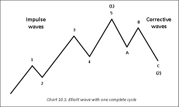
Developed by Ralph Nelson Elliott and popularized by Robert Prechter, Elliott wave theory is based on the observation that price moves in recognizable patterns at every degree of time scale. These patterns, as we shall see later, unfold in the form of waves. In Elliott parlance, there are two types of waves: impulse and corrective. Impulse wave is a 5-wave structure that moves in the direction of the trend of one larger degree, while corrective wave is a 3-wave structure or a combination of a 3-wave structure that moves against the direction of the trend of one larger degree. For instance, when the trend of one larger degree is up, the wave that precedes it will be characterized by 5s during rallies and 3s during corrections; whereas when the trend of one larger degree is down, the wave that precedes it will be characterized by 5s during declines and 3s during recoveries. Usually, impulse waves are labelled using numbers (1, 2, 3, 4, 5, I, II, III, (1), (2) etc.), while corrective waves are labelled using alphabets (A, B, C, a, b, c etc.). One complete cycle comprises of 8 waves, 5 of which are impulse and 3 are corrective. This structure keeps repeating forever and at every degree of time frame.
The above chart shows one complete cycle of an Elliott wave. The 5-wave up move is an impulse while the 3-wave down move is a correction. Notice that the 5-wave up move (labelled 1-5) and the 3-wave down move (labelled A-C) become the subwaves of one larger degree (numbered (1) and (2) respectively). Such a structure keeps repeating forever from the smallest degree of time frame to the largest degree of time frame. Always keep in mind that impulse waves move in the direction of the trend, while corrective waves move against the direction of the trend. In the chart above, waves 1, 3, and 5 being impulse will be composed of 5 waves, while waves 2 and 4 being corrective will be composed of 3 waves.
Waves unfold in the form of 5s and 3s
As already stated above, waves that move in the direction of one larger degree unfold in 5s while those that move against the direction of one larger degree unfold in 3s or a combination thereof. The chart shown above is based on three important rules. Keep in mind that these rules must always be adhered to when counting waves. Failure to meet even one of these rules would invalidate the wave counts and would warrant doing an alternate count that would adhere to all the rules. These rules are as stated below:
-
Wave 2 never retraces more than 100% of wave 1.
-
Wave 3 is never the shortest of the three impulse waves in a 5-wave structure. In other words, wave 3 is longer in magnitude than at least wave 1 or 5.
-
Wave 4 never enters the price territory of wave 1. In other words, the low of wave 4 is above the high of wave 1.
Now let us turn our focus on describing each of the five waves. For this purpose, we will assume that the wave of one larger degree is up. As such, waves 1, 3, and 5 become impulsive, while waves 2 and 4 become corrective. Because waves 1, 3, and 5 are impulsive, they will be composed of 5 waves; and because waves 2 and 4 are corrective, they will be composed of 3 waves or a combination thereof.
Wave 1
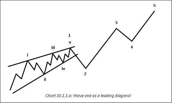
Wave 1 could be either an impulse (i.e. a 5-3-5-3-5 count) or a leading diagonal. A leading diagonal is a 5-wave structure but is different from an impulse in that all the wave counts of a leading diagonal will be subdivided into threes i.e. a count of 3-3-3-3-3 instead of 5-3-5-3-5. Also, in case of a leading diagonal, subwave 4 can enter the price territory of subwave 1 (remember, this is not allowed in case of an impulse). The other two rules mentioned above applies to a leading diagonal as well i.e. subwave 2 never retraces more than 100% of subwave 1 and subwave 3 is never the shortest subwave among subwaves 1, 3, and 5. The chart below shows how a leading diagonal looks like. Notice that each of the subwaves of wave 1 is composed of 3s instead of a combination of 5s and 3s.
Wave 2
Wave 2 is a corrective wave and hence, will be comprised of three waves. As a rule, wave 2 cannot retrace more than 100% of wave 1. Wave two could be a zigzag, a flat, or in rare cases even a triangle. A zigzag is a sharp correction whose wave counts are subdivided into a 5-3-5 structure, with subwave B usually falling well short of reaching the start of subwave A and subwave C usually moving well beyond the end of subwave A. Meanwhile, a flat is a sideways correction whose wave counts would be subdivided into a 3-3-5 structure, with subwave B terminating near the start of subwave A and subwave C terminating near the end of subwave A. Finally, a triangle is a sideways correction whose wave counts would be subdivided into a 3-3-3-3-3 structure. Note that unlike a zigzag or a flat which are composed of three waves, a triangle is composed of five waves. In fact, triangle is the only corrective pattern that is composed of five waves. The charts below show how a zigzag, a flat, and a triangle look like.
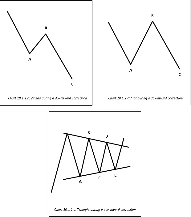
In chart 10.1.1.b, subwave A is composed of 5 waves, subwave B is composed of 3 waves, and subwave C is composed of 5 waves.
In chart 10.1.1.c, subwave A is composed of 3 waves, subwave B is composed of 3 waves, and subwave C is composed of 5 waves.
Finally, in chart 10.1.1.d, each of the five subwaves is composed of 3 waves.
Wave 3
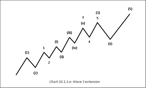
Wave 3 is always an impulse and is never the shortest of the three actionary waves i.e. waves 1, 3, and 5. Because wave 3 is an impulse, it will always be subdivided into 5s, producing an overall count of 5-3-5-3-5. Moreover, one of the three actionary waves is usually extended. In the equity market, it is common for wave 3 to extend. Extension of wave 3 means subwave 3 of wave 3 itself is nearly as long in length and time as are the other four subwaves of wave 3 (see chart below). Also, in the equity market, wave 3 is usually the most vibrant and strongest of all the actionary waves. It is similar to the participation phase that we talked about in Chapter 2: Dow Theory. A major chunk of market participation takes place during this wave.
Wave 4
Wave 4 is a corrective wave and hence, will be comprised of three waves. As a rule, wave 4 cannot enter the price territory of wave 1. Usually, wave 4 alternates with wave 2. What this means is if wave 2 is a zigzag, expect wave 4 to be a flat or a triangle, and if wave 2 is a flat, expect wave 4 to be a zigzag or a triangle. Usually, wave 4 is not as large in magnitude as is wave 2. This has got to do with investors’ sentiment. After the end of wave 1, there is still uncertainty about the direction of the broader trend. However, after the end of the wave 3, the direction of the trend is very clear and as such, corrections are relatively shallow.
Wave 5
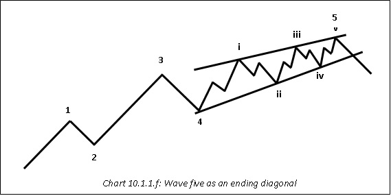
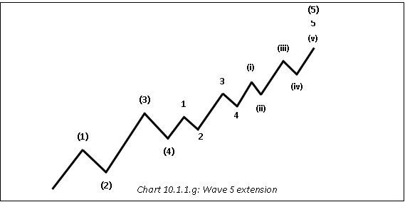
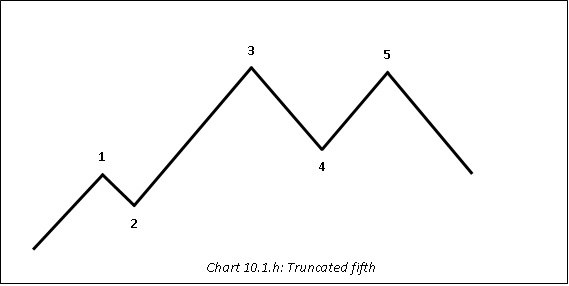
Wave 5 could either be an impulse or an ending diagonal. An ending diagonal is a 5-wave structure but is different from an impulse in that all the wave counts of an ending diagonal will be subdivided into threes i.e. a count of 3-3-3-3-3 instead of 5-3-5-3-5. Also, in case of an ending diagonal, wave 4 can and most frequently does enter the price territory of wave 1. The other two rules mentioned in case of a leading diagonal applies to an ending diagonal as well i.e. subwave 2 never retraces more than 100% of subwave 1 and subwave 3 is never the shortest subwave among subwaves 1, 3, and 5. Chart 10.1.1.f shows how an ending diagonal looks like. Notice that each of the subwaves of wave 5 is composed of 3s instead of a combination of 5s and 3s. Also, as already mentioned earlier, one of the three actionary waves is usually extended. If neither wave 1 nor 3 has extended, expect wave 5 to extend. Extension of wave 5 means subwave 5 of wave 5 itself is nearly as long in length and time as are the other four subwaves of wave 5. This is shown in chart 10.1.1.g. Finally, keep in mind that the fifth wave could also truncate. Truncation means failure of the 5th wave to move beyond the end of wave 3. This usually happens when wave 3 is very strong, causing the move to run out of steam by the time the end of wave 5 approaches. This is shown in chart 10.1.1.h.
Introduction to Harmonic patterns
Developed by Harold McKinley Gartley, harmonic patterns are a group of patterns that are based on various fibonacci ratios. These patterns help a chartist to identify important turning points, enabling him to enter a trade very early. The advantage of using harmonic patterns is that if a chartist is right in his identification of the pattern, he would enter a position right near the price turning point, which in turn would enable him to maximize his profit potential. On the flip side, the disadvantage of using harmonic patterns is that a chartist would be betting against the direction of the trade, and as such remains vulnerable to incur losses in case the prevailing trend continues in its direction. Nonetheless, the advantages of using harmonic patterns outweigh the disadvantages. As we shall see later, the profit potential in case the pattern is correctly identified is extremely rewarding. On the other hand, if the identified pattern does not work as expected, a chartist can still exit the trade very early and thereby limit his losses from aggravating. Keep in mind that harmonic patterns do not help us in projecting price targets or stop losses. For these, other parameters must be used. Another thing to keep in mind is not to jump right near the completion point of the pattern. Wait for the momentum to slow down and price to show some signs of reversal, before deciding to enter the trade.
Harmonic patterns
These are the harmonic patterns that we will be discussing in this section:
-
Bullish and bearish AB=CD
-
Bullish and bearish Gartley
-
Bullish and bearish Butterfly
-
Bullish and bearish Bat
-
Bullish and bearish Crab
-
Bullish and bearish Shark
-
Bullish and bearish Cypher
Bullish and bearish AB=CD
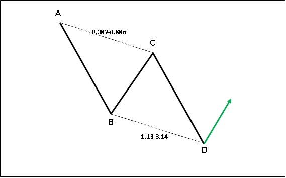
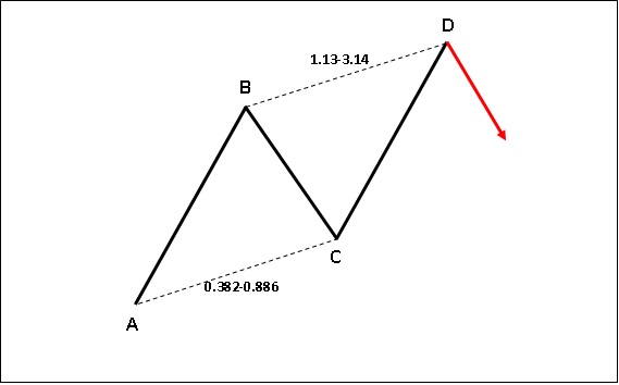
Bullish and bearish AB=CD patterns are patterns in which the AB leg and the CD leg will be equal in magnitude. The idea is to enter a trade near the termination point of the D leg in the opposite direction of the trend. The charts below will make this easier to understand.
Mathematical relationships of the pattern:
-
Leg BC = 0.382-0.886 of leg AB
-
Leg CD = 1.13-3.14 of leg BC
-
Legs AB and CD are equal in magnitude, and as such this pattern is referred to as AB=CD pattern
The idea is to buy at point D in case of a bullish AB=CD pattern and to sell at point D in case of a bearish AB=CD pattern.
Bullish and bearish Gartley
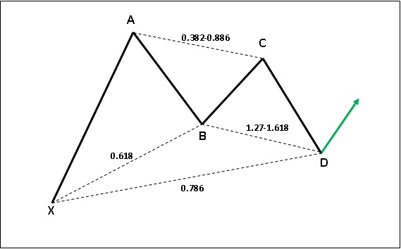
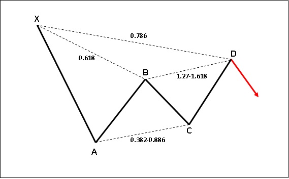
This is one of the most common and widely used harmonic patterns of all. Bullish and bearish Gartley patterns, unlike the AB=CD patterns which include four points, include five points A, B, C, D, and X. They resemble the alphabet M (bullish Gartley) or W (bearish Gartley). The idea is to enter a trade near the termination point of the D leg in the opposite direction of the prevailing trend. The charts below will make this easier to understand.
Mathematical relationships of the pattern:
-
Leg AB = 0.618 of leg XA
-
Leg BC = 0.382-0.886 of leg AB
-
Leg CD = 1.27-1.618 of leg BC
-
Leg AD = 0.786 of leg XA
The idea is to buy at point D in case of a bullish Gartley pattern and to sell at point D in case of a bearish Gartley pattern.
Bullish and bearish Butterfly
Bullish and bearish Butterfly patterns, just like the Gartley patterns, include five points A, B, C, D, and X. They too resemble the alphabet M (Bullish butterfly) or W (Bearish butterfly). However, the ratios of these patterns are quite different as compared to those of the Gartley patterns. The idea is to enter a trade near the termination point of the D leg in the opposite direction of the prevailing trend. The charts below will make this easier to understand.
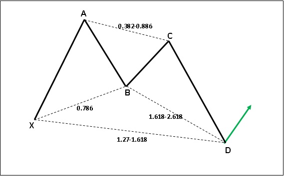
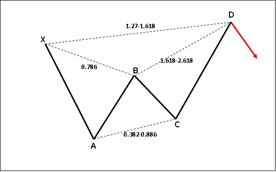
Mathematical relationships of the pattern:
-
Leg AB = 0.786 of leg XA
-
Leg BC = 0.382-0.886 of leg AB
-
Leg CD = 1.618-2.618 of leg BC
-
Leg AD = 1.27-1.618 of leg XA
The idea is to buy at point D in case of a bullish Butterfly pattern and to sell at point D in case of a bearish Butterfly pattern.
Bullish and bearish Bat
Bullish and bearish Bat patterns, just like the Gartley patterns, include five points A, B, C, D, and X. They resemble the alphabet M (bullish Bat) or W (bearish Bat). However, the ratios of these patterns are quite different as compared to those of the Gartley patterns. The idea is to enter a trade near the termination point of the D leg in the opposite direction of the prevailing trend. The charts below will make this easier to understand.
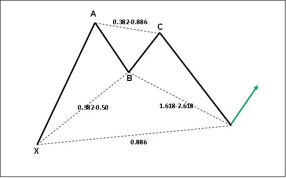
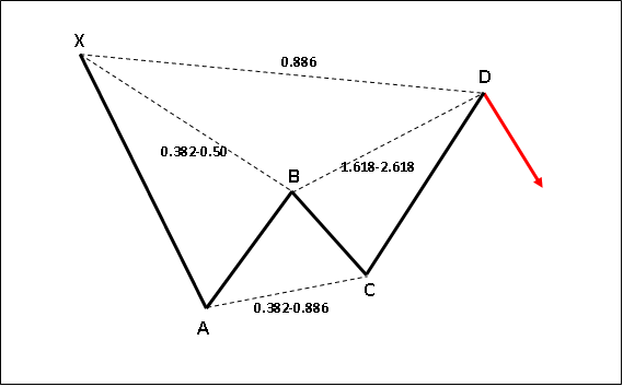
Mathematical relationships of the pattern:
-
Leg AB = 0.382-0.50 of leg XA
-
Leg BC = 0.382-0.886 of leg AB
-
Leg CD = 1.618-2.618 of leg BC
-
Leg AD = 0.886 of leg XA
The idea is to buy at point D in case of a bullish Bat pattern and to sell at point D in case of a bearish Bat pattern.
Bullish and bearish Crab
Bullish and bearish Crab patterns, just like the Gartley patterns, include five points A, B, C, D, and X. They too resemble the alphabet M (Bullish Crab) or W (Bearish Crab). However, the ratios of these patterns are quite different as compared to those of the Gartley patterns. The idea is to enter a trade near the termination point of the D leg in the opposite direction of the prevailing trend. The charts below will make this easier to understand.
Mathematical relationships of the pattern:
-
Leg AB = 0.382-0.618 of leg XA
-
Leg BC = 0.382-0.886 of leg AB
-
Leg CD = 2.24-3.618 of leg BC
-
Leg AD = 1.618 of leg XA
The idea is to buy at point D in case of a bullish Crab pattern and to sell at point D in case of a bearish Crab pattern.
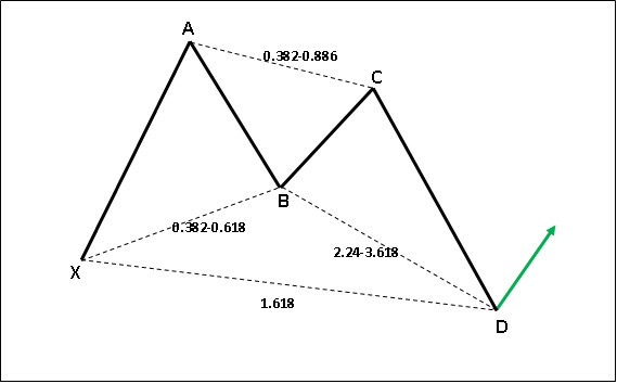
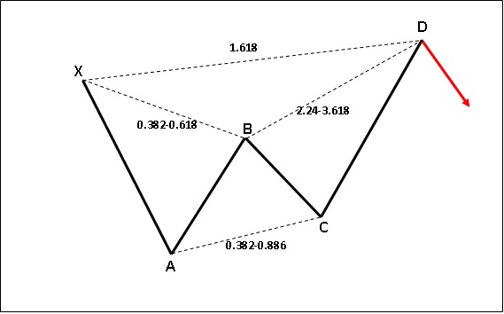
Bullish and bearish Shark
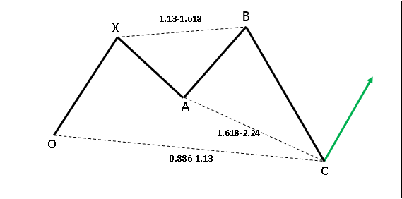
Developed by Scott Carney, bullish and bearish Shark patterns are a little different from the patterns mentioned above. Unlike other patterns which are labelled as X, A, B, C, and D, sharks are labelled as O, X, A, B, and C.The most notable difference of the shark pattern is the BC leg, wherein point B goes beyond point X and point Cusually travels beyond point O.
Mathematical relationships of the pattern:
- Leg AB = 1.13-1.618 of leg XA
- Leg BC = 1.618-2.24 of leg AB
- Leg XC = 0.886-1.13 of leg OX
The idea is to buy at point C in case of a bullish Shark pattern and to sell at point C in case of a bearish Shark pattern.
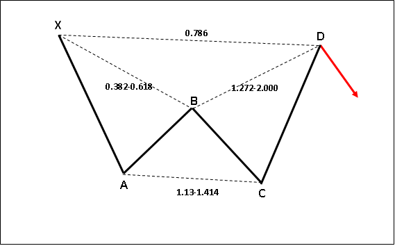
Bullish and bearish Cypher
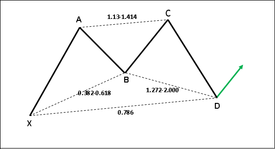
The last harmonic pattern that we would be talking about is the Cypher pattern. This pattern is a little similar to the shark pattern, with the difference being that the last leg is relatively short compared to that seen in the shark pattern.
Mathematical relationships of the pattern:
- Leg AB = 0.382-0.618 of leg XA
- Leg BC = 1.13-1.414 of leg AB
- Leg CD = 1.272-2.000 of leg BC
- Leg AD = 0.786 of leg XA
The idea is to buy at point D in case of a bullish Cypher pattern and to sell at point D in case of a bearish Cypher pattern.
Sample chart of a harmonic pattern
The chart below shows how a harmonic pattern looks like in the real world. One thing to keep in mind is that always keep some leeway when it comes to reversals from the fibonacci ratios. Do not be on the look out for a perfect pattern that reverses exactly from ratios mentioned earlier in this section. Such occurrences are usually rare in the real world. Keep in mind that technical analysis is an art, not a science.
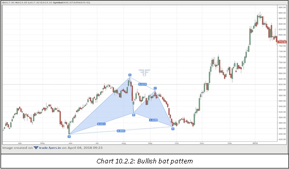
The above chart shows the formation of a bullish bat pattern. After the completion of the D leg, observe how price traded sideways for a few days, suggesting that a bottom could be forming. The emergence of a long bullish candle marked the end of this congestion and led to a sharp rally in the days ahead with increased volume, which further strengthened the validity of the up move.
Introduction to Intermarket Analysis
So far, we have studied how to analyse charts on individual securities. This could be stocks, indices, commodities, currencies, or bonds. We will now turn our attention to intermarket analysis. Intermarket analysis is a branch of technical analysis that involves studying charts across multiple asset classes with the aim of finding how those asset classes are inter-related. These multiple asset classes are studied not only in one market but across different markets around the world in order to better understand not only the domestic relationships between asset classes but also the global relationships between them. It is pivotal to know how one asset class might affect movements in other asset classes, to better position the trades and avoid being caught off guard. For instance, if a chartist wants to trade in a stock of a company that produces crude oil, he would benefit significantly by looking and analysing the chart of crude oil and the dollar and then taking a view in the stock, rather than looking at the chart of the stock in isolation. This is because movement in the stock of a company that produces oil is heavily influenced by movement in crude oil, which in turn is partly influenced by the dollar’s movement. By ignoring the chart of crude oil and the dollar, the chartist would be missing a vital part of the puzzle.
Basically, intermarket analysis involves looking at the correlation between:
-
Bonds
-
Stocks
-
Commodities
-
Currencies
All these four asset classes are linked to each other and movement in one asset has a bearing on other assets also. As an instance, movement in commodities is partly influenced by movement in currencies, especially the dollar. Movement in commodities in turn has an impact on movement in bond prices, which subsequently influence the movement in stocks. Let us understand these relationships in more detail using the example given below.
Commodities are priced in dollar terms. A strengthening dollar puts downward pressure on commodity prices because it makes commodities more expensive to buy for holders of foreign currencies. This in turn reduces demand for commodities. Because inflation is partly influenced by trends in commodity prices, a downward move in commodities reduces inflationary pressures, which in turn puts downward pressure on bond yields and thereby lifts bond prices higher. Lowering of bond yield, on the longer-run, is supportive to equities, because it reduces the cost of borrowing to corporates. Such relationships may not work all the time given that there are various forces at play that impact prices of these four asset classes. Nonetheless, in general, these relationships do exist over the longer time cycle. It is not uncommon for commodities to take cues from the dollar, for bonds to take cues from commodities, and for stocks to take cues from bonds. As such, if there is a change in the trend of one asset class, it becomes extremely important to take note of it as such an action could start influencing other asset classes at some point in time. Intermarket analysis comes into handy more so during market turning points.
Another reason why intermarket analysis is important is it helps the chartist to perform sector rotation analysis i.e. investing or trading in a sector that is strong and avoiding sectors that are weak. Because intermarket analysis helps a chartist to understand the relationships between various asset classes, he can get a better picture of stock sectors. For example, if commodity prices are in an uptrend, it alerts a chartist to look out for buying opportunities in stocks of companies that produce commodities and avoid stocks of companies that react negatively to rising commodity prices. If bond yields are trending in one direction, it alerts a chartist to keep banking, NBFC, real estate, and auto stocks under radar as these are more influenced by trends in interest rates. If the dollar is strengthening against its key counterparts, then it alerts the chartist to keep a watch on the technology and pharma companies, given that these companies derive a big chunk of their revenue from exports. As such, intermarket analysis greatly helps a chartist to find out relationships between various asset classes. Without intermarket analysis, the chartist will be at a disadvantage as he will not be aware of the unfolding relationships between asset classes.
Let us now simplify the relationships between asset classes:
-
There is an inverse correlation between the dollar and commodities. If the dollar goes up, commodities go down, and vice versa. This is because, as stated earlier, rising dollar has a negative impact on demand for commodities as it makes them more expensive to buy.
-
There is a direct correlation between commodities and bond yields. If commodities go up, so do bond yields, and vice versa. This is because, rising commodities put upward pressure on inflation, which in turn puts upward pressure on interest rates and bond yields.
-
Equities and yields usually rise in tandem until the last stage of an economic expansion. This is because strong business and economic conditions more than offset the impact of rising yields. Eventually, rising yields start to exert downward pressure on corporate borrowings and earnings, which in turn drags equities lower.
-
During the last stage of an economic contraction or during the initial stages of an economic expansion, yields and equities may start diverging as rate cuts from central banks exert downward pressure on yields, which in turn eventually ends the slide in equities and starts lifting them higher.
While the correlation between bonds and stocks keep changing depending on the stage of the economic cycle, that between commodities and the dollar usually remain constant. Let us now look at a few charts to understand these correlations better.
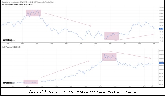
In chart 10.3.a, notice the inverse correlation between the dollar and gold. The dollar made a major top in 2002 and entered a prolonged downtrend over the next several years. The major top in the dollar was then accompanied by a major bottom in gold, which entered a period of sustained up move over the next several years. Also notice that the bottom in the dollar in 2011 was accompanied by a peak in gold during the same. Since then, the dollar has moved higher while gold has moved lower.
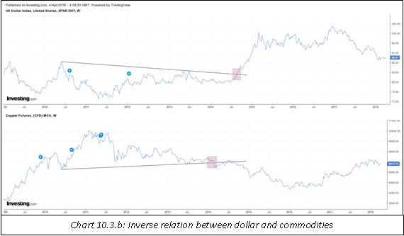
Notice in the above chart how a trendline breakdown in the dollar index was a few weeks later accompanied by a trendline breakout in copper prices.
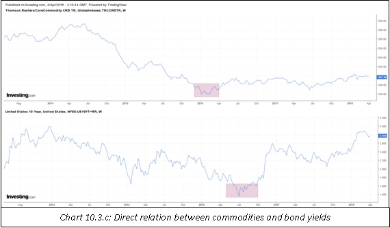
Notice in the above chart the positive correlation between commodities and bond yields. See that a bottom in commodities index was a few weeks later followed by a bottom in the U.S. benchmark yield.
Introduction to Relative Strength Analysis
The final subject that we will be covering in this chapter is relative strength analysis. Relative strength analysis is a part of technical analysis that deals in identifying relative strength or weakness among asset classes, by comparing the chart of one security with that of another security. The objective of relative strength analysis is to identify strong as well as weak candidates so as to trade or invest in those that are showing strength rather than those that are not showing as much strength on a relative basis. The relative strength ratio is calculated by dividing the price of one asset with the price of another asset. This is expressed below:
The ratio is plotted in the form of a line on the chart and its movement is observed in order to take cues about the relative strength of one security in relation to that of another security. If the ratio line is rising, it means that the security in the numerator is outperforming the security in the denominator; and if the ratio line is falling, it means that the security in the numerator is underperforming the security in the denominator. Keep in mind that the ratio line does not tell the chartist anything about the direction in which the price of the two securities being compared is moving. It just informs a chartist whether one security is outperforming or underperforming the other security with which it is being compared. For instance, if the ratio line is going up, it does not necessarily mean the security that is in the numerator of the ratio is also going up. It just means that the security in the numerator is outperforming the security in the denominator. In order to find out about the direction of the price, the chartist has to look at the price chart of the individual security.
There are various ways in which the relative strength ratio can be used. For instance, a chartist can compare one stock with another stock in order to find out which of the two stocks is showing strength. He can compare one stock with a sector or an index in order to find out whether the stock is performing better than the sector or the index in which it is listed. He can compare a commodity with the index in which the commodity is listed to find out whether the commodity is outperforming the index or not. He can even compare the price of one mutual fund with the index or another mutual fund to find out which of the two is performing better. Moreover, a chartist can also use different asset classes within the economy to find out about the state of the economic activity. For instance, a chartist can compare the ratio of crude oil to bond price to find out whether or not there are inflationary pressures. As we can see, the list of what assets to include in the numerator and what assets to include in the denominator is quite endless.
As we have already spoken, the objective of relative strength analysis is to find out assets that are portraying relative strength so as to trade or invest in those rather than in those which are not showing relative strength. Relative strength analysis also comes into handy when a chartist wants to trade in either one of two assets, say A or B, but is not sure in which of the two to put money in because the assets are in an uptrend. In such a case, he can plot the relative strength ratio and invest or trade in the asset that is showing greater relative strength.
Relative strength analysis is usually applied to closing prices of securities. A chartist can choose any time frame that he wishes to, right from the smallest time frame such as minute chart to the largest time frame such as quarterly or monthly chart. Generally speaking, it is common to use relative strength on intraday charts when the time frame of analysis is short-term, daily or weekly charts when the time frame of analysis is medium-term, and monthly or quarterly charts when the time frame of analysis is long-term. Last but not the least, a chartist can also use various tools discussed in earlier chapters on a relative strength chart. For instance, a chartist can use trendlines, channels, fibonacci retracement and extension, Andrew’s pitchfork, moving averages, technical indicators, price patterns etc. All these tools apply as well on the relative strength chart as they would on the chart of a single security.
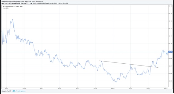
The above chart shows the relative strength chart between Reliance (numerator) and Nifty (denominator). Notice that until the start of 2015, Reliance grossly underperformed Nifty. However, observe that post this period, Reliance has started to outperform the Nifty, suggesting the chartist that between the two, Reliance is a better trade or investment at the present juncture. Also notice the breakout of an inverse H&S pattern and how well this pattern worked once price broke out of it.
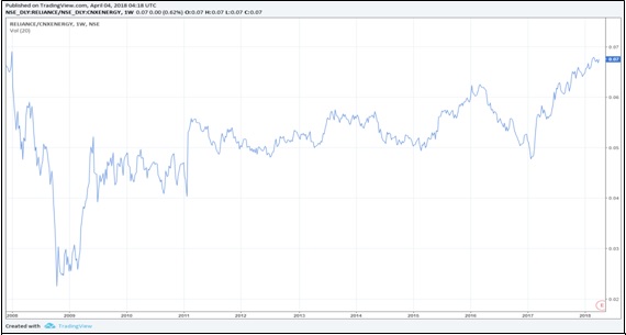
The above chart shows the relative strength between Reliance (numerator) and Nifty Energy index (denominator). While Reliance has started outperforming Nifty since 2015, notice that it has been outperforming the Energy index since 2009. This suggests at strength in the underlying trend of this stock as compared to the indices in which it is listed.
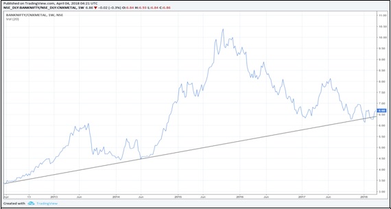
The above chart has Bank Nifty in the numerator and Nifty Metal index in the denominator. Observe that the banking index has been outperforming the metal index, as it has been trading above a rising trend line, suggesting at strength. That said, also note that while banking index has been outperforming the metal index over the past 5 years, it has been underperforming the metal index since 2015. So, for a long-term trader, the banking index might look more attractive given its outperformance over the past several years; while for a short-term or a medium-term trader, the metal index might look more attractive given its outperformance over the past couple of years.
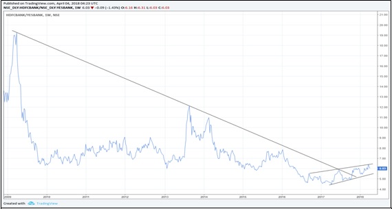
The above chart has HDFC bank in the numerator and Yes bank in the denominator. Notice that HDFC bank has been underperforming Yes bank since 2009, despite both the banks generally trending higher during this time period. This means that on a relative basis, Yes bank has been outperforming HDFC bank, suggesting that a long-term trader would have benefited more by investing in the former than in the latter.
Summary
-
In Elliott parlance, there are two types of waves: impulse and corrective. Impulse wave is a 5-wave structure that moves in the direction of the trend of one larger degree, while corrective wave is a 3-wave structure or a combination of a 3-wave structure that moves against the direction of the trend of one larger degree.
-
The three major rules of wave counts are: wave 2 never retraces more than 100% of wave 1, wave 3 is never the shortest of the three impulse waves in a 5-wave structure, and Wave 4 never enters the price territory of wave 1.
-
Wave 1 could be either an impulse (i.e. a 5-3-5-3-5 count) or a leading diagonal. A leading diagonal is a 5-wave structure but is different from an impulse in that all the wave counts of a leading diagonal will be subdivided into threes i.e. a count of 3-3-3-3-3 instead of 5-3-5-3-5.
-
Wave 2 is a corrective wave and hence, will be comprised of three waves. Wave two could be a zigzag, a flat, or in rare cases even a triangle.
-
A zigzag is a sharp correction whose wave counts are subdivided into a 5-3-5 structure, with subwave B usually falling well short of reaching the start of subwave A and subwave C usually moving well beyond the end of subwave A.
-
A flat is a sideways correction whose wave counts would be subdivided into a 3-3-5 structure, with subwave B terminating near the start of subwave A and subwave C terminating near the end of subwave A.
-
A triangle is a sideways correction whose wave counts would be subdivided into a 3-3-3-3-3 structure. Note that unlike a zigzag or a flat which are composed of three waves, a triangle is composed of five waves.
-
Wave 3 is always an impulse. In the equity market, it is common for wave 3 to extend. Extension of wave 3 means subwave 3 of wave 3 itself is nearly as long in length and time as are the other four subwaves of wave 3.
-
Wave 4 is a corrective wave and hence, will be comprised of three waves. Usually, wave 4 alternates with wave 2. What this means is if wave 2 is a zigzag, expect wave 4 to be a flat or a triangle, and if wave 2 is a flat, expect wave 4 to be a zigzag or a triangle.
-
Wave 5 could either be an impulse or an ending diagonal. An ending diagonal is a 5-wave structure but is different from an impulse in that all the wave counts of an ending diagonal will be subdivided into threes i.e. a count of 3-3-3-3-3 instead of 5-3-5-3-5.
-
Harmonic patterns are a group of patterns that are based on various fibonacci ratios. These patterns help a chartist to identify important turning points, enabling him to enter a trade very early.
-
The five major harmonic patterns are: AB=CD, Gartley, Butterfly, Bat, and Crab.
-
Intermarket analysis is a branch of technical analysis that involves studying charts across multiple asset classes with the aim of finding how those asset classes are inter-related.
-
Basically, intermarket analysis involves looking at the correlation between bonds, stocks, commodities, and currencies. All these four asset classes are linked to each other and movement in one asset has a bearing on other assets.
-
There is an inverse correlation between the dollar and commodities. If the dollar goes up, commodities go down, and vice versa. This is because, as stated earlier, rising dollar has a negative impact on demand for commodities as it makes them more expensive to buy.
-
There is a direct correlation between commodities and bond yields. If commodities go up, so do bond yields, and vice versa. This is because, rising commodities put upward pressure on inflation, which in turn puts upward pressure on interest rates and bond yields.
-
Equities and yields usually rise in tandem until the last stage of an economic expansion. This is because strong business and economic conditions more than offset the impact of rising yields. Eventually, rising yields start to exert downward pressure on corporate borrowings and earnings, which in turn drags equities lower.
-
During the last stage of an economic contraction or during the initial stages of an economic expansion, yields and equities may start diverging as rate cuts from central banks exert downward pressure on yields, which in turn eventually ends the slide in equities and starts lifting them higher.
-
Relative strength analysis is a part of technical analysis that deals in identifying relative strength or weakness among asset classes, by comparing the chart of one security with that of another security.
-
The objective of relative strength analysis is to identify strong as well as weak candidates so as to trade or invest in those that are showing strength rather than those that are not showing as much strength on a relative basis.
-
Relative strength chart can be used to compare one stock with the other, one stock with an index, commodity with an index, one mutual fund with another, etc. The list is endless. Essentially, a chartist can compare any one security with any other security.
Next Chapter
Comments & Discussions in
FYERS Community
.png)
.jpg)
Yajman commented on March 13th, 2019 at 3:39 PM
Very detailed
tejas commented on June 13th, 2019 at 3:03 PM
Thx.
MAYANK commented on April 3rd, 2019 at 10:48 PM
when to buy/sell according to Elliot wave theory?
tejas commented on April 4th, 2019 at 7:40 PM
There are various points at which you could buy & sell. That's not something that is clearly defined in the Elliot wave theory. That depends on your trading strategy.
Sundeep commented on May 14th, 2019 at 10:28 AM
Sir I have been reading your write ups continually and it's been a great learning. Could you recommend 5 books that you think would greatly help the traders? Thank you.
tejas commented on June 13th, 2019 at 3:03 PM
Hey Sundeep, There are plenty of good books. You can refer to the book reviews I've written on Brainstorm. However, if you want to learn in a systematic manner, I strongly recommend you stick to School Of Stocks.
Sangeeta T commented on August 16th, 2019 at 1:29 PM
Hi Tejas,
Really good content and very well presented with brief concepts.
I am planning to become a professional trader meanwhile, I have started learning Technical Analysis for intraday trading. What else do I need to read or refer to or learn before I enter into intraday trading? I could not find anyone who could answer this for me, hence consulting you.
tejas commented on August 20th, 2019 at 1:35 AM
Just make sure to read all our modules and chapters on School of Stocks. We aim to do our best to educate people on trading in the most comprehensive manner. In the meantime, you could read some books. I have written a couple of book reviews on our blog, Brainstorm. Check that out.
tejas commented on August 20th, 2019 at 1:33 AM
Hi, Thanks! To become a professional trader you will need to spend enough time trading profitably across different market cycles. Anyone can make money for a short while. But if you have done it in different kinds of markets over a period of time consistently, then you could perhaps consider it. A word of Advice: Do not quite your full-time job for trading unless you're in a position to support your expenses for at least 6 months without breaking a sweat.
SUDHAKAR commented on September 10th, 2019 at 8:46 AM
Thank you for sharing very useful lessons.
tejas commented on September 17th, 2019 at 8:48 PM
:-)
Ganesh Pawar commented on April 10th, 2020 at 8:13 PM
Very good technical analysis
Shriram commented on April 11th, 2020 at 8:38 AM
Hi Ganesh, thank you for your valuable feedback
Neeta Rathore commented on April 10th, 2020 at 9:11 PM
I am a Zerodha account holder. And do intraday and swing trading. I found the contents in School of Stocks are extremely informatively and useful. I find it difficult to read on computer screen, is it possible to download contents for printing and using them for revision and reference time to time.
Shriram commented on April 11th, 2020 at 8:43 AM
Hi Neeta, thank your for your valuable feedback. We have kept the content this way to keep it more interactive.
KRISANU KAR commented on April 19th, 2020 at 11:52 AM
Respected Mr. Tejas Khoday ,
Thank you for a great endeavour on learning for various methods . We need to learn more on bullish bar and price patterns for trading. I am a Fyers client and needs more technical support on charts .
Shriram commented on April 19th, 2020 at 7:59 PM
Hi Krisanu, thank you for the feedback! We have covered Bar patterns and Price patterns exhaustively in Chapter 9 and Chapter 5, respectively. We suggest you go through these chapters to gain an in depth understanding on Bar and Price patterns.
David Yishai commented on May 2nd, 2020 at 9:59 PM
Why would you made a PDF or an app like Zerodha Varsity?I read both but I am pretty much more impressed with your content.If you do that it will be very helpful for traders as well as Fyers team.
Shriram commented on May 3rd, 2020 at 6:21 PM
Hi David, thank you for your valuable feedback. We will surely consider coming out with an app in the future that would include all the modules from the School of Stocks.
darshan commented on May 28th, 2020 at 11:35 AM
i read all zerodha varsity modual but fyers modual are much better then them but one requsest can you make all this in pdf formate so we can read that ofline also zerodha varsity give this feature aslso '
Shriram commented on May 28th, 2020 at 9:04 PM
Hi Darshan, thank you for such a valuable feedback! We shall consider this going forward.
Goutham commented on August 26th, 2020 at 11:40 PM
Great content. I have recently opened an account with Fyers. I would like to know if there is a Relative Strength indicator( not the traditional RSI) in either Fyers Web or Fyers One. Thank you .
Abhishek Chinchalkar commented on August 27th, 2020 at 6:00 PM
Hi Goutham, thank you for the feedback! By Relative Strength Indicator, do you mean Ratio charts?