Having talked in detail about Intermarket Analysis, we now move to the second part of this module -Sector rotation. In this chapter, we will talk about a versatile tool that can be usedwhen making decisions relating to trading and investing. This tool helps in identifying the relative strength between one instrument and another.Knowing the relative strength facilitates one to trade or invest smartly, by reducing exposure to assets that are underperforming their benchmarks and increasing exposure to assets that are outperforming their benchmarks.
Ratio Analysis basics
Ratio Analysis, also known as Relative Strength Analysis, involves a comparison between two instruments to identify their relative performance. It is calculated by dividing the price of one instrument with that of the other. A ratio chart (aka relative strength chart) is plotted on a continuous, real-time basis and is usually done so in the form of a line chart. Usually, the numerator in the ratio consists of an instrument whose performance you want to compare with the other. For instance, if you want to see how Reliance Industries is faring vis-à-vis the Nifty, you will place Reliance in the numerator and Nifty in the denominator, and then plot a continuous, real-time chart. If the ratio line is rising, it means the numerator is outperforming the denominator; and if the ratio line is falling, it means the numerator is underperforming the denominator. Meanwhile, an interesting thing about ratio analysis is that on a ratio chart, you could use all the tools that you use when analysing absolute price charts. For instance, on the ratio chart, you could use trendlines and channel lines, fibonacci retracement and extension, price patterns, moving averages, technical indicators, harmonics etc.
Keep in mind that Ratio charts do not say anything about the absolute direction of prices, but just the relative direction. For instance, let us take the earlier example of Reliance and Nifty. If the ratio line of Reliance to Nifty is rising, it doesn’t necessarily mean Reliance is rising or Nifty is falling, but just that Reliance is outperforming Nifty, regardless of the direction of the two. In order to know the absolute direction of prices, one has to refer back to the absolute price charts of individual instruments.
A rising ratio line could imply any one of the following:
-
Numerator is rising, while denominator is falling
-
Numerator is rising, while denominator is unchanged
-
Both are rising, but numerator is rising more than the denominator
-
Numerator is unchanged, while denominator is falling
-
Both are falling, but numerator is falling less than the denominator
Similarly, a falling ratio line could imply one of the following:
-
Numerator is falling, while denominator is rising
-
Numerator is falling, while denominator is unchanged
-
Both are falling, but numerator is falling more than the denominator
-
Numerator is unchanged, while denominator is rising
-
Both are rising, but numerator is rising less than the denominator
There are various ways in which the numerator and the denominator can be chosen for performing a relative strength analysis. Below mentioned are some of the most followed ways of measuring relative strength between two instruments:
-
Stock vs. Stock (example, Infosys vs. TCS)
-
Stock vs. Sector (example, Infosys vs. IT Sector)
-
Stock vs. Market (example, Reliance vs. Nifty)
-
Sector vs. Sector (example, Banking vs. IT)
-
Sector vs. Market (example, Pharma vs. Nifty)
-
Market vs. Market (example, Nifty vs S&P500)
-
Asset vs. Asset (Gold vs. Nifty)
In the next chapter, we shall talk about how to use each of the above mentioned ratiocharts in great detail, so as to get a holistic view of the overall markets. In this chapter however, let us just focus on one of the ratiosdescribed above to get a broad sense of how to analyse ratio charts. Let us talk about the ratio chart of stock versus stock. Keep in mind that the manner in which the ratio chart of stock versus stock is analysed apply, in general, to each of the other six ratio charts mentioned above.
Ratio analysis of Stocks vs. Stocks
One would perform a ratio analysis on one stock vis-à-vis another to analyse which of the two is performing better. If the ratio line is rising, it implies the stock in the numerator is outperforming the stock in the denominator, and vice versa. This type of analysis is typically used either when:
-
A trader/investor wants to buy the security that is outperforming and sometimes even simultaneously sell the security that is underperforming, or
-
A trader/investor wants to narrow down on the number of stocks that he/she is willing to buy
In case of the first (using ratio chart to buy one and sell the other), there is not much of a need to see the absolute charts of the two securities. The trader/investor could just buy the stock that is outperforming and simultaneously sell the other. He would hold on to this trade until there is evidence that the ratio is reversing.
However, in case of the second (using ratio chart to buy only one of the twostocks without selling the other), the trader/investor must look at the absolute charts as well, to ensure that the one he/she is buying is in an uptrend and not in a downtrend (Recollect from the Technical Analysis module that you would want to trade/invest in the direction of the trend – buying a security that is in an uptrend, and vice versa).Let us try to understand this using an example.
Example 1:
Buying the outperformer and simultaneously selling the other
The above is the long term ratio chart of HDFC Bank to SBI (Numerator = HDFC Bank and Denominator = SBI). Both are stocks that belong to the banking space, with SBI a part of PSU banks and HDFC a part of private banks. It can be seen that the ratio line broke out of a channel in mid-2011 after almost four years of consolidation, suggesting that HDFC Bank is likely to outperform SBI as long as the ratio remains above the channel. Following this breakout, a trader could have bought HDFC Bank and simultaneously shorted SBI. Observe that post the breakout in May 2011, the ratio more than doubled inside the next three years.Also observe that the ratio has been in a strong uptrend since late-2014. A trend line is drawn connecting the two lows of 2014 and 2016 and then a parallel line to the main trend line is drawn from the high of 2016. One way atrader could have traded this set up is by buying HDFC Bank and simultaneously shorting SBI when the ratio bounced off the trend line on the third occasion (marked using the green arrow) and then exiting these positions as the ratio started to decline off the parallel line (marked using the third red arrow). A risky trader could also have considered shorting HDFC Bank and simultaneously buying SBI on the two occasions when the ratio turned down from the parallel line (marked using the red arrows) and then exiting these positions near the trend line support. This type of trading, however, is more suited to an active trader/investor rather than a passive trader/investor. Notice that the ratio broke above the parallel line in 2020 and later took support at that parallel line, indicating at strong performance of HDFC Bank relative to SBI.
Only buying the security that is outperforming without selling the other
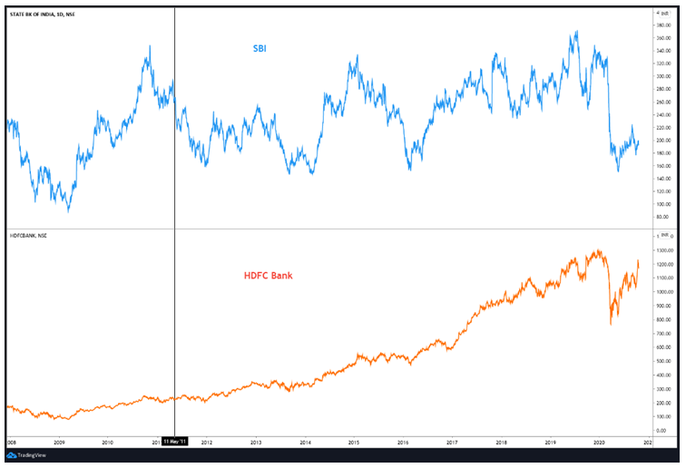
Keep in mind that ratio charts tell nothing about the absolute trend of individual stocks, but just their relative trend. Let us again take the above example of HDFC Bank/SBI ratio chart. As we saw above, the ratio has been in anuptrend since the consolidation breakout in 2011. However, just by looking at the ratio chart, you cannot say anything about the absolute trends of each of the two stocks. A rising ratio line does not necessarily mean that the numerator is rising, but just that it is outperforming the denominator. A ratio line canrise even whenboth the stocks in question are falling. As a result, it is critical to have a look at the individual stock charts in question, when the objective of the trader/investor is to only buy the stock that is outperforming, without simultaneously selling the other. Continuing with the above example, let us look at the individual chart of SBI and HDFC Bank.
Looking at the absolute charts of the two, the vertical black line marked above displays the period when the ratio broke out of consolidation. Since then, see that HDFC Bank has been in a strong uptrend, while SBI has been broadly consolidating. As the ratio and HDFC Bank haveboth been in an uptrend, it tells that if the trader/investor wants to buy just one of the two stocks, he or she should be buying HDFC Bank as long as there is no evidence of a reversal in the ratio.
Example 2:
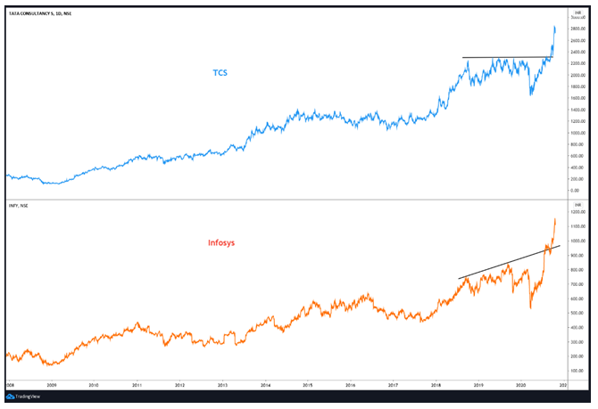
Let us now switch from the banking space to the Technology space. The chart below is the absolute chart of TCS and Infosys. It can be seen from the chart that both the stocks have been in a strong uptrend since 2008.It can also be seen that both Infosys and TCS have been in a powerful uptrend over the last few weeks.Let us now focus on the current scenario rather than the historical scenario.
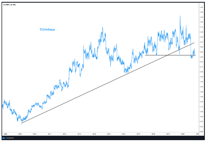
If a trader or an investor just wanted to buy one of the two stocks, what should he or she be buying? It seems difficult to take a decision just on the basis of absolute charts of the two stocks. So, in order to decide on this, let us look at what the ratio chart of the two has to say. Let us keep TCS in the numerator and Infosys in the denominator. The chart below shows the ratio chart of the two stocks.
Above, it can be seen that the ratio line was in an uptrend between 2009 and 2020 beforebreaking below a 10-year rising trendline earlier this year. What this essentially tells is that as long as the ratio line is trading below the trendline, TCS could underperform Infosys. So, if the trader/investor wants to buy only one of the two stocks, then based on this ratio chart, he or she should prefer Infosys over TCS until the time the ratio line is below the rising trendline.
Example 3:
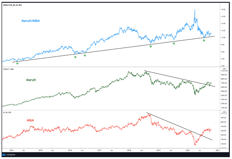
The above chart is the ratio chart of Maruti to Mahindra and Mahindra (M&M). Both are stocks that belong to the 4-wheeler space. Notice in the middle and the bottom panel that both Maruti and M&M broke above their respective falling resistance lines. This indicates at price strength. However, by just looking at the absolute chart, it is difficult to say which of the two would perform better. The top panel compares the ratio of the two (Maruti is in numerator and M&M is in denominator). From March 2020 to July 2020, M&M strongly outperformed Maruti, as can be seen by a steep decline in the ratio. However, the ratio line has bounced off an important trend line support. I call this trend line important because it has been unbroken since 2014 and has also been tested several times. The bounce off it suggests that Maruticould now start outperforming M&M as long as the trendline support remains intact. So, while the absolute chart of the individual stocks both look bullish, the ratio chart suggests that Maruti could outperform M&M.
This is how one can effectively combine absolute charts of two stocks with the ratio chart to analyse the relative performance. Needless to say, all the charts that are presented above are for the purpose of explaining the concept of relative strength only and should not be construed as a trading or investing recommendation.
As stated earlier, the objective of this chapter was to only introduce and discuss the basics of Ratio Analysis. In the next chapter, we shall extensively talk about how to use Ratio analysis charts, so as to get a holistic view of the overall markets.
Let us now conclude this chapter by highlighting the key learnings:
-
Ratio Analysis, also known as Relative Strength Analysis, involves a comparison between two instruments to identify their relative performance
-
It is calculated by dividing the price of one instrument with that of the other. Usually, the numerator consists of an instrument whose performance you want to compare with the other
-
If the ratio line is rising, it means the numerator is outperforming the denominator; and if the ratio line is falling, it means the numerator is underperforming the denominator
-
An interesting thing about ratio analysis is that on a ratio chart, you could use all the technical tools that you would use when analysing absolute price charts, such as trendlines, fibonacci, moving averages, technical indicators, harmonic patterns etc.
-
Keep in mind that Ratio charts do not say anything about the absolute direction of price, but just the relative direction
-
To check the absolute direction of price, one has to refer back to the absolute price charts of individual instruments
-
When using ratio analysis, one could choose to buy the outperforming stock and simultaneously sell the underperforming stock. In this case, there is not much of a need to see the absolute charts of the two stocks
-
Alternatively, one could also choose to buy only the outperforming stock without selling the other stock. In this case, one must look at the absolute charts as well, to ensure that the stock he/she is buying is in an uptrend and not in a downtrend
-
Preferably, when doing relative strength analysis between two stocks, ensure that the two stocks belong to the same sector, like the ones shown in the charts above


