Now that we have a broad idea of what Relative Strength Analysis (aka Ratio Analysis) is, let us take our understanding one step ahead and talk about the practical application of Ratio Analysis. In this chapter, we shall focus on how one could use the Top Down Approach technically. As the name suggests, the objective of this approach of trading is to scan from the top to the bottom so as to find out the strongest markets/sectors and the strongest stocks within those markets/sectors. We shall talk in detail about this over the next two chapters.
The Top Down Approach
The Top Down approach is a versatile method of stock selection. As you might have guessed from the name, the Top Down approach proceeds from the top and drills all the way down to the bottom. It is akin to taking an eagle’s view from the top. The TopDown approach is mostly used fundamentally, wherein the overall state of the economy is identified first, and then based on that, appropriate sectors and stocks are chosen. That said, the Top Down approach can also be used Technically, which we shall do over the course of this chapter.
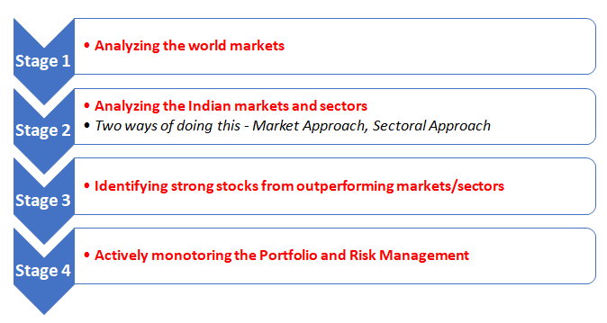
Broadly speaking, the Top Down Approach using charts can be split into four stages as follows:
Stage 1: Analyzing Global Market trends
In the Top Down approach, the trader first starts by analysing the absolute charts of each of the four tradable asset classes i.e., stocks, commodities, currencies, and bonds. If you have read the previous chapters in this module, you will know that the trend of each of these asset classes signal a lot about the state of the economy and market sentiment. For instance, periods during which stocks, commodities, and bond yields are all rising simultaneously typically coincide with strengthening economic conditions, and vice versa. Meanwhile, movements in the Dollar Index (DXY) and the CBOE Volatility Index (VIX) tell a lot about the prevailing risk sentiment. Typically, a strengthening DXY and a rising VIX coincides with risk aversion, and vice versa. Furthermore, within asset classes too, the performance of one vis-à-vis the other can indicate a lot. For instance, periods when copper or crude oil is outperforming gold or periods when commodity currencies are outperforming other currencies or periods when more capital is flowing into emerging markets than into developed markets typically coincide with a strengthening global economy, and vice versa. In short, by looking at the price trends of various assets, you can gain strong insights about the overall economic and market conditions. Hence, before trading, always get into the habit of tracking the price trends of various asset classes.
One of my favourite combination is to look at the monthly, weekly, and daily individual charts of the following instruments:
-
Nifty 50 index
-
S&P 500 index
-
DXY index
-
US 10y bond yield
-
Gold
-
Copper
-
Crude oil
-
VIX
The monthly, weekly, and daily time frame chart would tell the larger-term, medium-term, and shorter-term trends of each of these asset classes. If you are a short-term trader, you could skip the monthly and weekly time frame and instead focus on the daily and intraday time frame.
These individual charts would provide information about global market conditions and risk sentiment. However, when comparing between two securities, absolute charts will not provide much information about the relative performance, especially when they are moving in the same direction. That is where ratio charts come into the picture. Besides providing information about whether one security is outperforming or underperforming the other, ratio charts provide further insights about the state of the market and the level of risk appetite. As such, after looking at the individual charts, one needs to look at the daily ratio charts as well.Some key ratio charts that are worth tracking are:
-
S&P 500 index to GSCI Commodity index
-
MSCI Emerging Market index to S&P 500 index
-
Gold to Copper
You could scan other macro-ratio charts as well, depending on your preference and expertise. The point is that knowing the trajectory of each of these macro ratios can help considerably in selecting the right and appropriate local markets/sectors and stocks. We will talk about each of these in more detail going forward.
Stage 2: Drilling down to Indian markets and sectors
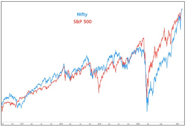
As you saw in stage 1, most of the analysis revolved around the global markets. You may ask, why to focus on global markets when we are trading in Indian stocks. Well, the answer is because Indian markets are tightly linked to the global markets and tend to move very much in sync with them (see the chart below). Hence, it is extremely critical to keep a track of developments across the world, most notably the US.
After scanning the individual and ratio charts of major global asset classes, the second stage is to drill down to the Indian markets and sectors. There are two ways in which this can be done.
The first way (I call this the market approach) is to compare the ratio charts of broader market indices with a largecap index (such as Nifty or Sensex). For example, one could compare the ratio chart of:
-
Nifty Midcap 100 to Nifty 50
-
Nifty Smallcap 100 to Nifty 50
-
Nifty Midcap 100 to Smallcap 100
Doing so enables the trader to gauge how the broader markets are faring relative to largecaps. If they are outperforming largecaps, it informs the trader to allocate a greater portion of their funds to stocks from the broader markets. Conversely, if they are underperforming largecaps, it tells the trader to allocate a greater portion of their funds to stocks from the largecap space.
The second way (I call this the sector approach) is to compare the ratio charts of sectoral indices with a largecap index. Below mentioned are some of the sectoral indices listed on the NSE:
-
Bank
-
Auto
-
Financial Services
-
FMCG
-
Information Technology
-
Media
-
Metal
-
Pharma
-
PSU Bank
-
Private Bank
-
Realty
A trader needs to compare each sectoral index with the Nifty 50 index. Doing so allows one to identify which sectors are performing the best relative to the markets and which are performing the worst. Remember, the idea is to deploy capital in the strongest possible sectors.
As you can see, under the 1st approach, you would look at the broader markets (midcaps and smallcaps), compare them with a benchmark index (Nifty), and accordingly decide the capital allocation among largecaps, midcaps, and smallcaps. In other words, you will create positions not on the basis of strongest market sectors, but rather on the basis of the market index showing the greatest strength, both absolute and relative. On the other hand, under the 2nd approach, you would look at the sectoral indices, compare them with a benchmark index, and accordingly decide the capital allocation across sectors.
Irrespective of which of the two ways is chosen, it goes without saying that besides looking at the ratio charts, one must also look at the absolute charts of the broader markets/sectoral indices. This is because while the ratio charts tell a lot about relative performance, they tell nothing about absolute performance. While deploying capital, just knowing the relative direction would not suffice. One must know the absolute direction as well. For example, let us assume that by looking at the ratio chart, we find out that broader markets are outperforming largecaps. However, as we said in the previous chapter, this outperformance can happen even at a time when markets in general are declining. But would it make sense to deploy capital in a falling market? Probably not. Hence, it is critical to know about the direction of the absolute trend as well and not just the relative trend.
Stage 3: Stock Selection from outperforming Markets or Sectors
After getting a holistic view of the overall markets (stocks, commodities, currencies, and bonds) and then identifying the markets or sectors that are looking the most promising, the third stage in the Top Down approach is stock identification and selection. Again, the idea is to select stocks from markets or sectors that you feel would perform the best going forward. But of course, as the saying goes, it is not a good idea to keep all your eggs in one basket. That is, one should not select only one market/sector that is performing the best and deploy the entire capital into that one market/sector. Instead, a trader should diversify holdings across a few other markets/sectors that are showing good absolute as well as relative strength. One must also deploy a certain percent of the overall capital into stocks from sectors that are considered defensive, as doing so can offer cushion during periods of heightened volatility. All these would reduce exposure to any unexpected market/sector-specific risks.
Even within markets/sectors that are showing strong absolute as well as relative strength, not all stocks will be performing equally well. There will be some that are outperforming their respective markets/sectors, some that are underperforming, and some that are performing at par. Hence, within markets/sectors as well, further filtering is needed. The trader must look at the absolute chart of each stock as well as the relative chart of each stock versus the market/sector of which it is a part of, and then deploy funds into only those stocks that are not only in an uptrend but are also outperforming their respective market/sector.
Stage 4: Monitoring the portfolio and ensuring proper risk management
The Top Down approach does not end once each of the above three stages are complete and a portfolio of stocks has been established. Once the trader has bought the most promising stocks from the most promising markets/sectors, only half of the job is complete. The other half of the job is to regularly monitor the overall markets (restarting from Stage 1 to 3) as well as ensure that right risk management measures are in place to protect the capital deployed. This is a process that should continue forever. If there are changes in market conditions, the trader will have to make necessary adjustments in his/her portfolio of stocks to reflect those changes. For instance, if a trader observes that the strongest market/sector is losing momentum and market leadership is shifting to some other market/sector, he or she may need to make necessary adjustments to his/her portfolio to reflect those changes. This is a part of actively managing the portfolio.
Before concluding this chapter, let us summarize the four stages of Top Down Approach, using the Technical way:
In the next chapter, we will put to practice what we have studied in this chapter. That is, we will talk about the real world application of the Top Down Approach using the Technical Way.


