.png)
So far, we have understood the correlation between dollar and commodities and that between commodities and bonds. In this chapter, we will explain the correlation between stocks and bonds and the role interest rates play in impacting stock prices. It is important to understand how the two correlateto each other and keep a track of how that correlation is evolving over time.Often, change in the direction of bonds can influence the direction of stocksas well.
Correlation between interest rates and stocks
Interest rates have a bearing on the price of a stock. Generally, there is an inverse correlation between the two. As interest rates rise, the cost of borrowing increases. When the cost of borrowing increases, not only will companies have to pay higher interest rates when taking on new loans but will also have to pay higher interest rates on existing loans (assuming the interest rates were variable). This has the potential to reduce the quantum of money that companies borrow from banks. Furthermore, if interest rates increase, borrowing money by way of issuing corporate bonds or other fixed income instruments will also become expensive, as investors would seek out for higher coupons because of the increase in interest rates. As a result, as the cost of borrowing increases, all else equal, the profitability of a company reduces due to the higher interest costs, which subsequently hurts the price of the stock. Similarly, as interest rates decline, the cost of borrowing reduces. And as the cost of borrowing reduces, all else equal, the profitability of a company would increase because of lower interest costs, which subsequently would benefit the price of a stock.
A stock index, such as the Dow Jones Industrial Average or the S&P 500, is an index that comprises of various stocks from different sectors. As changes in interest rates have a bearing on stocks in general, changes in interest rates affect the stock index as well. Generally, just like in case of an individual stock, there is an inverse correlation between interest rates and a stock index too.
The above chart is a long-term chart showing the correlation between the Dow Jones Industrial Average (DJIA) and the Effective Federal Funds rate, which is the proxy for interest rates in the US. It can be seen that from mid-1960s to early-1980s, interest rates in the US trended higher because of high inflation that was prevalent during that period. This combination of surging interest rates to combat ultra-high inflation caused the US markets to virtually consolidate within a sideways range for almost a decade and a half. However, observe that since the early-1980s, interest rates in the US have been in a secular downtrend. See that the Federal Funds rate peaked in mid-1981 at over 20% and has since declined to as low as 0%. This peak in US interest rates in mid-1981 caused the US markets to break out of their 15-year sideways range in late-1982, before entering into a secular bull market. See that after exiting the consolidation, the DJIA has rallied manifold times.
Having said that, in the medium-term, the inverse correlation between interest rates and stock prices may change at times depending upon factors such as the state of the economy, the level of inflation, the positioning of the economy within the business cycle etc. For instance, during times wheninflationary pressures are slowly rising and economic conditions are strengthening, interest rates and stock prices may rise in tandem for some period of time as long as rising interest rates do not start exerting downward pressure on the demand for a company’s goods and services. Until then, the higher debt expenses that a company incurs due to rising interest rates can be more than offset by the higher revenues that it generates from the sales of such goods and services, thereby helping the stock price to continue risingdespite the rising borrowing costs.Similarly, during times when deflationary pressures are mounting or an economy is experiencing a sharp slump, interest rates and stock prices may fall in tandem as long as falling interest rates do not start to stimulate the demand for a company’s goods and services. Until that happens, the reducing debt burden of a company due to lower interest rates is unlikely to offset the lower revenues that a company generates from the sale of goods and services, thereby pressurizing the stock price to continue falling despite the declining interest rates. We will talk more about the business cycle in a later chapter.
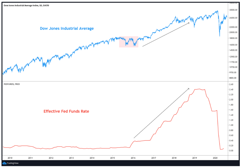
The above chart compares the price action of DJIA and the Effective Fed Funds rate over the past one decade. Notice the shaded region in the DJIA panel. There was increased volatility in stock prices during this time, which was partly due to the fact that interest rates in the US were to start rising soon, after almost 8 years of zero rates. Such worries increased the turbulence in the US as well as in the global markets. However, by then, the US economy was strengthening. The series of rate increases by the Fed and the subsequent higher borrowing costs were more than offset by strong economic growth and rising demand, causing stock prices to rise in tandem with interest rate increases between late-2016 and late-2018.
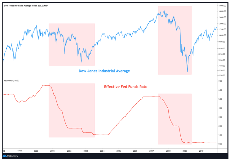
The above chart compares the price action of DJIA and the Effective Fed Funds rate between 1999 and 2010. Notice the first shaded box. This highlights the period between late-2000 and mid-2003. See that during this period, interest rates and the DJIA both trended lower asthe steep reduction in interest rates failed to offset the plunge in demand as economic conditions deteriorated notably. Similarly, observe the second shaded box. This reflects the period between mid-2007 and early-2009. During this period too, interest rates and the DJIA both fell sharply as lower borrowing costs failed to offset the impact of the worst recession in America’s history since the Great Depression of 1929.
From the above, we can conclude that:
-
From a secular/long-term perspective, there is an inverse correlation between interest rates and stocks
-
As interest rates rise, all else equal, the profitability of a company reduces due to higher interest costs, which subsequently hurts the price of the stock
-
As interest rates fall, all else equal, the profitability of a company increases due to lower interest costs, which subsequently lifts the price of the stock
-
From medium-term perspective however, there could be periods when interest rates and stocks move in tandem depending on factors such as the state of the economy, the level of inflation, the positioning of the economy within the business cycle etc.
-
For instance, during periods when inflation is rising slowly and economic conditions are strengthening, interest rates and stock prices could rise in tandem as demand tends to more than offset the negative impact of higher borrowing costs
-
Similarly, during periods when deflationary pressures are mounting or an economy is experiencing a sharp slump, interest rates and stock prices can fall in tandem as the positive impact of lower borrowing costsfails to fully offset the plunge in demand
Correlation between bond yields and stocks
As we saw in the previous section, the correlation between interest rates and stocks is not fixed all the time. From a long-term perspective, interest rates and stock prices typically tend to move in the opposite direction. However, from a short-to-medium-term perspective, the two can move in the same direction, especially when economic conditions are strengthening or deteriorating at a rapid pace. Because bond yields move in sync with interest rates (with short-term yields being more sensitive to interest rates than long-term yields), it follows that the correlation between bond yields and stocks is also not a fixed one.
Generally speaking, from a long-term perspective, bond yields and stock prices tend to move in the opposite direction. That is, falling bond yields is bullishfor stocks, while rising bond yields is bearish for stocks. Again, the reason why this happens is because rising yields coincide with rising interest rates, and vice versa. However, over the short-to-medium term, the two can move in sync with each other. Earlier, we spoke that the traditional inverse correlation between bond yields and stocks could change depending on the positioning of the economy within the business cycle. Let us talk about this in moredetail using the case of a business cycle.
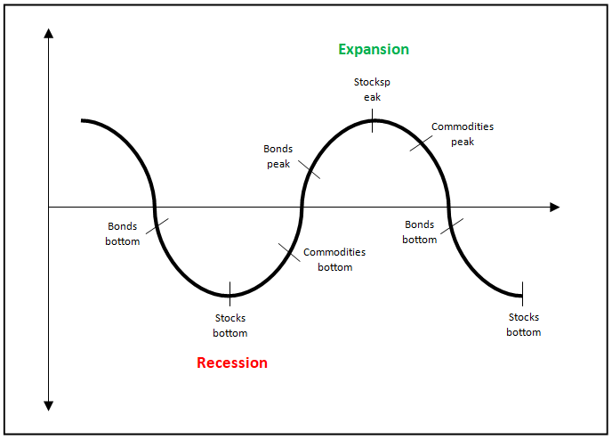
The above chart shows the typical business cycle and the typical performance of each asset class within this business cycle. This business cycle theory was promulgated by Martin Pring, a globally renowned expert on charting and the author of several well-known books on Technical Analysis. We will speak more about the business cycle in a later chapter. But for now, keep in mind that, typically, bonds change direction ahead of stocks, which in turn change direction ahead of commodities. This applies during both stages of an economic cycle – expansionary and contractionary stage.
When an economy is somewhere in the earlyexpansionary stage, bonds tend to peak outand start declining as credit conditions start to tighten. At this stage, as bonds peak out and start declining, bond yields bottom out and start rising tojoin in the up move in stocks, which are usually in an uptrend during this stage because of strengthening economic conditions. Until somewhere between the mid-to-late-expansionary stage, bond yields and stocks tend to rise in tandem before higher yields and slowing economic conditions eventually cause stocks to top out, who then join in the decline in bond prices.Another way of looking at why bond yields and stocksrise in tandem between the mid-to-late-expansionary stage is because bondsand stocks compete for allocation of fundsin an investor’s portfolio.As the economy is at its strongest point during this stage, investors allocate a greater proportion of their funds to riskier assets in search for higher returns, causing stocks to outperform and bonds to underperform. Similarly, when an economy is in the earlycontractionary stage, bonds tend to bottom out and start rising as central banks start cutting interest rates to revive the economy. At this stage, as bonds bottom out and start rising, bond yields start declining to join in the down move in stocks, which are usually in a downtrend during this stage because of deteriorating economic conditions. Until the mid-to-late-contractionary stage, bond yields and stocks tend to fall in tandem before lower yields and expectations from far-sighted investorsof an economic trough eventually cause stocks to bottom out, who then join in the rally in bond prices.It is for this reason - the positioning of the economy within the business cycle - that bond yields and stocks tend to move in tandem in the short-to-medium term.
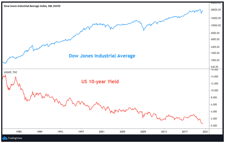
The above is the long-term chart of the DJIA and the 10y US yield. During this period, observe that the 10y yield has been in a secular downtrend, while the US market has been in a secular uptrend. The steady decline in interest rates over the last four decades has played animportant role in the stock market rally.
From the above, we can conclude that:
-
From a secular/long-term perspective, there is an inverse correlation between bond yields and stocks
-
As bond yieldstrend lower, all else equal, stock prices trend higher, and vice versa
-
From short-term to medium-term perspective however, there could be periods when bond yields and stocks move in tandem
-
One reason for this is the positioning of the economy within the business cycle
-
Between the early-expansionary and the mid-to-late-expansionary stage of a business cycle, yields and stocks both rally due to robust economic conditions
-
Between the early-contractionary and the mid-to-late-contractionary stage of a business cycle, yields and stocks both fall due to deteriorating economic conditions
In 1998, the traditional correlation between yields and stocks decoupled
In 1998, an important thing happened: the traditional inverse correlation between bond yields and stocks that had prevailed for the past several years broke. One reason for this was the Asian financial crisis. This turmoil in Asia and other regions increased appetite for the safe haven US treasuries, causing yields on these instruments to fall. At the same time, as the crisis began spreading to regions outside of Asia, demand for riskier assetsdiminished towards the turn of the century,causing stocks to top out and start declining. Let us look at a few charts to understand this better.
The above chart compares the DJIA with the US 10y yield between 1996 and 2012. Notice the 13 year period between the black vertical lines. During this period, the traditional inverse correlation between bonds yields and stocks decoupled and the two moved in tandem. That is, they both rose and fell together most of the times.
If you closely observe, you will see that during both the 2000 dot com bubble and the 2007-08global financial crisis, bond yields broke lowerfirst,and stocks followed suit later (see the corresponding purple trend line). Given the positive correlation that had existed between bond yields and stocks since late-1998, the trendline breakdown in the 10y yield in March 2000 coupled with a slowing US economy was a warning that the rally in stocks could be running into trouble. Such warning did materialize five months later in September 2000 when the DJIA broke below the trendline. The two then fell in tandem over the next two years. However, an interesting thing to note is that the DJIA bottomed in September 2002, whereas bond yields did not bottom until June 2003. This delayed bottoming in bonds yields after stocks had already bottomed was primarily due to interest rates in the US, which continued declining until mid-2003. See here that the steady decline in US yields between January 2000 to June 2003, which reflected lower interest rates in the US, eventually ended the downtrend in stocks and ushered in a new wave of up move over the next five years.
Meanwhile, notice that the four year up move in 10y yield ended when it broke below the rising trendline in August 2007. While the DJIA made a life-time high during this period, the breakdown in bond yields coupled with the positive correlation that had existed between bond yields and stocks since late-1998 yet again warned that the rally in DJIA could run into trouble. This is what happened in January 2008 when the DJIA also broke below its rising trendline support, thereby ending a 5-year bull market in stocks. For the remainder of 2008, both bond yields and stocks fell together sharply amidst the global economic turmoil. Eventually however, the steep fall in US interest rates and bond yields caused stocks to bottom out in March 2009, roughly three months after yields had bottomed out in December 2008. Note here that the 10y yield bottomed out prior to the bottom in stocks. The positive correlation between bond yields and stocks continued for the next couple of years. However, this positive correlation had weakened noticeably during this two year period, as stocks recovered strongly from March 2009 lows but bond yields struggled to gain much ground on the upside as the Quantitative Easing program launched by the Fed supressed interest rates and bond yields.
Since the last decade, the correlation between yields and stocks has varied
From 2011, the correlation between bond yields and stocks has varied. The US markets bottomed out in early-2009 and entered into a strong bull market over the next one decade. During this 10+ year bull market in stocks, rallies were quite powerful and long-lasting while corrections were quite shallow and only for brief periods. On the other hand, yields mostly trended lower during this period, but their movements have been quite volatile.
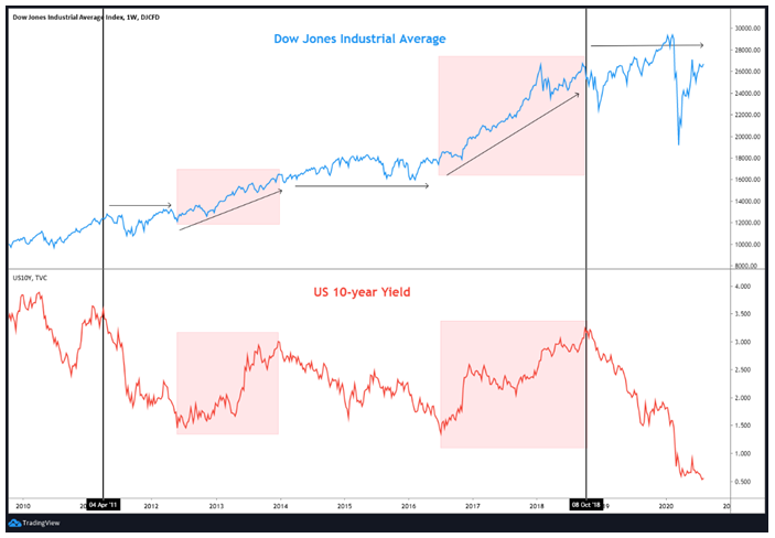
The above chart compares the DJIA with the US 10y yield since 2010. Within this chart, notice the 7 year period between the black vertical lines. During this period, US markets steadily headed higher, while the 10y yield fluctuated within a wide range of 1.5-3.5% without a clear direction.
Within this 7 year period, notice the two red boxes in the 10y yield panel and the corresponding boxes in the DJIA panel. This represents the intermediate up moves in the 10y yield. It can be seen that the intermediate up moves in bond yields during this period were accompanied by strong advances in stocks, as represented by the DJIA index.On the other hand, within this 7 year period, notice the non-shaded regions in the 10y yield panel and the corresponding non-shaded regions in the DJIA panel. This represents the intermediate down moves in the 10y yield. It can be seen that the intermediate down moves in bond yields during this period were accompanied by sideways to only modest rallies in stocks. This suggests that between early-2011 and late-2018, the correlation between bond yields and stocks varied, in a way that rising bond yields benefited stocks while falling bond yields did not have much of an impact on stocks.
Meanwhile, since late-2018, observe that the 10y yield has plunged from over 3.25% to a record low of under 0.5%. During this period, stocks have essentially traded in a pretty volatile and wide range. However, while the swings in stocks have been pretty wild, it can be seen that, net-net, stocks today are essentially where they were in late-2018. In other words, the correlation that has prevailed since early-2011 still continues till date, wherein rising bond yields tend to underpin stocks, while falling bond yields do not have much of an overall impact on stocks.
From the above, we can conclude the following about the prevailing correlation between bond yields and stocks:
-
Since 1998, the traditional inverse correlation between bonds yields and stocks has decoupled and the two have sinceusually moved in tandem
-
Bond yields can often act as a leading indicator for stocks
-
During both the dot com bubble of 2000 and global financial crisis of 2007-08, bond yields broke down first and stocks followed suit a few months later
-
Since 2011, the correlation between bond yields and stocks has varied in a way that rising bond yields have benefited stocks but falling bond yields haven’t had much of an impact on stocks. In fact, during periods when yields have declined, volatility in stock markets has shot up
-
Since late-2018, yields have plunged to record lows, but stocks today are essentially where they were back in late-2018, albeit with a great degree of volatility
-
At the time of writing, bond yields and stocks are correlated in such a way that stocks tend to react quite positively to rising bond yields, but they tend to react in a volatile manner to falling bond yields
-
Keep in mind that unlike the correlation between the dollar and commodities or that between commodities and bond yields, the correlation between bond yields and stocks can vary
-
At times, the two could be positively correlated; while at other times, the two could be negatively correlated
-
It is because of this that one needs to keep a close track of the correlation between bonds yields and stocks from time to time
Yield curve inversion and its impact on stocks
A yield curve is a graphical representation of bond yields having a similar underlying instrument but differing maturities. As an example, the current yield of various US treasury securities ranging from short-term to medium-term and long-term would be plotted on a graph and then connected using a curve to get a visual representation of yields across various maturities. The shape of the yield curve gives vital economic information such as the state of the economy and the direction in which it is headed, investors’ perception about risk, the direction in which interest rates could move etc.As such, by tracking the shape of the yield curve periodically, a trader/investor will be in a better position to understand the state of the economy and accordingly deploy or modify trading/investment strategies.
There are four types of yield curve: normal, steep, flat, and inverted.
Normal yield curve
A normal yield curve is one in which long-term yields are aboveshort-term yields. It is called normal because, most of the times,long-term rates are aboveshort-term rates to compensate the holder for taking duration and credit risk. When plotted using a curve, a normal yield curve will slope upwards to the right.A normal yield curve usually occurs when economic conditions are either strengthening or are reviving following a period of slowdown.
Steep yield curve
A steep yield curve is one in which long-term yields are rising at a faster rate than short-term yields. When plotted using a curve, a steep yield curve will look similar to a normal yield curve but with a difference that it will slope upwards at a steeper angle. A steep yield curve usually occurs when economic conditions are either strengthening or are reviving following a period of slowdown.
Flat yield curve
A flat yield curve is one in which long-term yields and short-term yields are essentially identical. When plotted using a curve, a flat yield curve is one which will neither trend up nor down but will essentially be flat. A flat yield curve is usually associated with an economy that is either slowing and slipping towards a recession or reviving and emerging out of a recession.
Inverted yield curve
An inverted yield curve is one in which long-term yields are below short-term yields. It is called inverted because this situation, wherein short-term instruments are yielding more than long-term instruments, is not normal and occurs quite infrequently. When plotted using a curve, an inverted yield curve will slope downwards to the right. An inverted yield curve usually occurs when economic conditions are rapidly deteriorating. Historically, an inverted yield curve has been a reliable indicator of future recession.
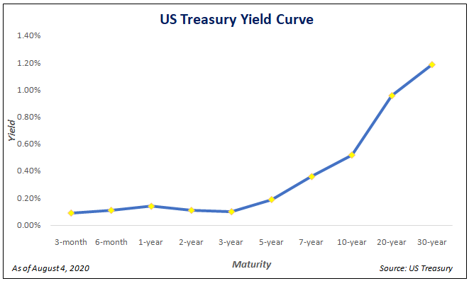
The chart above shows the shape of the current US treasury yield curve, which is the most widely tracked yield curve in the world. The yields across various US treasury instruments can be found on this link of the US Treasury Department.Notice that the shape of the yield curve is mostly normal, except for a couple of inversions in between (2y yield is below 1y yield and 3y yield is below 2yyield). From the chart, it can also be observed that the long-end of the yield curve is steep. The current yield curve, as at the time of writing, is reflective of improving risk sentiment and economic conditions. That said, keep in mind that as yields change, the shape of the yield curve can also change. Hence, it is necessary to keep a periodic track of the yield curve to gauge what market participants, via the bond markets, are anticipating about future economic conditions and interest rates.
Besides tracking the current shape of the overall yield curve, one could also track the historical spread between two differing yields. Of all the maturities discussed above, one of the most widely tracked yield spread is that of the 10 year and the 2 year treasury note.
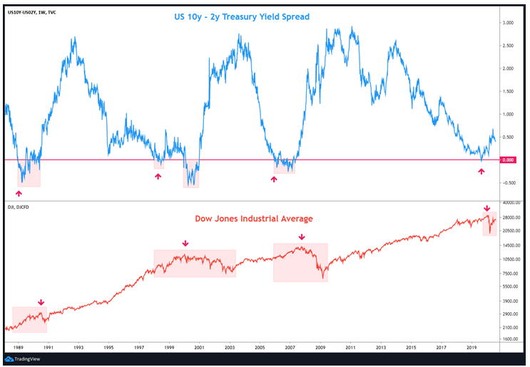
The chart above compares the spread between the 10-year and the 2-year treasury yield with the DJIA. A red horizontal line has been drawn on the top panel to show equilibrium. When the spread is above the red line, it means the curve is normal as the 10y yield is above the 2y yield. On the other hand, when the spread is below the red line, it means the curve is inverted as the 10y yield is below the 2y yield. See that most of the time, this spread is normal. However, sometimes, it tends to invert. As we said earlier, an inverted curve occurs when economic conditions are rapidly deteriorating, causing long-term yields to fall below short-term yields.
In the chart above, observe the shaded boxes in the top panel with the corresponding boxes in the bottom panel. This reflects periods when the 10y2y spread inverted and shows the corresponding behaviour of stock markets during this period of yield curve inversion. See that whenever the 10y2y yield curve has inverted, it has eventually spelled trouble for the stock markets. Also observe in the chart each red arrow in the top panel and the corresponding red arrow in the bottom panel. The arrow in the top panel reflects the period when the yield curve first inverted, whereas the corresponding arrow in the bottom panel reflects the period when the stock market topped out and started declining. It can be seen that, since the late-1980s, there has been a gap between the time the 10y2y spread first inverted and the time the stock market topped out. While the chart shows that every 10y2y yield curve inversion since the late-1980s has spelled trouble for the stock market, it must also be kept in mind that there has been a notable delay between the time the yield curve inverts and the time stock markets actually top out. As such, a yield curve inversion doesn’t outrightly mean a trader/investor must start reducing equity exposure right away, but just that it is time to become cautious and be aware of the possibility that the stock market could come under pressurein the months ahead. The table below shows the lead-lag between the first time the 10y2y yield spread inverted and the time the stock market actually topped out:
| First Yield Curve Inversion | DJIA peak | Lag (in months) |
| December 1988 | July 1990 | 19 |
| March 1998 | January 2000 | 22 |
| January 2006 | October 2007 | 21 |
| August 2019 | February 2020 | 6 |
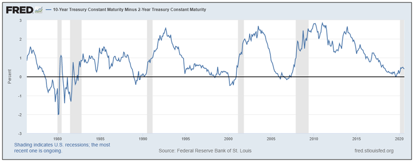
The chart above shows the spread between the 10y2y yield curve. Meanwhile, the grey shaded regions reflect periods when the US economy experienced recession. It can be seen that since the 1980s, every recession in the US was preceded by this 10y2y yield curve inverting, including the most recent one, in which the yield curve briefly dipped below zero in August 2019 before normalizing.
Other than the most popular 10y2y spread, the 10y3m spread is also quite popular and is regularly tracked by market participants. The 10y3m spread measures the yield spread between the 10-year treasury note and the short-term 3-month treasury bill.
From the above, we can conclude that:
-
The shape of the yield curve, either overall or selective, tells a lot about the state of the economy and the direction in which it is headed as well as about investors’ perception of risk
-
An inverted yield curve occurs quite infrequently. However, whenever it occurs, it spells trouble ahead for the economy as well as for the stock market
-
The 10y2y US treasury yield spread is the most widely tracked yield spread in the world
-
Every recession in the US since the 1980s has been preceded by the 10y2y yield curve inverting
-
There is a notable lag between the time the 10y2y yield curve first inverts and the time the stock market peaks out and starts declining
-
Besides the 10y2y spread, the 10y3m US yield spread is also monitored closely
-
Given the importance of yield curve, one must closely monitor it periodically
-
An inverted yield curve does not guarantee a recession, but rather only increases the probability of one occurring in the months ahead
Next Chapter
Comments & Discussions in
FYERS Community


Brook commented on August 24th, 2020 at 6:08 PM
I will immediately clutch your rss as I can't in finding your e-mail subscription link or e-newsletter service.
Do you have any? Please allow me know so that I may just subscribe.
Thanks. I could not resist commenting. Perfectly written! It's very effortless to find
out any topic on net as compared to textbooks, as I found this piece of
writing at this website. http://house.com