So far, we have discussed four of the most critical intermarket relationships. These are the relationships between:
-
Currencies and Commodities
-
Commodities and Bonds
-
Bonds and Stocks
-
Stocks and Commodities
In this chapter, we shall study the two remaining intermarket correlations, whichcan add a lot of value when tracked periodically whilealso provide clues on the overall risk appetite of market participants. The remaining two correlations that we will be covering in this chapter include the correlation between:
-
Currencies and Bonds
-
Currencies and Stocks
Currencies and Bond Yields
Before starting our discussion on the correlation between the US dollar and US treasury yields, let us start off by saying that US treasuries are one of the safest financial instruments in the world. When we say safest, we mean in terms of credit risk and not interest rate risk. In the modern era, the US treasury department has never defaulted on coupon and principle payments. Also, the US is the most powerful economy in the world and the US dollar is the world’s reserve as well as the most liquid currency. Because of all these factors, US treasuries are widely sought after by various types of investors not only from the US but from other countries as well. These investors could be individual investors, institutional investors, or even nations themselves.
During periods of global risk aversion, there is a flight to safety across the world. And one of the assets that tend to benefit the most during such turbulent times areUS treasuries, as both domestic and international investors flock these instruments. This increased demand for US treasuries causes their price to move higher and yields to move lower. And as the flight to safety for US treasuries increases from international investors, so does the demand for US dollars. This is because when international investors want to buy US treasuries, they will first have to convert their local currencies into dollars, before they eventually purchase treasuries. As a result, during times of heightened risk aversion, US treasury yields tend to move lower while the dollar tends to move higher.
Similarly, during times when economic conditions are strengthening, investors around the world tend to move out of safer assets and into riskier assets. In fact, during times the global economy is strengthening, investors increase their allocation in emerging and developing markets while reducing their allocation in developed markets, as the former tend to offer superior returns over the latter during times of strengthening global economy. This causes money to rotate out of US treasuries and move out of the US. And as the demand for US treasuries reduces during such periods, their prices decline and yields rise. Also, as international investors withdraw their funds from the US, the supply of US dollars increases. This is because when international investors reduce/exit their holdings from US treasuries, they tend to covert the dollars back into their home currencies. As a result, during times of strengthening global economy, US treasury yields tend to move higher while the dollar tends to move lower.
Having said that, the correlation between the dollar and US yields is not always inverse. Above, we primarily spoke from the view point ofthe prevailing risk flows driving movements in the dollar and US yields. First, we spoke of a scenario wherein rising risk aversion causes international investors to increase their holdings of US treasuries, causing US yields to decline and the dollar to rise. Second, we spoke of a scenario whereina strengthening global economy causes international investors to reduce their holdings in US treasuries, pushing US yields higher and the dollar lower. During such times, the dollar and US yields tend to move in the opposite direction.
However, there will be circumstances wherein interest rate expectations are driving movements in the dollar and US yields. Under such circumstances, the dollar and US yields tend to move in the same direction. Let us explain this more. We know that the Euro, the Yen, and the Pound account for more than 80% of the DXY’s weight. As such, let us focus on Euro zone, Japan, and the UK for our explanation.
If market participants expect interest rates in the US to rise relatively more or fall relatively less than those in any of these nations, yields on US treasuries will tend to rise more or fall less than those of the G-Secs of each of these nations. In other words, US treasuries, because of their higher relative yields, will become more attractive, causing global funds to move into the US. This, in turn, will also cause the dollar to strengthen as there will be an increased demand for the US currency.On the other hand, if market participants expect interest rates in the US to rise relatively less or fall relatively more than those in any of these nations, yields on US treasuries will tend to rise less or fall morethan those of the G-Secs of each of these nations. As a result, US treasuries, because of their lower relative yields, will become less attractive, causing global funds to move out of the US. This, in turn, will also cause the dollar to weaken as there would be an increased supply of the US currency.
From the above, we can conclude that:
-
The correlation between the dollar and US yields is quite dynamic and depends upon the factors that are causing the yields to move
-
Broadly speaking, the yields could be moving either due to prevailing risk flows or due to interest rate expectations
-
If movementsarebeing driven by prevailing risk flows, US yields and the dollar tend to move in the opposite direction
-
During times of rising risk aversion, international investors increase their holdings of US treasuries, causing US yields to decline and the dollar to rise
-
During times the global economy is strengthening, international investors reduce their holdings in US treasuries, causing US yields to rise and the dollar to decline
-
On the other hand, if movementsare being driven by interest rate expectations, US yields and the dollar tend to move in the same direction
-
If market participants expect US interest rates to rise more or fall less than those of other nations, US yields tend to rise more or fall less than those of other nations, in turn increasing their appeal, which subsequently lifts the dollar as well
-
If market participants expect US interest rates to rise less or fall more than those of other nations, US yields tend to rise less or fall more than those of other nations, in turn reducing their appeal, which subsequently drags the dollar down
But only tracking absolute yields don’t tell the whole picture
The above chart compares the US 10-year treasury yield with the DXY index over the last four decades. It can be seen that from a longer-term perspective, there doesn’t seem to be much of a correlation between yields and the DXY, as the former has steadily declined while the latter has traded within a range, albeit a wider one, during this period. The main reason why this is the case is because the DXY is impacted not only by what is happening in the US but also by what is happening across each of the other six nations. This is especially true in case of Euro zone (whose currency occupies 58% of the DXY) and in case of Japan (whose currency occupies14% of the DXY). What is happening in these nations also have a strong say on the trajectory of the DXY. After all, keep in mind that currencies are always relative and never absolute.
Instead, one must track yield spreads to analyse the trend of the DXY
One of the best ways to see the correlation between relative yields and the DXY is to compare the DXY with the spread between two similar yields that have the same maturity but belong to different nations. Examples include comparing the yield spread between US 10y and German 10y note or that between US 2y and Japanese 2y note, etc.
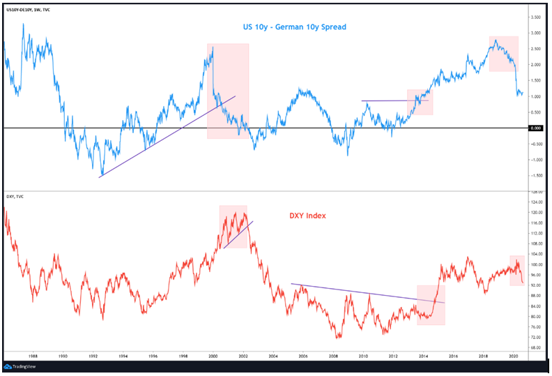
The above chart compares the DXY index with the yield spread between the US 10-year and the German 10-year note (US 10y yield – German 10y yield). Notice that this spread fluctuates above and below zero (black line). Values above zero mean the US 10y yield is more than the German 10y yield, and vice versa. Meanwhile, a value that is equal to zero means that the US 10y yield is at par with the German 10y yield. If the spread is positive and rising or is negative and falling, it means the differential between the two yields is widening. On the other hand, if the spread is positive but declining or is negative but rising, it means the differential between the two yields is narrowing. Let us highlight the implications of this in a table:
| + or - | ↑ or ↓ | Spread is | Implication |
| Positive | Rising | Widening in favour of DXY | Bullish DXY |
| Positive | Falling | Narrowing against DXY | Bearish DXY |
| Negative | Rising | Narrowing in favour of DXY | Bullish DXY |
| Negative | Falling | Widening against DXY | Bearish DXY |
The reason why a rising US-German spread is bullish for the DXY is because it makes US bonds more attractive over German bunds, causing more money to move into the US.This in turn increases demand for the dollars and subsequently benefits it. On the other side, a falling US-German spread is bearish for the DXY because it makes German bunds more attractive over US bonds, causing more money to move into Germany. This in turn increases demand for the Euros, which subsequently weighs on the DXY.
Coming back to the above chart, it can be seen that there is a strong positive correlation between the DXY and the yield spread between the US 10y and the German 10y note. Notice that the two were in a downtrend between 1987 to 1992 and then in an uptrend between 1992 to 2000. Also see that the two were in a downtrend between 2002 to 2008 and then in an uptrend between 2011 to 2018.Another interesting thing to note is that there is a tendency for the yield spread to change direction before the DXY changes direction. To understand this, observe the shaded region in the spread and the corresponding shaded region in the DXY. Notice that the spread peaked in December 1999 and was in a steady downtrend till September 2002. See that this narrowing of spread from above zero eventually caused the DXY to top out in February 2002. Similarly, notice that the spread moved above its prior peak in June 2013 and continued to move higher, which eventually caused the DXY to break out in September 2014 and rally over the next several months. Finally, observe that the spread peaked out in October 2018 and started declining, which eventually caused the DXY to top out in March 2020.
From the above, we can conclude that:
-
As the Euro occupies a bulk of the weight in the DXY, the trend of the DXY is not only impacted by US yields but also by German yields
-
One must closely monitor the spread between the benchmark 10y US yield and the benchmark 10y German yield
-
A rising US-German yield spread is bullish for the DXY, as it makes US bonds more attractive over German bunds, causing more money to move into the US.
-
A falling US-German yield spread is bearish for the DXY, as it makes German bunds more attractive over US bonds, causing more money to move into Euro zone.
-
That said, one needs to be aware of the lag that can and do exist between the time the spread tops out/bottoms out/breaks out till the time the DXY follows suit
Using yield spreads to analyse the trends of currencies
Above, we talked about how one could utilize the yield spread between the US 10y bonds and the German 10y bunds to gauge the impact it could have on the DXY. This same logic could be applied to other currencies as well. For instance, one could track the yield spread between US and Japanese bonds to analyse the impact on USD/JPY or that between US and Australian bonds to analyse the impact on AUD/USD or that between US and Indian bonds to analyse the impact on USD/INR, and so on. In fact, one could also track the yield spread between two countries other than the US to gauge the impact on cross currencies. For instance, one could track the yield spread between Australian and Indian bonds to analyse the impact on AUD/INR or that between German and UK bonds to analyse the impact on EUR/GBP, and so on. Let us look at a couple of charts before moving on to the next section:
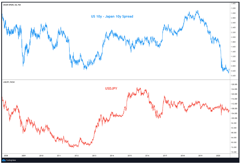
The above chart compares the USD/JPY currency pair with the yield spread between US 10y and Japanese 10y bonds. See that the two usually move in sync. That is, a rising spread is positive for USD/JPY, an vice versa. Notice that since late-2018, the spread has narrowed sharply, which in turn has kept USD/JPY under pressure. That said, as the spread still remains positive, notice that the downside in USD/JPY has been limited.
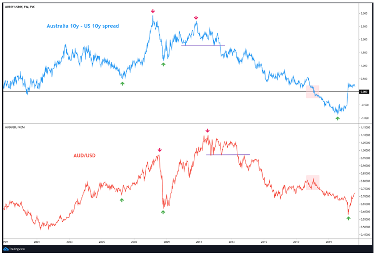
Meanwhile, the chart below compares the AUD/USD currency pair with the yield spread between Australian 10y and US 10y bonds. Again, it can be seen that the two tend to move pretty much in tandem. That is, a rising spread is positive for AUD/USD, an vice versa. Notice closely how a top in the spread is followed by a top in AUD/USD. An important thing to keep in mind is that the yield spread often acts as a leading indicator for the currency pair, especially near tops. Also notice the region marked within the shaded box in the spread. During this time, the spread fell into negative, meaning the Australian 10y yield fell below the US 10y yield, which is a relatively rare occurrence.As US treasuries are considered to be the safest in the world, the drop in Aussie yields below the US yields reduced their attractiveness and caused money to shift to the US, which in turn put the Aussie dollar under severe pressure. Notice how AUD/USD plunged and was in a downtrend during the period when the spread was negative. The Aussiedollar eventually bottomed out at essentially the same time the spread narrowed from negative to zero. Since then, the spread has traded above zero, causing AUD/USD to continue its recovery from lows.
A note of caution here. It is important to keep a track of the order in which you are calculating the spread and the order of the currency pairing. For instance, in this chapter, we first talked about the US 10y – German 10y yield spread and compared it to the DXY. Since the left side of the spread is US 10y yield and the currency in question is an index which tracks the performance of the US dollar, there is a direct correlation between the spread and the DXY. We then talked about the US10y – Japanese 10y yield spread and compared it to USD/JPY. Since the left side of the spread is US 10y yield and the base currency is also USD, there is again a direct correlation between the spread and USD/JPY.
Put it in other words, when the left side of the spread and the left side of the currency pair belongs to the same country, there is a direct correlation between the spread and the currency pair. That is, a rising spread is positive for the currency pair, and vice versa. On the other hand, if the left side of the spread and the right side of the currency pair belongs to the same country, there is an inverse correlation between the spread and the currency pair. That is, a rising spread is negative for the currency pair, and vice versa.
From the above, we can conclude that:
-
One can use the spread between the bond yields of two countries to analyse the impact on the currency pair of those two countries
-
For instance, one can use the yield spread between US and German bonds to analyse the impact on EUR/USD, Australian and US bonds to analyse the impact on AUD/USD, US and Indian bonds to analyse the impact on USD/INR, and so on
-
It is important to keep in mind the order in which the yield spread is calculated and the order of the currency pairing
-
If the left side of the spread and the left side of the currency pair belongs to the same country, there is a direct correlation between the spread and the currency pair
-
If the left side of the spread and the right side of the currency pair belongs to the same country, there is an inverse correlation between the spread and the currency pair
-
The yield spread between two countries often acts as a leading indicator for the currency pair of those two countries
Currencies and Stocks
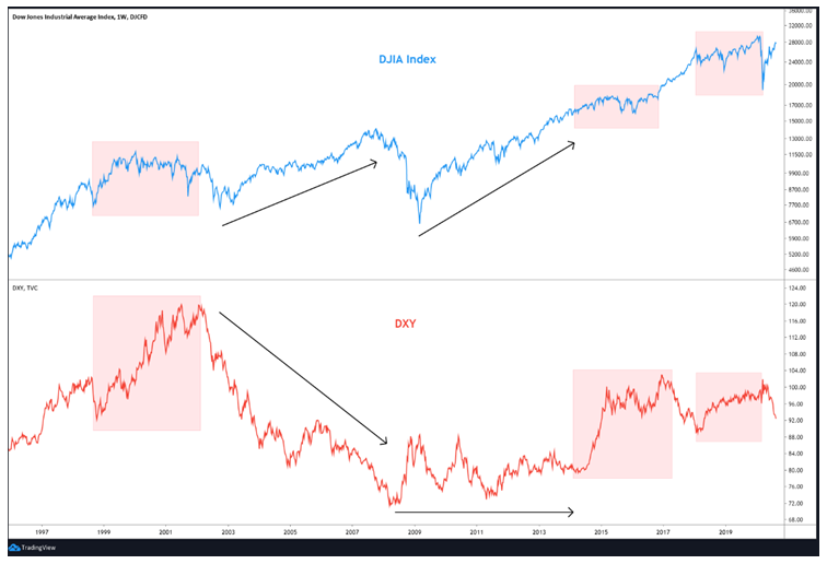
The correlation between the dollar and the stock markets has varied over the years. Sometimes, the dollar and stock markets move in sync, while at other times they move in the opposite direction. That said, since the late-1990s, the DXY and US stock markets have mostly shared a negative correlation. To understand this visually, let us look at the chart below between the DJIA index and the DXY:
In the above chart, see that a falling dollar or a weak dollar has underpinned the US stock markets. For instance, see that between late-2002 and late-2007, a bear market in the dollar coincided with a bull market in US stocks. Also, see that between mid-2008 and early-2014, the dollar trading sideways but near its historic lows coincided with a strong rally in US stocks. Finally, notice that the up turn in US stocks since March 2020 has coincided with a downturn in the dollar. On the other hand, periods when the dollar has risen has usually not boded well for US stocks. For instance, observe the shaded region in the DJIA index with the corresponding shaded region in the DXY. See that between late-1998 and early-2002, a sharp rally in the dollar increased volatility in US stocks. Similar such behaviours occurred between early-2014 and late-2016 and then again between early-2018 and early-2020.
One major reason for the existence of an inverse correlation between the dollar and US equities is the dollar’s role as a safe haven. The US currency typically tends to rally during periods of global economic turmoil,as international investors move out of high-yielding non-dollar denominated assets to the safe havendollar-denominated assets, primarily US treasuries. On the other hand, the dollar typically tends to decline during periods of global economic strength, as international investors move their funds from safe haven dollar-denominated assets to high-yielding non-dollar denominated assets.
The above is the short-term chart comparing key equity indices in the US with the DXY. See that the surge in DXY in March coincided with a plunge in US stocks. Since April however, the gradual decline in the DXY to a 2-year low has coincided with strong recovery in the US markets. In fact, the S&P 500 and the NASDAQ index have already surged to historic highs during this same period. The price action this year further highlights the negative correlation that has generally prevailed between the DXY and US stocks since the turn of the century.
Emerging markets are more closely linked to the dollar
Compared to developed markets, emerging markets tend to offer superior returns and high economic growth potential. However, the risks of investing in emerging marketsalso tend to be high because of their close ties to the fortunes of global economic growth and commodity prices. As a result, emerging markets tend to perform strongly during times when the global economy is strengthening and commodity prices are rallying. Similarly, emerging markets come under stress during times the global economy is slowing down and commodity prices are declining. Meanwhile, previously, we said that there is a tendency for the US dollar to advance during times of global risk aversion and decline during times of global risk appetite. Also, we know that the dollar and commodity prices share a strong negative correlation. Because of these factors, emerging markets tend to be quite sensitive to the trajectory of the dollar.
As seen in the previous section, the DXY and US stocks usually share a negative correlation. However, this negative correlation is even stronger with stocks from emerging markets. In other words, a rising DXY hurts emerging markets more than it hurts the US or other developed markets. Similarly, a falling DXY benefits emerging markets more than it benefits the US or other developed markets.
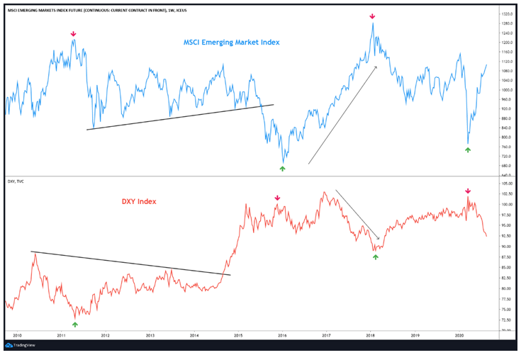
The chart below compares the MSCI Emerging Market index with the DXY. See the existence of a strong inverse correlation between the two. Observe the arrows marked in the MSCI index and the corresponding arrows marked in the DXY index. It can be seen that a bottom in the DXY usually coincides with a top in the MSCI index. Also notice that the rally past the trendline resistance in the DXY index in September 2014 eventually caused the MSCI index to break below the trendline support nine months later in June 2015. Even in 2020, observe that a peak in the DXY in March precisely coincided with a bottom in the MSCI emerging market index. Since then, the DXY has declined while the MSCI index has rallied.
The below chart compares the MSCI Emerging Market index with the DJIA index. Notice that since 2010, the MSCI Emerging Market index has strong underperformed the DJIA index – the former today is barely above where it was in 2010, while the latter has tripled during this period. Weakening Chinese economy, weaker commodity prices, strong dollar, and turmoil in a few emerging market economies have caused funds to move out of emerging markets and into developed markets over the last decade.
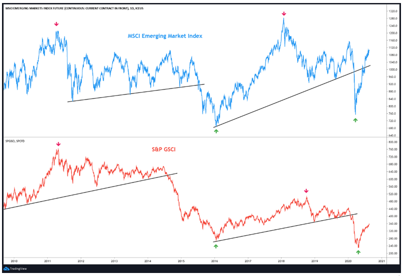
The above chart compares the MSCI Emerging market index with S&P GSCI. Notice in the chart how strongly and positively are emerging markets and commodities interlinked.
From the above, we can conclude that:
-
Since the late-1990s, the DXY and US stock markets have mostly shared a negative correlation
-
The US currency typically tends to rally during periods of global economic turmoil and decline during periods of global economic strength
-
Emerging markets tend to be more sensitive to the trajectory of the dollar than developed markets
-
Emerging markets are also extremely sensitive to trends in commodities and usually move in tandem with commodities
-
A rising DXY hurts emerging markets more than it hurts the US or other developed markets, and vice versa
-
Since 2010, developed markets have massively outperformed emerging markets because of factors such as weakening Chinese economy, softening commodity prices, strengthening dollar, and turmoil in a few emerging market economies
Next Chapter
Comments & Discussions in
FYERS Community

.PNG)
