
Introduction
Technical indicators are extremely valuable tools that can be used to determine various aspects of the trend, most important of which is the momentum. The primary purpose of using a technical indicator is to understand the momentum, that is the velocity with which price is changing. Velocity tends to rise steadily as the trend begins, but then starts to slowdown as the trend approaches maturity. For example, once an uptrend begins, the momentum tends to increase at a faster pace because of the change in trend. However, as the uptrend continues, the momentum starts to fade as the intensity of price appreciation slows down. This slowing momentum is usually not very evident to the naked eye just by looking at the price action itself. Therein come technical indicators into action, as these tools can help us in better understanding the momentum of the prevailing trend and help us answer questions such as: is the momentum strong, is the momentum slowing, is the momentum suggesting that a trend reversal could be in sight, etc.
So far, we have studied about price tools, price patterns, and moving averages. Technical indicators are another tool in a chartist’s toolbox which, when used in conjunction with other tools, can be of significant help in trading both trending as well as non-trending markets. In this chapter, we will discuss various types of technical indicators and how to use each one of them. Before proceeding, keep in mind that technical indicators are derivates of price (or volume). By this, what I mean is indicators are derived from price, and because they are derived from price they do not provide any new piece of information. As such, always use technical indicators as a supplement to price action rather than using them as a substitute to price action. Basing a trading decision on technical indicators alone without any confirmation from the price itself is likely to be a futile strategy.
Keep in mind that a lot of indicators that we will cover in this chapters are oscillators. Well, what does one mean by an oscillator? In simple words, oscillators are technical indicators that oscillate around a band. Some oscillators have a fixed band (such as 0 to 100), beyond which the indicator cannot oscillate; while others have a central value (such a 0), above and below which the indicator oscillates. Oscillators are usually plotted below the price. Finally, indicators can be used across all time frames, be it 1-minute chart, 1-hour chart, daily chart, weekly chart, monthly chart etc. Just remember that the shorter the time frame, the more signals will the indicator generate, and vice versa. So, an intraday trader will benefit by using indicators on minute or hourly chart, a swing trader will benefit by using indicators on daily chart, while a long-term investor would benefit by using indicators on monthly or even quarterly chart.
Various uses of technical indicators:
Identifying overbought/oversold areas
One of the main use of technical indicators is to identify whether the security in question is overbought or oversold. A security is said to be overbought when the indicator value reaches an extreme on the upside. This happens when the rally in price gets ahead of itself in a relatively short span of time. An overbought condition warns an analyst that the price could be set for a short-term correction. An analyst might consider initiating a counter position i.e. going short, if the overbought condition in the oscillator is followed by some sort of bearish signal in price. Similarly, a security is said to be oversold when the indicator value reaches an extreme on the downside. This happens when the decline in price gets ahead of itself in a relatively short span of time. An oversold condition warns an analyst that the price could be set for a near-term recovery. An analyst might consider initiating a counter position i.e. going long, if the oversold condition in the oscillator is followed by some sort of bullish signal in price.
Identifying whether indicators are confirming the price action
One of the primary objective of using an indicator is to confirm the price action. For instance, if the price is making a new swing high, is the technical indicator also making a new swing high? If the price is making a new swing low, is the technical indicator also making a new swing low? If the price is breaking out of a price pattern on the upside, is it being accompanied by a bullish signal in the indicator? etc. If the answer to such questions is yes, then the technical indicator is said to be confirming the price action. An indicator that is confirming the price action adds credence to the move than an indicator that is not confirming the price action.
Identifying divergence between indicators and price
Another common and important use of an indictor is to identify whether there is a divergence between an indicator and price action. Divergences are of two types: bullish divergence and bearish divergence. A bullish divergence occurs when price makes a new low, but an indicator does not make a new low. A bearish divergence occurs when price makes a new high, but an indicator does not make a new high. Such a divergence warns an analyst that the ongoing trend could reverse in the near-term, thereby putting him on alert mode. However, as already stated, positions should not be taken unless the divergence has been accompanied by some sort of reversal in price itself. Trading just based on divergence without any kind of confirmation from price is a recipe to making bad trades.
Crossover above and below the indicator central value
An indicator can also be used whenever central value crossovers take place. For instance, if the central value of an indicator is 0, it means a reading above zero is bullish and that below zero is bearish. Crossovers above and below this value can be used to gauge the direction as well as the strength of the trend. For instance, when an indicator crosses above zero, continues rising, and has not yet ventured into overbought territory, it indicates that the trend is up, and that price is in a strong trend. Such a development alerts a chartist to look out for buying opportunities, as long as price and indicator as confirming each other. Similarly, when an indicator crosses below zero, continues falling, and has not yet ventured into oversold territory, it indicates that the trend is down, and that price is in a strong trend. Such a development alerts a chartist to look out for selling opportunities, as long as price and indicator as confirming each other. Further, the position of an indicator relative to its central value can be used to identify overbought and oversold conditions too.
Identifying swing failures
Last but not the least, another use of technical indicators is to identify swing failures. A bearish swing failure occurs when an indicator rises above overbought territory, makes a top and then comes below the overbought territory, makes a bottom and starts rising again, fails to break the previous high before turning lower again, and finally breaks the previous bottom. In simple words, a bearish swing failure appears as an ‘M’ pattern with the second high being below the first. It indicates that bullish momentum is weakening and that a trend reversal could be in sight. Similarly, a bullish swing failure occurs when an indicator drops below oversold territory, makes a bottom and then rises above the oversold territory, makes a top and turns lower again, fails to break the previous bottom before turning higher again, and finally breaks the previous high. In simple words, a bullish swing failure appears as a ‘W’ pattern with the second low being above the first low. It indicates that bearish momentum is weakening and that a trend reversal could be in sight. Swing failures are a reliable pattern, especially when they are accompanied by divergences.
Behaviour during trending markets
There is a common belief that technical indicators do not work well in trending markets. Such beliefs are ill founded. Technical indicators work as well in trending markets as they do in non-trending markets. In fact, the behaviour of an indicator tells a lot about the strength of the trend. For instance, during a strong uptrend, it is common for indicators to frequently venture into overbought territory and barely reach oversold zones. Unless these dynamics start to change, the fact that overbought levels are easily reached but oversold levels are barely reached tells how robust the current uptrend is. Naturally, in such a powerful uptrend, reversal from overbought region must be used to trim existing longs rather than build fresh short positions, while any approach towards oversold region must be used to create additional longs. When a trend is weakening or is about to reverse, the dynamics of technical indicators will start to change beforehand and accordingly warn the analyst to adjust his trading strategies. For instance, during the final stages of an uptrend, an indicator will start to show signs of weakness by sliding a few times into oversold zone but failing to reach anywhere near the overbought territory. Such a development is an early warning that the uptrend could be nearing an end. Similarly, during a downtrend, it is common for indicators to frequently venture into the oversold zone but barely reach the overbought zone. When the downtrend is nearing an end, technical indicators will warn about changing market dynamics.
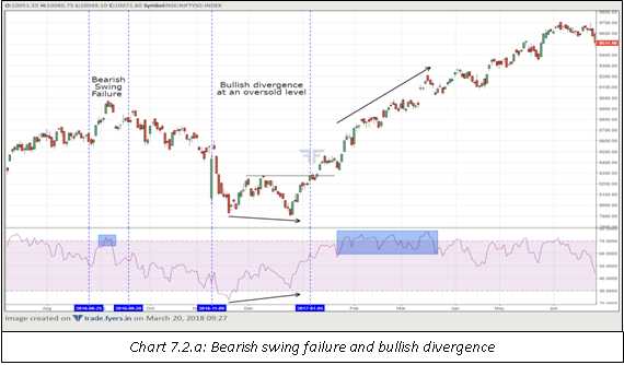
Notice in the chart above, three observations have been pointed out. First is the bearish swing failure that occurred when the indicator was at an overbought level. See how well this pattern unfolded as price fell sharply in the following days. Second is the indicator venturing into oversold territory and then forming a bullish divergence with price. See how this coincided with a double bottom pattern. An aggressive trader could have bought the security on the appearance of the bullish candle (more on candles in a later chapter) immediately after the emergence of the divergence, while a more conservative trader could have bought the security following the breakout above the neckline of the double bottom pattern. While both the bearish and bullish patterns worked quite well, now look at the third observation. The indicator frequently ventured into overbought territory. However, the price barely reacted to this as it continued its rally to fresh highs. This bring us to a very important point, one which we have already discussed earlier. Never act on a signal that is generated by the indicator, unless that signal is confirmed by some sort of reversal in price itself. Keep in mind that in a bull market, an indicator will frequently venture into overbought regions, but fail to reach oversold regions. Such an action from the indicator suggests how powerful the prevailing trend is. When this trend is about to change, indicators will warn beforehand about the changing market dynamics.
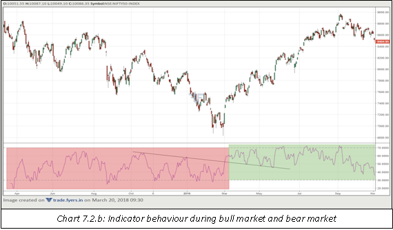
Notice in the above chart the behaviour of an indicator in a bull and a bear market. The first half of the chart is characterized by the security being in a bear market, which was confirmed by the indicator as it frequently fell into oversold zones but never ventured into overbought zones. In the second half, there was a change in the dynamics of the indicator. After breaking above the sloping trendline, the indicator switched its role from frequently approaching oversold zones (and barely touching the overbought zones) to frequently approaching overbought zones (and barely touching the oversold zones). Notice how the indicator took the lead by switching course ahead of the reversal in price itself.
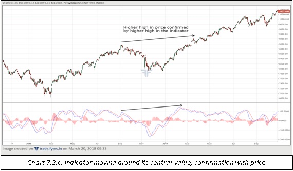
Notice the chart above how some indicators fluctuate around their central values. In a bull market, it is common for such indicators to spend a major chunk of their time above the central values, and vice versa. Also notice the concept of confirmation between price and indicator – how the new high in price was confirmed by a new high in the indicator too.
Technical indicators
Below mentioned is the list of technical indicators that we will be discussing in this chapter:
-
Moving Average Convergence Divergence
-
Fast Stochastics
-
Relative Strength Index
-
Bollinger Bands
-
Average True Range
-
Directional Movement Indicator
-
On-Balance Volume
-
Chaikin Money Flow
Moving Average Convergence Divergence
Developed by Gerald Appel, the Moving Average Convergence Divergence is a momentum indicator that is commonly used in a trending market. It is plotted below the price and comprises of three elements. The first is the MACD line, which is the difference between two moving averages, one shorter and the other longer. The second is the signal line, which is used to smoothen the MACD line. The third is the histogram, which is the difference between the MACD line and the signal line. Let’s talk about each of these elements in detail.
The MACD line is the difference between two moving averages, one shorter and the other longer. The two moving averages that are used in the calculation of the MACD line are exponential moving averages (EMAs). By default, most charting platforms will use 12-period EMA as the shorter moving average and 26-period EMA as the longer moving average. Of course, these values can be changed as per the convenience of the chart reader. The MACD line oscillates around the central value, which is the zero line. When the 12-period EMA crosses above the 26-period EMA, the MACD line moves above zero (i.e. in the positive territory) and when the 12-period EMA crosses below the 26-period EMA, the MACD line moves below zero (i.e. in the negative territory). When the MACD line is in positive zone, the momentum is bullish, because it indicates that the shorter moving average is above the longer moving average. The higher the MACD line above zero, the higher is the shorter EMA above the longer EMA, and vice versa. Similarly, when the MACD line is in negative zone, the momentum is bearish, because it indicates that the shorter moving average is below the longer moving average.The lower the MACD line below zero, the lower is the shorter EMA below the longer EMA, and vice versa. A basic buy signal is generated when the MACD line enters the positive zone, and a basic sell signal is generated when the MACD line enters the negative zone. The formula that is used to calculate the MACD line is given below:
MACD line = 12-period EMA – 26-period EMA
The signal line is used to smoothen the MACD line. By default, the signal line is the 9-period EMA of the MACD line. The MACD line moves above and below the signal line. A buy signal is generated when the MACD line crosses the signal line from below, and a sell signal is generated when the MACD line crosses the signal line from above. A buy signal that is generated when the MACD line is in positive territory and crosses above the signal line is a safer buy signal than a buy signal that is generated when the MACD line is in negative territory and crosses above the signal line. In other words, buy signals are more reliable when the MACD line is above the zero line than when the MACD line is below zero line. The opposite scenario holds true in case of a sell signal - sell signals are more reliable when the MACD line is below zero line than when the MACD line is above zero line. One way to trade this is: When the MACD line is in positive zone, use MACD buy signals to build long positions and MACD sell signals to cut existing long positions. When the MACD line is in negative zone, use MACD sell signals to build short positions and MACD buy signals to cut existing short positions.
Having said that, there are two exceptions to initiating a position counter to the trend i.e. buying when MACD line is below zero or selling when MACD line is above zero. The first is when price starts forming divergence with MACD line and signal line, and the second is when there is no such divergence, but there is some sort of bullish or bearish signal in price itself. First exception: there are occasions when one can initiate an early long position i.e. buying when the MACD line has crossed above the signal line but is still below the zero line. These occasions occur when the two lines are way below zero and start to form a bullish divergence with price. On such occasions, if price starts to show signs of bottoming, long positions can be initiated on the earliest buy signal in price. Similarly, there are occasions when one can initiate an early short position i.e. selling when the MACD line has crossed below the signal line but is still above the zero line. These occasions occur when the two lines are way above zero and start to form a bearish divergence with price. On such occasions, if price starts to show signs of topping out, short positions can be initiated on the earliest sell signal in price. Second exception: when MACD line is way below the zero line, the chartist can build long positions when MACD line cuts above the signal line even without forming any bullish divergence, provided there is bullish signal generated in the price such as breakout of a price pattern, reversal from an important support area etc. Similarly, when MACD line is way above the zero line, the chartist can build short positions when MACD line cuts below the signal line even without forming any bearish divergence, provided there is bearish signal generated in the price such as breakdown from a price pattern, reversal from an important resistance area etc. The formula that is used to calculate the signal line is:
Signal line = 9-period EMA of the MACD line
The histogram is the difference between the MACD line and the signal line. Rather than being expressed as a line, the histogram is expressed using bars. The histogram is positive when the MACD line is above the signal line and negative when the MACD line is below the signal line. The higher the histogram above zero, the higher is the MACD line above the signal line and the stronger is the bullish momentum. The lower the histogram below zero, the lower is the MACD line below the signal line and the stronger is the bearish momentum. While MACD is unbounded and as such is not subject to overbought and oversold conditions, yet the histogram can be used as a crude estimate of overbought and oversold conditions by studying the prior MACD trends. This especially comes into handy when divergences start to build at extremes. Keep an eye when the histogram is at an extreme high and a bearish divergence starts to form between price and the histogram, or when the histogram is at an extreme low and a bullish divergence starts to form between price and the histogram. Such an action usually indicates that the current momentum is weakening. Having said that, keep in mind that buy and sell signals are generated not by the action of the histogram, but rather by crossovers between the MACD line and the signal line. The histogram, at best, tells us about the momentum of the trend. The formula that is used to calculate the histogram is:
Histogram = MACD line – Signal line
Finally, note that not all signals must be acted upon as this could lead to whipsaws. It must be kept in mind that MACD is a trending indicator. It works extremely well in trending markets, and equally bad in a non-trending market. As such, using price and other tools, the first step is to find out whether the market is trending. If it is, the chartist can then use MACD to generate buy and sell signals.
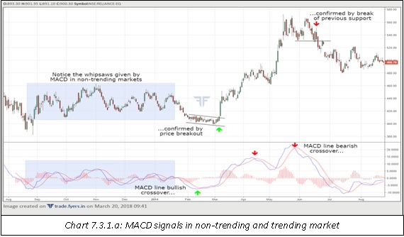
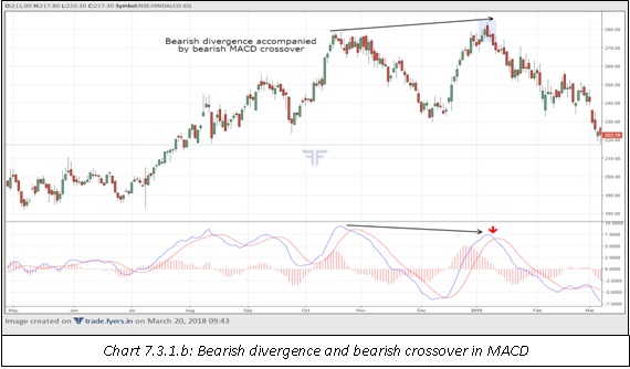
Notice in the chart above when market was trading sideways, there were a lot of whipsaws and false signals generated by MACD. This further highlights how poorly the indicator works in non-trending markets. Then, notice how the indicator performed in a trending market. The MACD line (green) crossed above the signal line (red), which was later followed by a buy signal as the price broke out of a narrow downward sloping channel. This buy signal was in place until the MACD line crossed below its signal line, which warranted cutting of existing long positions. Then, the MACD line again crossed above the signal line, warranting addition of further long positions. This buy signal was in place until the MACD line gave a bearish crossover. Notice here that the bearish crossover was a few days later followed by a support breakdown in price, which warranted the initiation of a short position and holding on to it until the emergence of a bullish crossover. Meanwhile, notice in the chart below how a bearish divergence accompanied by a bearish MACD crossover and a bearish candle pattern (more on this in a later topic) led to a sharp decline in price. This highlights the fact that the greater the number of signals that occur at the same time, the more powerful the reversal signal.
Fast Stochastics
Developed by George Lane, fast stochastics is an oscillator that is commonly used to identify overbought and oversold regions. This indicator tells the position of the closing price relative to the high-low range over the past ‘n’ periods. By default, the value of ‘n’ is 14 in most charting platforms, and we will be using this value in our discussion of stochastics. Basically, stochastics compares the closing price today to the highest high and the lowest low over the past 14 periods. The positioning of the current close relative to the high-low range tells a chartist about the strength of the prevailing trend. Stochastics is expressed in percent terms and is bounded on both sides, meaning it fluctuates within a range of 0 to 100 with 50 acting as the central value. Because stochastics is expressed as a percent, it cannot travel below 0 or above 100. A reading above 50 means the price is in the upper half of the high-low range, while that below 50 means the price is in the lower half of the high-low range. The higher the reading above 50, the greater is the bullish momentum, and the lower the reading below 50, the greater is the bearish momentum.
During an uptrend, it is common for the price to close in the upper half of the range, causing stochastics to move between 50 and 100. As the uptrend gathers steam, the price tends to close near the upper extremes of the high-low range, causing stochastics to move closer towards 100. However, the turning point arrives when the uptrend begins to lose momentum. As the intensity of the uptrend begins to fade, there is a tendency for the price to retreat from the upper extremes, causing stochastics to retreat too. Stochastics turns before a turn in the price itself and as such, before the uptrend reverses, stochastics will already warn the chartist about the impending weakening of bullish momentum. Similarly, during a downtrend, it is common for the price to close in the lower half of the range, causing stochastics to move between 50 and 0. As the downtrend gathers steam, the price tends to close near the lower extremes of the high-low range, causing stochastics to move closer towards 0. However, the turning point arrives when the downtrend begins to lose momentum. As the intensity of the downtrend begins to fade, there is a tendency for the price to back off from the lower extremes, causing stochastics to recover. But because stochastics turns earlier, it will already warn the chartist about the impending deterioration of bearish momentum, before the downtrend reverses.
Fast stochastics is displayed below the price chart. The indicator is plotted using two lines: %k and %d. %k is the actual stochastics line, while %d is the signal line that is used to smoothen %k line. While the default period for %k is 14, the default period for %d is 3. These default values can be changed depending upon the preferences of the chartist. Increasing these default values will make stochastics less sensitive to price change, while decreasing these values will make stochastics more sensitive to price change. The formula that is used to calculate %k and %d is as mentioned below:
%k = {[ Closing price – Lowest low ] / [ Highest high – Lowest low ]} * 100
%d = 3-period simple moving average of %k
Because stochastics is an oscillator, it can be used to determine whether price is overbought or oversold. Usually, a reading above 80 is considered overbought, while that below 20 is considered oversold. The %d line crossing above and below such extremes can be used to generate signals. For instance, when the %k line cuts below the %d line in an overbought region and both the lines exit the overbought region, a crude sell signal is generated, especially if confirmed by price action. Similarly, when the %k line cuts above the %d line in an oversold region and both the lines exit the oversold region, a crude buy signal is generated, especially if confirmed by price action.
Another use of stochastics is to identify bullish and bearish divergence with price. A bearish divergence forms when stochastics is in overbought territory and forms a lower peak, while price forms a higher peak. Similarly, a bullish divergence forms when stochastics is in oversold territory and forms a higher trough, while price forms a lower trough. If these divergences are accompanied by %d crossovers (as discussed in the previous paragraph), then the signals are even stronger. Last but not the least, stochastics can also be used to identify bearish and bullish swing failures.
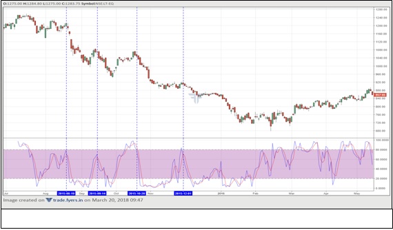
Notice in the above chart the behaviour of the stochastics indicator in a trending market. It is clear from the chart that the trend is lower. When in a downtrend, notice how sell signals and buy signals work. The four sell signals that occurred as the stochastics approached the overbought region is marked using blue dotted vertical line. Observe how well these signals worked. Alternatively, note that buy signals did not work well in most of the occasions. This brings us to an important point. When in an uptrend, use bullish indications from stochastics to go long and bearish indications to trim existing longs rather than build fresh shorts. Similarly, when in a downtrend, use bearish indications from stochastics to go short and bullish indications to trim existing shorts rather than build fresh longs.
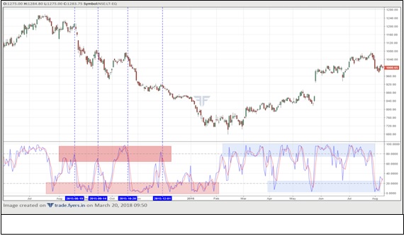
The above chart is the same chart shown earlier but with more data to the right. When a market is trending down, stochastics frequently ventures into the oversold zone but does not venture as frequently into the overbought zone. Such a behaviour continues as long as the downtrend is healthy. Once the intensity of the downtrend deteriorates and price starts to slowly inch higher, the behaviour of stochastics will change. It will now start to move into the overbought zone, but will usually fail to reach the lows that it used to when price was in a downtrend. If the uptrend picks pace, the stochastics will frequently venture into the overbought zone and fail to as frequently reach the oversold zone. In the first half of the above chart, notice how stochastics behaved when price was in a downtrend. And then, in the second half of the chart, notice how it behaved when the trend reversed from down to up. This again highlights an important point. The behaviour of stochastics tells a lot about the strength of the prevailing trend. When the trend is about to change, so will the dynamics of stochastics. This helps to dispel the belief that stochastics works well only in non-trending markets.
Relative Strength Index
Developed by Welles Wilder, the Relative Strength Index is one of the most popular and most widely used technical indicators of all. The RSI is an oscillator as it fluctuates in a fixed band between 0 and 100, with 50 being the central value. It can neither go below 0 nor can it go above 100. Because the range for the RSI is fixed, it can be used to identify overbought and oversold regions. By default, most charting platforms use 14 periods to calculate the value of the RSI. In our further discussions too, we will be using a 14-period RSI. However, please note that this figure can be adjusted as per the needs of the chartist. Increasing the default period will make the RSI less sensitive to price change and generate fewer signals, thus helping to avoid whipsaws. Decreasing the default period will make the RSI more sensitive to price change and thereby generate greater number of signals, but at the same time will increase whipsaws also. As such, there is always a trade-off between increasing and decreasing the default RSI period. The formula that is used to calculate RSI is as follows:
RS = average gainfor the past n-period/ average loss for the past n-period
RSI = 100 – { 100 / [ 1 + RS ]}
Note: For the nth period, simple average is used to calculate average of n-period gains (or losses). From the next period onwards, these averages are smoothed using the formula: averagegain = {[ Previous average gain * ( n – 1 ) + current period gain] / n }and averageloss = {[ Previous average loss * ( n – 1 ) + current period loss] / n }
As we can see, there are two steps in the calculation of the RSI. The first step is to calculate the average of the positive closes for the past 14-periods and then divide this figure by the average of the negative closes for the past 14-periods. The second step is to feed this value in the RSI equation. As already stated, because of the way the RSI is constructed, it is an extremely valuable tool to identify overbought and oversold regions. However, the usage of the RSI does not stop here. The RSI is an extremely versatile tool that be used to find out not only overbought and oversold regions, but also to identify bullish and bearish divergences, positive and negative reversals, bullish and bearish swing failures, and bullish and bearish zones.
Typically, an RSI reading above 70 is considered overbought, and that below 30 is considered oversold. However, this is usually a range when the trend is sideways. The overbought/oversold levels will be different in an uptrend and in a downtrend. In an uptrend, the price will usually get overbought after approaching 75-80 and get oversold after approaching 35-40. In a downtrend, the price will usually get overbought after reaching 60-65 and get oversold after reaching 20-25. As long as the ongoing trend is healthy, expect the RSI to fluctuate within these ranges. When a trend is about to change, so too will the behaviour of the RSI. For instance, in an uptrend, the RSI will usually fluctuate in a band of 35-80. When the uptrend matures, the dynamics of the RSI will start reflecting this. The indicator will struggle to get past 70 and, on the downside, start to slide below 30. If such actions persist, they can be construed as a warning that the uptrend is nearing an end. Similarly, in a downtrend, the RSI will usually fluctuate in a band of 20-65. When the downtrend matures, the dynamics of the RSI will start reflecting this. The indicator will struggle to slide below 30 and, on the upside, go past 70. If such actions become regular, they can be construed as a warning that the downtrend could be about to end. Knowing about how the RSI behaves during a trend and how it behaves when a trend is changing helps a chartist to adjust his trading strategies accordingly.
The RSI can also be used to spot for positive and negative reversals. A positive reversal refers to a scenario when the RSI makes a new low, but the price does not make a new low. Similarly, a negative reversal refers to a scenario when the RSI makes a new high, but the price does not make a new high. Such signals can be used to establish counter positions, especially when confirmed with other tools. For instance, if a positive reversal between price and RSI is followed by some sort of bullish indication in price, a long position can be established. Similarly, if a negative reversal between price and RSI is followed by a break below support, a short position can be established. Meanwhile, bullish and bearish divergences, as well as bullish and bearish swing failures, appear more frequently on the RSI than they do on the MACD and the fast stochastics.
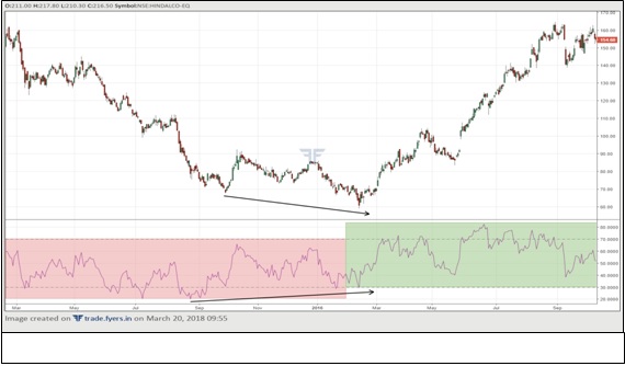
In the above chart, notice the behaviour of the RSI at a time when the trend is changing. The first half of the chart portrays a clear downtrend. Notice that during this period, the RSI got overbought on approaches towards 60-65, and oversold on approaches towards 20-25. As the intensity of the downtrend started to decelerate, the oversold region of the RSI stared to shift higher from the earlier zone of 20-25 to 30. This can be construed as a warning the downtrend is weakening. Also notice the emergence of a bullish divergence during this period, as the higher low in the RSI was accompanied by a lower low in price. As the price bottomed and started to rise, notice how quickly the RSI broke its previous peak and rose above 70. This is a second warning that the downtrend is weakening, and that we are potentially in the early stages of an uptrend. As the uptrend gathered momentum, notice the transition in the RSI reading. The overbought zone shifted higher to 75-80 while the oversold zone moved higher to 40. Notice how easily the indicator moved into the overbought territory, while barely approaching the oversold territory. This chart shows how versatile a tool the RSI is as it can offer immense help in a trending market, both at the time of trend continuation and trend reversal.
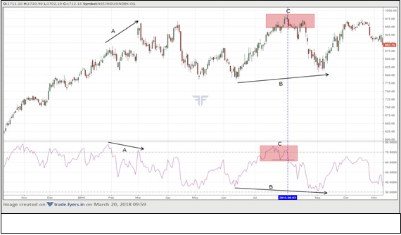
The above chart has three observations worth noting. The first observation, marked A, displays a bearish divergence. Notice how this divergence occurred with both RSI peaks in the overbought zone. The highest high in the price registered during this period was a classic bearish engulfing candle (more on candles in a later chapter) that engulfed not only one but the previous two candles. The second observation, marked B, displays a positive reversal. Notice that during this period, the lower low in the RSI was accompanied by a higher low in price, which is a bullish development. One thing to point out here is that a bullish engulfing pattern works better when it occurs in the oversold zone, while a bearish engulfing pattern works better when it occurs in the overbought zone. No such requirement exists for a positive or negative reversal. So, a positive reversal works as good when it appears in the oversold territory as it does when it appears above the oversold territory, while a negative reversal works as good when it appears in the overbought territory as it does when it appears below the overbought territory. The third observation, marked C, displays a bearish swing failure. Notice that after entering the overbought zone and making a new high, the RSI retreated below the overbought zone, made a low and then re-entered the overbought zone again. However, it failed to break the previous high and then went on to break below the prior bottom. The vertical blue line shows the point at which the RSI broke below its previous low. This pattern was accompanied by an evening star candle pattern (more on candles in a later chapter) on the price chart, adding credence to the bearish swing failure pattern. Notice how price never crossed the high during the remainder of the chart. This further highlights how RSI patterns can be used with price tools to increase the validity of a pattern.
Bollinger Bands
The indicators that we have studied so far are plotted on a different scale below the price. Bollinger bands, on the other hand, are plotted on the price chart itself. Developed by John Bollinger, Bollinger bands is a tool that is used to measure the volatility of a security. The size of the bands tells the chartist the prevailing volatility in prices. The wider the bands, the greater is the volatility; the narrower the bands, the lower is the volatility. Bollinger bands consists of standard deviation bands that are placed above and below a moving average. By default, most charting platforms use a 20-period simple moving average and 2 standard deviation bands. Of course, these default values can be adjusted, but in our discussion, we will stick to the default values. The upper band is plotted 2 standard deviations above the moving average, while the lower band is plotted 2 standard deviations below the moving average. The moving average is referred to as the middle band.
In an uptrend, it is common for price to travel between the middle band and the upper band, while frequently touching or in some cases even exceeding the upper band. This is a sign of strength. When the price becomes overbought, it retreats from the upper band to the middle band, before resuming its uptrend again. During an uptrend, think of the middle band as an area of support whenever the price retreats off the upper band. As long as the uptrend is intact, pullback towards the middle band can be used to build long positions. As the uptrend matures, price will start struggling to touch the upper band. If such an action is followed by a break below the middle band and move towards the lower band, it is an early warning that the uptrend could be in the process of reversing. If during the next move, price fails to break above the middle band, returns to the lower band, and the upper band starts flattening out, it could be construed as a reversal in trend from up to down. The opposite scenario holds true when the price is in a downtrend and how the dynamics change when the downtrend is about to reverse into an uptrend.
It may be noted from the above paragraph that Bollinger bands is quite helpful when trading in a trending market. Similarly, Bollinger bands can be used to trade in a non-trending market too. As long as the price is in a lateral band, reversal from the lower band can be used to go long, and that from the upper band can be used to go short. When a non-trending market is in the process of changing to a trending market, Bollinger bands can used to identify such changing dynamics. Usually, when the current trend gets very narrow, the upper and lower bands shrink considerably. Such an event usually presages a strong move in either direction, up or down. If the price starts moving higher and crosses the upper band, it usually means the start of an uptrend. Similarly, if the price starts moving lower and crosses the lower band, it usually means the start of a downtrend. Finally, keep in mind that Bollinger bands must be used with other tools rather than using it in isolation. When combined with price patterns, candlestick patterns, or other technical indicators, Bollinger bands can become an immensely valuable tool in a chartist’s toolbox.
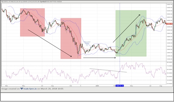
In the above chart, all three trends are visible:
-
Down
-
Sideways, and then
-
Up.
When the price was in a downtrend, notice how the price moved between the lower and the middle band, while frequently touching the lower band. If a chartist identifies such a trend during its infancy, he can use it to his advantage and ride the trend until the dynamics of Bollinger bands start changing. Notice that as the intensity of the downtrend slowed down (the second red box), price failed to touch the lower band and started moving above the middle band while even touching the upper band. Such a development is a warning that the downtrend could be nearing an end. Here, the trend turned from down to sideways. As already stated, when the bands flatten out and shrink markedly, a pickup in volatility can be expected in either direction. Notice that near the end of the consolidation phase, price moved higher and touched the upper band. During this same time, the RSI broke above its sloping resistance line (the breakout point is shown using the vertical blue line). The move higher in price coupled with the confirmation by the RSI increased the likelihood that an uptrend is likely to begin. And this is what happened in the days ahead. In this uptrend, notice how the price fluctuated within the middle and the upper band while RSI frequently ventured into overbought zone but barely even approached the oversold zone. This highlights the importance of using Bollinger bands with other tools to increase the validity of the trading signals.
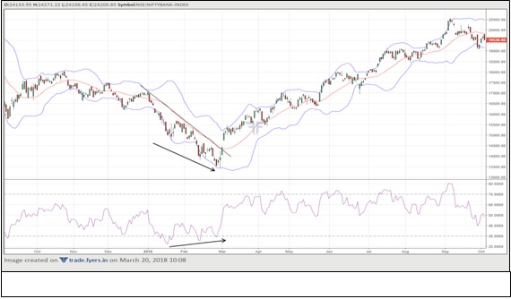
The above chart shows why Bollinger bands must be used with other tools to generate trading signals. Notice that when the price was in a downtrend, it made a series of lower lows. During this same period, notice that the RSI made higher lows. Here, we have a bullish divergence. Such a development warns that the prevailing trend has overextended itself. The appearance of a few bullish candles at the bottom combined with the break above the downward sloping trendline and the middle band was a warning that a recovery in price can be expected from such oversold levels. Had the chartist not paid much attention to other tools and just emphasised on the bands, he would have probably ignored the break above the middle band and waited until the price went further higher and touched the upper band. In doing so, either he would have held on to his short position and exited it at higher levels, or he would have built a long position when the price was way above the middle band. Using multiple tools will not only strengthen the validity of a trading signal, but it will also help in filtering out potential bad signals.
Average True Range
Developed by Welles Wilder, Average True Range is a tool that is used to measure the volatility of a security. Unlike the Bollinger bands however, this tool is plotted below the price rather than on the price. ATR talks about the volatility only, and nothing more than that. It does not indicate the direction of the trend, whatsoever. So, don’t presume that if the ATR line is rising, it means the price must be in an uptrend. Not necessary at all, the price could either be in an uptrend or in a downtrend. To identify the trend, either look into the price or use other technical indicators. What the ATR tells us is that if the ATR line is rising, volatility is increasing; if the ATR line is falling, volatility is decreasing. To calculate the ATR, the first step is to calculate the true range (TR). For doing this, the current bar is compared either to itself or to the previous bar close. The TR is the greatest of the following:
-
Current bar high – current bar low
-
Absolute value of [current bar high – previous bar close]
-
Absolute value of [current bar low – previous bar close]
By default, most charting platforms use a 14-period ATR. We will use the same in our further discussions. Once the TR is computed, ATR can be calculated as the average of the TR over the past ‘n’ periods based on Wilder’s own system of averaging. The formula that is used to calculate the current period ATR is as follows:
Current period ATR = {[ Previous period ATR * ( n – 1 ) + current period TR ] / n }
So, for instance, in case of 14-period ATR, n = 14 and n – 1 = 13; while in case of a 7-period ATR, n = 7 and n – 1 = 6.
Note: For the nth period, simple average is used to calculate the current period ATR. From the next period onwards, each current period ATR value is smoothed using the formula mentioned above.
ATR is an excellent tool for determining the size of a stop loss at the time of entering a trade. Because it measures volatility, it informs the chartist the magnitude of the stop loss that must be placed when a trade is entered. A high ATR reading is reflective of high volatility and tells the chartist that a wider stop must be placed to avoid getting whipsawed. Similarly, a low ATR reading is reflective of low volatility and tells the chartist that a narrow stop must be placed due to a lack of directional trend in the market.
Notice in chart 7.3.5.a below that the ATR line was declining for most of the first half. This implies that the volatility was reducing. During this period, if the chartist wanted to initiate a trade, he could do so by placing a small stop loss. However, notice that once the price broke above the sloping resistance line, it was accompanied by a marked pickup in volatility too. In fact, the ATR also broke above a sloping resistance line of its own. This dual confirmation – breakout in price accompanied by an expansion in volatility – increased the probability of the beginning of a new trend i.e. from sideways to up. Meanwhile, to the extreme right of the chart, notice that the up move in price was not followed by a similar kind of up move in the ATR. This has got to do with the way the ATR is calculated. Remember that the ATR, in its calculation, compares the current bar either with itself or with the previous bar close. In other words, the ATR is comparing the range of the bars. Naturally, the smaller the range, the lesser will be the volatility; and the greater the range, the higher will be the volatility. To the right of the chart, notice that despite price heading higher, expect for a few candles, most of the candles were narrow in size. This in turn caused the ATR to rise but at a slower pace. During market extremes, the decline in ATR can, on occasions, be construed as a sign that the current trend might be weakening.
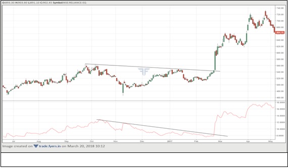
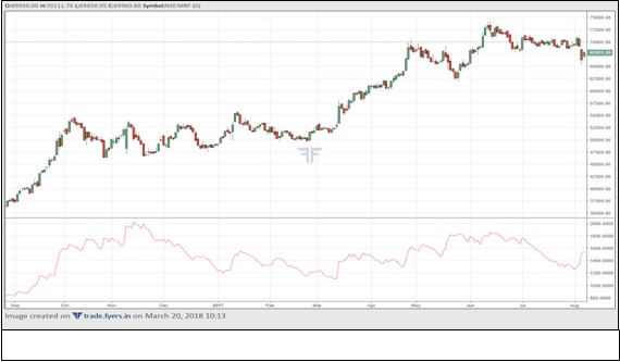
Compare the chart 7.3.5.b with the chart 7.3.5.a. Look at the price scale of ATR reading on each of the two charts. What did you notice? In the case of the first chart, the latest ATR reading was around 15, while in the case of the second chart, the latest ATR reading was around 1300. Why such a discrepancy? This has got to do with the price of the security. Note that in the first chart, the latest price of the security was just three digits, while in the second chart, the price was five digits. So, in the case of the first chart, a trader could trade by maintaining a stop loss of 15 or some multiple thereof. However, if he wants to trade the second chart, he will have to maintain a stop loss of 1300 or some multiple thereof. Try to trade the second chart with a stop loss of 15 will surely lead to lots of whipsaws!
Directional Movement Indicator
Developed by Welles Wilder, Directional Movement Indicator and Average Directional Index are tools that are used to measure the direction of the trend and the strength of the trend, respectively. By default, most charting platforms use 14-period in their calculation, and as such, we will also stick with the default reading in our further discussion. DMI is a commonly used tool to determine the direction of the trend i.e. to find out whether the price is trending up or down. ADX is a commonly used tool to identify how strong the prevailing trend is irrespective of its direction.
To calculate each period’s directional movement, the current bar extreme is compared to the previous bar extreme. At any point in time, one of the below mentioned events will occur:
-
Current bar high is above previous bar high and current bar low is above previous bar low. In this case, we have positive directional movement (+DM). It is calculated as: current bar high – previous bar high.
-
Current bar high is below previous bar high and current bar low is below previous bar low. In this case, we have negative directional movement (-DM). It is calculated as: previous bar low – current bar low.
-
Current bar high is less than previous bar high and current bar low is greater than previous bar low. In this case, we have a directional movement equal to zero.
-
Current bar high is above previous bar high and current bar low is below previous bar low. In this case, we could have either +DM or -DM, depending on which difference is greater. If the difference between current bar high and previous bar high is greater than that between previous bar low and current bar low, we have +DM. In this case, +DM is calculated as: current bar high – previous bar high. On the other hand, if the difference between current bar high and previous bar high is less than that between previous bar low and current bar low, we have -DM. In this case, -DM is calculated as: previous bar low – current bar low.
Keep in mind that at any point in time, we can have either +DM or -DM, but not both. On days when we have +DM, -DM is zero; and on days when we have -DM, +DM is zero.
Once +DM and -DM are calculated for each of the past n periods, they are then smoothed using the Wilder’s system of averaging to calculate the n-period +DM and the n-period -DM. Meanwhile, along with +DM and -DM, TR is also calculated for each of the past n periods, and then it is smoothed using the Wilder’s system of averaging to calculate the n-period TR.
Once the smoothed n-period +DM, -DM, and TR are calculated, it is time to calculate the positive directional movement indicator (+DMI) and the negative directional movement indicator (-DMI) for that period using the formula mentioned below:
+DMI = [ smoothed +DM / smoothed TR ] * 100
-DMI = [ smoothed -DM / smoothed TR ] * 100
Once the +DMI and -DMI are calculated, it is time to calculate the Directional Index (DX) using the formula mentioned below:

Finally, the ADX is then calculated using the following formula:
Current period ADX = {[ Previous period ADX * ( n – 1 ) + current period DX] / n }
Note: For the first calculation, simple average of DX is used to calculate the current period ADX. From the next calculation onwards, each current period ADX value is smoothed using the formula mentioned above.
Please keep in mind that the DMI is a calculation intensive technical indicator. Do not get bogged down or worried about the calculation details. The entire calculation will be taken care of by the trading platform. All we must do is just select the period for the indicator, and then use the indicator for understanding the price, the direction of the trend, and the strength of the trend. Now that the calculation is behind, let us focus on the analytical part of the indicator. As already stated, the DMI is used to determine the direction of the trend, while the ADX is used to determine the strength of the trend. All the three lines - +DMI, -DMI, and ADX – are plotted in the same chart below the price. To make interpretation easy, represent the +DMI line using the green colour, the -DMI line using the red colour, and the ADX line using any other colour.
ADX fluctuates between a reading of 0 and 100, but such extremes are very rare, more so on the upside. It is very rare to see the ADX line crossing above 70. Usually, it moves in a band between 10 and 60, with a reading near 10 indicating a very weak trend and that near 60 indicating a very strong trend. While the behaviour of the ADX will be different for different securities, generally speaking, an ADX line that is falling and is below 20 indicates that the price is in a lateral band and warrants the implementation of ranging strategies, such as stochastics, RSI, selling near resistance, buying near support etc. Meanwhile, when the ADX line is rising and crosses 25, it indicates that a trend is beginning to gather momentum and as such, warrants the implementation of trending strategies such as MACD, RSI, moving averages, breakout above resistance, breakdown below support etc. An ADX reading above 50 indicates a very strong trend, but at the same time, it also puts the chartist on an alert mode to look out for any signs of trend fatigue and subsequently a reversal.
Just like the ADX, the two DMIs also fluctuate between a reading of 0 and 100. Once it is observed that the ADX line is rising and has crossed 25, the chartist can then look at the two DMIs to determine the direction of the trend and develop trading strategies. If the +DMI line is above the -DMI line, it means the uptrend is gathering strength. In such a case, the chartist should look out for buying opportunities using price, price tools, or other technical indicators. Similarly, if the -DMI line is above the +DMI line, it means the downtrend is gathering strength. In such a case, the chartist should look out for selling opportunities using price, price tools, or other technical indicators.
An important thing to keep in mind is that the two DMI lines and the ADX line must be used to figure out the direction and the strength of the trend and not to generate buy and sell signals. Actual buy and sell signals must be based on the action of the price itself. Initiating a long position just because the ADX line is rising above 25 and the +DMI line has crossed above the -DMI line won’t lead to profitable trades unless such signals are confirmed by the action of the price. If, for example, the price breaks out of an inverse H&S or a triangle pattern, and if during or after the breakout, the ADX and the DMI generate a bullish signal, such a simultaneous action increases the validity of the pattern breakout. Always combine the DMI and the ADX will other tools and indicators.
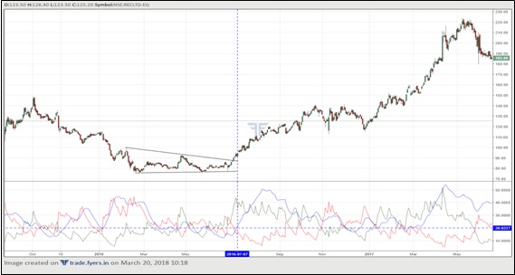
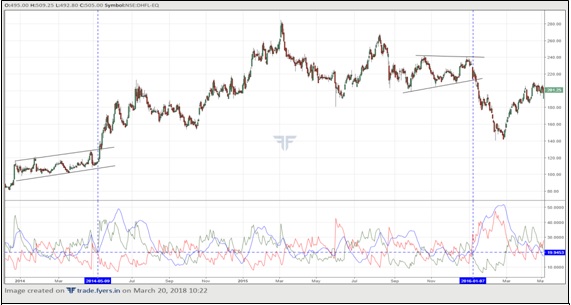
Notice in the chart 7.3.6.a that the price broke out of a descending triangle pattern on the upside. This breakout was simultaneously accompanied by the +DMI line crossing above the -DMI line and a few days (see the vertical blue line) later the ADX line rising above 25. Such an action confirms that the breakout in price has been accompanied by an acceleration in bullish momentum, which in turn increases the validity of the signal. Also notice in chart 7.3.6.b how a breakout of a rising channel was accompanied by the ADX line rising above 25 and the +DMI surging above the -DMI line. Later in the chart, also notice the breakdown from the triangle was again accompanied by the ADX line rising above 25 and the -DMI surging above the +DMI.
On-Balance Volume
So far, we have studied technical indicators that are based on the most important element, the price. Now, we will turn our focus on technical indicators that are based on the other important element, the volume. Developed by Joe Granville, On-Balance Volume is an indicator that uses volume in its calculation to measure the force of the move in price. It is plotted below the price in the form of a cumulative running line. Its calculation is very straight forward as is shown below:
When the current bar closes above the previous bar, the current day volume is added to the previous OBV value as follows:
Current OBV value = previous OBV value + current volume
When the current bar closes below the previous bar, the current day volume is subtracted from the previous OBV value as follows:
Current OBV value = previous OBV value –current volume
When the current bar closes at the exact same level as the previous bar, the current OBV remains unchanged as follows:
Current OBV value = previous OBV value
The OBV is used to measure the buying and selling pressure. Generally speaking, in an uptrend, volume must increase during rallies and fade during declines; while in a downtrend, volume must increase during declines and fade during rallies. The purpose of using OBV is to see whether volume is confirming such price action. For instance, in an uptrend, if the OBV line is rising during price advance and declining during price decline, it is said to be confirming the price action and as such, the uptrend is healthy and intact. However, if the OBV line is falling during price advance and rising during price decline, it is diverging with the price action and such, the uptrend could be nearing an end. OBV can also be used to confirm breakouts or breakdowns in price. For instance, if the price is breaking out of a resistance, is it also being accompanied by some sort of breakout in the OBV? If yes, we have a confirmation that the breakout in price has been accompanied by an expansion in volume, which is a bullish signal. If not, then it puts a question mark on the validity of the breakout. Given that volume usually tends to lead the price, expect to see price breaks usually being preceded by volume breaks.
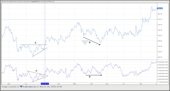
Notice in the above chart the breakout of as ascending triangle pattern in price was confirmed by the breakout of a contracting triangle pattern in the OBC line. Also notice the bullish divergence that formed between price and the OBC line at point B. The lower low in price was not accompanied by a lower low in the OBC line, suggesting that the bearish momentum in price is not confirmed by the indicator. This was later followed by a recovery in price.
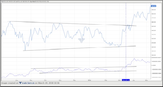
Notice in the above chart that the breakout of a lengthy consolidation in price was also confirmed by the breakout in the OBC line. However, what is noteworthy here is that the breakout in the OBC line occurred a few days before the breakout in price (see the vertical line). Usually, but not always, volume leads the price and gives an idea where the price might head. The earlier breakout in the OBC line hinted that the price will also follow the volume breakout soon, and that is what happened a few days later. Such patterns are applicable not only to upside breakouts, but also to downside breaks.
Chaikin Money Flow
Developed by Marc Chaikin, Chaikin Money Flow is a volume oscillator that combines both price and volume in one indicator. It is an oscillator because it fluctuates above and below the zero line. Values above zero indicate accumulation, while those below zero indicate distribution. Most charting platforms use 20-period as the default setting for this indicator. For our further discussion, we will stick with this default value. This indicator compares where within the bar range does the closing price lie. If it lies in the upper half of the range, the CMF value rises; and if it lies in the lower half of the range, the CMF value falls. The CMF line fluctuates within a range of -1 and +1. A reading of -1 indicates that the price closed at the low point of the bar for the look back period, while a reading of +1 indicates that the price closed at the high point of the bar for the look back period. Such readings, however, are seldom seen. Typically, the CMF line fluctuates between -0.5 and +0.5.
There are two steps that are involved in the calculation of the CMF line. They are as mentioned below:
Step 1: Find out the multiplier for the current bar and multiply it with the current bar volume to calculate the current bar money flow. The formula to do this is as follows:

Step 2: Calculate the current bar money flow for each of the past ‘n’ sessions. Once done, the n-period CMF can be calculated for each of the following sessions from the nth session onwards, using the following formula:

If the current bar close is in the upper half of the bar, the multiplier fluctuates between 0 and +1; while if the current bar close is in the lower half of the bar, the multiplier fluctuates between 0 and -1. If price is consistently closing in the upper half of the range and if this is accompanied by high volume, such an action indicates that accumulation is taking place. The higher the CMF line above the zero line, the stronger is the uptrend. An uptrend is said to be weakening when price is closing in the upper half of the range but is being accompanied by declining volume. Such an action causes the CMF line to decline despite the rally in price. This is referred to as a bearish divergence. Similarly, if the price is consistently closing in the lower half of the range and if this is accompanied by high volume, such an action indicates that distribution is taking place. The lower the CMF line below the zero line, the stronger is the downtrend. A downtrend is said to be weakening when price is closing in the lower half of the range but is being accompanied by declining volume. Such an action causes the CMF line to rise despite the decline in price. This is referred to as a bullish divergence.
CMF is widely used to confirm the price action such as break above resistance, break below support, break of price pattern, price crossing a moving average etc. For instance, a breakout of an inverse H&S pattern that is accompanied by the CMF line being above zero and rising is a stronger signal than a similar breakout but with the CMF line being below zero. Besides being used to confirm the price action, this indicator can also be used to look out for divergences with price, to look out for overbought and oversold regions (remember, this is an oscillator) etc.
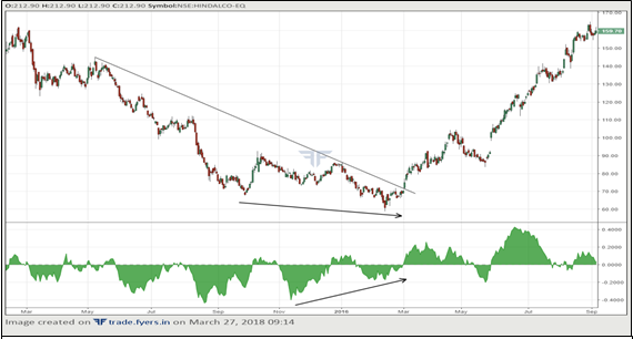
Notice in the above chart how the price formed a bullish divergence with the CMF line. The lower low in price combined with a higher low in the CMF line indicates that the decline in price was being accompanied by lower volume, a sign that the downtrend is weakening. Later, the price broke above the sloping trendline. This breakout in price was accompanied by the CMF line moving above zero and rising, an action that confirms an up move in price.
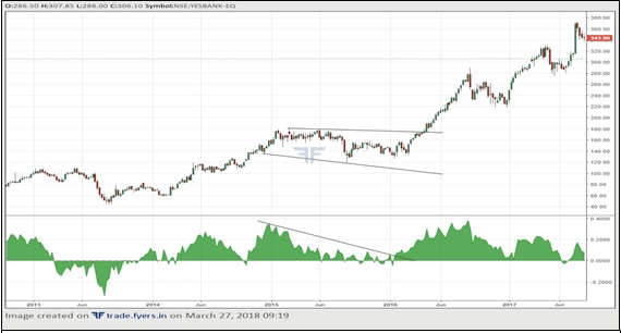
Notice in the above chart that after the start of the uptrend, price entered a consolidation mode and traded inside a down sloping channel for a few months. During this period, the CMF line consistently declined from its peak. However, notice that the CMF line did not sustain for long below the zero line. Instead the CMF line broke above the sloping trendline a few days before the price broke out of the channel. The earlier breakout in the CMF line on this occasion served as a potential signal that the price could break out of channel soon.
Things to keep in mind
-
Technical indicators are a supplement to price action and not a substitute to price action. They must be used as a secondary study only. Trading decisions that are based just on the signals generated by technical indicators without any confirmation from price are bound for failure. Once a signal is generated by an indicator, trade on that signal only when it is confirmed by price action.
-
As far as possible, stick to the default indicator settings. If, however, there is a need to change these default setting, do a careful analysis about how well these settings have worked in the past. As a rule, decreasing the value of default settings will make the chart more sensitive to price changes, while increasing the value of default settings will make the chart less sensitive to price changes.
Summary
-
Technical indicators are used to identify: overbought/oversold areas, whether indicators are confirming the price action, divergence between indicators and price, crossover above and below the indicator central value, swing failures, and behaviour during trending markets.
-
MACD is a momentum indicator that is commonly used in a trending market. It consists of two lines: MACD line and signal line. The MACD line is the difference between two moving averages, one shorter and the other longer, while the signal line is used to smoothen the MACD line.
-
Fast stochastics tells the position of the closing price relative to the high-low range over the past ‘n’ periods. It is an oscillator that is commonly used to identify overbought and oversold regions.
-
RSI compares average gains over the past ‘n’ periods to average losses over the past ‘n’ periods, to identify about the strength and the momentum of the trend. RSI is an extremely versatile tool that be used to find out overbought and oversold regions, bullish and bearish divergences, positive and negative reversals, bullish and bearish swing failures, and bullish and bearish zones.
-
Bollinger bands is a tool that is used to measure the volatility of a security. Bollinger bands consists of standard deviation bands that are placed above and below a moving average.
-
ATR is a tool that is used to measure the volatility of a security. An increase in the ATR line suggests that volatility is increasing, while a decrease in the ATR line suggests that volatility is decreasing.
-
DMI is a commonly used tool to determine the direction of the trend i.e. to find out whether the price is trending up or down. ADX is a commonly used tool to identify how strong the prevailing trend is irrespective of its direction.
-
OBV is an indicator that uses volume in its calculation to measure the force of the move in price. Depending on the closing price, the OBV line could increase, decrease, or remain unchanged.
-
CMF compares where within the bar range does the closing price lie. If it lies in the upper half of the range, the CMF value rises; and if it lies in the lower half of the range, the CMF value falls.
Next Chapter
Comments & Discussions in
FYERS Community
Alpha commented on March 14th, 2019 at 10:04 AM
Can you please explain what is super trend?
Yajman commented on March 14th, 2019 at 10:46 AM
Very detailed. Thank you
yashas commented on March 14th, 2019 at 11:01 AM
Thank you, Yajman. Through the School of Stocks, we are striving to provide comprehensive learning material which will help deepen understanding of trading & investing.
Mohan C. Gole commented on April 4th, 2019 at 12:03 PM
Very good Thank you. Please give in pdf format to read offline.
tejas commented on April 4th, 2019 at 1:35 PM
Hey Mohan, Glad you like it. PDFs? Hmmm.. not happening now. Maybe in the future.
Avinash commented on April 6th, 2019 at 8:08 AM
Hey Tejas, very good initiative from you guys. This is comprehensive and explains concepts without any hint of ego. It is to the point and precise. Please keep up the great work!
Avinash (afin)
tejas commented on April 8th, 2019 at 1:53 PM
Hi Avinash, Thanks! Do encourage people to read from our platform. We want to reach out to those who want to learn about the markets. And yeah, do participate. As a regular member of Traderji, you would be in a position to answer to some queries too.
Avinash commented on April 8th, 2019 at 2:23 PM
Sure Tejas! That sounds like a great thing too. Will contribute here as well.
Md Sekendar Biswas commented on April 6th, 2019 at 11:08 PM
this is a great initiative and traders are no doubt going to be benefitted a lot from this.I also think that there are many who are new or not so much aquainted with these things but they are eager to learn . it seems to me that some videos in this regard should also be posted especially on the use of technical indicators so that people can learn it properly. Finally I would thank the authority for this great endeavour
tejas commented on April 8th, 2019 at 1:56 PM
Hi @MD Sekandar Biswas. Yeah, I know but right now we're focusing on content on this platform. We just got started :-). Do feel free to share with whoever you think will benefit from it. We want to spread financial awareness to the maximum possible extent.
Trupti commented on April 20th, 2019 at 4:46 PM
Hi Team, I really appreciate your work. Beginners can easily learn from this. All the very best. Keep growing.
tejas commented on April 22nd, 2019 at 5:53 PM
Thanks Trupti! Thanks for appreciating our work.
jahangir commented on June 13th, 2019 at 1:52 PM
which is best the best indicator for identifying trend
tejas commented on June 13th, 2019 at 3:25 PM
Any indicator based on moving averages are good. The most basic ones being Stochastics, RSI and MACD.
kalyan k commented on June 13th, 2019 at 1:54 PM
is it good to trade with MACD convergence and divergence strategy.
tejas commented on June 13th, 2019 at 3:27 PM
Kalyan, MACD divergences are more useful to identify the divergence. The trade decision must be based on some other reconfirmation such as price levels, trend lines, pivots or chart patterns. MACD tells you about the momentum but the entry point needs to be more precise IMO.
sumanth commented on June 13th, 2019 at 1:57 PM
Which is the best time frame for intraday trading
tejas commented on June 13th, 2019 at 3:29 PM
I would say, it's 5 minutes because it's the most widely used in India. For currencies, 15-minute timeframe makes more sense as the price action on the 5-minute charts aren't very decisive. This is just my opinion.
Preetam sahu commented on September 28th, 2019 at 10:23 PM
why the adx oscilator in your web platform doesnot have the (+) di and (-) di lines, in your webplatform there is only a red line, but there should be one golden line (adx line), a red line indicating (-) di, and a green line indicating (+) di. why this is so and when it will be resolved ???
Sureshkumar commented on October 2nd, 2019 at 9:33 PM
Do we have option to add indicator on indicator, Eg to add moving average on OBV.
If yes, How ?
tejas commented on October 3rd, 2019 at 9:00 PM
Tradingview (the charting platform) used on FYERS web has not yet provided this functionality for third parties.
Jakir Ahmed commented on November 3rd, 2019 at 10:12 PM
How to plot moving average at volume of stock.
tejas commented on November 6th, 2019 at 11:36 PM
That's simple. You can find it under indicators. Just choose the type of MA you want. Currently, we have 8 moving average indicators on the web.
brij kishore sharma commented on March 23rd, 2020 at 8:12 PM
How helpful is Pivot in intra day equities? Do you have some material in your lessons? If not ,where I can find it.
Shriram commented on March 25th, 2020 at 7:11 AM
Pivot can be helpful but is quite subjective depending on the formula one uses to calculate it. For instance, some use plain pivots that just involve OHLC data and then calculate resistances and supports based on that. A few other combine OHLC with volatility tools such as ATR so that the supports and resistances take volatility into consideration, and so on. For intraday trading, simple pivot points can help. That said, one must see how these work for each security and must compliment them with other tools rather than using them in isolation.
brij kishore sharma commented on March 23rd, 2020 at 8:19 PM
Whenever 'pivot point standard' is plotted on chart in web it condenses/shortens/shrinks size of candle
too much that it is almost impossible to decipher where is pivot line and resistance and supports on candlesticks.
Shriram commented on May 14th, 2020 at 5:12 PM
Hi Brij Kishore, that happens because the chart, by default, adjusts itself to the best possible fit when this indicator is selected. As a result, to account for all the supports and resistances below and above the price, the size of the candles shrinks. That is how this indicator is. One way that you could tackle this issue is to reduce the number of supports/resistances in the indicator.
Siddhu Gaddi commented on May 6th, 2020 at 5:34 PM
Hi team,
Can you please update one small update in Indicator.
Right not now moving average can be added based on open, high, low, close, ohlc/4, oh/2, so can you update where I can use RSI, CCI, and another indicator rather than close data.
Thank You.
Shriram commented on May 14th, 2020 at 5:18 PM
Hi Siddhu, can you elaborate more on the issue that you are facing? Do you mean to ask whether moving average can be added on technical indicators such as the RSI?
Siddhu Gaddi commented on May 14th, 2020 at 5:36 PM
Right now when we go the MA setting it has source as an input, in this drop-down list we can select on which basis we can calculate MA,,is it based on Close, Open, High , Low,,, At the same time if we have added RSI in Chart it should also calculate MA based on RSI value. For reference In Zerodha, they provide ChartIQ chart platform... You can refer to that...
Shriram commented on May 18th, 2020 at 8:10 PM
Hi Siddhu, understood what you saying. Unfortunately at present, we don't have the indicator on indicator facility on our platform. But be assured, we will see what we can do about this at the earliest.
V. Ramachandrareddy commented on May 7th, 2020 at 7:59 PM
Sir how to set CPR indicator in fyers web platform pls
Shriram commented on May 14th, 2020 at 5:20 PM
Could you elaborate more on this indicator? Do you mean the PCR (Put Call Ratio) indicator?
Suresh M commented on May 15th, 2020 at 11:54 PM
It's not PCR, its CPR (Central Pivot Range). Apart from Daily Pivot point, supports and resistances, there will be couple more data as well which are like below:
1. Previous day high and Previous day Low
2. Previous week central pivot range.
3. Weekly support and resistance. etc etc
There are so many user written CPR indicators in trading view. I see now a days majority of people are using CPR for trading. Even i prefer the same during trading.
From one of my friend i came to know that Fuers doesn't have CPR, thats one of the reason which i didn't open account with them.
I have seen several email request sent to Fyers to include this as indicator. May be its the right time to include this into platform and add more value to your platform.
Shriram commented on May 18th, 2020 at 8:19 PM
Hi Suresh, at present, we have most of the indicators that are available on charting platforms. However, we shall have a look at the CPR indicator and see if we can incorporate it onto our platform.
Shoukat commented on June 10th, 2020 at 9:47 PM
I was keen to search for bill William Fractal indicator, which is quite decent to use. If you this feature please let me know. I would be happy to go ahead and open the account ASAP.
Abhishek Chinchalkar commented on June 12th, 2020 at 8:26 AM
Hi Shoukat, will check out about this
Abhishek Chinchalkar commented on June 13th, 2020 at 8:18 AM
Hi Shoukat, Williams Fractal indicator is already available on our charting platform. Besides, we also have the Williams Alligator indicator on our platform.
Siddhu Gaddi commented on June 16th, 2020 at 8:17 AM
Hi team,
One small request , please introduce MACD 4C INDICATOR in fyers....
Thank you.
Abhishek Chinchalkar commented on June 16th, 2020 at 9:20 AM
Hi Siddhu, will check out if this would be possible
Kiran soni commented on June 21st, 2020 at 11:11 PM
Please provide pdf for fundamental and technical analysis all chapter in mail.
[email protected]
Abhishek Chinchalkar commented on June 22nd, 2020 at 7:33 AM
Hi Kiran, at present, we will be continuing with web-based content and are not planning a PDF version of the same. That said, we will give a thought to this going forward.
Tejas commented on July 6th, 2020 at 5:55 PM
Hellooo....what is meant by 'smoothing ' used in moving average .. RSI ..MACD .. please explain in the simplest words you can...
Abhishek Chinchalkar commented on July 7th, 2020 at 12:12 PM
Hi Tejas, smoothing is a technique used in technical indicators to reduce the frequency of trading signals. Let me explain this in context of MACD. MACD indicator is comprised of two lines: MACD line and signal line. The signal line here is nothing but the smoothing line. It is a certain period MA of the MACD line and is used to smooth out the signals generated by the MACD line. Again, the reason for doing so is to reduce the frequency of trading signals and thereby reduce whipsaws.
Tejas commented on July 7th, 2020 at 5:10 PM
Sorry for asking too much of questions..but how the wipshaws are avoided by smoothning techniques ?.
Tejas commented on July 7th, 2020 at 5:13 PM
And do we really need to remember all the formulae. ?
Abhishek Chinchalkar commented on July 9th, 2020 at 8:10 AM
Hi Tejas, not really. But knowing how an indicator is calculated will help you in tweaking the studies, as and when necessary. That said, there is no need to remember them. Understand them logically and refer back whenever necessary.
Abhishek Chinchalkar commented on July 9th, 2020 at 8:08 AM
Hi Tejas, you can ask as many question as you feel necessary. Talking about your question, one of the reasons why data is smoothed is to reduce the noise in the price. Moving average, for example, is noting but smoothing. For instance, a 50-day simple MA is the average of the past 50 daily closing prices. By calculating the 50-day simple MA, all you are doing is smoothing out the data by removing the noise element from the price. As an example, on a chart, select a security and plot a 50-day simple MA on price. Notice how smooth the trend becomes, as compared to the price which be subject to a lot of noise.
Talking about MACD, as you see in this chapter, the MACD indicator comprises of two lines: MACD line and Signal line. MACD line is nothing but the difference between 12-period EMA and 26-periods EMA. If 12-period EMA is above 26-period EMA, the MACD line will be above zero, which is bullish. On the other hand, if 12-period EMA is below 26-period EMA, the MACD line will be below zero, which is bearish. But trying to act every time MACD line crosses above zero or falls below zero could generate a lot of false signals. As a result, a signal line is calculated, which is nothing by a smoothed line of the MACD line. A trader trading on the basis of MACD will not buy an underlying every time the MACD line moves above zero, but would rather buy when MACD line crosses above zero and is also above the signal line. Notice that now there are two conditions that need to be satisfied to generate a trading signal? This, as you can see, will reduce the number of signals, and thereby possibly help in reducing whipsaws as well. The opposite is also true in case of a sell signal.
Please note above that I have oversimplified the MACD example just for understanding purpose.
Tejas commented on July 9th, 2020 at 3:21 PM
Thank you very much sir for your oversimplified explanation. It is getting quite easier to study technical analysis through your ' School of Stocks'.
Abhishek Chinchalkar commented on July 10th, 2020 at 7:40 AM
Hi Tejas, thank you for your valuable feedback!
Tejas commented on July 12th, 2020 at 7:04 PM
Hiiii Abhishek sir !! The question is not of this section and I saw that u were not in the section of ''Advance technical analysis part' .. I didn't understood the Fibonacci number used between the gaps of harmonic patterns and how they are used .. Please answer if you can
Abhishek Chinchalkar commented on July 15th, 2020 at 7:55 AM
Hi Tejas, the fibonacci ratios that are used in various Harmonic patterns are pre-defined and are based out of some of the most important fibonacci numbers
Tejas commented on July 15th, 2020 at 11:39 AM
Hello Abhishek sir!! Are you there on Instagram? Please let me know.!!
Abhishek Chinchalkar commented on July 16th, 2020 at 7:48 AM
Hi Tejas, I am not there on Instagram, but I am there on Twitter.
Tejas commented on July 16th, 2020 at 11:41 AM
Hiiii sir!! Can I get ur email on contact... Mail me once
on ''[email protected] '' I want to discuss much things with you ..sir
Tejas commented on July 16th, 2020 at 11:43 AM
Email or any other contact ..!!
Tejas commented on July 16th, 2020 at 5:41 PM
Abhishek sirrr
Abhishek Chinchalkar commented on July 18th, 2020 at 7:58 AM
HI Tejas, you can post in your queries in the chapter comment section, and I will respond to them. The advantage of posting comments here is that if someone else has similar queries, the comment section would help address those.
Tejas commented on July 18th, 2020 at 12:07 PM
Could you be my mentor after sometime..?? That's only the question I wanna ask .!
Abhishek Chinchalkar commented on July 20th, 2020 at 7:45 AM
HI Tejas, sure. Please feel free to ask what ever questions you have on the comment section of this platform. I would be more than happy to address them.
Tejas commented on July 20th, 2020 at 1:31 PM
But sir .. for every question I wanna ask I have to login everytime in school of stocks ..no doubt I enjoy coming on this site..but then too it's long to come all the way in the sub section and ask .. it would be great sir if we can contact on any of the following... WhatsApp Instagram or GMail.
Abhishek Chinchalkar commented on July 22nd, 2020 at 6:33 PM
Hi Tejas, the reason for insisting on posting queries here is because it is visible to everyone. As a result, if someone else has similar queries, it becomes quite easier to access for the entire community. Also, posting queries here keeps the chapter quite interactive, thereby adding value further. Hence, I request you to post queries in individual chapters, as it becomes earlier to relate and answer questions. Meanwhile, you can expect a reply to all queries within 1-2 days.
Tejas commented on July 20th, 2020 at 1:34 PM
And sir it also takes almost 2-3 days to get answered..let's make a contact sir .. would be helpful ... Just mail me once at '[email protected]'.
I will share the contact first if you feel any problem..
Tejas commented on July 23rd, 2020 at 12:59 AM
Abhishek sir ... IF I wanna share a screenshot of charts regarding some queries and some related stuff than how would could we do that ?? And a mentor does that .. solving queries ...sir and 2-3 days is literally too much ..like ask a question and wait 2-3 days ... Sir couldn't we contact on WhatsApp? GMail ?