
Introduction
In the third chapter, we discussed Japanese candlesticks in terms of how to construct them and how to interpret them. In this chapter, we will continue with our discussion on Japanese candlesticks by switching our focus towards various candle patterns. While not nearly as significant as the other techniques that we have discussed so far, candle patterns nonetheless cannot be ignored. Their role is especially heightened when they appear near an important price area such as a support, a resistance, a fibonacci level, a trendline, a breakout from a price pattern etc. Because candle patterns are very short-term patterns, they usually pause the ongoing trend rather than reverse it. As such, when we mention the phrase ‘reversal patterns’ in this chapter, keep in mind that these patterns do not always signal an outright reversal in trend from up to down or from down to up, but just that the prevailing trend may take a short-term breather. Having said that, on some occasions these patterns can indeed appear as an important reversal patterns, especially when they appear after an extended trend or are confirmed by other indicators. An important thing to keep in mind is the trend leading to the formation of a candle pattern. Because candle patterns signal a pause to the ongoing trend, the foremost criteria is that the price must be trending, either up or down. If the price is in a lateral band, candle patterns don’t have much significance, unless they appear at the breakout point of the lateral band. Candle patterns could be a combination of one candle or multiple candles. Also, candle patterns will appear on all the time frames – minute, hours, days, weeks, months etc. The larger the time frame, the greater is the significance of a candle pattern in terms of the magnitude of the forthcoming move.
Note: Occasionally, we will refer to the body of the candle using the words ‘green’ and ‘red’. The word ‘green’ stands for a bullish body, i.e. closing price is above opening price. The word ‘red’ stands for a bearish body, i.e. closing price is below opening price.
Candle patterns:
These are the candle patterns that we will be discussing in this chapter:
-
Hammer and hanging man
-
Inverted hammer and shooting star
-
Bullish and bearish engulfing
-
Dark cloud cover and Piercing line
-
Morning and evening star
-
Bullish and bearish harami
-
Three black crows and three advancing soldiers
-
Tweezers tops and bottoms
-
Bullish and bearish belt hold lines
-
Rising and falling methods
-
Doji
Hammer and hanging man
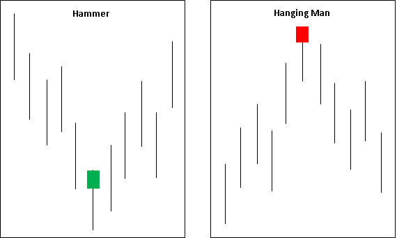
The hammer and hanging man are single candle reversal patterns that belong to the star family. Both the candles look exactly alike in terms of shape, size, etc. What separates them is where in the prevailing trend do they appear. If they appear after a steady decline in price, they are called hammer; while if they appear after a steady advance in price, they are called hanging man. Because a hammer appears after a decline in price and because it is a reversal pattern, it naturally follows that hammer is a bullish pattern. Similarly, becausea hanging man appears after a rally in price and because it is a reversal pattern, it naturally follows that hanging man is a bearish pattern. In the next couple paragraphs, we will discuss about the candle characteristics of each of these patterns.
Hammer
A hammer is a bullish reversal pattern that appears after a steady decline in price. This pattern is characterized by long lower shadow, little or no upper shadow, and body that is situated near the top end of the candle range. Ideally, the body should be one-third the size of the entire candle, while the lower shadow should be two-third the size of the entire candle. The longer the lower shadow and the higher the body to the top of the candle range, the stronger is the pattern. The body could be either green or red. However, because we are looking out for a reversal in trend, a green body is preferred over a red body.
Hanging man
A hanging man is a bearish reversal pattern that appears after a steady advance in price. This pattern is characterized by long lower shadow, little or no upper shadow, and body that is situated near the top end of the candle range. Ideally, the body should be one-third the size of the entire candle, while the lower shadow should be two-third the size of the entire candle. The longer the lower shadow and the higher the body to the top of the candle range, the stronger is the pattern. The body could be either green or red. However, because we are looking out for a reversal in trend, a red body is preferred over a green body.
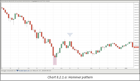
In chart 8.2.1.a, notice how the emergence of the hammer pattern marked an end to the price decline. While the trend did not out rightly turn from down to up, it nonetheless led to the formation of a higher lows in the following sessions, suggesting that the selling pressure is ebbing. Also notice in the chart that price never fell below the low of the hammer candle over the next several sessions. Such an action suggests at a change in force – in this case, from sellers to buyers.
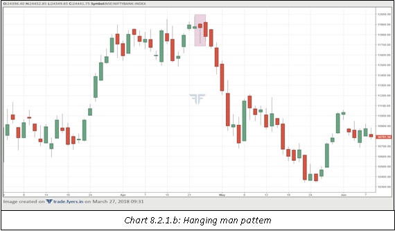
In chart 8.2.1.b, notice the emergence of the hanging man pattern. On the next day, although the price opened slightly above the high of the hanging man line, it never sustained beyond it. Instead, by the end of the session, it formed a bearish candle that was characterized by opening near the high and closing near the low. On the following day, price broken below the low of the hanging man line, and a steep sell-off ensued thereafter.
Inverted hammer and shooting star
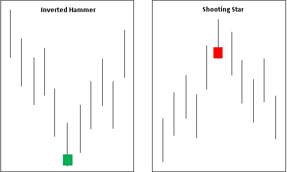
The inverted hammer and shooting star are single candle reversal patterns that belong to the star family. Both the candles look exactly alike in terms of shape, size, etc. What separates them is where in the prevailing trend do they appear. If they appear after a steady decline in price, they are called inverted hammer; while if they appear after a steady advance in price, they are called shooting star. Because an inverted hammer appears after a decline in price and because it is a reversal pattern, it naturally follows that inverted hammer is a bullish pattern. Similarly, because a shooting star appears after a rally in price and because it is a reversal pattern, it naturally follows that shooting star is a bearish pattern. In the next couple paragraphs, we will discuss about the candle characteristics of each of these patterns.
Inverted hammer
An inverted hammer is a bullish reversal pattern that appears after a steady decline in price. This pattern is characterized by long upper shadow, little or no lower shadow, and body that is situated near the bottom of the candle range. Ideally, the body should be one-third the size of the entire candle, while the upper shadow should be two-third the size of the entire candle. The longer the upper shadow and the lower the body to the bottom of the candle range, the better. The body could be either green or red. However, because we are looking out for a reversal in trend, a green body is preferred over a red body. Having said that, an inverted hammer is not as bullish as is a hammer. This is because of the location of the body. In the case of a hammer, the body is situated at the top of the range, suggesting that demand was strong enough to absorb most of the selling pressure. However, in the case of an inverted hammer, the body is situated at the bottom of the range, suggesting that supply remains a dominant force. As such, it is prudent to wait for further price action before trading on an inverted hammer pattern.
Shooting star
A shooting star is a bearish reversal pattern that appears after a steady advance in price. This pattern is characterized by long upper shadow, little or no lower shadow, and body that is situated near the bottom of the candle range. Ideally, the body should be one-third the size of the entire candle, while the upper shadow should be two-third the size of the entire candle. The longer the upper shadow and the lower the body to the bottom of the candle range, the stronger is the pattern. The body could be either green or red. However, because we are looking out for a reversal in trend, a red body is preferred over a green body. A shooting star pattern is more bearish than is a hanging man pattern. This is again because of the location of the body. In the case of a hanging man, the body is situated at the top of the range, suggesting that buying pressure remains dominant. However, in the case of a shooting star pattern, the body is situated at the bottom of the range, suggesting that supply was strong enough to absorb most of the buying pressure.
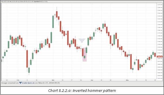
In chart 8.2.2.a, notice how the emergence of an inverted hammer marked an end to the downtrend. On the day following the formation of the inverted hammer candle, price closed above the high of the inverted hammer, suggesting that buying pressure is starting to take over the selling pressure.

In chart 8.2.2.b, notice the appearance of the shooting star candle after a rally in price. This candle marked a temporary pause to the uptrend as price corrected sharply over the next two sessions, before the resumption of the rally. This chart again reiterates the point that candle patterns will not always mark a major change to the prevailing trend. Instead, it will mark a pause to the ongoing trend.
Bullish and bearish engulfing
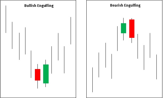
Bullish engulfing and bearish engulfing are reversal patterns that appear near the culmination of a strong trend. Bullish engulfing appears after a sustained up move in price, while bearish engulfing appears after a sustained down move in price. They are two candle patterns with the first candle appearing in the direction of the prevailing trend and the second candle appearing against the direction of the prevailing trend.
Bullish engulfing
A bullish engulfing is a two-candle pattern that appears near the end of a downtrend. The first candle continues in the direction of the prevailing trend. In other words, the first candle is a red candle. The second candle, however, goes against the prevailing trend by forming a long green body that completely engulfs the body of the preceding red candle. The second candle might not completely engulf the preceding candle, but the body of the second candle must completely engulf that of the first candle. Else, the pattern cannot be called a bullish engulfing. Also, the closing of the second candle must preferably be near the high of the candle, as such an action suggests that buyers are starting to gain an edge over sellers.
Bearish engulfing
A bearish engulfing is a two-candle pattern that appears near the end of an uptrend. The first candle continues in the direction of the prevailing trend. In other words, the first candle is a green candle. The second candle, however, goes against the prevailing trend by forming a long red body that completely engulfs the body of the preceding green candle. The second candle might not completely engulf the preceding candle, but the body of the second candle must completely engulf that of the first candle. Else, the candle cannot be termed as a bearish engulfing. Also, the closing of the second candle must preferably be near the low of the candle, as such an action suggests that sellers are starting to gain an edge over buyers.
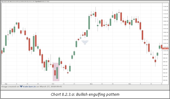
In chart 8.2.3.a, notice how the bearish engulfing marked an end to the prevailing downtrend. The first candle was a bearish candle, suggesting that the downtrend remains intact. However, the second candle below the close of the previous candle and rallied sharply to close above the prior session’s open, thereby engulfing the prior session’s body. After a brief profit booking, notice how the price rallied sharply over the next few sessions.
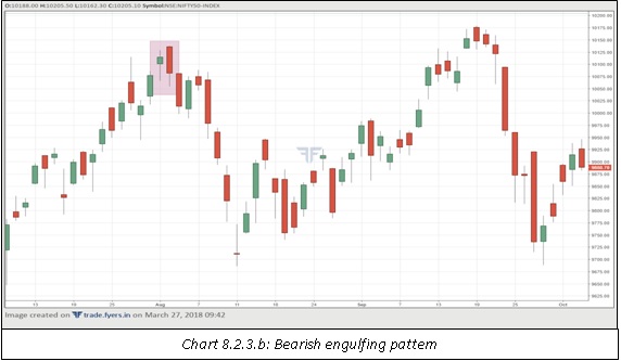
In chart 8.2.3.b, notice the appearance of a bearish engulfing pattern after a sustained period of up move. This pattern marked an end to the prevailing downtrend. The second candle opened above the close of the previous candle, suggesting that the uptrend remains intact. However, price was unable to hold on to its gains and fell sharply, before closing the session below the prior session’s open. Notice how sharply the price dropped in the next few sessions, before starting to head higher again.
Piercing line and Dark cloud cover
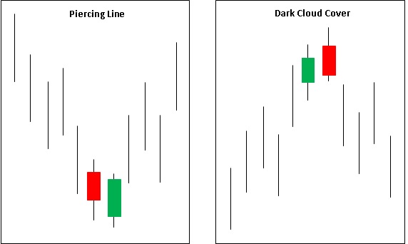
Piercing line and dark cloud cover are two-candle reversal patterns that appear near the end of a price trend. They are a slight variation of the engulfing family. While in case of an engulfing pattern, the body of the second candle completely engulfs that of the first candle, in case of a piercing line and dark cloud cover pattern, the body of the second candle only partially engulfs that of the first candle. As such, these patterns are not as impactful as are the engulfing patterns. Nonetheless, the appearance of these patterns cannot be ignored as they tend to work well especially when they appear after a sustained up move or down move.
Piercing line
Piercing line is a two-candle bullish reversal pattern that appears after a sustained decline in price. The first candle continues in the direction of the prevailing trend i.e. the first candle is a red candle. The second candle opens below the close of the first candle. However, the selling stops, and the price starts to recover, before closing the session beyond the midway point of the previous candle. The higher the close beyond the halfway mark of the previous candle, the stronger the pattern. Also, the closing of the second candle must preferably be near the high of the candle. Such an action indicates that the selling pressure is abating and buying pressure is starting to take over.
Dark cloudcover
Dark cloud cover is a two-candle bearish reversal pattern that appears after a sustained rally in price. The first candle continues in the direction of the prevailing trend i.e. the first candle is a green candle. The second candle opens above the close of the first candle. However, the buying stops, and the price starts to decline, before closing the session underneath the midway point of the previous candle. The lower the close underneath the halfway mark of the prior candle, the stronger the pattern. Also, the closing of the second candle must preferably be near the low of the candle. Such an action indicates that buying pressure is abating and selling pressure is increasing.
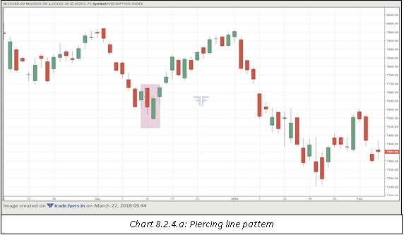
In chart 8.2.4.a, notice the emergence of the piercing pattern after a steady decline in price. The first candle was a red candle. The second candle opened below the close of the previous candle but then closed above the midway point of the first candle, suggesting that selling pressure is starting to recede. Notice that the price recovered over the next few sessions, before resuming its downtrend yet again.
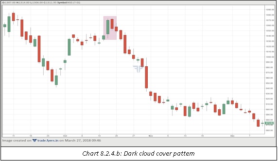
In chart 8.2.4.b, notice the formation of the dark cloud cover after a nice rally in price. As expected, the first candle turned out to be a tall green candle, suggesting that the bullish picture remains intact. However, after opening the next session above the prior session’s close, price fell during the day before closing the session around the midway mark of the previous session. Post the completion of the second candle, notice how steadily the price fell in the forthcoming sessions. In fact, the dark cloud cover marked a major change in trend as price declined sharply over the course of next several sessions.
Morning star and Evening star
Morning star and evening star are a family of three-candle reversal patterns that appear after a period of sustained up move or down move in price. The first candle continues along the direction of the prevailing trend, the second candle indicates uncertainty to the prevailing trend, while the third candle marks an end to the prevailing trend. These patterns work very well, especially when they appear after a strong rally or decline in price.
Morning star
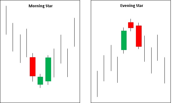
A morning star is a three-candle bullish reversal pattern that appears near the end of a downtrend. The first candle of this pattern is a long red candle with a large body, suggesting that the prevailing downtrend is healthy. The second candle is characterized by a small body that usually opens and closes below the close of the first candle. The small body of the second candle and its placement below the body of the first candle makes it look like a star, hence the name. The colour of the second candle is not important, it could be green or red. Finally, the third candle is a long green candle, which opens within the range of the body of the second candle, but then closes sharply higher and near the opening of the first candle. The higher the close of the third candle, the stronger is the pattern. These three candles signal that buying pressure is gradually starting to absorb all the selling pressure, and hence an up move is likely post the completion of the third candle.
Evening star
An evening star is a three-candle bearish reversal pattern that appears near the end of an uptrend. The first candle of this pattern is a long green candle with a large body, suggesting that the prevailing uptrend is healthy. The second candle is characterized by a small body that usually opens and closes above the close of the first candle. The small body of the second candle and its placement above the body of the first candle makes it look like a star, hence the name. The colour of the second candle is not important, it could be green or red. Finally, the third candle is a long red candle, which opens within the range of the body of the second candle, but then closes sharply lower and near the opening of the first candle. The lower the close of the third candle, the stronger is the pattern. These three candles signal that selling pressure is gradually starting to absorb all the buying pressure, and hence a down move is likely post the completion of the third candle.
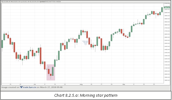
In chart 8.2.5.a, notice the appearance of a morning star pattern in a downtrend. The first candle suggested at the continuation of the downtrend. The second candle was a hammer, suggesting that the downtrend could be weakening. The third candle is a long green candle that closed above the opening of the first candle. Such a strong candle in the opposite direction of the prevailing trend suggests that the downtrend has possibly ended. In fact, in this case, this pattern formed a major reversal in trend.
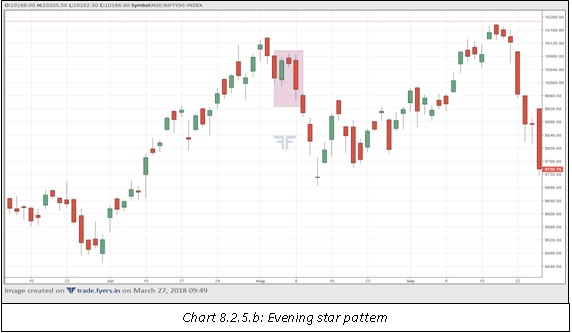
In chart 8.2.5.b, notice the emergence of the evening star pattern in an uptrend. This pattern did not appear at the highest point, but this is acceptable. In fact, a bearish engulfing pattern appeared at the highest point, which already was a hint that the rally was in trouble. The first of the three candles is a healthy green candle, while the second candle is a small red candle. Finally, the third candle is a long red candle that closed well below the opening of the first candle. The security fell sharply in the following days before a reversal took place that lifted the price towards the prior peak.
Bullish and bearish harami
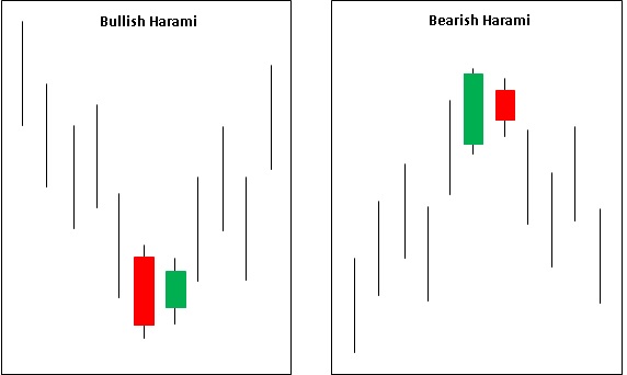
Bullish and bearish harami are two-candle patterns that indicate uncertainty over the prevailing trend. These patterns are the opposite of the engulfing family. While in an engulfing pattern, the body of the second candle completely engulfs the body of the first candle, in a harami pattern, the body of the second candle is within the body of the first candle. Because of this, the harami pattern indicates uncertainty over the prevailing trend. It reflects a scenario wherein neither the bulls nor the bears were able to take complete control. As such, whenever these patterns appear, it is necessary to wait for further price action to get more clarity on the trend.
Bullish harami
A bullish harami is a two-candle reversal pattern that appears during a downtrend. The first candle is a long, red candle that signals at the continuation of the downtrend. The second candle, however, is a small green candle that opens and closes within the body of the first candle. So, as we can see, the body of the first candle engulfs that of the second candle. Having said that, because of the structure of the pattern, a bullish harami is not as strong as is a bullish engulfing pattern. As such, it is prudent to wait for more price action post the completion of the second candle, before deciding to act based on this pattern.
Bearish harami
A bearish harami is a two-candle reversal pattern that appears during an uptrend. The first candle is a long, green candle that signals at the continuation of the uptrend. The second candle, however, is a small red candle that opens and closes within the body of the first candle. So, as we can see, the body of the first candle engulfs that of the second candle. Having said that, because of the structure of the pattern, a bearish harami is not as strong a pattern as is a bearish engulfing. As such, it is prudent to wait for more price action post the completion of the second candle, before deciding to act based on this pattern.
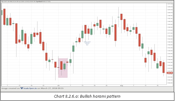
In chart 8.2.6.a, notice the formation of a bullish harami pattern after a decline. Post the completion of the second candle, the price traded sideways for the next two sessions, before heading higher over the following days.
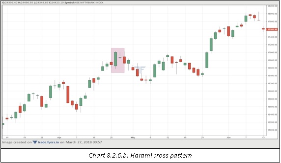
In chart 8.2.6.b, notice the slight variation of the harami pattern. If the second candle takes the shape of a ‘doji’ pattern (more on this later), the pattern is a special type of harami pattern called a harami cross. Notice that in this case, the appearance of the harami cross just led to a temporary pause to the uptrend. There was a minor correction post the formation of this pattern before price resumed its up move. This reiterates the point that candle patterns do not always mark a major reversal in trend. In some cases, they just pause the ongoing trend, before resuming the prior trend again.
Three advancing soldiers and three black crows
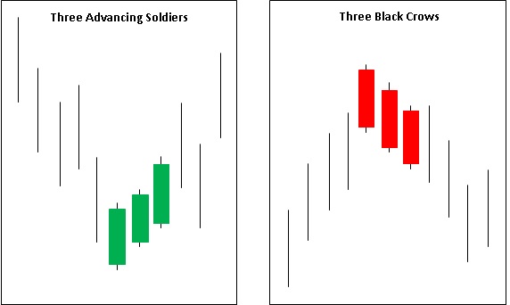
Three advancing soldiers and three black crows are three-candle reversal patterns that appear after a sustained advance or decline in price. These patterns comprise of three same coloured candles that mark an end to the ongoing trend. When such patterns form, an important thing to keep in mind is that the bodies of each of the three candles must be large enough compared to the candle as a whole. On some occasions, the bodies get smaller and smaller with each candle, which in turn reduces the overall effectiveness of the pattern.
Three advancing soldiers
Three advancing soldiers is a three-candle reversal pattern that appears at the end of a downtrend. In some cases, this pattern can also appear as a continuation pattern during the middle of an uptrend. The first candle is a long candle that is characterized by long green body and small shadows. This is the first sign that the downtrend is weakening. The second candle opens within the body of the first candle, but then closes above the close of the first candle. Just like the first candle, the second candle must also have a long green body with small shadows. Finally, the third candle opens within the body of the second candle, but then closes above the close of the second candle. Just like the earlier two candles, the third candle must also have long green body with small shadows. Preferably, the open of each candle must be near the low and the close must be near the high.
Three black crows
Three black crows is a three-candle reversal pattern that appears at the end of an uptrend. In some cases, this pattern can also appear as a continuation pattern during the middle of a downtrend. The first candle is a long candle that is characterized by long red body and small shadows. This is the first sign that the uptrend is in trouble. The second candle opens within the body of the first candle, but then closes below the close of the first candle. Just like the first candle, the second candle must also have a long red body with small shadows. Finally, the third candle opens within the body of the second candle, but then closes below the close of the second candle. Just like the earlier two candles, the third candle must also have long red body with small shadows. Preferably, the open of each candle must be near the high and the close must be near the low.
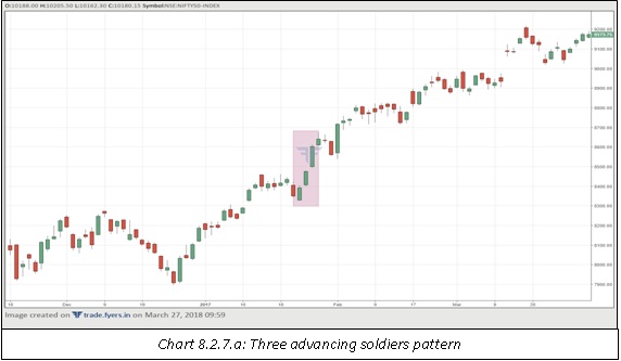
In the chart 8.2.7.a, notice that the three advancing soldiers appeared during the middle of an uptrend. As such, in this case, the pattern is appearing as a continuation pattern rather than as a reversal pattern. Notice that each candle opens near the low of the day and then closes near the high of the day. Such a behaviour indicates strength in the pattern and increases the likelihood of prices continuing to move higher post the completion of the pattern.
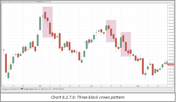
In the chart 8.2.7.b, notice the various three black crows pattern that formed over the course of the chart. The first pattern appeared as a reversal pattern right at the end of an uptrend and was followed by a steady decline in price. Notice that the second candle had a small body, but this is acceptable given the emergence of a long red body in the following candle. The second pattern appeared as a reversal pattern right at the end of the recovery, while the third pattern appeared as a continuation pattern when price was already in a decline. Notice that all the patterns worked well in this case, as each was followed by a steady decline in price in the forthcoming sessions.
Tweezer bottoms and tops
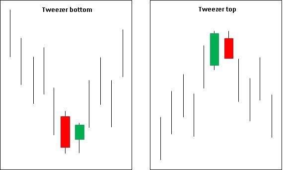
Tweezer bottoms and tops are a combination of two or more candles that appear at identical levels, either at the bottom or at the top. The two or more candles may either be consecutive or may be separated by a few more candles between them. What is important is that the two or more candles must appear at identical levels, kind of like suggesting at resistance or support at such levels.Having said that, it is better to combine these pattern with other technical parameters, rather than acting on them in isolation. This is because these patterns are not as effective as compared to the other candle patterns that we have discussed so far. They tend to work well when combined with other candlestick patterns or technical parameters.
Tweezer bottoms
A tweezer bottom is a bullish reversal pattern that appears near the end of a downtrend. This pattern is characterized by two or more candles that appear at similar troughs. The identical troughs suggest at underlying support at such levels. The first candle usually continues in the direction of the prevailing trend, and as such, it is usually a red candle. The lows of the second or any subsequent candles appear at the same level as that of the first candle. Also, because we are looking at a reversal, the second candle should ideally be a healthy green candle.
Tweezer tops
A tweezer top is a bearish reversal pattern that appears near the end of an uptrend. This pattern is characterized by two or more candles that appear at similar peaks. The identical peaks suggest at underlying resistance at such levels. The first candle usually continues in the direction of the prevailing trend, and as such, it is usually a green candle. The highs of the second or any subsequent candles appear at the same level as that of the first candle. Also, because we are looking at a reversal, the second candle should ideally be a healthy red candle.
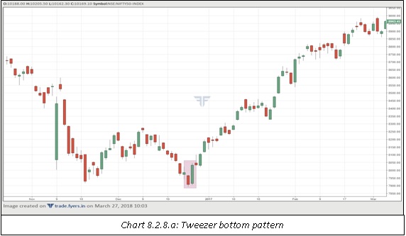
In chart 8.2.8.a, notice the appearance of two candles with nearly identical lows. Because the lows are nearly identical, the pattern can be termed as tweezer bottom. The first of the two candles was a bearish candle as it continued along the direction of the prevailing downtrend. The second candle, however, opened near the lows of the previous candle and then rallied sharply during the day to close well above the high of the first candle. Moreover, look to the left of the chart to see that the two lows of the tweezer pattern appeared near a former bottom. The appearance of a bullish candle pattern right at support further increases the likelihood of a reversal in trend. And this is what happened in the following days. The lows of the tweezer pattern marked a major bottom in the security.
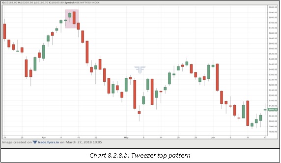
In chart 8.2.8.b, notice the appearance of the tweezer top pattern right near the top of the rally. The first candle is a green candle as it took the uptrend to a new high. However, the second candle opened right near the high of the session as well as near the high of the previous session, before heading sharply lower during the day. The two candles combined are not only tweezer top but also a bearish engulfing pattern, as the body of the second candle completely engulfs that of the first candle. Notice how sharply price fell after the appearance of this pattern.
Bullish and bearish belt hold line
Bullish and bearish belt hold line are single-candle reversal patterns that appear after a rally or a decline in price. They open in the direction of the prevailing trend, but by the end of the candle, register a strong move in the opposite direction of the prevailing trend. Having said that, because these are single-candle patterns, a chartist needs to wait for more confirmation from the following few candles before deciding to act based on these patterns.
Bullish belt hold line
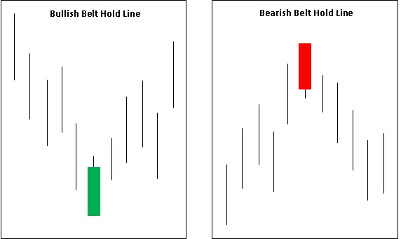
A bullish belt hold line is a single-candle bullish reversal pattern that appears after a decline in price. It is a green coloured candle that opens at or very near the low, then rises steadily to close at or near the high. The longer the body of the candle, the stronger is the pattern. Because this is a single-candle pattern, it becomes important that the structure of the pattern is adhered to. The open must be at or very close to the low, the close must be near the high, and the body should be long enough to warrant that selling pressure is abating. If these conditions are not met, the pattern cannot be relied upon.
Bearish belt hold line
A bearish belt hold line is a single-candle bearish reversal pattern that appears after a rally in price. It is a red coloured candle that opens at or very near the high, then declines steadily to close at or near the low. The longer the body of the candle, the stronger is the pattern. Because this is a single-candle pattern, it becomes important that the structure of the pattern is adhered to. The open must be at or very close to the high, the close must be near the low, and the body should be long enough to warrant that buying interest is abating. If these conditions are not met, the pattern cannot be relied upon.
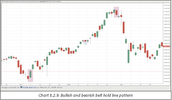
In chart 8.2.9, notice how the bullish belt hold line marked the start of an uptrend. Price rallied steadily over the next several sessions, before topping out. Coincidentally, price topped out after forming a bearish belt hold line and declined sharply since then. Note that each of the two candles adhered to the definition of the pattern. In case of the bullish version, the open and low were the same while the close was near the high. In case of the bearish version, the open and high were identical while the close was near the low. Furthermore, both the candles had long and healthy body.
Rising and falling methods
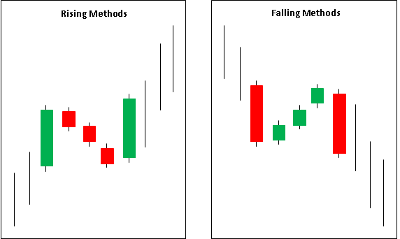
Most of the patterns that we have discussed so far are reversal patterns. Rising and falling methods, on the other hand, are continuation patterns. These patterns resemble a flag formation that we studied in chapter 5. After a strong move and the emergence of a long candle in the direction of the current trend, price takes a breather by forming three or more small body candles against the direction of the prevailing trend. Once this minor consolidation ends, the prior move resumes with the emergence of a long candle that closes beyond the close of the first candle. An important thing to keep in mind when scanning for these patterns is to offer some leeway. Because these patterns contain five or more candles, be flexible with the candle characteristics. Do not always expect textbook type patterns to emerge on the chart.
Rising methods
Rising methods is a bullish continuation pattern that forms during an uptrend. The first candle is a long green candle that takes the price to new highs in the prevailing trend. This candle is then followed by a series of three or more small body candles. These candles must be against the direction of the prevailing trend, and they must be contained within the range of the first long green candle. The last candle in this pattern is a long green candle that opens above the prior session’s closing and closes beyond the close of the first long green candle.
Falling methods
Falling methods is a bearish continuation pattern that forms during a downtrend. The first candle is a long red candle that takes the price to new lows in the prevailing trend. This candle is then followed by a series of three or more small body candles. These candles must be against the direction of the prevailing trend, and they must be contained within the range of the first long red candle. The last candle in this pattern is a long red candle that opens below the prior session’s closing and closes below the close of the first long red candle.
Doji
The last candlestick pattern that we will cover in this chapter is the doji. A doji is a single-candle pattern that could act either as a reversal pattern or as a continuation pattern. The doji candle is characterized by having an open and a close at the same level. Of course, a minor difference between open and close is acceptable. Doji indicates uncertainty on part of the buyers and sellers. It indicates a session wherein neither the buyers nor the sellers were able to gain an upper hand, thereby causing price to end at the same level as the open. Because doji is a single candle pattern, a chartist must wait for more clues before deciding to act on this pattern. At the time the doji is formed, it is not possible to say whether the price will go up or down, hence it is prudent to wait for further price action.
Doji after a rally
Doji can appear after a prolonged rally in price. In many cases, the doji forms part of a multiple candle pattern that appears near a market top. For instance, doji can appear as the second candle in the evening star pattern, doji can appear as the second candle in the harami pattern, doji can appear as the second candle in the tweezer top pattern etc. Near the termination point of the uptrend, the emergence of doji signals at an exhaustion. If on the following candles, price struggles to cross the high of the doji candle and then goes on to break below the low of the doji candle, a reversal in trend can be expected. Sometimes, doji can also appear as a continuation pattern. This is especially true when it appears in the middle of an uptrend. In such a case, the emergence of doji signals that buyers are taking a pause after the rally. Once this minor consolidation ends, it is usually accompanied by resumption of uptrend.
Doji after a decline
Doji can appear after a prolonged decline in price. In many cases, the doji forms part of a multiple candle pattern that appears near a market bottom. For instance, doji can appear as the second candle in the morning star pattern, doji can appear as the second candle in the harami pattern, doji can appear as the second candle in the tweezer bottom pattern etc. Near the termination point of the downtrend, the emergence of doji signals at an exhaustion. If on the following candles, price struggles to fall below the low of the doji candle and then goes on to break the high of the doji candle, a reversal in trend can be expected. Sometimes, doji can also appear as a continuation pattern. This is especially true when it appears in the middle of a downtrend. In such a case, the emergence of doji signals that sellers are taking a pause after the decline in price. Once this minor consolidation ends, it is usually accompanied by resumption of downtrend.
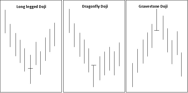
Notice in the above chart the three different doji patterns. To the left is the long-legged doji pattern. It is called long-legged because it has tall shadows on either side of the body. If the shadows are not as long as those compared to the candles around it, the pattern is just called a doji. To the centre is the dragonfly doji. This pattern has body situated near the top of the candle. Dragonfly doji usually appears after a decline in price and signals at a near-term reversal in trend. Finally, to the right is the gravestone doji. This pattern has body situated near the bottom of the candle. Gravestone doji usually appears after a rally in price and signals at a near-term reversal in trend. Note that in the above chart, doji is expressed as a reversal pattern. However, keep in mind that doji can also appear as a continuation pattern, especially when they emerge during the middle of the trend.
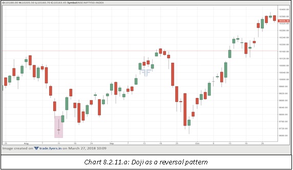
In chart 8.2.11.a, notice how the emergence of the doji pattern marked an end to the decline in price and led to a reversal in trend. As we can see, over the course of the chart, the low of the doji was not broken
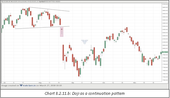
In chart 8.2.11.b, notice how the price broke below the triangle pattern with a breakaway gap. The candle that occurred during the pattern breakdown was a doji, signalling at continuation in price decline. Observe how sharply price fell in a short span of time post the emergence of the doji candle.
Having said that, be careful of doji patterns that appear during a period of consolidation or lateral movement. Doji patterns tend to work very well when they appear near the end of a trend, either up or down, or when they appear during the middle of a trend. Doji patterns that appear during consolidation zone usually do not have any forecasting value.
Things to keep in mind
-
Because a lot of candlestick patterns that we have discussed are reversal patterns, the foremost criteria is to ensure that a trend is in place before the appearance of the candle patterns. If a clear trend is not in place, then candle patterns may or may not work.
-
Combine candle patterns with other tools such as price patterns, technical indicators, moving averages, fibonacci retracement and extension, trendlines etc. to increase the validity of signals.
-
Compare price with volume during the formation of a candle pattern as well as after its completion. A candle pattern that is accompanied by a pickup in volume is more likely to succeed than a candle pattern that is not accompanied by a pickup in volume.
-
Do not trade until the candle pattern formation is complete. Trading before the completion of the pattern is a dangerous and an often-futile trading strategy.
-
If a trade has been placed on the completion of the candle pattern but if the pattern is not working as expected, try to exit the trade with minimum loss rather than holding on to a losing position based on hope.
Summary
-
A hammer is a bullish reversal pattern that appears after a steady decline in price. This pattern is characterized by long lower shadow, little or no upper shadow, and body that is situated near the top end of the candle range.
-
A hanging man is a bearish reversal pattern that appears after a steady advance in price. This pattern is characterized by long lower shadow, little or no upper shadow, and body that is situated near the top end of the candle range.
-
An inverted hammer is a bullish reversal pattern that appears after a steady decline in price. This pattern is characterized by long upper shadow, little or no lower shadow, and body that is situated near the bottom of the candle range.
-
A shooting star is a bearish reversal pattern that appears after a steady advance in price. This pattern is characterized by long upper shadow, little or no lower shadow, and body that is situated near the bottom of the candle range.
-
A bullish engulfing is a two-candle pattern that appears near the end of a downtrend. The first candle continues in the direction of the prevailing trend. The second candle, however, goes against the prevailing trend by forming a long green body that completely engulfs the body of the preceding red candle.
-
A bearish engulfing is a two-candle pattern that appears near the end of an uptrend. The first candle continues in the direction of the prevailing trend. The second candle, however, goes against the prevailing trend by forming a long red body that completely engulfs the body of the preceding green candle.
-
Piercing line is a two-candle bullish reversal pattern that appears after a sustained decline in price. The first candle continues in the direction of the prevailing trend. The second candle opens below the close of the first candle but closes beyond the midway point of the previous candle.
-
Dark cloud cover is a two-candle bearish reversal pattern that appears after a sustained rally in price. The first candle continues in the direction of the prevailing trend. The second candle opens above the close of the first candle but closes underneath the midway point of the previous candle.
-
A morning star is a three-candle bullish reversal pattern that appears near the end of a downtrend. The first candle is a long red candle. The second candle has a small body that usually opens and closes below the close of the first candle. The third candle is a long green candle, which opens within the range of the body of the second candle, but then closes near the opening of the first candle.
-
An evening star is a three-candle bearish reversal pattern that appears near the end of an uptrend. The first candle is a long green candle. The second candle has a small body that usually opens and closes above the close of the first candle. The third candle is a long red candle, which opens within the range of the body of the second candle, but then closes near the opening of the first candle.
-
A bullish harami is a two-candle reversal pattern that appears during a downtrend. The first candle is a long, red candle that signals the continuation of the downtrend. The second candle, however, is a small green candle that opens and closes within the body of the first candle.
-
A bearish harami is a two-candle reversal pattern that appears during an uptrend. The first candle is a long, green candle that signals the continuation of the uptrend. The second candle, however, is a small red candle that opens and closes within the body of the first candle.
-
Three advancing soldiers could appear either as a reversal or as a continuation pattern. It is characterized by three successive long green candles than open near the lows and close near the highs. Each candle usually opens within the body of the previous range.
-
Three black crows could appear either as a reversal or as a continuation pattern. It is characterized by three successive long red candles than open near the highs and close near the lows. Each candle usually opens within the body of the previous range.
-
A tweezer bottom is a bullish reversal pattern that appears near the end of a downtrend. This pattern is characterized by two or more candles that appear at similar troughs.
-
A tweezer top is a bearish reversal pattern that appears near the end of an uptrend. This pattern is characterized by two or more candles that appear at similar peaks.
-
A bullish belt hold line is a single-candle bullish reversal pattern that appears after a decline in price. It is a green coloured candle that opens at or very near the low, then rises steadily to close at or near the high.
-
A bearish belt hold line is a single-candle bearish reversal pattern that appears after a rally in price. It is a red coloured candle that opens at or very near the high, then declines steadily to close at or near the low.
-
Rising methods is a bullish continuation pattern that has three or more small body candles around two long green candles. The smaller candles must be contained within the range of the first long green candle, while the second-long green candle must open above the close of the previous small candle and then close above the close of the first long green candle.
-
Falling methods is a bearish continuation pattern that has three or more small body candles around two long red candles. The smaller candles must be contained within the range of the first long red candle, while the second-long red candle must open below the close of the previous small candle and then close below the close of the first long red candle.
-
A doji could be either a reversal or a continuation pattern that is characterized by open and close that are the same. A doji could be a long-legged doji, a dragonfly doji, or a gravestone doji.
Next Chapter
Comments & Discussions in
FYERS Community
Alpha commented on March 14th, 2019 at 11:08 AM
Is there an automatic patter recognition software?
yashas commented on March 14th, 2019 at 11:09 AM
We have candlestick pattern recognition on our Fyers One platform. You can check it out. Feel free to give us your feedback once you have used it
MAYANK commented on April 3rd, 2019 at 11:46 PM
In 8.3.3 Did not understand about the term volume
Shriram commented on January 26th, 2020 at 5:31 PM
Hi Mayank, which part are you exactly referring to?
tvk commented on April 4th, 2019 at 5:33 PM
the candle recognition pattern in live markets if you are referring to something like Investing.com chart feature , can you please list the steps to activate it in the fyers one
tejas commented on April 4th, 2019 at 7:36 PM
Hey Tvk, The investing.com feature is not yet available. For any feature requests, you can get in touch with us on other platforms or blogs. You could even write to us at [email protected]. If you have any doubts about the concepts in this chapter, let me know. Thanks!
tejas commented on April 4th, 2019 at 7:34 PM
Mayank, there is no 8.3.3! Please let me know which graph you are referring to.
Vipulkumar .R .Patel commented on April 4th, 2019 at 8:50 PM
Dear , Sir I live in usa chicago I love chart and chart patterns. Can you give me stock patterns.
tejas commented on April 8th, 2019 at 1:57 PM
Hey, good to know! What sorta stock/chart patterns?
MAYANK commented on April 4th, 2019 at 9:52 PM
Sir, I love Fyers It is my first and forever trading platform, I would like to suggest you add trailing stop losses in the order form because it is impossible to trail the stop losses from the graph because of sudden fall/rise in the price of the stock.
tejas commented on April 8th, 2019 at 2:01 PM
Hi Mayank, That's awesome! Thanks. Okay, so there is a technical reason why we haven't introduced a Trailing Stop Loss feature. We wanted to but the thing is that the way these orders are managed in the back-end is not optimal at the moment, so we avoided it.
MAYANK commented on April 7th, 2019 at 7:12 PM
Can you please add some chapters about RSI indicator?
tejas commented on April 8th, 2019 at 2:02 PM
RSI is covered in the chapter on Technical Indicators.
Capt Prashant commented on April 18th, 2019 at 9:15 PM
Sir i have a querry regarding trend reversal patterns.. How effective are they in which time frames? Eg would a doji be more effective in a half hour time frame chartor a daily chart?
tejas commented on April 18th, 2019 at 11:34 PM
Hey Capt Prashant, the longer the timeframe is, the more meaning the candlestick pattern/type has. For example, a doji on 30-minutes chart effectively means that during those 30 minutes buyers & Sellers were indecisive about the future direction of the price. But in real terms, 30 minutes is only useful for an intraday trader as it indicates uncertainty for a short period of time. However, if a doji was to form on a weekly or monthly chart, it would mean those market participants were jittery/unsure about the price range for a longer period of time thus more profound.
Srikanth commented on June 13th, 2019 at 8:36 PM
Great work from fyers!! Keep doing it.
tejas commented on August 20th, 2019 at 1:38 AM
Thx Srikanth.
Shloka P commented on August 16th, 2019 at 7:20 PM
Hi Tejas,
Generally, people say to look for the prior trend before concluding any pattern. So how many days you want us to take for calculating downtrend or uptrend?
Shriram commented on January 26th, 2020 at 5:33 PM
Hi Shloka, this completely depends on an individual as there is no hard and fast rule over here. Generally speaking, the greater the number of bars, the better.
Ramya Choudhary commented on August 16th, 2019 at 7:27 PM
Which candlestick pattern is considered as the strong reversal pattern out these - Engulfing, piercing/dark cloud and harami or black/white crow?
tejas commented on August 20th, 2019 at 1:41 AM
Engulfing and Harami. It basically means that the next time interval is the total opposite of the previous one indicating a change in mood/market sentiment. The larger the timeframe, the higher the impact. For instance, it makes more sense on a daily chart than on a 5-minute chart.
Jim Antolli commented on August 28th, 2019 at 12:54 AM
Hello, my name is Jim and I was just looking your website fyers.in
over and thought I would message you on your contact form and offer
some help. I really like your site but I noticed you weren’t getting a
lot of traffic and your Alexa ranking isn’t as strong as it could be.
>>>> http://besttrafficsolutions.xyz
Fortunately, I may have an answer for you. I can get you 1,000’s of
visitors looking at fyers.in ready to buy your product, service or
sign up for an offer and fast. Our advertising network of over 9000
websites provides a low cost and effective online marketing solutions
that actually works. I can help your business get more online quality
traffic by advertising your business on websites that are targeted to
your specific market. The Internet is vast but you don’t have to spend
huge amounts of cash to jump start your business. I can get you 5,000
highly targeted visitors directly to your website for as little as
$29.00 for a 30 day trial run.
>>>> http://besttrafficsolutions.xyz
It has taken us 12 years to perfect our system and in addition to
being exciting, it works!! We also have a special offer of 200,000
Targeted visitors spread over 60 days for a special one time charge
of $299.00.
>>>> http://besttrafficsolutions.xyz
If you would like to talk personally and have specific questions, call
me @ 480-331-6775 from 9am to 5pm MST. Also check out the short video
here and see how everything works.
Best Regards,
Jim
[email protected]
BestTrafficSolutions.xyz
http://besttrafficsolutions.xyz
Please let us know if you received this in error and wish to be removed from future contact.
remove me: https://zfrmz.com/vTN2gJq4qHlWtaZ1YFQO
Sakshi commented on July 19th, 2020 at 6:02 PM
Hi, in 8.3.2.a there was another bullish engulfing right before the one that is marked. But we didn't see a price rise from there. So it was a false alarm. How to tackle with that? Because it was a quite clear bullish engulfing pattern. It can be quite risky for Intraday.
Abhishek Chinchalkar commented on July 20th, 2020 at 8:04 AM
Hi Sakshi, you have raised an important question. Keep in mind that just like other tools, candlestick patterns are not fool proof. There will be periods when they will fail. The most important thing is recognizing the pattern failure and exiting the trade in case the candle pattern does not work out as expected.
For instance, let us talk about bullish engulfing. Once this pattern is printed, the ideal way to trade it is to buy above the high of the second candle and keep a stop loss below the low of the second candle. By keeping a stop loss below the second candle's low, you know what your risk for the trade is. NEVER TRADE A CANDLESTICK PATTERN WITHOUT A STOP LOSS.
In the above case as you highlighted, the pattern failed. It is not possible to avoid false alarms in entirety, as they are part and parcel of the game. However, you can reduce the false alarms by combining candlestick patterns with other tools such as price patterns, price tools, technical indicators, volume and volume-based indicators etc. The greater the weight of evidence used, the greater will be the probability of a successful trade.
Sakshi commented on July 20th, 2020 at 6:39 PM
Thank you for such a detailed answer Abhishek. Much appreciated.
Abhishek Chinchalkar commented on July 22nd, 2020 at 6:36 PM
You're welcome Sakshi!
Sakshi commented on July 20th, 2020 at 7:35 PM
Hi Tejas , the way you have explained is very nice. However, it would be great if "Volume" topic would get a solo chapter and be explained with respect to patterns(price, candlestick, indicators).
Abhishek Chinchalkar commented on July 22nd, 2020 at 6:35 PM
Hi Sakshi, thank you for the valuable feedback. Yes, that has been on the back of my mind for quite some time now. I will soon cover an individual topic on Volume in the Technical Analysis module.