In this chapter, our objective is to analyse currencies from a technical standpoint. Before proceeding any further however, we would assume that the reader has a basic understanding of technical analysis. If not, we highly recommend referring to our Technical Analysis module, wherein we have covered various aspects of technical analysis, in detail. With that assumption, let us now dwell into the world of charting currencies.
Technical Analysis of currencies
Technical analysis is as much applicable on currencies as it is on equities, commodities, and bonds. In fact, it is safe to say that given the mammoth size of the global Forex markets, technical analysis works exceptionally well on currencies. This is especially true in case of the liquid currency pairs such as the Majors, the Crosses, and several other pairs where one of the currency is the US Dollar.
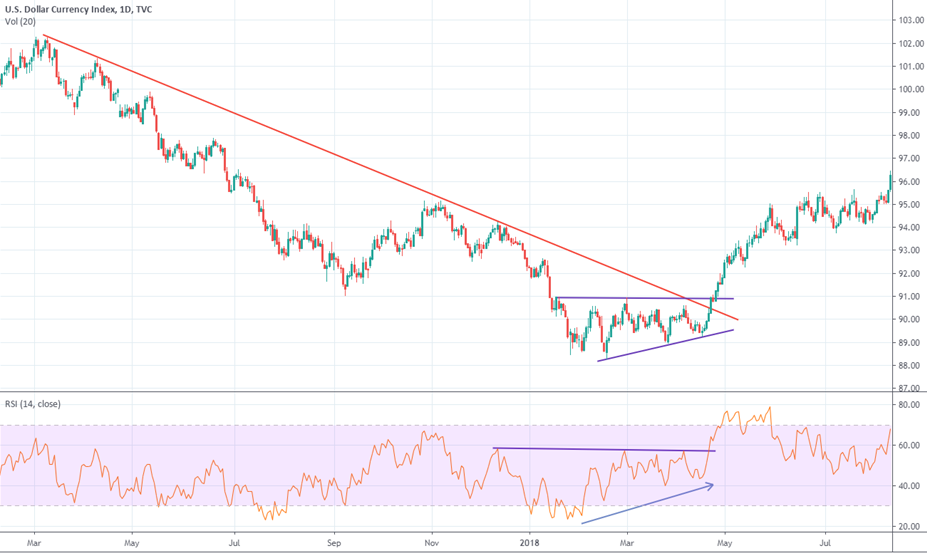
The above chart is the daily candlestick chart of the Dollar Index (DXY). Notice that since early 2017, the DXY has been trading below the downward sloping resistance line. In the early parts of 2018 however, the decline halted and the DXY entered a period of consolidation in the form of an ascending triangle pattern. Notice that during this consolidation, the RSI started making higher lows, indicating that momentum is starting to turn bullish. A few days later, the DXY not only broke out of this ascending triangle pattern, but it also broke above the downward sloping trend line. Furthermore, the breakout in price was accompanied by a breakout in RSI as well. All such weight of evidence indicated at a high odds of a reversal in the trend of the DXY.
The chart below shows the daily line chart of USD/JPY currency pair. Notice that the pair was in a severe downtrend from 2008 till late 2011. Towards the start of 2012 however, the pair broke the downward sloping resistance (black) line, indicating that the selling pressure is abating. From the start of 2011, over the next year and a half, the pair consolidated and in doing so, it formed an inverse Head & Shoulder pattern. The right shoulder of this pattern formed a falling wedge pattern and broke out of it soon. The price target of the wedge pattern was beyond the breakout point of the inverse H&S pattern, giving an early indication that the pair could break out of the H&S pattern too. This did happen a few days later as price broke above the neckline of the H&S pattern, signalling that the downtrend has ended and an uptrend has started. From here on till 2015, the pair was in a strong uptrend. Notice that during this uptrend too, there were consolidations in between, before the price broke higher. Each of these consolidations came in the form a triangle pattern. While the first two triangle breakouts worked like a charm, the third triangle breakout was rather short lived. Instead, failure to sustain above the triangle breakout coupled with the pair breaking below the a 3-year trend line later that year signalled the end of a 3-year uptrend and the start of a new downtrend.
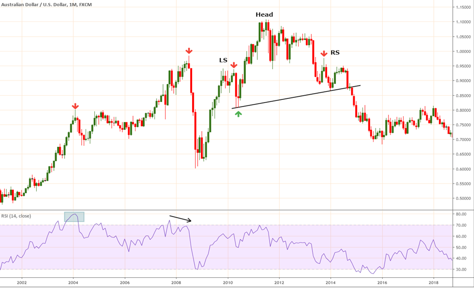
The above chart shows the monthly candlestick chart of AUD/USD currency pair. Notice that from 2002 till 2007, the pair was in a strong uptrend. During this uptrend, the pair consolidated from early 2004 to early 2007. Observe the first red arrow that was marked for the month of February 2004. A ‘shooting star’ candlestick pattern emerged on this month following a strong rally over the past several months. Moreover, this shooting star pattern occurred at a time when the RSI was extremely overbought. Failure of price to break above the high of the shooting star candle in the subsequent month signalled that a reversal or a correction could occur over the next few months. Notice that in November 2004, February 2005, and March 2005, the pair tested the high of the shooting star candle but failed to break above it. Eventually however, in March 2007, the pair broke above the high of the shooting star candle, signalling the resumption of the uptrend. Later, in July 2008, another shooting star candle pattern appeared. This shooting star was accompanied by a divergence between price and RSI, with price forming a higher high and RSI forming a lower high. Price closing near the month’s low in July 2008, then failing to cross above the month’s open in August 2008 combined with RSI divergence was a strong signal that the uptrend is in trouble. In the coming months, there was a steep correction in the pair, which ended with a base formation between November 2008 and March 2009. Later, observe that the pair formed a bearish H&S pattern, with the high of the left shoulder and that of the right shoulder both forming shooting star candle patterns. Observe how the pair fell following the break of the H&S neckline in October 2014. The objective of this chart is to show that technical analysis on currencies works extremely well on the monthly time frames too and can be used to identify the primary and the secular trends among currencies.
As we saw from the above three charts, technical analysis can be used in identifying trends of currency pairs on various time frames. One can use the daily chart to analyse the short-term trends of currencies, the weekly chart to analyse the medium-term trends of currencies, and the monthly chart to analyse the long-term trends of currencies. In a similar way, technical analysis can also be used to analyse intraday trends by using time frames below the daily chart, such as 1-minute chart, 5-minute chart, 30-minute chart, 1-hour chart, 4-hour chart etc.
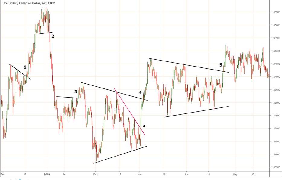
The above chart is the 4-hourly candlestick chart of USD/CAD currency pair. Observe the 5 signals that were generated over a course of a few months. Signal 1 occurred when the pair broke out of a small downward sloping trend line and rallied nicely over the course of the next few sessions. Signal 2 occurred when the pair broke below a minor support line, indicating an end to the rally. Notice how steeply the pair declined following this break. Signal 3 occurred in a similar fashion like signal 1. However, the breakout turned out to be rather short-lived and a false one. Signal 4 occurred when the price broke out of a contracting triangle pattern. Notice that at point (a), an early trend line breakout occurred. Some traders, especially those who have an aggressive style, would usually initiate a long position at this point rather than waiting for the triangle breakout that occurred at point 4. Signal 5 was similar to signal 4, in that the pair broke out of a triangle pattern. This chart highlights how one can trade both sides (long and short) as and when short-term buy and sell signals are generated.
Entering a trade with target and stop loss
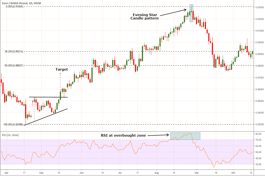
The above chart is the daily candlestick chart of EUR/GBP. Notice that the pair broke out of a small ascending triangle pattern. On the breakout, one can enter a long position in the pair. One potential stop loss for this long position would be below the low of the candle that precedes the breakout candle. Such a stop loss would suit a trader who does not want to take a bigger risk. However, as the stop loss is small, the risk of getting stopped out on the trade is high. Another potential stop loss for this long position could be below the lower trend line of the triangle pattern. Note that this stop loss would be dynamic as the trend line keeps rising each day. Such a stop loss would suit a trader who has the appetite to tolerate a larger stop loss. The minimum price objective of the pattern (as measured by the price objective of the triangle pattern) has been marked with a dashed vertical arrow line. Let us look at this from a numeric perspective.
Aggressive trade, with a relatively smaller stop loss
-
Buy entry level on breakout = 0.8530
-
Stop loss: 0.8455 (below the low of the candle that immediate precedes the breakout candle)
-
Target: 0.8730
-
Reward to Risk Ratio: (0.8730 - 0.8530) / (0.8530 - 0.8455) = 2.67:1
Conservative trade, with a relatively larger stop loss
-
Buy entry level on breakout = 0.8530
-
Stop loss: 0.8410 (below the low of the lower rising trend line of the triangle pattern)
-
Target: 0.8730
-
Reward to Risk Ratio: (0.8730 - 0.8530) / (0.8530 - 0.8410) = 1.67:1
As one can see from above, things eventually boil down the one’s reward-to-risk ratio. The first trade set-up had a favourable reward-to-risk ratio, but a relatively greater risk given the small stop loss. On the other hand, the second trade set-up had a not so favourable reward-to-risk ratio, but a relatively smaller risk given the large stop loss.
Meanwhile, another interesting trade set up occurred when the pair completed a three-candle “Evening star” pattern, which is a reversal pattern. One could initiate a short position following the completion of this pattern, by placing a stop loss slightly above the high of the middle candle. Candlestick patterns cannot be used the measure the price target. Hence, some other tool must be used to identify the potential price target. We have used fibonacci retracement in this case. Notice that the 38.2% and the 50% retracement of the rally from 0.8300 to 0.9300 came at 0.8920 and 0.8800, respectively. One orboth of these could be considered as the potential target for the short position. Let us look at this from a numeric perspective.
-
Sell entry level = 0.9190 (the close of the third candle of the evening star pattern)
-
Stop loss: 0.9310 (above the high of the second candle of the evening star pattern)
-
Target: 0.8920
-
Reward to Risk Ratio: (0.9190 - 0.8920) / (0.9310 - 0.9190) = 2.25:1
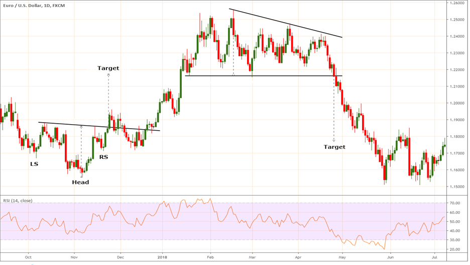
The above chart is the daily candle chart of EUR/USD. Two noticeable signals were generated in the pair. The buy signal was generated when price broke above the neckline of an inverse H&S pattern. The minumum price objective of this pattern was 1.2175. The stop loss could be placed below the low of the right shoulder. Let us look at this from a numeric perspective.
-
Buy entry level on breakout = 1.1860
-
Stop loss: 1.1710 (below the low of the right shoulder)
-
Target: 1.2175
-
Reward to Risk Ratio: (1.2175 - 1.1860) / (1.1860 - 1.1710) = 2.1:1
Meanwhile, a sell signal was generated a few weeks later when price broke below a descending triangle pattern. The minimum price objective of this pattern was 1.1770. The stop loss could be placed above upper trendline of the triangle pattern. Let us look at this from a numeric perspective.
-
Sell entry level = 1.2154
-
Stop loss: 1.2415 (slightly above upper trend line of the triangle pattern)
-
Target: 1.1770
-
Reward to Risk Ratio: (1.2154 - 1.1770) / (1.2415 - 1.2154) = 1.47:1
The risk-to-reward ratio seems slightly unfavourable in this trade. As such, one could either keep a slightly smaller stop loss or set a larger price target (remember, the price pattern target that was mentioned earlie was the minimum price objective). This again, completely depends on the trading style. One might even considering entering the trade with the 1.47:1 reward-to-risk ratio.
Charting currencies traded on Indian exchanges
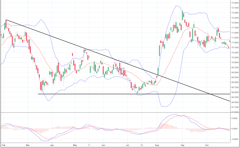
The above chart is the daily candlestick chart of USD/INR. Notice that the pair had been trading within a descending triangle pattern, before breaking out of it. Observe the weight of evidence on the day of breakout. The breakout from this pattern occurred with the emergence of a very bullish candle that had negligible lower shadow and a long body. Secondly, this breakout was accompanied by the MACD line moving above the zero line while also being above its signal line. Thirdly, notice that the breakout was accompanied by an increase in volatility, as was indicated by an expansion in Bollinger bands after a period of narrow volatility. All these signals suggested that the pair was set to move higher in the coming days.
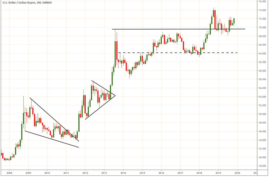
The above chart shows the monthly candlestick chart of USD/INR. The objective of this chart is the show how larger time frames can be used to forecast the primary trend of the currency pair. Notice that between 2009 and 2011, the pair was declining within a falling wedge pattern, with volatility shrinking as the time progressed. Eventually, the pair broke out of this pattern, which initiated the beginning of a major uptrend in the pair. As can be seen, the pair rose sharply for the next few months, before undergoing a consolidation within a small contracting triangle pattern. The pair then broke out of this pattern and continued moving higher. The appearance of a long bearish candle signalled a halt to the rally, with the pair unable to move above the high of this candle for the next several months. Notice how a former resistance acted as a support going forward in time (the dotted horizontal line). The pair bounced strongly off this resitance-turned-support line and went on to eventually breakout above the previous high, signalling a resumption of the uptrend. This chart pefectly shows how to use longer time frame charts to understand the larger price trends of currencies.
To gain further insights on Technical Analysis and how to use it in the real world, we highly recommend you to go through our Technical Analysis module.
Next Chapter
Comments & Discussions in
FYERS Community
.png)
