
Until now, we have discussed extensively the various fundamental factors that influence commodity prices. Each of those chapters focused on various demand and supply forces that impact each commodity, be it precious metals, industrial metals, or energy. The focus of this chapter is on charting relating to commodities i.e. technical analysis of commodities. Later, we will also be talking about intermarket analysis of commodities and how commodities are linked to other asset classes. For a detailed understanding of technical and intermarket analysis, one can refer to the respective modules that we have covered separately.
Commodity charting
Technical analysis of commodities is quite like that of equities, currencies, or bonds. No matter the asset class chosen, the basic principles of technical analysis remain the same. All technical tools and patterns that apply to equities are equally applicable to commodities too. One can apply different time scales on commodity charts depending on the time horizon he or she is looking at. One can apply various technical indicators to commodities such as Relative Strength Index, Moving Average Convergence Divergence, Moving Averages, Directional Movement Indicator, Stochastics, Bollinger Bands etc. Only can use various tools on commodity charts such as Fibonacci retracement and extensions, Andrew’s Pitchfork, Trendline, Channels etc. One can also use different types of charts such as line chart, bar chart, candle chart, point & figure chart etc.
An important thing to keep in mind when looking at charts is to always refer to different time frames rather than sticking to just a single time frame. For instance, if you are looking at the daily chart, it would greatly help if you also have a look at the chart of one smaller degree, say the 4-hourly chart, as well as the chart of one larger degree, say the weekly chart. Doing so will help you in achieving two things: identity what is the immediate larger trend so that you know in which direction to trade and identify what is the immediate smaller trend so that you can time the entry better.
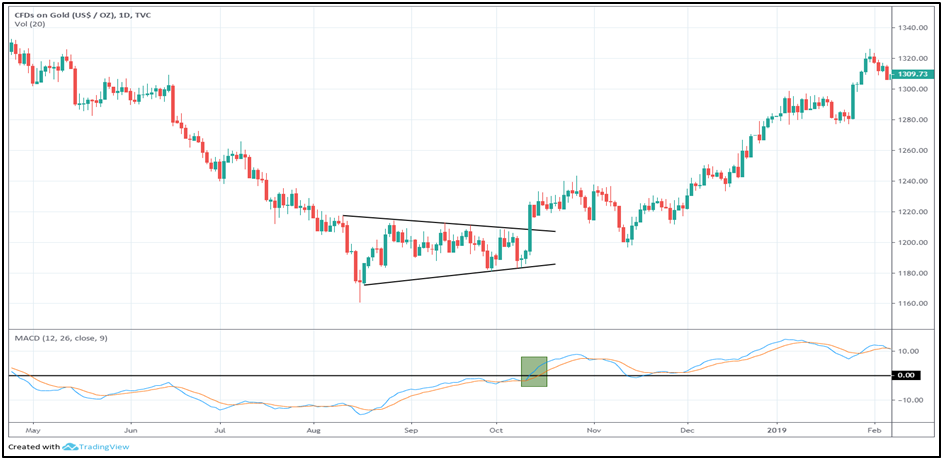
The above chart is the daily chart of gold. Notice in the above chart how a breakout from a contracting (symmetric) triangle pattern started a steady uptrend in the price of gold. Closely observe the move-in and the move-out from this pattern. Prior to entering this pattern, gold was in a prolonged downtrend with sellers in clear command. This downtrend ended when gold started to consolidate in a tight range, signalling that buyers and sellers are now in equal command. Then observe how gold broke out of this consolidation pattern with the emergence of a healthy bullish candle, signalling a shift from sellers to buyers and a change in short-term trend from down to up. Be on the lookout for such patterns wherein there is a shift in polarity from down to up, or from up to down. Also observe in the chart that the breakout of this pattern coincided with the MACD line giving a bullish crossover and moving into positive zone. This confirms the breakout in price and strengthens the odds of price moving in the direction of breakout.
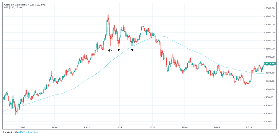
The above chart is the weekly chart of gold. The unprecedented 10-year gold rally that started in early 2000s finally showed signs of fatigue between 2011 and 2013, when gold price swung widely in a lateral band. Observe that during this wide consolidation, bulls defended the $1,500-1,530 zone thrice. The first sign of trouble to the existing gold rally came when price broke below the 100-week SMA after trying to find support above this moving average for a few weeks. The final confirmation of a change in the major trend came when gold broke below the $1,500-1,530 zone that bulls had defended strongly over a two-year period. Break below this zone triggered a steep sell-off over the next few years that took gold price towards the psychological $1,000 support, where the metal finally attracted buying interest.
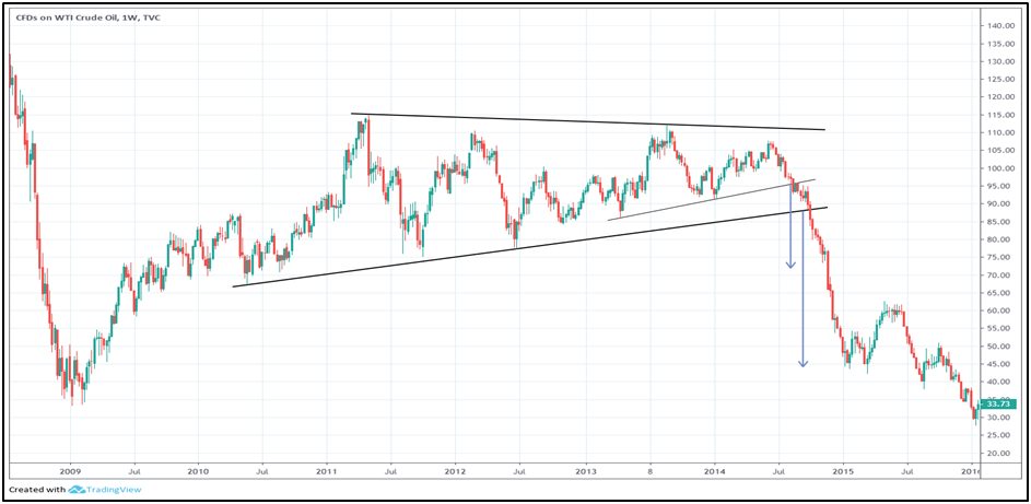
The above chart is the weekly chart of WTI crude oil. Observe that following a two-year rally, oil consolidated inside a contracting triangle pattern for almost 4 years. The first sign that the rally was in trouble came when oil broke below the neckline of a bearish Head & Shoulder (H&S)pattern. Break below this pattern gave an early signal that oil could break below the rising trendline of the contracting triangle pattern. This is what exactly happened in a few weeks. Oil broke below this triangle and came under sharp selling pressure over the course of next several weeks. In doing so, the targets of both the H&S and the contracting triangle pattern were achieved. A lesson to learn from this is that when a smaller pattern forms inside a larger pattern, pay close attention to it. If the smaller pattern is broken and if it projects a price target that exceeds the breakout point of the larger pattern, then one can initiate a trade early before there is a break from the larger pattern.
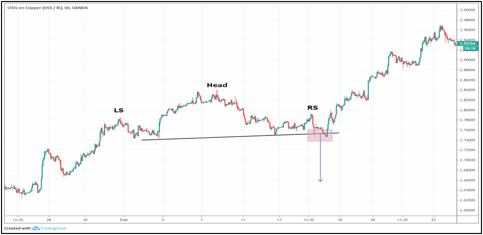
The above chart is the hourly chart of COMEX copper. Observe here that copper broke below the neckline of a bearish H&S pattern, generating a target as indicated by the blue line. However, notice that the break from this pattern turned out to be false. Copper reversed higher and proceeded to continue its prior uptrend. From this chart, we can learn that patterns will occasionally give false signals. The important point to learn from this chart is to understand when the trade has gone wrong so that one can exit the trade as early as possible and cut short the losses. In this case, the break above the high of the right shoulder (marked RS on the chart) was a signal that any shorts established following the break below the H&S neckline needs to be exited.
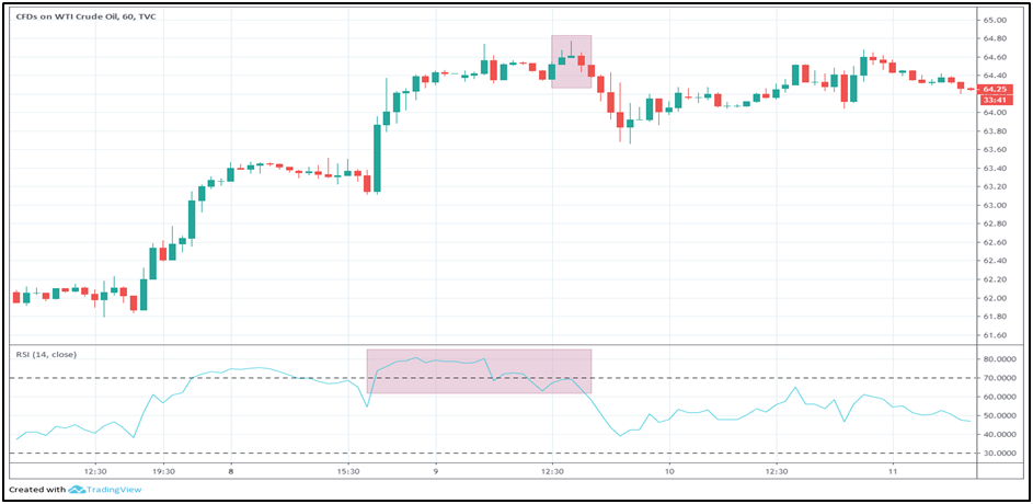
The chart below is the hourly chart of crude oil. Here the emphasis is largely on combining Japanese candlestick patterns with other parameters. Observe that oil tried to break above its previous top, but it couldn’t quite do so. Instead, it formed a ‘shooting star’ candle pattern right near its previous top. This was also accompanied by a bearish divergence between price and the RSI, as the higher high in price was not confirmed by a higher high in the RSI. The next candle closed a tick below the low of the candle that preceded the ‘shooting star’. These three candles combined formed an ‘evening star’ pattern, which accompanied with bearish RSI divergence signalled at a move lower. A trader could have initiated a short position following the completion of the ‘evening star’ pattern and placed a stop loss a few ticks above the high of the ‘shooting star’ pattern. Trading candlestick patterns is quite powerful and effective in intraday trading as well. The advantage of using candlestick patterns for intraday trading is that it allows a trader to precisely define what his or her risk is before entering the trade, so that timely entry and exit can be made. In the case of the above chart, a trader would know that in case price goes above the high of the ‘shooting star’ candle, he or she should exit the trade and take a small loss.
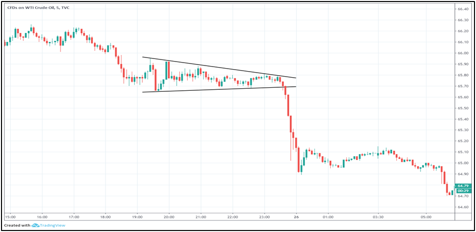
The above chart is a 5-minute chart of crude oil. The point of adding this chart is to show that technical analysis can work on any time frame, be it a long-term chart (such as quarterly or monthly chart) or a minute-chart (such as 5-minute or even a 1-minute chart). The time frame chosen would entirely depend on the trader in terms of the size of the move that he or she is interested in capturing. Notice in the chart above that once oil broke below the narrow consolidation, it fell more than a percent within a few minutes. Such a move would suffice an intraday trader who enters and exits his or her position during the day.
Intermarket Analysis
We will now shift our attention towards intermarket analysis. The objective of this section is to show how commodities are impacted by other asset classes namely equities, bonds, and currencies. We will also see how one commodity can influence the price of another commodity
Commodities and the dollar
We have already discussed about the impact of currencies on commodities. The currency that we are referring to is the US dollar. As all international commodities are priced in terms of the US currency, movements in the dollar can and do have a strong impact on commodity prices. As we have discussed, a rise in the value of the dollar vis-à-vis other currencies makes it more expensive for holders of international currencies to buy commodities. This in turn has a negative impact on the price of the commodities. Similarly, a fall in the value of the dollar makes it cheaper for holders of international currencies to buy commodities. This has a positive impact on the price of the commodities. Hence, broadly speaking, commodities move in the opposite direction of the dollar. Short-term commodity movements can deviate from the dollar’s move, because there are a lot of commodity-specific demand-supply forces that are simultaneously in play. However, over the longer horizon and especially during major turning points, commodities and the dollar share a strong negative correlation.
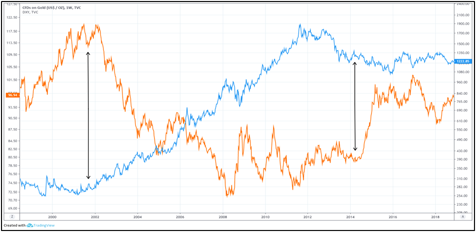
The above chart shows the price of gold (represented by blue line) and DXY (represented by orange line). Observe that the major top in DXY in 2002 also coincided with a major bottom in gold during the same year. From here on for the next six years, DXY was in a primary bear market, which benefited gold and increased its value nearly four-folds to a record high. The 2008 crisis and the subsequent interest rate cuts and Quantitative Easing by the Federal Reserve increased the volatility in the DXY over the next four years, which benefited gold and caused its value to double during this period. However, in 2011, the DXY failed to break below its 2008 bottom and started to rise, which was the first sign that the bear market in the US currency could be in its final stages. This started to take some steam off the gold’s rally, which peaked out towards the end of 2011 and started to head lower from thereon. In 2014, the DXY broke above its 2010 peak, thereby forming the first sequence of higher low and higher high in more than a decade. This marked the end of a 12-year bear market in the dollar, which in turn ended a 10-year bull market in gold too. Since then, the DXY has been in a primary bull market, while gold has been in a primary bear market.
Earlier, we talked about the DXY, which is the trade-weighted average of the dollar against six global currencies. A rising DXY indicates the dollar is strengthening against these currencies, while a falling DXY means the dollar is weakening. In a similar way, there are various commodity indices that include a variety of commodities and portray the performance of commodities in general. One such closely observed index is the Thomson Reuters/Jefferies CRB index, which is a composite weighted index comprising of 19 commodities, sorted into four groups. These groups are agriculture (41%), Energy (39%), industrial metals (13%), and precious metals (7%). A rise in the CRB index means commodities, in general, are trending up; while a fall means they are trending down.
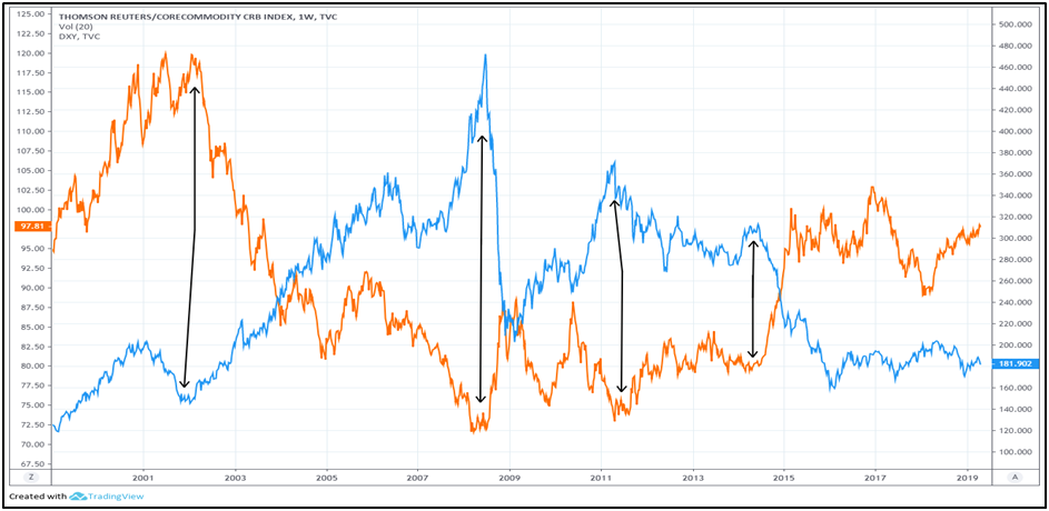
The above chart shows the price of CRB index (represented by blue line) and DXY (represented by orange line). Notice the correlation between the two during important market turning points. The 2002 major top in the DXY led to a major bottom in the CRB index. Until 2008, the DXY fell sharply which caused the CRB index to rally sharply. Then observe how a sharp rally in the DXY in late 2008 led to a sharp decline in the CRB index. Since the 2011 bottom, the DXY has been heading higher, which in turn has caused the CRB index to head lower. Also observe how the steep rally in the DXY in late 2014 coincided with a steep decline in the CRB index during the same period. This in turn reiterates that a sharp up or down move in the DXY in the short-term can strongly influence the price of commodities too during this period.
As such, always keep a close watch on the dollar. Try to find out whether the current trend is likely to continue or are there any signs of reversal emerging from the charts. Analyse not only the short-term trend of the dollar but also the medium-term and the long-term trend. Put it simply, the analysis of commodities is not complete without taking a view of the dollar.
Commodities and bond yields
Commodities are directly linked to inflation. Sustained increase in the price of commodities puts upward pressure on inflation. As inflation goes up and becomes a threat to the economy, central banks use monetary policy tools to rein in inflationary pressures. To do this, they increase their short-term policy rates. The increase in the short-term policy rates is then filtered through the financial system, which puts upward pressure on overall interest rates, including longer-term rates. Eventually, this spills over to bonds as well, causing bond yields to head higher and bond prices to head lower. So, as we can see, rising commodity prices tend to put upward pressure on bond yields. Similarly, falling commodity prices tend to put downward pressure on bond yields. In other words, commodity prices and bond yields usually move in the same direction.
Earlier, we saw how the dollar and commodities are inversely correlated. A rise in the dollar puts downward pressure on commodities. As commodities and bond yields are positively correlated, a fall in commodity prices then tends to put downward pressure on bond yields too. So, it can be said that a rising dollar indirectly puts downward pressure on bond yields. Similarly, a falling dollar indirectly puts upward pressure on bond yields. The word ‘indirect’ is used here because the effect of the dollar on bond yields filters through commodities. Keep in mind that when we are talking about bond yields, we are talking about them in general, i.e. global bond yields.
Having said that, the correlation between commodities and bond yields is not as strong and as straight forward as that between commodities and the dollar. Sometimes, commodities and bond yields can move in the opposite direction too, especially if things other than just inflation are in play. For instance, the period between 2000 and 2003 saw commodities rising and bond yields falling. This was because rising commodity prices during this time was not perceived as a threat of rising inflation. As such, despite the rising commodity prices, central banks kept their policies accommodative to revive their economies following the 2000 dot com bubble burst and the subsequent recession.
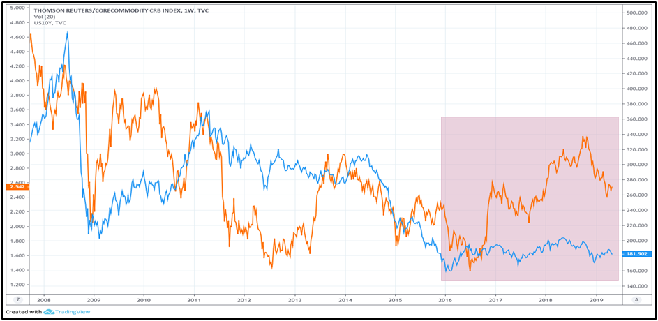
The above chart shows the price of CRB index (represented by blue line) and the US 10-year bond yield (represented by orange line). Over the past decade, observe that the two, in general, have shared a positive correlation, as both have been trending lower. Also notice that commodities seem to be forming a base since 2016, as the downtrend has turned into a consolidation range. This apparent end to the commodity downtrend has coincided with US yields heading higher during this period, partly because the Federal Reserve has been increasing its policy rates and partly because commodities have stopped falling. Occasionally, observe that the two can decouple, like in 2013 and 2015 when commodities continued to fall while US yields rose.
Commodities and equities
So far, we have seen the correlation between commodities and the dollar as well as that between commodities and bond yields. We have seen that commodities and the dollar share a strong negative correlation, while commodities and bond yields share a positive correlation most of the times. The third important correlation to understand is that between commodities and equities.
Generally, the correlation between the two depends on the stage of the economic cycle. During an economic expansion, commodities and equities usually share a positive correlation. They both tend to rise simultaneously until the late economic expansion stage when inflation becomes a major threat and starts exerting upward pressure on interest rates. Once this happens, the two usually decouple with commodities continuing to head higher, while equities start declining. Eventually, as demand starts fading, commodities also peak out and join equities in moving lower. During an economic contraction, both the asset classes usually share a positive correlation yet again. As business conditions deteriorate and demand for commodities decline, the two tend to fall simultaneously until the late economic contraction stage when falling interest rates eventually start to revive economic activity. During this stage, the two again decouple with commodities continuing to head lower, while equities start to recover from their slump. Eventually, as economic conditions start reviving, demand for commodities emerges and they then join equities in moving higher.
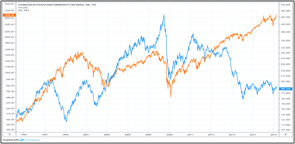
In brief, commodities and equities usually share a positive correlation during expansionary and contractionary stages of a business cycle. It is usually during the late expansionary and the late contractionary stages that the two tend to decouple. Having said that, this traditional correlation can and do sometimes fail, especially when some other bigger forces are in play. The second half of the below chart shows this.
The above chart shows the price of CRB index (represented by blue line) and the S&P 500 index (represented by orange line). Closely observe that correlation between the two. From 1995 to 1998, the two rallied simultaneously, boosted by an expanding US and global economy. For the next one year though, the two decoupled – CRB index fell while S&P 500 rallied – as the Asian financial crisis led to a deflationary spiral in many eastern and commodity-producing nations. From 1999 till early 2011, the two again resumed their positive correlation as both rose and fell in sync. From 2011 onwards however, the two have been moving in the opposite direction – S&P 500 has rallied sharply while CRB index has continued to head south. This again reiterates that the traditional correlation can break, especially when other bigger forces are in play. In this case, the force that has been in play is China, the world’s second largest economy.
Over the past several years, China has been in a gradual slowdown. Given that China is a major global manufacturing hub, it is always in need of huge quantities of various commodities to manufacture various goods and products for its domestic consumption as well as for exports to other nations. In fact, China is the world’s largest consumer of many commodities, be it hard commodities or soft commodities. As such, a slowdown in China has led to a severe reduction in demand for several commodities, which in turn has dragged all commodity indices lower. Until China starts emerging from its economic slump, the traditional correlation between stocks and commodities is unlikely to hold.
Recapping the correlation of commodities with other asset classes
-
Commodities and the dollar share a strong inverse correlation. A rise in the dollar tends to drag commodity prices lower, while a fall in the dollar tends to lift commodity prices.
-
Commodities and bond yields share a positive correlation. Rise in commodities tends to put upward pressure on bond yields, while fall in commodities tends to put downward pressure on bond yields.
-
Commodities and equities share a positive correlation during expansionary and contractionary stages of a business cycle. It is usually during the late expansionary and the late contractionary stages that the two tend to decouple and move in the opposite direction.
Next Chapter
Comments & Discussions in
FYERS Community
Gangadhar Mane commented on June 14th, 2019 at 11:00 PM
Fyers is doing a great job, It is very difficult to get this information for free. I have one question. some stocks like ongc and carin india are affected by the crude oil price. Any other stocks like this are affected by the commodities.
tejas commented on June 17th, 2019 at 2:46 PM
Hi Gangadhar, The entire economy and many companies are affected by oil prices because it affects the following:
1. The country's foreign reserves
2. Currency value
3. Inflation
4. GDP
5. Interest rates
Akint Singh commented on June 24th, 2019 at 10:55 PM
Is it good to trade with technical analysis in commodities? I heard that the commodities are traded mostly based on the news.
tejas commented on June 25th, 2019 at 4:41 PM
Nope. Commodities are influenced primarily by demand/supply. Stocks are more influenced by the news and people (Management, regulators, governments etc.)
Milind commented on August 16th, 2019 at 1:56 PM
Hi
I have read almost all the chapters in School of stocks. Thanks for it. I was knowing nothing about share market before 3 months. My friend advised reading this.
If I want to see the market, charts, indicators; all live for free just to understand it, where can I see it?
tejas commented on August 20th, 2019 at 1:36 AM
Hey, the best way to do that is to open an account with us. You can see all of that on our trading platform, FYERS Web.
hi commented on May 31st, 2022 at 3:13 PM
Hi there this is somewhat of off topic but I was wondering if blogs use WYSIWYG editors or if you have to manually code with HTML. I'm starting a blog soon but have no coding know-how so I wanted to get advice from someone with experience. Any help would be greatly appreciated!|
hi http://jlskdjflksdjf.net
Sima commented on June 16th, 2022 at 11:24 PM
Good respond in return of this matter with firm
arguments and describing all concerning that.
aid for ukraine
Sherman commented on February 10th, 2024 at 6:19 AM
Wow, awesome weblog layout! How lengthy have you ever been running a blog for?
you made running a blog look easy. The total look of your web site is magnificent, let alone the content!
You can see similar: https://intellara.top and here https://intellara.top
Nathaniel commented on March 2nd, 2024 at 11:20 PM
Right away I am ready to do my breakfast, once having
my breakfast coming again to read other news. I saw similar here: najlepszy sklep
and also here: e-commerce