26 Sep, 2025
 4 mins read
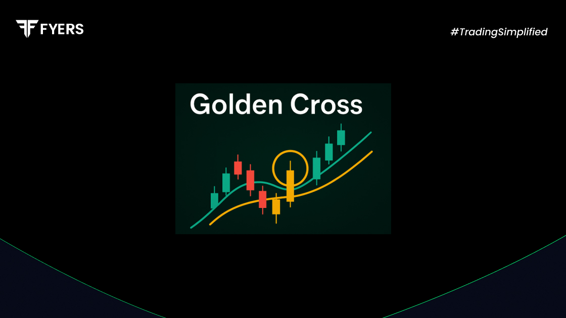
In market cycles where uncertainty dominates, traders search for patterns that provide clarity. The golden cross in stocks is one such signal, often celebrated as a turning point from weakness to strength. More than just lines on a chart, this crossover has inspired confidence in investors for decades. It is easy to spot, historically reliable, and often accompanied by a surge in participation, making it one of the most watched patterns in technical analysis.
A golden cross is a bullish chart signal that occurs when a short-term moving average rises above a long-term moving average. The most common form is when the 50-day moving average crosses above the 200-day moving average.
This movement suggests that buying momentum is increasing and that the market could be shifting from a neutral or bearish phase into a bullish trend. For traders, it often acts as a potential buy signal, especially when confirmed by trading volume.
The golden cross formation usually unfolds in three stages:
Downtrend ends: Prices are falling, and the short-term average stays below the long-term average.
Crossover occurs: The short-term average, such as the 50-day, begins rising and moves above the 200-day average.
Uptrend begins: Both averages slope upward, confirming a new bullish trend.
In many cases, trading volume rises alongside the crossover, strengthening the signal’s reliability.
The golden cross pattern carries weight for several reasons:
Trend confirmation: It provides strong confirmation of a long-term uptrend.
Broad recognition: Both institutional and retail investors monitor it, amplifying its impact.
Simplicity: Easy to identify on price charts, even for beginners.
Versatility: Useful across asset classes, including stocks, indices, and cryptocurrencies.
Still, it should be combined with other tools like RSI, MACD, or volume analysis to reduce the risk of false signals.
The Death Cross is the bearish counterpart to the Golden Cross. Here is a simple comparison:
|
Feature |
Golden Cross |
Death Cross |
|---|---|---|
|
Signal Type |
Bullish |
Bearish |
|
Moving Average |
50-day crosses above 200-day |
50-day crosses below 200-day |
|
Trend Indication |
Start of long-term uptrend |
Start of long-term downtrend |
|
Investor Action |
Potential buy signal |
Potential sell or short signal |
Both are lagging indicators, meaning they confirm a trend after it begins. Timing, therefore, should be balanced with confirmation from other tools. Understanding the difference between golden cross and death cross is key to avoiding one-sided trading decisions.
Consider a stock trading near ₹150, with its 50-day moving average approaching the 200-day average at ₹155. If prices continue to climb and the 50-day line crosses above the 200-day at, say, ₹160, a golden cross is formed.
When this move coincides with higher volume and momentum, many traders interpret it as a buy opportunity. Historical cases include the Nifty 50 and Sensex showing golden cross formations before extended rallies, particularly following market corrections.
A golden cross trading strategy goes beyond simply acting on the crossover. Effective approaches often include:
Wait for confirmation: Allow a few sessions after the crossover before entering.
Check trading volume: Stronger signals often come with higher volume.
Combine indicators: Use RSI or MACD to confirm strength or identify overbought conditions.
Risk management: Apply stop-loss levels to protect capital.
Gradual entry: Start with partial positions and increase exposure if the trend holds.
Market sentiment, macroeconomic news, and sector performance should also be factored into decisions.
The golden cross in stocks is more than a chart pattern. It represents the collective optimism of investors, signalling that the tide may be turning in favour of the bulls. Its history and simplicity make it a favourite among traders, but relying on it alone can be risky. Used wisely alongside volume analysis, other indicators, and disciplined risk management, the golden cross can transform from a signal on a chart into a valuable guide for trading success.
Not always. While it signals bullish potential, the move may not always lead to sustained rallies. Its reliability improves when used with supporting indicators and market context.
A false Golden Cross occurs when the crossover forms but the uptrend fails to continue, leading to a quick price decline. These can be avoided by confirming with volume and waiting for follow-through.
Yes, it can be applied to intraday charts like hourly or 15-minute intervals. However, the reliability decreases as the timeframe shortens, making false signals more common.
Managing risk involves setting stop-loss levels, keeping position sizes small initially, diversifying across stocks, and confirming signals with technical tools before committing fully.
Calculate your Net P&L after deducting all the charges like Tax, Brokerage, etc.
Find your required margin.
Calculate the average price you paid for a stock and determine your total cost.
Estimate your investment growth. Calculate potential returns on one-time investments.
Forecast your investment returns. Understand potential growth with regular contributions.

You have successfully submitted your partnership request form. You will be hearing us soon!