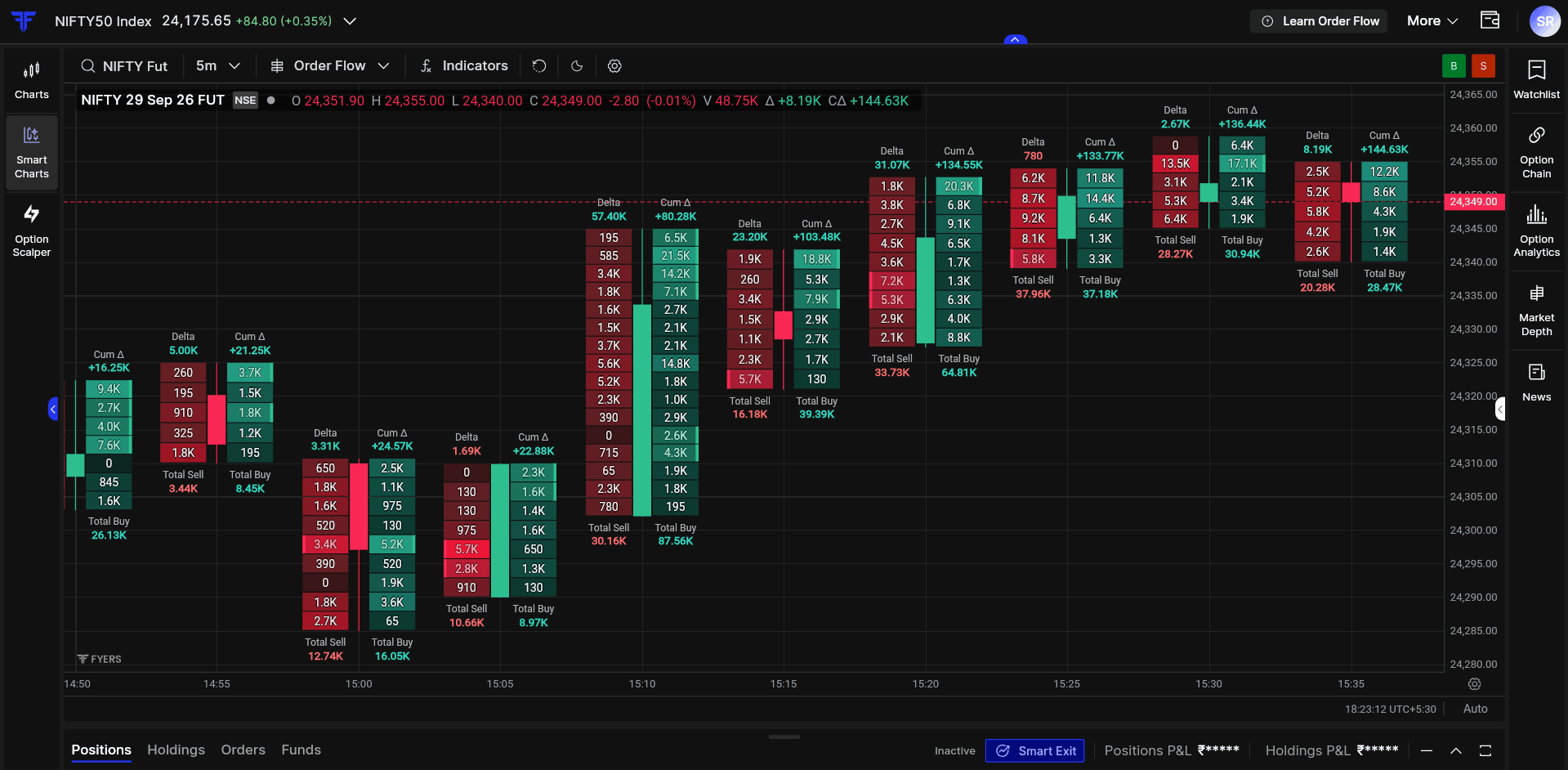
When you look at a regular chart, you see one candle forming after another as price moves. Once a candle closes, you know its open, high, low and close, which gives you a summary of what happened during that period. But there can be thousands of individual trades behind that candle, with buyers becoming active at some prices and sellers becoming active at others. A regular candle does not show you that activity.
The market does not really move candle by candle. It moves trade by trade. That is why we have added Order Flow on FYERS Smart Charts, our in-house charting platform.
It lets you look inside each candle and see buying and selling activity at different price levels, so you can understand more about the participation behind a price move instead of looking only at the final shape of the candle.
What you can now see inside a candle
Order Flow shows you the real-time trading activity behind price movements, including how buyers and sellers are participating at different price levels within each candle. This gives you additional context when reading trends, breakouts, reversals, support and resistance.
It can help you understand:
-
What is happening behind a breakout or rejection
-
Which side is more active at a price level
-
Whether participation is building or fading
Suppose NIFTY is testing resistance at 24,500 and price moves above it. On a regular chart, it looks like a breakout. With Order Flow, you can look deeper and see whether buying activity is supporting the move or starting to fade.
That is where Order Flow starts adding context.
Delta
Delta measures the difference between buying and selling within a candle.
Delta = Total Buy - Total Sell
If Buy Volume is higher than Sell Volume, Delta is positive. If Sell Volume is higher, Delta is negative.

For example, in the candle shown above, Total Buy Volume is 5.07K and Total Sell Volume is 8.84K. That gives us a Delta of approximately 3.77K.
Delta is read along with price action. A positive or negative Delta tells you which side is more aggressive, while the way price responds to that activity gives you the context.
Cumulative Delta
Delta tells you what happened within one candle. Cumulative Delta helps you follow that activity over several candles by keeping a running total of Delta.
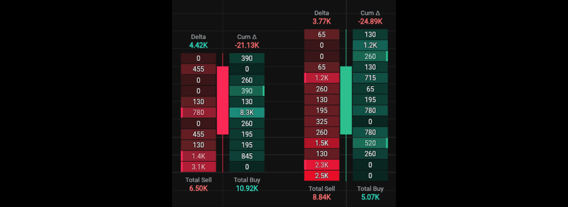
For example, Cumulative Delta is -21.13K, and Delta is 3.77K, so Cumulative Delta is -24.89K.
If price is moving higher and the Cumulative Delta is also rising, aggressive buying is supporting the move. But if price continues making new highs while Cumulative Delta starts falling, price and participation are no longer moving together.
That does not mean price is about to reverse. It tells you that the participation behind the move is changing.
Imbalances
Delta gives you the difference between Buy and Sell Volume across the whole candle. Imbalances help you see where aggressive buying or selling is appearing at specific price levels.
An imbalance compares Buy and Sell Volume diagonally across adjacent price levels. When one side is significantly larger than the other, that price level is highlighted as an imbalance.

For example, if the Imbalance Ratio is set to 300%, one side needs to have at least three times the volume of the opposite side. If Sell Volume is 65 and the corresponding Buy Volume is 260, the Buy side meets the threshold and is highlighted as a buy imbalance.
You can customise this ratio depending on how large you want the difference to be before an imbalance is shown.
Absorption
Absorption happens when aggressive buying or selling is met by enough limit orders on the other side to stop price from moving further.
For example, sellers may be aggressive around a support level, but price may refuse to move lower because passive buyers are absorbing that selling. The same can happen near resistance, where aggressive buying is absorbed by passive sellers.
This is why positive Delta does not automatically mean bullish and negative Delta does not automatically mean bearish. Price still tells you whether that activity is actually moving the market.
Exhaustion
Exhaustion happens when the activity behind a price move starts to weaken.
For example, the market may be moving higher with positive Delta and repeated buy-side imbalances. As price attempts another high, Delta may become smaller and buy imbalances may appear less frequently.
That tells you the buying activity behind the move is fading. It does not mean price has to reverse, but it gives you another clue about how participation is changing.
Indicators in Order Flow
Along with the Order Flow, you can use indicators that give you more context around price and participation.
Volume Profile
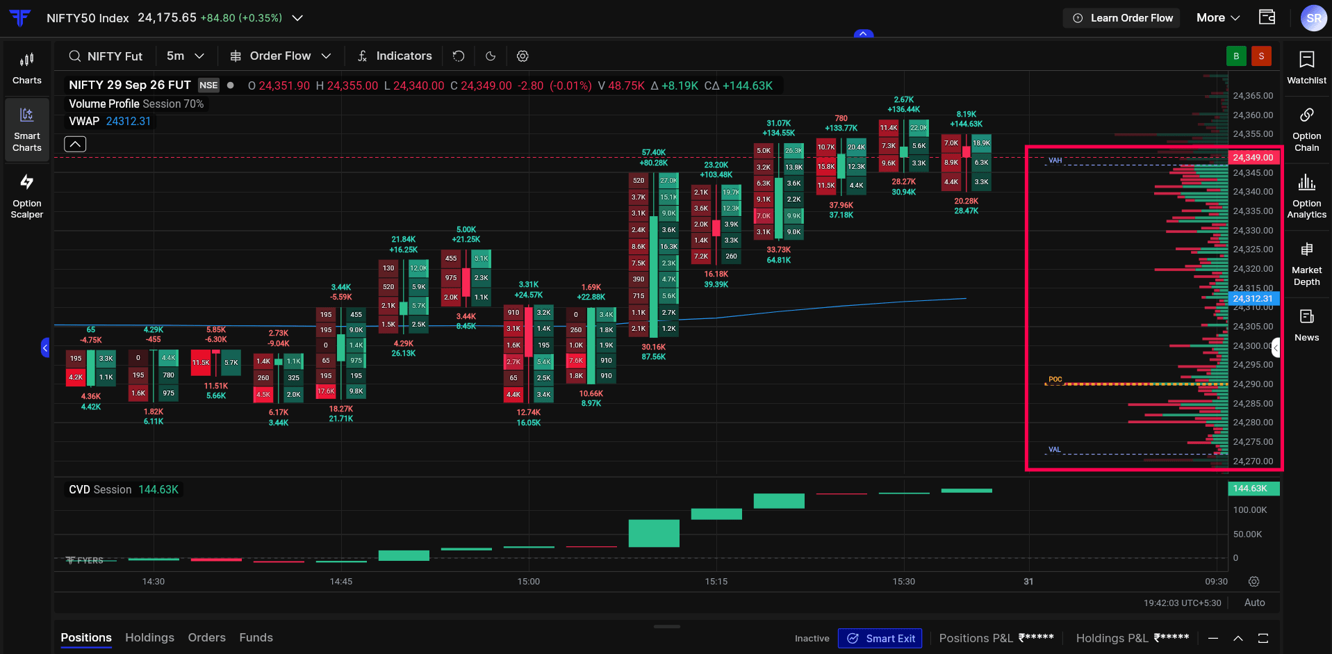
Volume Profile shows where trading activity has been concentrated across a price range. Longer bars represent price levels where more volume traded, while shorter bars represent levels where less volume traded.
-
Point of Control (POC): The price level where the highest volume traded
-
Value Area High (VAH): The upper boundary of the Value Area
-
Value Area Low (VAL): The lower boundary of the Value Area
Volume Profile helps you identify important areas of activity. You can use Order Flow to see what buyers and sellers are doing when price reaches those levels.
VWAP
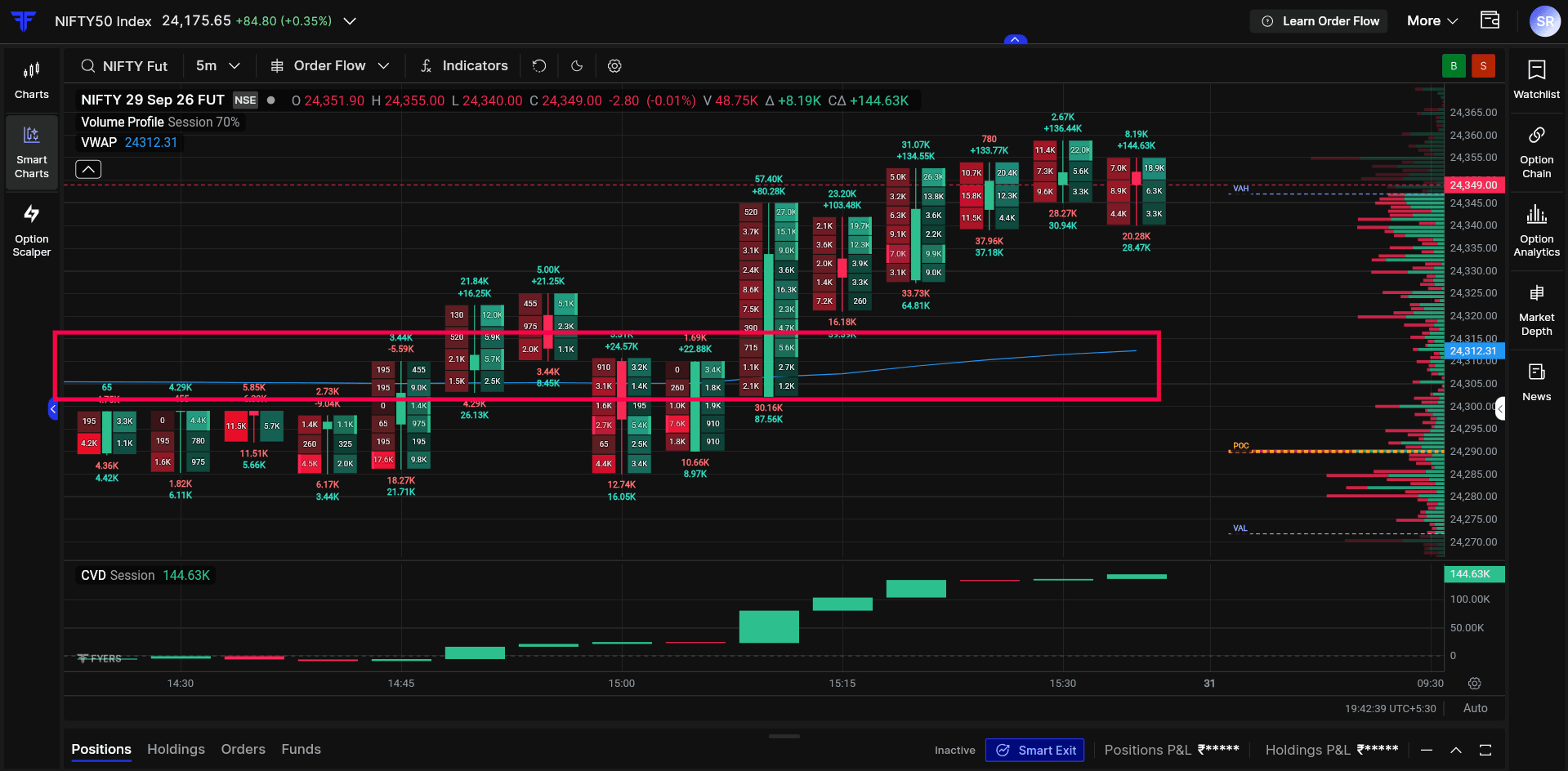
Volume Weighted Average Price (VWAP), shows the average price at which an instrument has traded during the session, weighted by volume.
It gives you a reference point for where price is trading relative to the session average. You can use Order Flow with VWAP to understand how buying and selling activity is developing as price approaches or moves away from it.
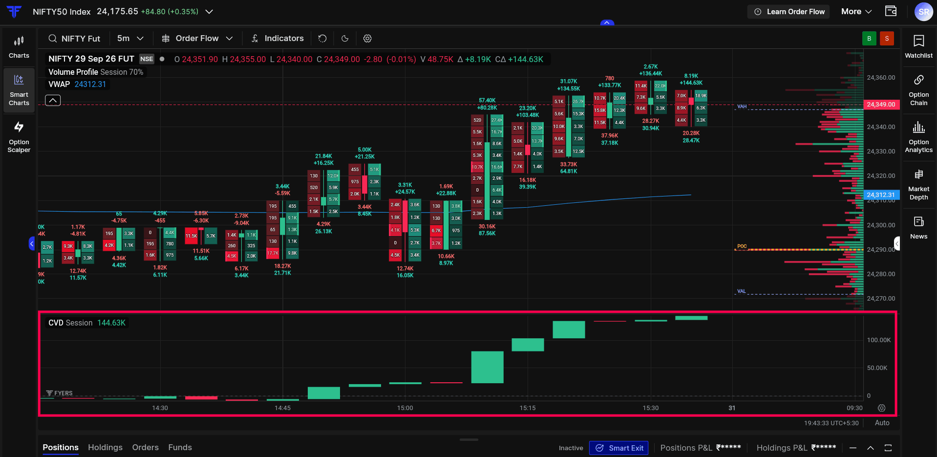
CVD Session
Cumulative Volume Delta (CVD), keeps a running total of the difference between Buy Volume and Sell Volume throughout the trading session.
While Delta shows you what is happening within one candle, CVD Session gives you a broader view of how participation is developing across the day.
You can compare CVD Session with price to see whether both are moving together or starting to diverge.
For the complete list of indicators available with Order Flow and how they work, click here
Read Price and Participation Together
Start with price action. Identify the trend, support and resistance, breakouts, VWAP, or whichever levels matter to your setup. Then use Order Flow to understand what buyers and sellers are doing around those levels.
A regular candle tells you what price did. Order Flow helps you see more of the activity behind that move.
Order Flow is now live on FYERS Smart Charts across Fyers Web and Fyers App. Add it with your existing chart setup and see how price and participation behave around the levels you already track.
 ), but I find your approach to order flow much better and more useful—especially because you also let us explore order-flow details beyond just the intraday timeframe.
