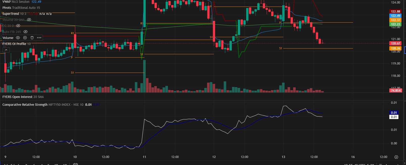
Just because a stock is going up does not mean it is doing well.
On many days, the market itself moves up. Most stocks will show green candles, and everything looks fine on the chart. But what matters is whether a stock is outperforming the market or simply following it.
That difference is easy to miss if you only look at price.
Comparative Relative Strength indicator helps you see that. It compares a stock’s performance to the market so you can quickly tell if it is leading or lagging.
What it does
This indicator compares how a stock is performing against a benchmark like NIFTY50. It plots a line below your price chart. NIFTY50 is the default benchmark, but you can change it to any other index you prefer.
If the line is rising, the stock is outperforming. If the line is falling, it is lagging. Your price chart stays unchanged, and the comparison runs in the background.
A quick example
Look at Apollo Hospitals on a 5-minute chart. Price trends steadily higher and trades near ₹7,080 by early afternoon. It looks like a clean move.
Now add Comparative Relative Strength with NIFTY50 as the benchmark. The line rises and holds through pullbacks, even while NIFTY stays flat. That shows Apollo is gaining stronger momentum than the broader market.
Why it matters
In choppy or flat markets, many stocks bounce randomly. This indicator helps you spot the ones showing real strength relative to the index.
How it works
It compares the percentage change of a stock to its benchmark.
If the line is above zero and rising, the stock is outperforming. If it is below and falling, the stock is underperforming. No manual work needed.
Where it applies
Use it on any stock, ETF, or index where benchmark comparison adds context.
Where to find it
Available on FYERS Web, FYERS App, and FYERS Trader.
- Open any chart
- Go to Indicators
- Search for Comparative Relative Strength
- Select your benchmark and timeframe
If you want to spend more time on strong stocks and less time chasing random moves, this tool makes the difference clear.
 Actually oru doubt ullath, if market also going up and stock also going up, the line will still show outperforming? Because sometimes I feel stock going up but actually nifty more aanu poyath
  Apollo example kanda manasilaayi but still want to try it myself before fully trusting it
  .
.