Have you ever bought an option thinking the premium looked reasonable, only to watch it lose value even when the market barely moved? Or noticed how some option strikes hold their premiums better than others?
As traders, we usually look at the premium, market direction, and time left until expiry. But there’s another factor that plays an important role in option pricing: Implied Volatility (IV).
To help you understand how IV differs across strikes, we’ve introduced IV Skew in FYERS Option Analytics.
Understanding IV Skew
Not all option strikes have the same IV, even when they belong to the same expiry.
Let’s say NIFTY is trading at 25,000. You check two different strikes and notice that one has an IV of 19%, while the other has an IV of 16%.
This happens because the market is pricing volatility differently at different strikes. That difference is called IV Skew.
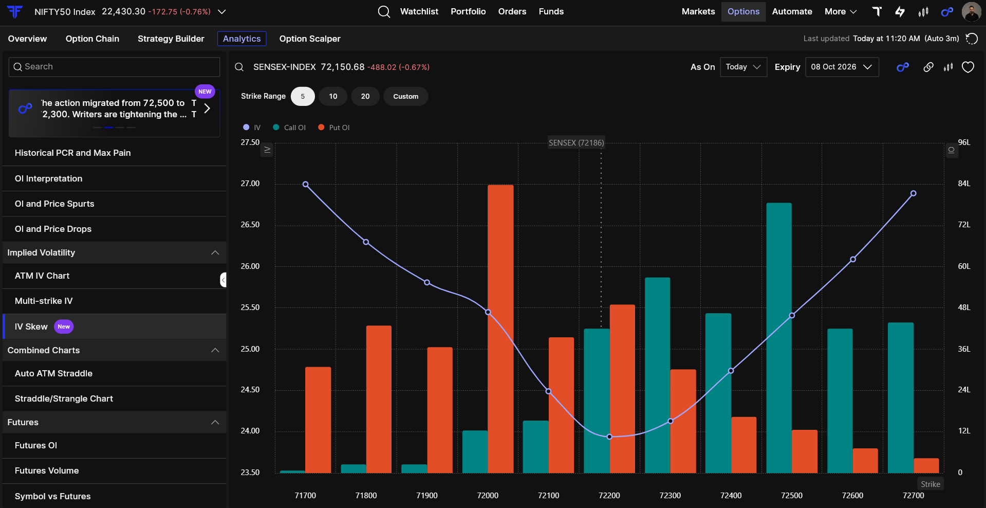
The IV Skew chart makes this easier to understand. It shows strike prices along the bottom and IV on the side, with a line connecting the values. When the line rises, IV is increasing across strikes. When it falls, IV is decreasing.
Instead of checking each strike separately, you can see the entire pattern in one chart.
What Does the Shape of IV Skew Tell You?
The interesting part is that the IV Skew line doesn’t always look the same. Its shape changes depending on how the market is pricing volatility.
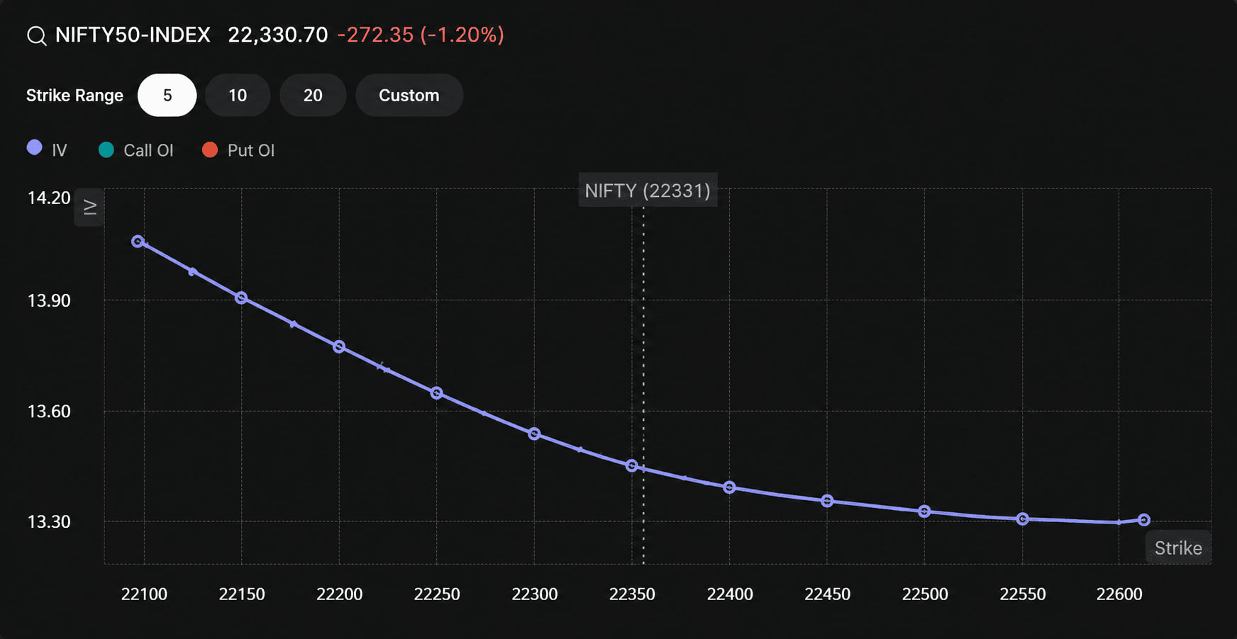
- Downward-sloping curve: IV is higher at lower strikes, which may indicate greater concern about a market fall.
- Upward-sloping curve: IV is higher at higher strikes, showing relatively more volatility being priced into those strikes.
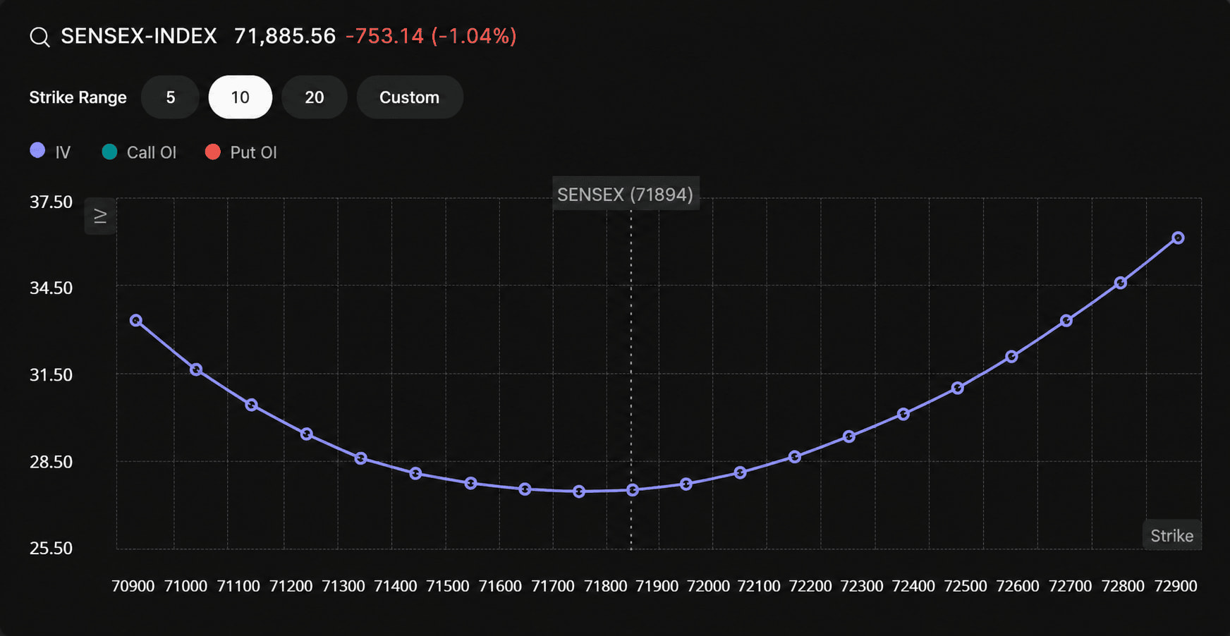
- Smile-shaped curve: IV is higher on both sides and lower near ATM (At The Money).
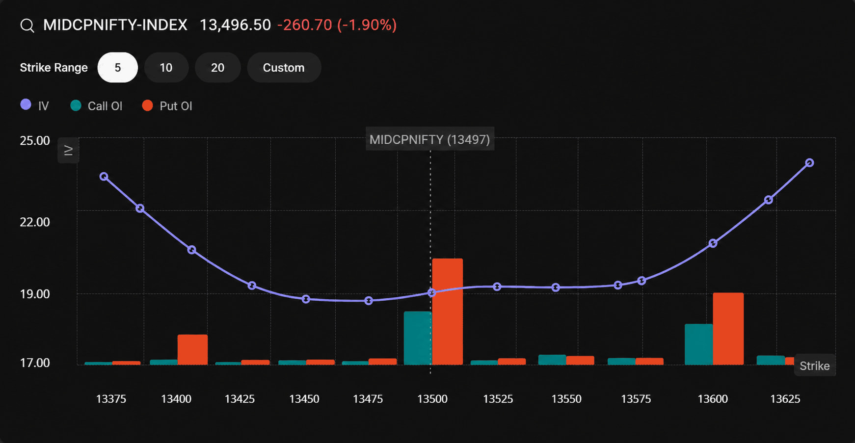
- Flat curve: IV is almost the same across strikes.
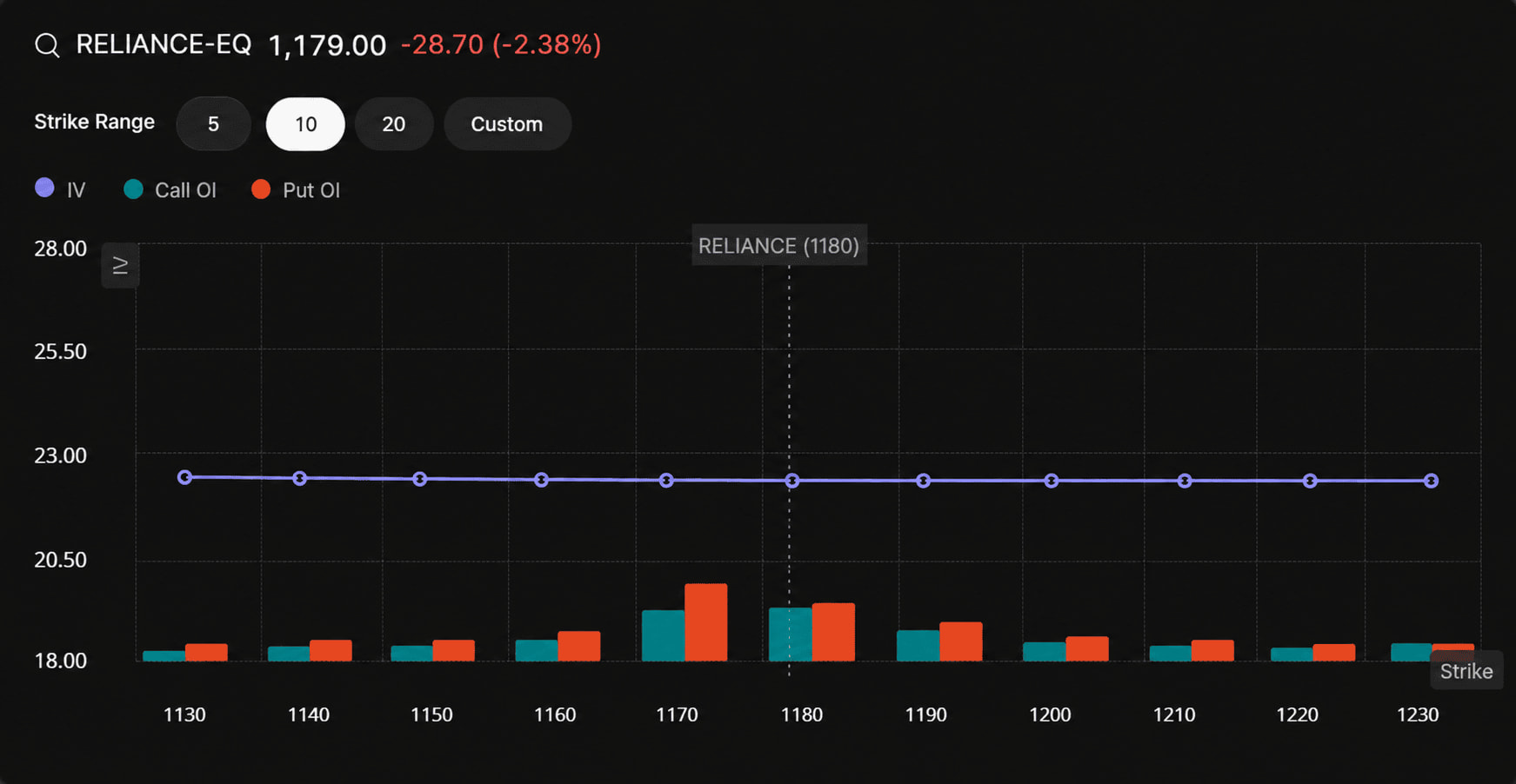
These shapes don’t predict where the market will move next. They simply help you understand which strikes carry relatively higher or lower IV.
Explore IV Skew on FYERS
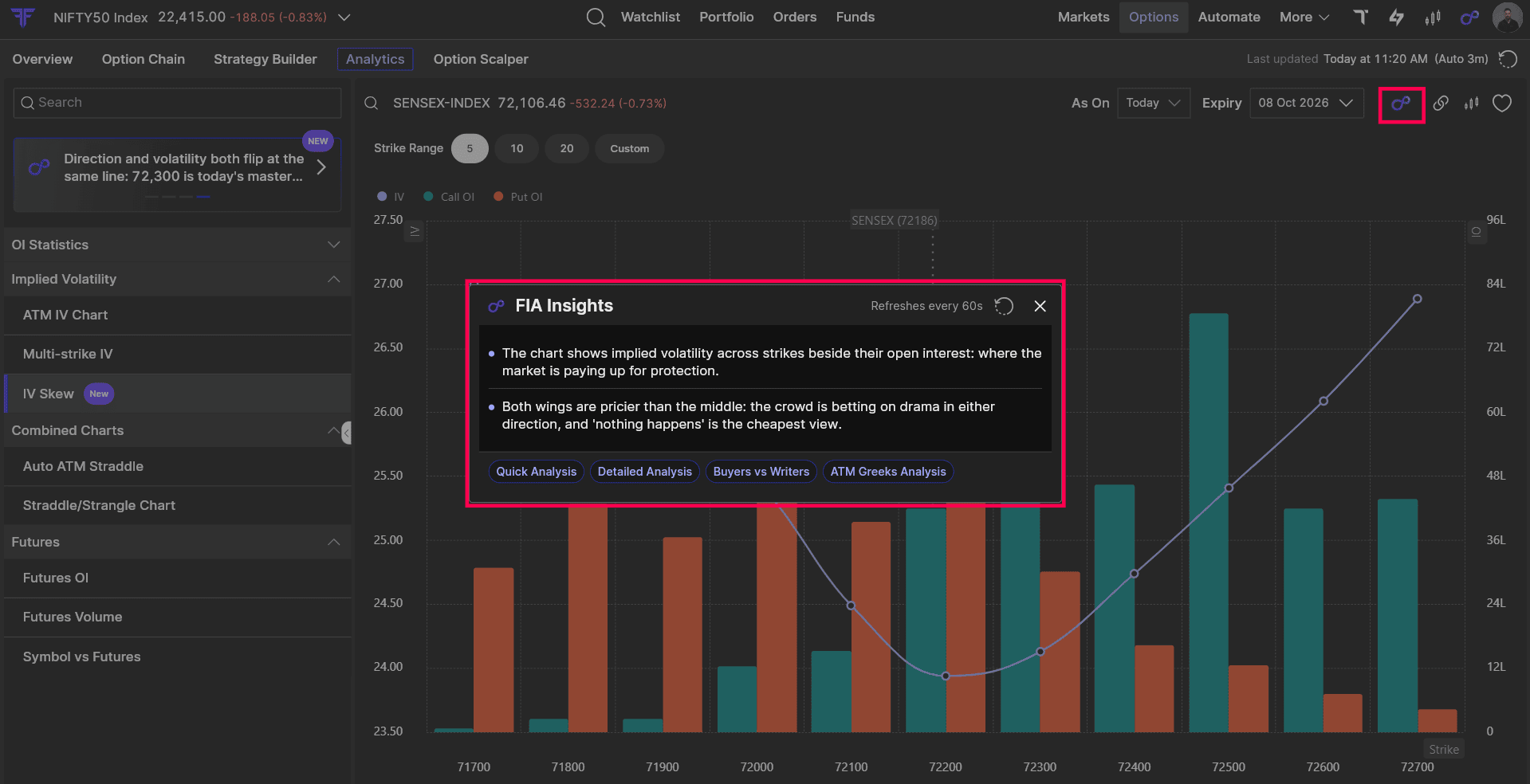
With IV Skew in FYERS Option Analytics, you can view the IV curve alongside Call and Put Open Interest (OI) to see how volatility and positions differ across strikes. You can also view 5, 10, or 20 strikes, or choose a custom range.
You can also click FIA Insights to get a quick explanation of what the chart is showing. It highlights IV patterns, how volatility differs across strikes, and what the data may suggest about market expectations.
Steps to Access IV Skew on FYERS
-
Log in to FYERS
-
Go to Options → Option Analytics.
-
Under Implied Volatility, select IV Skew.
-
Choose your preferred underlying and expiry to view the chart.
Explore IV Skew and discover the other tools we’ve built in FYERS Option Analytics and Support Articles.
Start Exploring IV Skew
When trading options, it’s natural to focus on the premium. But knowing how IV differs across strikes gives you another useful perspective before choosing a strike or planning a strategy.
The next time you’re analysing NIFTY, Bank Nifty, or SENSEX options, open the IV Skew chart. Look at the shape, compare the strikes, and observe how it changes as the market moves.
IV Skew is now available on FYERS Web and FYERS App