If you trade options, you already know this. Clicking Buy or Sell is the easiest part of the job. It takes less than a second. What actually takes time is building the confidence to click that button.
For most traders, that confidence is hard to build because the workflow itself is fragmented. Charts sit in one window. The NSE website is open in another to check Open Interest because you want official numbers. Futures positioning is checked elsewhere. You keep checking all of this and try to connect the dots.
We realised something important. Even though the data existed, traders had to search for it in too many places and then reconstruct the market in their heads. That led to a simple question. Why not bring all of it together?
That question led to Options Analytics.
A single analysis screen on FYERS App and Web where price, Open Interest, volatility, and futures positioning sit together and can be read together. Seventeen tools on one screen, built to reduce guessing and improve conviction.
In this post, I will walk you through how these fit together and how we think about reading options markets using them.
Open Interest Statistics
Open Interest sits at the core of options trading. But raw OI numbers, by themselves, do not say much. What matters is how OI behaves along with price, and what that behaviour says about who is entering, who is exiting, and who is under pressure.
1. OI Interpretation
This is where options analysis should begin. When most traders look at an option chain, they see numbers changing. What they actually need to see is intent.
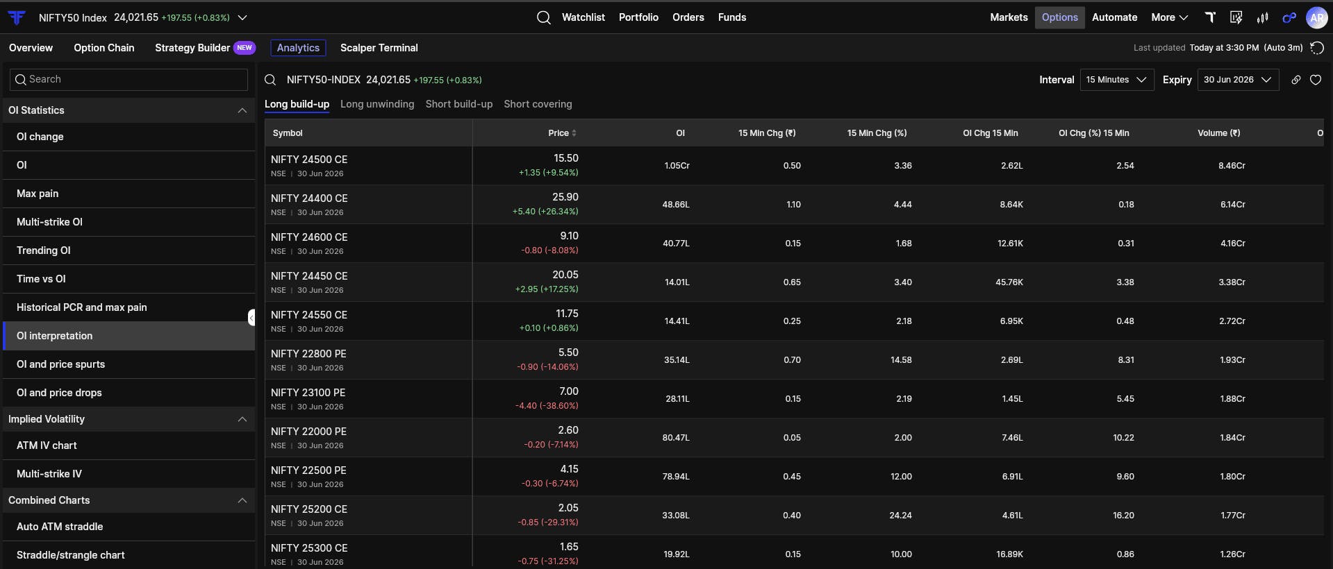
OI Interpretation brings price and Open Interest together and classifies market behaviour into four clear states:
- Long build-up: Price is rising and Open Interest is rising. Fresh long positions are being created. Buyers are committing capital rather than just chasing price.
- Short build-up: Price is falling while Open Interest is rising. Option writers are adding new short positions and building resistance deliberately.
- Short covering: Price is rising but Open Interest is falling. Short sellers are exiting quickly, often leading to sharp and fast moves.
- Long unwinding: Price is falling and Open Interest is falling. Long positions are getting closed and support is being removed.
What this view tells you is not direction, but pressure.
For example, imagine NIFTY is hovering around 24,500. The price isn’t moving much, but you see Short Covering appearing on the 24,500 and 24,600 Calls. This tells you that Call writers are nervous and leaving. Even if the price hasn’t spiked yet, the resistance is weakening.
2. OI Spurts
Intraday markets rarely move in a smooth, predictable way. They move when something changes suddenly.
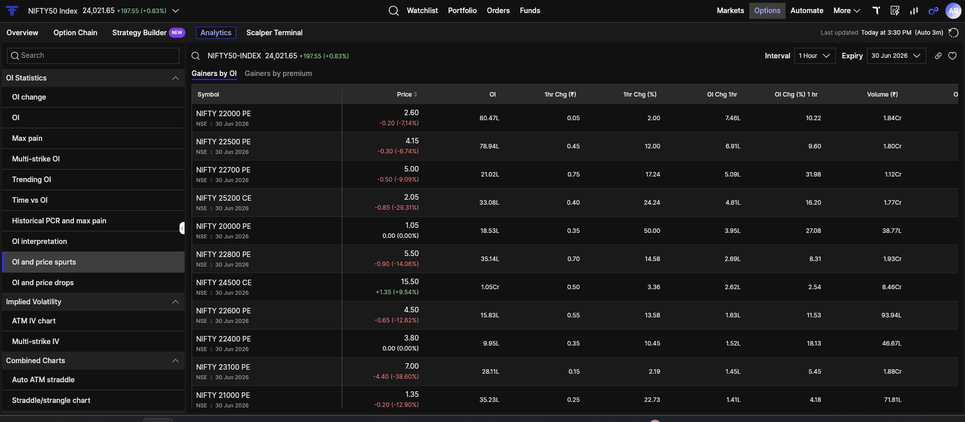
OI Spurts is built to highlight those moments. Instead of waiting for price to react, this view shows where Open Interest or option premiums are changing sharply in a short period of time.
It does this in two ways:
- Gainers by OI: This highlights strikes where Open Interest is increasing rapidly. When this happens near important levels, it often signals fresh positions being created rather than routine adjustments.
- Gainers by Premium: This shows strikes where option prices are jumping quickly, usually because of aggressive hedging or sudden repricing driven by volatility.
What to look for here is repetition and size. This view is not a signal generator. It acts as an attention filter. When the same strike keeps appearing with meaningful volume, it deserves a closer look in the option chain and market depth. Very often, positioning moves before price does.
3. OI Drops
Knowing where money is entering the market is only half the picture. Knowing where money is leaving is just as important.
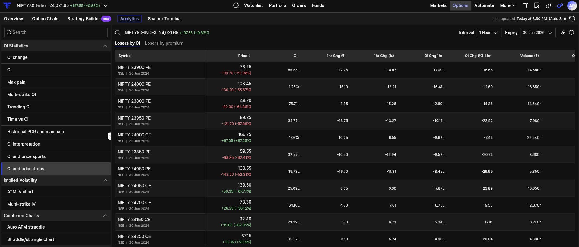
OI Drops highlights strikes where Open Interest is reducing sharply. This usually means traders who were defending a level are stepping away.
When a major Call strike starts showing up here, it often indicates that Call writers are exiting quickly to avoid risk. Once these walls weaken, price tends to move more freely through those levels.
4. OI Change
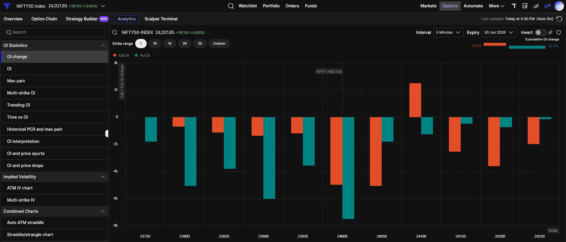
OI Change shows the net flow of the trading session. It compares Call-side and Put-side Open Interest changes across strikes.
This view becomes useful when there is imbalance. When Call OI is rising while Put OI is falling at the same levels, it usually reflects initiative from one side rather than random activity. It helps you understand who is building and who is backing off during the day.
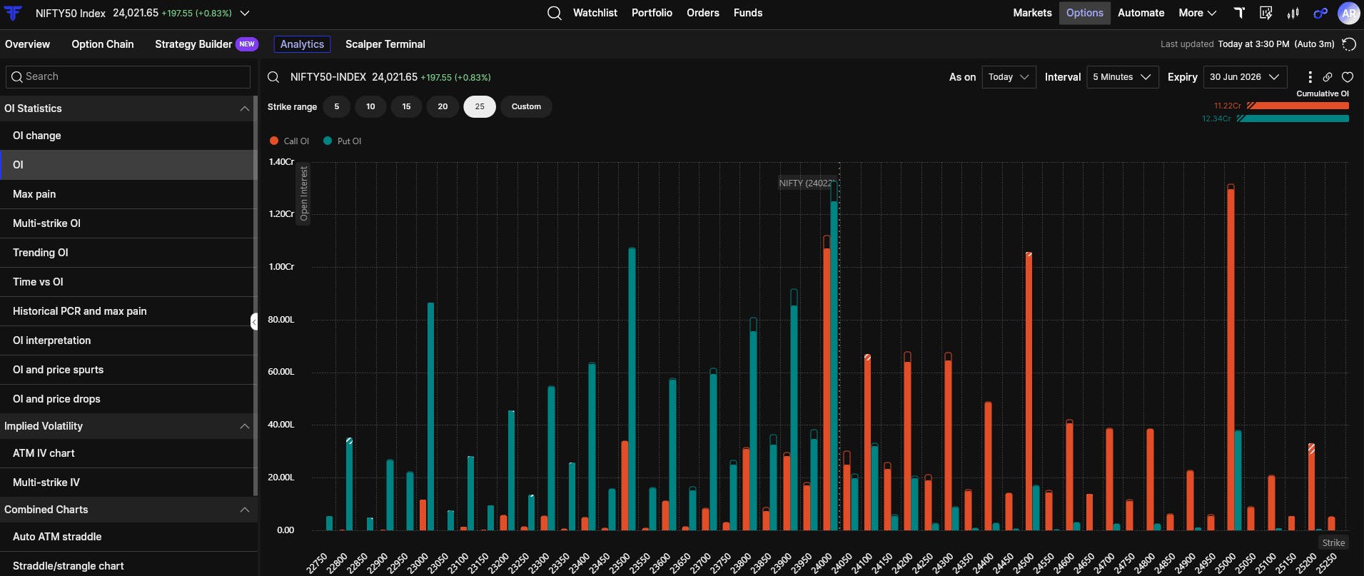
5. OI (Absolute)
OI Absolute shows the total open positions in the market. These are the structural support and resistance zones.
The strike with the highest Call OI often acts as overhead resistance. The strike with the highest Put OI often acts as support. Price can break these levels, but it usually requires effort and confirmation. Trading directly into heavy OI zones without context often leads to frustration.
6. Max Pain
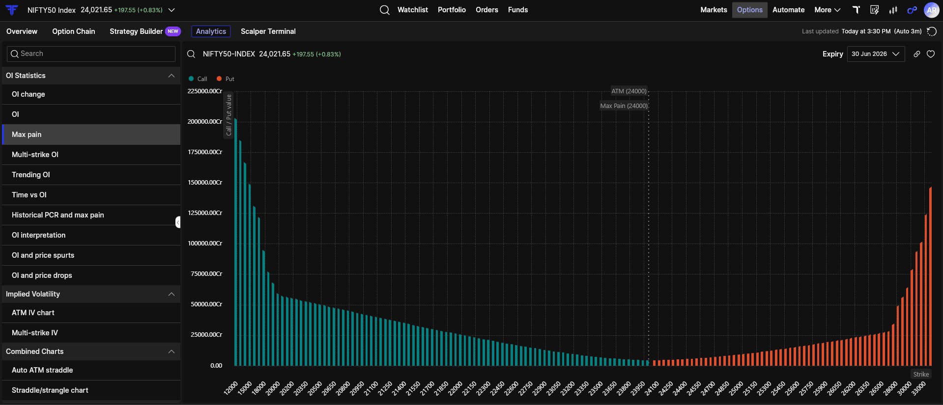
Max Pain shows the strike where option buyers would lose the most money at expiry.
Markets often drift toward this level, especially as expiry approaches. On its own, it does not predict direction. But on expiry days, it provides useful context about where payout pressure exists and why price may gravitate toward certain levels.
7. Multi Strike OI
Sometimes the market narrative is concentrated around a few important strikes.
Multi Strike OI lets you track Open Interest for selected strikes on a single chart. This makes it easier to compare how positions are building or unwinding relative to each other.
What matters here is relative movement. When Put OI starts building faster than Call OI at a level, control can begin to shift. Tracking multiple strikes together helps you see that change clearly, especially in range-bound or compressed markets.

8. Trending OI
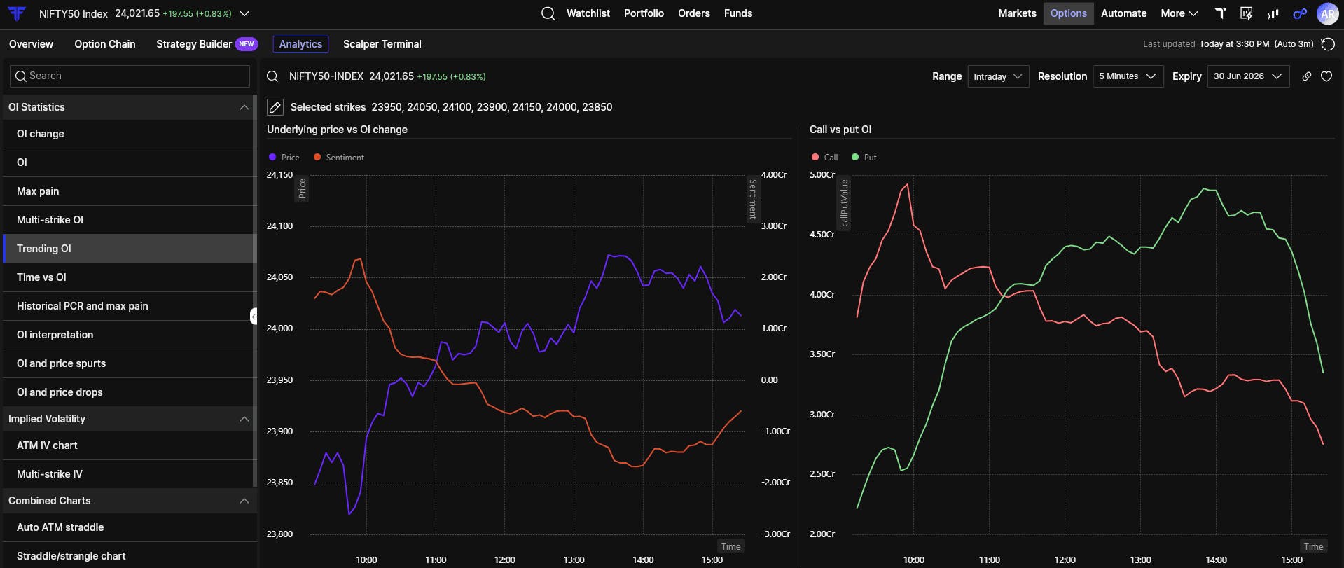
Price alone does not tell the full story. Open Interest alone does not either.
Trending OI plots both together over time. This helps you spot divergence and quiet accumulation.
When price moves slowly but Open Interest builds aggressively, positions are forming beneath the surface. These situations often lead to expansion later, once price starts responding to the built-up pressure.
9. Time vs OI
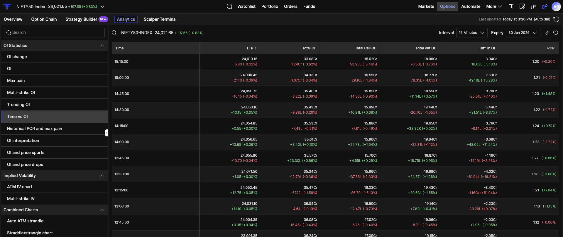
Some traders prefer raw data over charts. Time vs OI caters to that approach.
This view logs Total Open Interest, PCR, and price at fixed time intervals. When Total OI keeps increasing while price remains flat, it usually indicates accumulation happening quietly in the background.
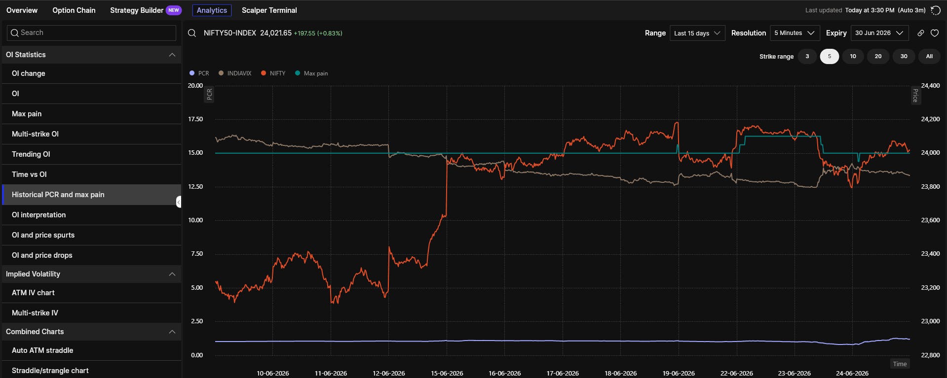
10. Historical PCR and Max Pain
Intraday data can be noisy. Looking only at the current snapshot can be misleading.
This view shows how PCR and Max Pain have shifted over time. Rising PCR over multiple sessions often reflects increasing bullish sentiment. Shifting Max Pain levels show that option writers are adjusting their expectations rather than holding fixed views.
Implied Volatility
Direction alone does not decide profitability in options trading. Volatility plays an equally important role in deciding who gets paid.
11. ATM IV Chart
This chart tracks the implied volatility of the current at-the-money strike and adjusts automatically as price moves.
When price stays flat but ATM IV keeps falling, option sellers are benefiting from time decay and volatility compression. Buying options in this phase is usually difficult, even if direction eventually plays out.

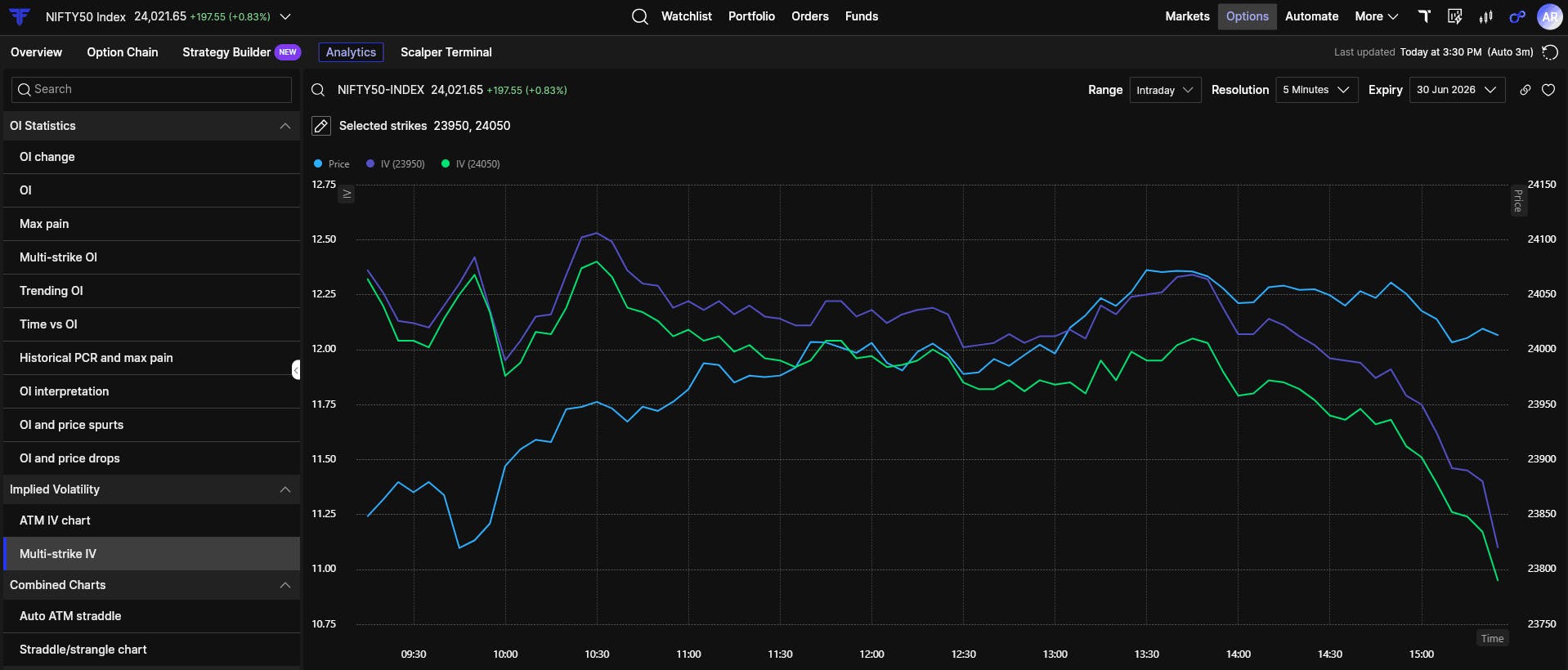
12. Multi-Strike IV
Multi-Strike IV shows how volatility differs across strikes.
When out-of-the-money Call IV rises while ATM IV stays flat, the market may be pricing in upside risk. When out-of-the-money Put IV rises, traders are paying for downside protection. This view helps you understand where fear or expectation is building.
Combined Charts
Combined Charts help you analyse how multiple options-related data points move together on a single chart, making it easier to understand market behaviour without switching between different views.
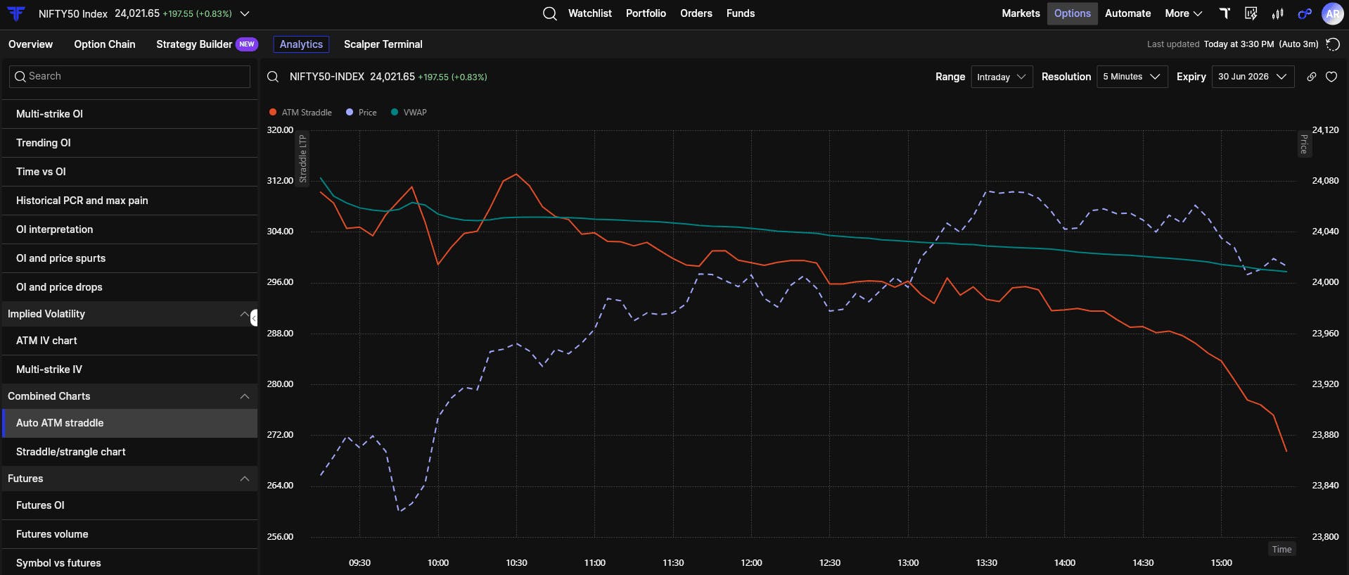
13. Auto ATM Straddle
This view tracks the combined premium of the ATM Call and Put and adjusts the strike automatically as price moves.
When the combined premium keeps falling while price stays within a range, time decay is working in favour of sellers. This helps straddle traders judge whether the environment is supportive or hostile.
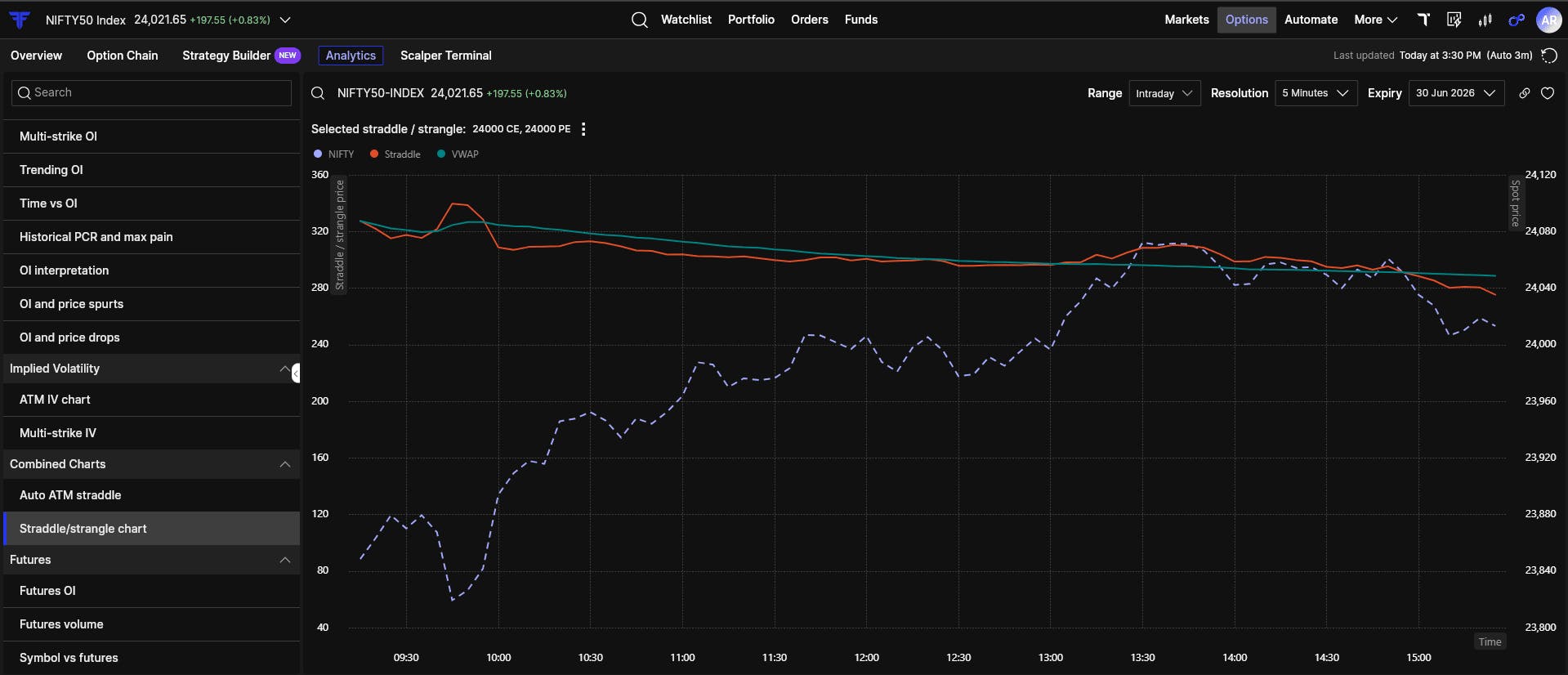
14. Multi Straddle/Strangle
This view allows you to track custom multi-leg strategies as a single combined structure.
Looking at legs individually often hides what the strategy is actually doing. Here, you can see the combined behaviour and also execute directly when needed, without switching screens.
Futures
Options react to what happens in the futures market. Futures often lead.
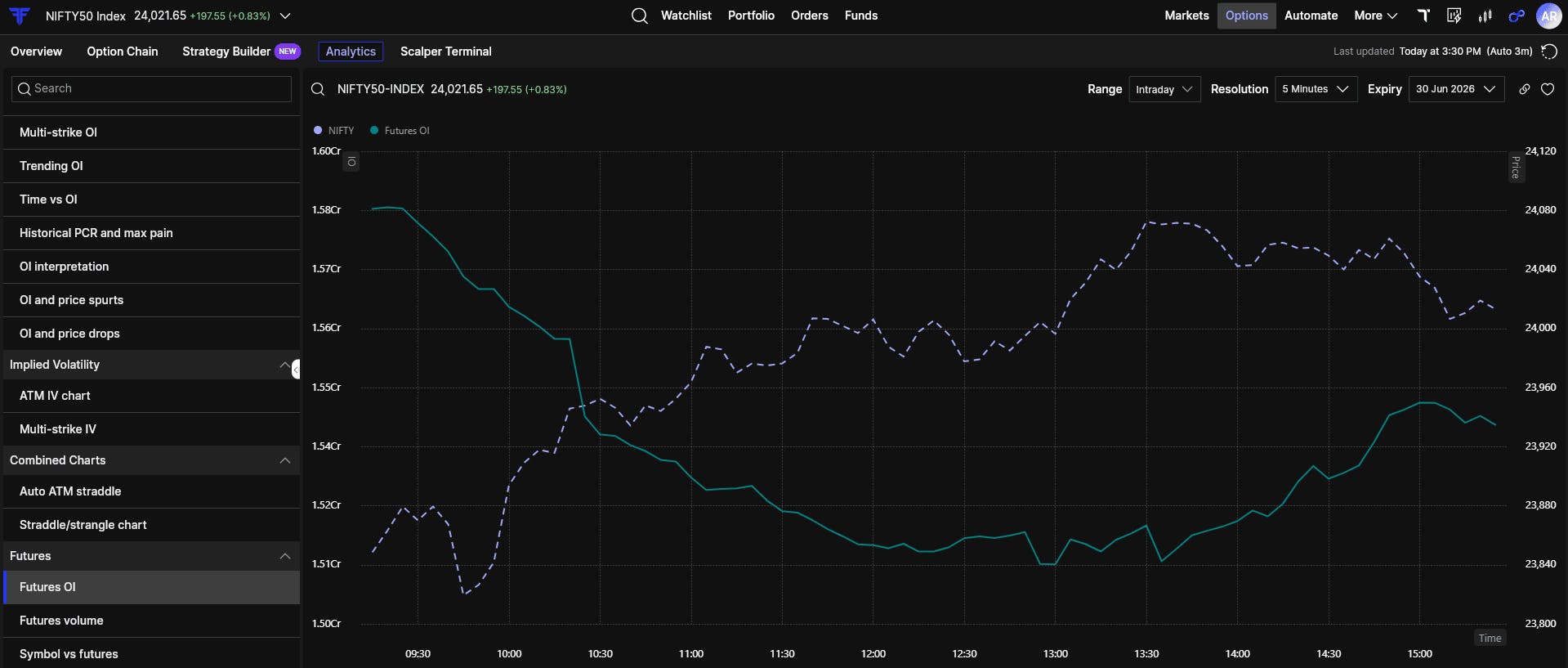
15. Futures OI
Futures OI shows whether price moves are backed by real positions. Price rising along with rising Futures OI usually indicates genuine participation. Price rising while Futures OI falls often points to short covering, which can be sharp but may not sustain.
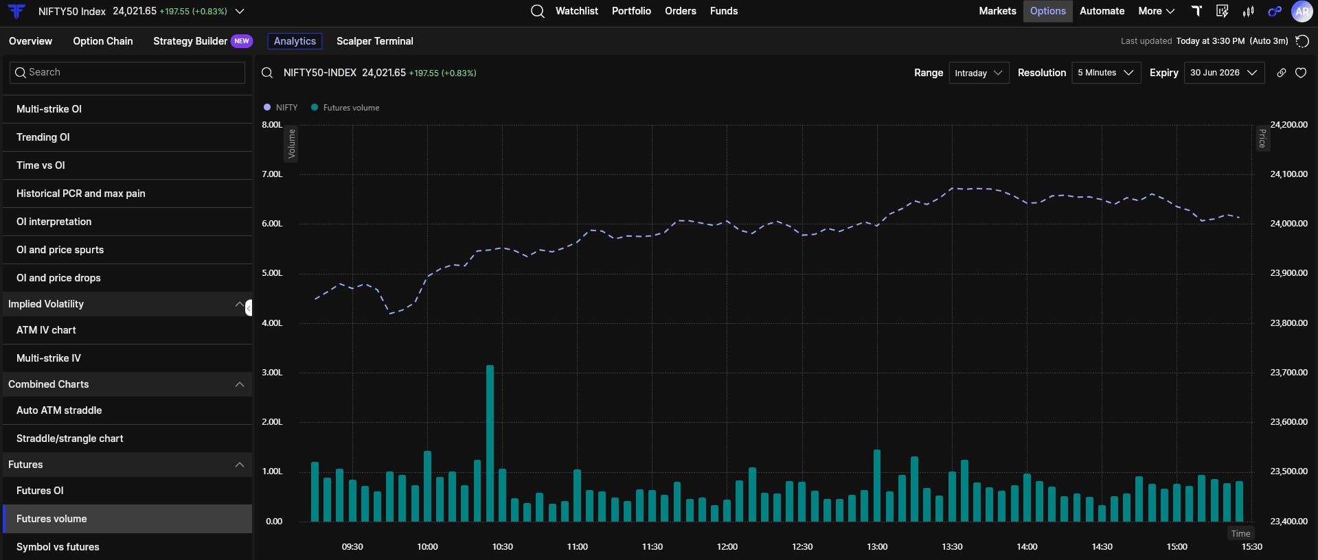
16. Futures Volume
Volume shows how much participation is behind a move.
Breakouts supported by strong volume tend to hold. Low-volume moves often fade once the initial momentum passes.
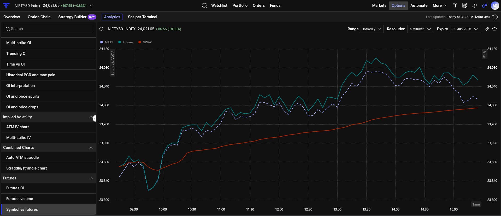
17. Symbol vs Futures
This view compares spot price, futures price, and VWAP.
When futures trade above spot, sentiment is generally positive. When futures remain below VWAP, sellers tend to control the intraday trend. This comparison helps you understand premiums, discounts, and control at a glance.
Bringing it all together
These views are meant to be read together, not in isolation. Many of them allow you to place trades, open the option chain, or check market depth without leaving the analysis screen.
Switching contexts breaks focus, and in options trading, focus matters.
Options Analytics was built so serious analysis does not require multiple platforms. The next time you are watching the market, do not guess. Go to Options → Analytics on FYERS and read the market the way it actually trades.