
 12 Jun, 2024
 9 mins read
One of the important pillars of trading is understanding the concepts of technical analysis, which involves interpreting price movements. A crucial tool in this process is candlestick patterns, which help in understanding trends and recognising suitable entry and exit points for an optimum portfolio. Here are the basics of candlestick patterns and how they are an important tool for traders in shaping their trading portfolios.
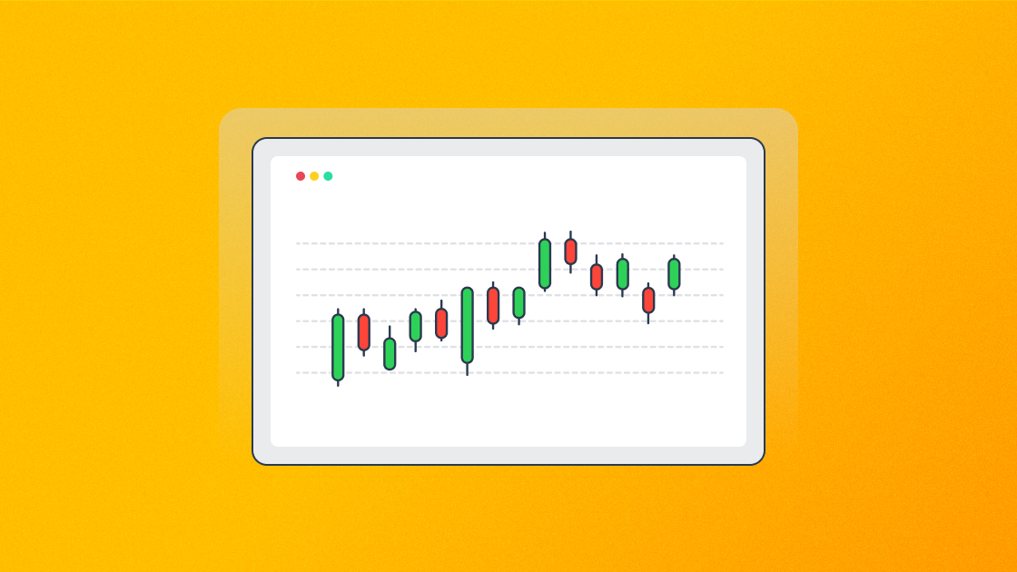
Candlestick patterns or candlestick charts are financial charts used to understand the price movements of an asset over a specific period. Candlestick charts originated in Japan more than 300 years ago and have become integral to technical analysis. They are highly favoured by traders for their visual clarity and ability to convey complex information with ease. Each candlestick displays the key price points of the asset within the selected time frame. This format helps traders worldwide to identify market trends, potential reversals, and trading opportunities by analysing patterns and formations in the candlesticks.
As mentioned above, each candle reflects the key data points of the selected timeframe for analysis. A typical candlestick consists of four data points for any particular period which could be 1 day, 1 week, 1 month or even as short as a second. The data points that are depicted on a candlestick chart are:
The opening price of the particular period
Closing price of the particular period
Highest price point of the period, and
The lowest price point of the corresponding period.
Furthermore, a candlestick consists of three main parts representing vital market insights.
Body - It indicates the range between opening and closing prices.
Upper Wick (Shadow) - It represents the highest price reached during the period.
Lower Wick (Shadow) - It shows the lowest price within the period.
The process of analysing candlestick charts includes observing all their components. Here is a brief analysis of candlestick components and what they represent.
It represents the opening and closing prices during the specified period, allowing traders to quickly see the stock's price range over that time. The body length can be long or short, reflecting the intensity of buying or selling pressure. The colour of the body indicates whether the stock price is rising (green) or falling (red). A series of red candles suggests a bearish trend, while a series of green candles suggests a bullish trend.
Wicks are the lines on the top and bottom of the candle. The length and position of the wicks can provide valuable insights into market sentiment and potential price movements.
The long wicks on bullish or bearish candles can be interpreted as follows
Long Upper Wick on a Green Candle indicates selling pressure despite the stock closing higher than its opening price.
Long Upper Wick on a Red Candle This suggests buying pressure that wasn’t enough to overcome the initial selling, with the stock closing below its opening price.
Long Lower Wick on a Green Candle signifies buying pressure after an initial sell-off with the stock closing above its opening price.
Long Lower Wick on a Red Candle - This highlights initial buying pressure overtaken by selling, resulting in the stock closing below its opening price.
The short wicks on bullish or bearish candles can be interpreted as follows
Short Upper Wick on a Green Candle - This indicates that the stock closed near its high, showing strong buying pressure.
Short Upper Wick on a Red Candle - This suggests the stock opened near its high and then faced selling pressure.
Short Lower Wick on a Green Candle - This shows strong buying pressure, with the stock opening near its low and closing higher.
Short Lower Wick on a Red Candle - This indicates that the stock closed near its low, demonstrating strong selling pressure.
Candlestick patterns can be broadly classified as bullish or bearish. Here is a brief overview of popular candlestick patterns.
A few popular bullish candlestick patterns include,
Hammer
How does it look?: A bullish reversal pattern that appears after a downtrend. It features a small natural body near the top of the trading range and a long lower shadow.
Interpretation: Indicates that sellers drove prices lower during the session, but buyers regained control, pushing prices back up, suggesting a potential reversal to the upside.
How does it look?: A two-candlestick pattern where a small bearish candlestick is followed by a larger bullish candlestick that completely engulfs the body of the first candle.
Interpretation: This pattern signifies a strong shift from bearish to bullish sentiment, often indicating the start of an uptrend.
How does it look?: A three-candlestick pattern indicating a bullish reversal. It starts with a bearish candle, followed by a small-bodied candle (indicating indecision), and ends with a strong bullish candle that opens above the small-bodied candle.
Interpretation: The Morning Star signals that the downtrend might be ending and an uptrend could be starting, making it a key signal for traders to consider buying or going long.
How does it look?: A two-candlestick bullish reversal pattern. The first candle is a strong, bearish candle, followed by a bullish candle that opens below the previous low but closes above the midpoint of the first candle.
Interpretation: This pattern suggests that the bears are losing control and bulls are taking over, often considered a sign of a potential reversal from a downtrend to an uptrend.
These patterns are widely recognized in technical analysis, and traders use them to make informed decisions about potential market reversals.
A few popular bearish candlestick patterns include,
The information provided about the candlestick patterns is accurate. Here is a brief verification and additional context for each pattern:
How does it look?: A bearish reversal pattern that appears after an uptrend. It is characterized by a small real body near the lower end of the trading range and a long upper shadow.
Interpretation: Indicates that buyers pushed prices higher during the session, but sellers took over by the end, suggesting a potential reversal to the downside.
How does it look?: A two-candlestick pattern where a small bullish candlestick is followed by a larger bearish candlestick that completely engulfs the first candle's body.
Interpretation: This pattern signifies a strong shift from bullish to bearish sentiment, often indicating the start of a downtrend.
How does it look?: A three-candlestick pattern indicating a bearish reversal. It starts with a bullish candle, followed by a small-bodied candle (indicating indecision), and ends with a strong, bearish candle that opens below the small-bodied candle.
Interpretation: The Evening Star signals that the uptrend might be ending and a downtrend could be starting, making it a key signal for traders to consider selling or short positions.
How does it look?: A two-candlestick bearish reversal pattern. The first candle is a strong bullish candle, followed by a bearish candle that opens above the previous high but closes below the midpoint of the first candle.
Interpretation: This pattern suggests that the bulls are losing control and bears are taking over. It is often considered a warning of a potential reversal from an uptrend to a downtrend.
These patterns are widely recognized in technical analysis, and traders use them to make informed decisions about potential market reversals.
Understanding candlestick patterns is essential to filter out the market buzz and make sense of the noise. This helps traders make a successful trading portfolio by shaping their trading strategies and implementing them successfully. However, it is easy to misinterpret candlestick patterns, especially for beginners in trading. Therefore, the correct analysis from candlestick patterns should be backed by significant volumes and indicators confirming the trend.
The most successful candlestick pattern can vary depending on market conditions, but the Bullish Engulfing and Bearish Engulfing patterns are widely recognised as strong reversal signals indicating potential shifts in market sentiment and price direction.
Traders can confirm a candlestick pattern by looking for additional confirming signals such as increased trading volume, supporting technical indicators (like moving averages or RSI), and observing price action in subsequent candles to validate the pattern's reliability before making trading decisions.
The "3 candle rule" typically refers to a trading strategy where traders wait for three consecutive candles to confirm a trend or pattern before taking a trading position. This rule helps reduce false signals and increases the reliability of trading decisions.
The "5 candle rule" is a trading strategy where traders wait for five consecutive candles to confirm a trend or pattern before making a trading decision. This rule aims to provide a more comprehensive assessment of market dynamics and reduce the impact of short-term fluctuations.
The "9 candle rule" is a trading strategy where traders analyse nine consecutive candles to identify trends or patterns before taking a trading position. This rule emphasises on a more patient approach to filter out the market noise and adheres to an extensive evaluation of market movements increasing confidence in trading decisions.
The Harami pattern is a Japanese two-candlestick pattern where the second candle's body is completely engulfed by the first candle's body. A Bullish Harami is a potential reversal signal during a downtrend, while a Bearish Harami is seen as a potential reversal signal during an uptrend.
Calculate your Net P&L after deducting all the charges like Tax, Brokerage, etc.
Find your required margin.
Calculate the average price you paid for a stock and determine your total cost.
Estimate your investment growth. Calculate potential returns on one-time investments.
Forecast your investment returns. Understand potential growth with regular contributions.

You have successfully submitted your partnership request form. You will be hearing us soon!


